Tuesday, July 2, 2013

2/7/2013: Village June 2013: Real Effects of Government Debt Overhang?


This is an unedited version of my column in the Village Magazine, June 2013 edition.


Ever since the publication of the working paper by Thomas Herndon, Michael Ash and Robert Pollin (HAP) detailing their criticism of the 2010 paper by Carmen Reinhart and Kenneth Rogoff, Irish Left has been abuzz with the anti-austerian sloganeering.

According to the Left’s Neo-Keynesianistas, the article by Carmen Reinhart and Kenneth Rogoff, titled Growth in a Time of Debt and published in the American Economic Review in May 2010 (R&R, 2010) provided the intellectual foundation for the argument that austerity is necessary for countries with public debt in excess of or near the 90% of GDP bound.  And, according to the same Neo-Keynesiastas, the R&R 2010 article has now been demolished by the HAP critique.

In the immediate aftermath of the HAP publication, both the new and the traditional media channels were saturated with ‘the austerity is dead’ missives from angry Leftists of all shades. The HAP paper became the buzzword of the blogosphere, twitter and facebook, and its student co-author became an overnight celebrity.

Alas, the HAP critique of the Reinhart and Rogoff study grossly over-exaggerated the true extent the errors committed by Reinhart and Rogoff. The tidal wave of anti-austerity rhetoric unleashed since the HAP publication has vastly distorted the nature of the original study conclusions and ignored the large body of academic research on the relationship between public expenditure, economic growth and public debt.


Consider the HAP authors’ main charges against the R&R 2010 paper and the case of ‘austerity’ in general.

Firstly, the authors identified a glaring and undeniable error in the spreadsheet calculation relating to one of the six main reported findings contained in the R&R paper. This error, unfortunate as it might be, is neither influential in terms of the original results, nor significant in terms of disputing the core conclusions of the Reinhart and Rogoff body of research. Correcting for this error changes original estimates of the impact of debt on growth by just three tenths of a percent –within the statistical margins of error. In other words, economically, the error was barely significant. A 0.3% swing in growth for an ‘austerity-hit’ economy like, say Ireland or Spain, is indistinguishable from normal volatility in growth rates present in good and bad times alike. Over 1980-2012, standard deviation in real growth in the peripheral euro area states averaged more than nine times the magnitude of the excel error discovered by HAP.

Second, the authors have claimed that the methodology used in the R&R paper in computing three of the six core reported results was flawed. In fact, the major difference between HAP and Reinhart and Rogoff papers is found in the authors differing opinions as to which averages matter when it comes to summarizing countries’ experiences across periods of crises.

The significance of this error can be best understood in terms of a practical example, provided by James Hamilton of the University of California, San Diego.

Since 1945 through 2009 – the period covered by both papers – the US experienced debt to GDP ratio in excess of 90% over only 4 years. In contrast, Greece was in a similar predicament for 19 years. To compare the two countries experiences, one has to deal with the averages across time (4 years vs 19 years) and across countries (the US – with more structurally robust and much larger economy, against Greece – with weaker and smaller economy). Difference between periods matter: if the US experienced 4 years of high debt when the global economy was in slower growth period, some of the US slowdown is attributable to global conditions and had nothing to do with debt overhang. In contrast, if Greece experienced 19 years of debt overhang amidst, say, a robust global expansion, then more of the impact of excessive debt levels can be attributed to internal conditions in Greece. And so on: exchange rates, interest rates, and inflation regimes variations, and other differences between economies at different times – all matter.

HAP assume that the correct way to deal with all these differences is to ignore them completely. Thus, under HAP, the expected growth rate for Greece under debt overhang conditions (debt in excess of 90% of GDP) is exactly the same as it would be in the US. More than that, HAP assumptions also imply that growth rates volatility around the mean is identical in the US and Greece, despite the fact that smaller economies tend to be much more volatile than the larger ones, or that volatility in growth changes over time and across countries. The end result of the HAP assumption is that Greek experience of debt overhang is weighted as if it was almost five times more significant than the US experience.

In contrast, Reinhart and Rogoff assume that differences across economies and time do matter, and this means that we should consider separately the average growth rates in the US from those in Greece.

Table below shows a summary of the HAP results compared to Reinhart and Rogoff results.


Note that unlike Reinhart and Rogoff, HAP fails to report median values, which are (a) not as different from the HAP mean-based results as the R&R mean variables reported, and (b) were always clearly stated as the preferred results by Reinhart and Rogoff. The omission of the median findings reporting by HAP is a major one. The difference between the median and average growth rates reported in the original Reinhart and Rogoff paper is indeed very sizeable in the case of the countries reaching beyond the 90% debt/GDP threshold. This, statistically, indicates that there is a lot of skeweness in the data and suggests that in addition to being associated with lower growth rates, high debt/GDP ratios are also associated with greater risk or volatility in growth.


Despite all the hoopla about the HAP study, it confirms the main argument set out in the Reinhart and Rogoff paper, namely that breaching a 90% bound on Government debt to GDP ratio is associated with significantly slower rates of growth. This is something that the Neo-Keynesianistas are largely ignoring in their calls for scrapping the drive to structurally rebalance fiscal spending and revenue models operating in the countries with already high levels of Government debt. Uncomfortably for Neo-Keynesianistas, the analysis by Reinhart and Rogoff 2010 is broadly and even numerically close to other studies by the two authors which were based on different data and models, as well as to papers from BIS (Cecchetti, Mohanty and Zampolli paper from 2011), ECB (Checherita and Rother, 2010 paper), the IMF (the World Economic Outlook, 2012), and a number of other studies. All of these papers have clearly confirmed that higher debt levels in post-war advanced economies are associated with indisputably lower levels of economic growth.

The debate re-ignited by HAP criticism of Reinhart and Rogoff 2010 paper is emblematic of the problem of politicized thinking on both sides of the austerian-neo-Kenesian divide.  Whilst we do not know much about the causality between debt and growth overall, what we do know is that:
1) Higher debt is associated with lower growth,
2) Higher debt is associated with higher present and future interest rates, and
3) Higher interest rates are associated with higher cost of borrowing for Governments, households and companies alike
The latter points were established for a number of advanced economies and across the post-war epriod in a recent paper from Bank of Japan (Ichiue and Shimizu, 2013), in Vincent Reinhart and Brian Sack 2000 study,  Thomas Laubach 2009 work for the US, Greenlaw, Hamilton, Hooper and Mishkin 2013 paper, Ardagna, 2004, and Baldcacci and Kumar 2010 studies, to name just a few.

The US Congressional Budget Office – hardly a hot house for austerians – clearly shows that US net interest cost of debt financing relative to GDP can be expected to double over the next decade.  This will take net interest cost of funding the US Government debt from 2.2% of GDP in 1973-2012 period to 3.7% of GDP by 2023. By 2018-2020, US Defense and non-Defense discretionary expenditures will be running below those on net interest funding.

In the case of another heavily indebted economy, Ireland, latest IMF projections show that interest on our debt will rise from EUR3.3 billion in 2009 (2.04% of GDP) to EUR9.4 billion by 2018 (4.6% of GDP). Full 65% of all income tax increases since 2009, including those to be achieved from the forecast increases in economic activity in Ireland through 2018 will be consumed by the hikes in interest cost on Irish Government debt. While the IMF does not publish underlying interest rates and Government bond yields assumptions, given the dynamic of debt accumulation, it is relatively safe to assume that the IMF is expecting Irish Government bond yields to average around 4% for 10-year bonds over 2013-2018 horizon. This expectation can be rather optimistic. As I repeatedly pointed out in a number of presentations, we can expect ECB repo rate to rise to above 3.1% historical average in medium term future. With risk premium broadly consistent with higher Irish debt levels, this can lead to sovereign yields averaging closer to 5% over the 2013-2018 period. In this case, Government interest costs can run to EUR12 billion or closer to 5.75% of GDP. If this were to occur, growth in the economy projected by the IMF can fall short of the levels required to deflate our Government debt to GDP ratios.

If neo-Keynesianists think this to be sustainable, we can add the potential impact of higher government yields on cost of funding Irish mortgages and corporate loans.

Another major issue missing in the HAP v Reinhart & Rogoff debate is the question as to whether the aggregate comparatives based on datasets pooling together vastly distinct countries over different periods of time and underlying economic conditions is a meaningful way for looking at the debt overhang problems. In the case of Ireland, consider two sub-periods of high Government indebtedness: the 1980s and the present period. In both, debt/GDP ratios for the Irish Government were running at similar levels. However, the 1990s were associated with Ireland facing an exceptionally robust global demand for its exports. Ireland’s comparative advantage vis-a-vis our main trading partners – our high corporate tax rate incentives and low cost basis – drove rapid expansion of our exports. Low interest rates environment that followed devaluations of the currency has resulted in a series of asset bubbles helping to reduce debt/GDP burden inherited from the 1980s. None of these conditions are present in Ireland today. Lastly, whilst in the 1980s Irish debt levels were flashing red only for Government debt, today we have one of the most-indebted private and public sectors economies in the world.

Which means – in terms of the table above – that we are not starting from a 4%-plus growth benchmark of pre-crisis long term growth trend and we are not heading for a 1.6% median or 2.2% average growth rate in the aftermath of the debt overhang crisis. More likely than not, we are going from a structural growth rate of 2-2.5% pre-crisis to a post-crisis long-term average growth rate of 1%. Whatever Reinhart and Rogoff or HAP aggregates might tell us about the future, it is hardly going to be rosy unless we get our debt and deficits under control and, more crucially, unless we shift our economy from slower structural growth path associated with current economic environment here onto a higher growth path.

How this can be achieved, however, is an entirely different debate from the superficial austerians v neo-Keynesianists ‘to cut or not to cut’ ideological warfare.

2/7/2013: EU Youth Unemployment: Promises of Urgency Urgently Promised


After much hoopla about the need to do something about youth unemployment, the EU leaders have managed to produce a strategy to do something about youth unemployment. As strategies go, this one is about as likely to deliver on the objectives (which remain undefined in any real tangible sense) as all other EU strategies. But, the good news is, the EU has managed to agree the strategy with the social partners.

So here;s the link to the EU's "comprehensive approach to combat youth unemployment": http://consilium.europa.eu/uedocs/cms_data/docs/pressdata/en/ec/137634.pdf.

The promise is to "speed up implementation of the “Youth Employment Initiative”, which should be fully operational by January 2014, and concentrate spending in its first two years". Now, wait a second, the EU already has a strategy to combat youth unemployment? Yes, it does. And the new over-hyped 'initiative' is to… speed up the old overhyped initiative that worked marvellously so far. Yes, it is.

And there is more: the EU "will also speed up implementation of the “Youth Guarantee”, which is designed to get young people who are not in education, employment or training back to work or into education or training within four months". So again, speeding up the past well-working initiatives is apparently makes for a new initiative, which, of course, will be even better working.

"In addition, unspent funds from the EU budget will be reallocated to support employment, especially for youth, as well as innovation and research. This is made possible by the flexibility of the EU budget, or Multi-annual Financial Framework, for the next seven years." What that? Ah, that will be EUR6 billion that the EU now plans to spend over 2 years to… yes… right… combat youth unemployment.

Perspective: in May 2013, 5.525 million young persons (under 25) were unemployed in the EU27, of whom 3.555 million were in the euro area. So that works out at EUR543 per unemployed youth. Overwhelmingly bold move by Europe, then, to combat the crisis…

Perspective: 26.522 million men and women in the EU27, of whom 19.340 million were in the euro area, were unemployed in May 2013. The other urgent crisis the EU faces, the banking crisis, has cost so far some EUR740bn (http://trueeconomics.blogspot.ie/2013/04/2342013-updating-cost-of-banking-crisis.html) and that runs at around EUR27,901 per each unemployed (not just youth unemployed) in EU27. Let us assume that these net liabilities are at least partially recoverable (you know, those AIB shares are worth something, and the bad loans in bad banks are not all completely and totally bad), so let's say the figure is more like EUR13,900 per unemployed.

Perspectives 1 & 2 imply the relative urgency in the EU strategic responses to the crises as follows (higher number = higher priority): Banks : Unemployed at 12:1.

With that in mind, recall that the "European Council also agreed on measures to promote cross-border mobility, including for vocational training. The “Your First EURES Job” programme will be strengthened and the “Erasmus +” programme should be fully operational from January 2014. High-quality apprenticeships will be promoted via the European Alliance for Apprenticeships to be launched in July." Sounds good? Of course it does, because one might think the programme is going to result in inefficient apprenticeships systems in countries like Portugal or Ireland becoming Swedish-styled or Austrian-styled super-efficient? Not really. This is more about Apprenticeship Programmes Administrators talking to their colleagues at more junkets. So chop down that EUR543 per young unemployed dish-out by few bob to cover the cost of 'cross-border mobility' of junkets.

But do read the document the EU produced, as linked above. it contains real pearls, like the following:

Paragraph 1.1: "All efforts must be mobilised around the shared objective of getting young people who are not in education, employment or training back to work or into education or training within four months, as set out in the Council's recommendation on the "Youth Guarantee". Building on the Commission's communication on youth employment, determined and immediate action is required at both national and EU level."

So basically - no idea what to do here. The Eu leaders admit as much by offering not a single programme solution, but stressing instead that something (anything? whatever?) must be done and that solutions must be 'determined and action is required'.

Overwhelmed yet?

Monday, July 1, 2013

1/7/2013: Summary of education systems stats for Ireland, 2013

Interesting numbers on education system in Ireland, compared to OECD and EU21: http://ec.europa.eu/ireland/press_office/news_of_the_day/pdf_files/2013/ireland_eag2013-country-note.pdf

Summary tables are very informative.

The full OECD publication is available here: http://www.oecd-ilibrary.org/education/education-at-a-glance_19991487

Here's an interesting chart from the publication (click to enlarge):
Basic point - once we exclude international students, Ireland is basically indistinguishable from the OECD average on terms of tertiary education attainment.

Furthermore, with international students counted in, 1.9% is the Irish graduation rate for Advanced Research Degrees (PhDs) which ranks us 12th in the OECD. Removing international students, the rate is 1.6% or 9th.

Another note: Ireland does not report on the proportion of students who enter the third level education and graduate, so we cannot tell how bad is the propensity of Irish system to graduate students once they are into the system. Ireland also does not report completion rates in third and higher levels of education.

In 2011, Ireland had the fifth highest unemployment rate for those with at least tertiary education completion, the third highest rate for those with Upper secondary or post-secondary non-tertiary education and the sixth highest for those below upper secondary education in the OECD.

Employment rate in Ireland for those with Type A and advanced research programmes tertiary education completion stood at 83%, which ranked as 22nd in the OECD. Put differently, that 'best educated' workforce in Ireland was, apparently, one of the least employed.

A caveat to all reading both documents: there are no corrections in the data for foreign workers employed in the country of residence. Which, of course, means that high salaries in ICT services and International Finance, earned by foreign employees working in Ireland are potentially skewing the data on returns to education

1/7/2013: Good Numbers on Trips to Ireland: January-May 2013


Good numbers on trips to Ireland from abroad for January-May 2013:

March-May (3mo) y/y rises were:

  • Trips to Ireland from Great Britain + 5.6% (below the overall rate of rise of 8.1%);
  • Trips to Ireland from Other Europe + 9.6% (above the overall rate of increase);
  • Trips to Ireland from North America + 12.6% (substantially above the overall rate of increase); and
  • Trips to Ireland from Other Areas + 3.2% (well below the overall rate of increase)
January-May (5mo) y/y rises were:

  • Trips to Ireland from Great Britain + 2.8% (below the overall rate of rise of 6.4%);
  • Trips to Ireland from Other Europe + 8.5% (above the overall rate of increase);
  • Trips to Ireland from North America + 12.8% (substantially above the overall rate of increase); and
  • Trips to Ireland from Other Areas + 4.9% (below the overall rate of increase)

1/7/2013: Irish Manufacturing PMI: June 2013


Irish Manufacturing PMI is out today and I can't really report much on the subject - the Investec - Markit continue to put out qualitative analysis in place of what used to be very informative press releases.

The PMI data is seasonally adjusted, which makes y/y comparatives slightly questionable, while normal volatility makes m/m comparatives pretty much meaningless. Note: despite the seasonal adjustment data remains Laplace-distributed. In the past, it was possible to make some educated guesses as to the underlying drivers of the PMI by looking at trends in components. Now - it is impossible.

But ok, let's deal with the headline PMI alone.

The headline PMI reading is not as ugly in June as it was in March and April (PMI average at 48.3), but not pretty either.

We have a statistically insignificant rise in the overall index reading of 0.6 points (bi-directional standard deviation for this data is at 4.37 for full sample, 4.28 since 2000 and 5.21 since 2008).

The increase brings us notionally above 50 to 50.3, for the first time since February 2013, but
1) This is not a reading that is statistically significantly different from 50.0 (STDEV is at 2.19 for difference from 50 and the skew is -1.46, so 0.3 is not significant)
2) Current reading still remains consistent with negative trend set on around 12 months ago. Next 1-2 months will be critical in either confirming the trend or potentially signalling an inflection point. Then again, next 1-2 months will be peak of summer, and will be unlikely to tell us much.
3) 50.3 reading in June is identical to January 2013 and is below 12mo MA of 50.9, and is about identical to the 3mo average through March 2013 at 50.1. 3mo average reading through June is below 3mo averages through June in every year 2010, 2011, 2012.

Core conclusion: output did not, in any normal statistical likelihood, return to growth yet, although PMI reading did come to around 50 from the upside (50.3)… it was also around 50 back in May (49.7) but on the downside.

Per Investec, there was "a further reduction in new orders, although the latest decrease was only fractional, and the slowest in the current four-month period of decline. New export orders, meanwhile, fell at a faster pace than in May." We, of course, have no idea just how far these reductions have taken the two sub-indices, because Investec and Markit are no longer giving us actual sub-index readings.

Charts on dynamics:


Saturday, June 29, 2013

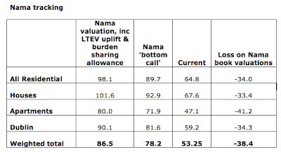
29/6/2013: Nama valuations update to May 2013

In the previous post I looked at the latest prices trends in Irish property markets. Now, as promised, an update on Nama valuations.

Note: these numbers are indicative, rather than exact estimates.


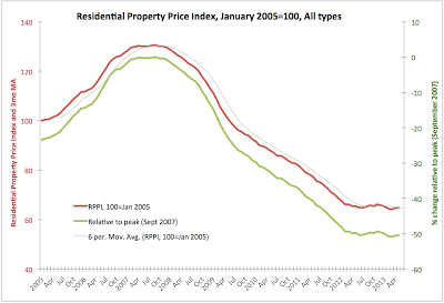
29/6/2013: Irish Residential Property Prices: May 2013


This week, CSO released Residential Property Price Index (RPPI) for May. Here's the update on trends and changes. Nama valuations update will be posted in a follow-up post.

Per CSO data, All properties RPPI rose marginally from 64.6 in April to 64.8 in May, 2013. The index is now in the range of 64.1-64.8 for four months in a row, suggesting no change to the overall flat trend at around 65.2. The flat is now running from February 2012, and we are currently below the trendline by about 0.6%.

Year on year, index is down 1.07% and in April it was down 1.22%. Over the last 3 months, All-RPPI rose 0.62% cumulatively, which reverses 1.22% loss on 3mo through April 2013. On 6mo basis, cumulative, All-RPPI is down 0.33% which is an improvement on 1.22 loss over 6 months through April 2013.

2013 is not shaping that great so far, as All-RPPI is down 1.52% since December 2012 end.

Overall, All-RPPI is down 50.34% on all-time peak and in May 2013 it was up only 1.09% on all-time low of 64.1 reached in March 2013.


Houses sub-index rose from 67.3 in April 2013 to 67.6 in May - another marginal improvement. Y/y index is down 0.88% and in April it was down 1.17%. 3mo cumulated gain through May 2013 was 0.9% and there was a 6mo cumulated loss of 2.17%. Relative to peak, the series are down 48.79% and the sub-index is 1.2% above the all-time low.


Per chart above, Apartments sub-index is again in decline, falling from 48.4 in April 2013 to 47.1 in May. Y/y sub-index is down 3.09% and previous y/y decline was 2.42%. 3mo cumulative move in May 2013 was -8.54%, while on 6mo basis, the index is up 3.06%. There is huge volatility in the index by historical standards, which suggests that the market is subject to some very concentrated volume swings in sales.

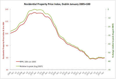
Dublin sub-index has been used before to drum up the evidence that Irish property markets are returning to life. Chart below shows a marginal positive sloping of the trend since the historic lows of H1 2012.

However, at 59.2, May reading came in only marginally better than 58.9 in April 2013. Year on year, Dublin sub-index is up 1.37 and on cumulated 3mo basis, May reading is down 0.17%. On cumulated 6mo basis, the decline is -1.33% through May. There is zero gain since the end of December 2012. 6mo average reading is now 59.2 - bang on with May 2013 reading. 12mo average is at 58.74, less than 0.8% away from the current reading. For all intent and purpose, current trend is flat at around 58.7-59.0 range. Overall, Dublin prices are down 55.99% on peak and are 3.32% up on absolute low.


29/6/2013: Research Funding Does Not Seem to Match Research Performance

Very interesting:

http://www.plosone.org/article/info%3Adoi%2F10.1371%2Fjournal.pone.0065263

From the abstract: "Agencies that fund scientific research must choose: is it more effective to give large grants to a few elite researchers, or small grants to many researchers? Large grants would be more effective only if scientific impact increases as an accelerating function of grant size."

So, the paper examines "the scientific impact of individual university-based researchers in three disciplines funded by the Natural Sciences and Engineering Research Council of Canada (NSERC)", based on "four indices of scientific impact:

  • numbers of articles published, 
  • numbers of citations to those articles, 
  • the most cited article, and 
  • the number of highly cited articles."
All of the above parameters are "measured over a four-year period" and referenced against "the amount of NSERC funding received".

Core findings:

  • "Impact is positively, but only weakly, related to funding" - which is disturbing, as it suggests that funding allocation is not academically efficient. 
  • "Researchers who received additional funds from a second federal granting council, the Canadian Institutes for Health Research, were not more productive than those who received only NSERC funding." Which suggests that the most important agency has trouble identifying and signalling by its grants allocation the academic 'winners'.
  • "Impact was generally a decelerating function of funding." Which is really bad. In basic terms, the more funds were pumped the less was the positive marginal impact. So that "impact per dollar was therefore lower for large grant-holders". Which "is inconsistent with the hypothesis that larger grants lead to larger discoveries". 
  • "Further, the impact of researchers who received increases in funding did not predictably increase." So obtaining a larger grant did not lead to subsequent improvement of the researcher output! 
  • "We conclude that scientific impact (as reflected by publications) is only weakly limited by funding."
  • And a big Boom! "We suggest that funding strategies that target diversity, rather than “excellence”, are likely to prove to be more productive." 
Now, the last point is what all funding agencies around the world are trying to avoid. Everywhere, the policy in funding research is on more concentration and on more winner-picking. Not on funding broader research and research groups.

Incidentally, if you are interested in this topic - what and how should be funded and prioritised in research and education - read my Sunday Times article tomorrow.

29/6/2013: WLASze Part 2: Weekend Links on Arts, Sciences and Zero Economics


This is the second part of my usual Weekend Links on Arts, Sciences and zero economics (WLASze). The first part is linked here.


An insightful piece on what philosophers as a group believe in:
http://www.openculture.com/2013/06/what_do_most_philosophers_believe_.html
Very interesting and can be followed by the very brief (and as such not very deep, but still interesting)
http://www.openculture.com/2010/11/do_physicists_believe_in_god_.html
and by brilliantly extensive http://www.sixtysymbols.com/ .
The latter literally is a sort of a merger of art (of symbol or word or meaning) and sciences.
And while on the above topics, here's John Lennox of Oxford on science and belief… http://johnlennox.org/


Back to art-meets-science, a major mapping/visualization geek alert:
http://www.wired.com/design/2013/06/infographic-this-detailed-map-shows-every-river-in-the-united-states/?cid=co9216134#slideid-152839
Love the images:
Laborious, but beautiful mapping, sadly in relatively low res only...


But blending cheeky with complex does not make it either art or science in the end, in my opinion, of course:
http://www.guardian.co.uk/science/alexs-adventures-in-numberland/2013/jun/26/mathematics
"And when you slice a scone in the shape of a cone, you get a sconic section – the latest craze in edible mathematics, a vibrant new culinary field" Err… not really.


http://www.prokopchik.com/ @pavelprokopchik great photo by Pavel Prokopchik for NY Times: http://www.nytimes.com/2013/06/21/world/europe/a-sea-of-bikes-swamps-amsterdam-a-city-fond-of-pedaling.html?_r=0


Sadly, only in low res quality, again...


Good review via @farnamstreet of a very interesting book on occasionally mindless fascination we hold for scientific explaining away of reality (or is this fascination itself an behavioural bias?):
http://www.linkedin.com/today/post/article/20130607125052-5506908-what-if-capitalism-could-be-artistic?trk=mp-details-rr-rmpost
Which makes me wonder, are biases endogenous to biases? Liam, your suggestions?!. And to MrsG a gentle suggestion: my birthday is coming up...


Bad news:

"Art Southampton Presented by Art Miami for Art Collectors NYC and In-Crowd East Coast with Cars Italia and Galleries Kitsch USA" for the crowd of those who think a horse bronze with polished detail is worth a silver metal couch and all that shines…
You can almost see the parallel to the previous screenshot: animate duo 'racing' to the cocktails counter with an enlightened look about them of a floodlight set to highlight the Maserati... being vs object - all denoting the same fake-ness of the art world that fits a dressed-up-white hangar… in dressed-up Hamptons… Watch the preview slideshow… http://www.art-southampton.com/ it is frightening (and as such so anti-artistic as to become almost artful).

29/6/2013: Banks-Sovereign Contagion: It's Getting Worse in Europe

Two revealing charts from Ioan Smith @moved_average (h/t to @russian_market ): Government bonds volumes held by Italian and Spanish banks:


Combined:

  • Italy EUR404bn (26% of 2013 GDP) up on EUR177bn at the end of 2008
  • Spain EUR303bn (29% of 2013 GDP) up on EUR107bn at the end of 2008
Now, recall that over the last few years:
  • European authorities and nation states have pushed for banks to 'play a greater role' in 'supporting recovery' - euphemism for forcing or incentivising (or both) banks to buy more Government debt to fund fiscal deficits (gross effect: increase holdings of Government by the banks, making banks even more too-big/important-to-fail); 
  • European authorities and nation states have pushed for separating the banks-sovereign contagion links, primarily by loading more contingent liabilities in the case of insolvency on investors, lenders and depositors (gross effect: attempting to decrease potential call on sovereigns from the defaulting banks);
  • European authorities and nation states have continued to treat Government bonds as zero risk-weighted 'safe' assets, while pushing for banks to hold more capital (the twin effect is the direct incentive for banks to increase, not decrease, their direct links to the states via bond holdings).
The net result: the contagion risk conduit is now bigger than ever, while the customer/investor security in the banking system is now weaker than ever. If someone wanted to purposefully design a system to destroy the European banking, they couldn't have dreamt up a better one than that...

Friday, June 28, 2013

28/6/2013: Expenditure Components of GDP: Q1 2013

Having looked at the recession/expansion dynamics in Irish economy on foot of Q1 2013 figures (here),  the dynamics in GDP and GNP in Ireland at the aggregate levels (here), and the mythology of the 'exports-led recovery' (here), let's round up the Q1 2013 QNA cover with a look at the expenditure-lined components of the GNP and GDP.

Below we look at the Seasonally-adjusted Current Market Prices data.

Personal Expenditure on Consumption Goods and Services fell 2.21% in Q1 2013 q/q and was up 0.01% y/y. This compares against much more benign drop of -0.07% q/q in Q4 2012 and a 1.15% rise y/y. Since Q1 2011, when the Coalition came to power, Personal Expenditure is down 1.55%. In terms of q/q changes, Q1 2013 marked second consecutive quarter of declines.

Net Government Expenditure on Current Goods and Services declined 0.1% q/q in Q1 2013 and was down 2.56% y/y. This marks moderation in declines recorded in Q4 2012 when q/q decline stood at -1.90% and y/y decline was running at -2.88%. Net Government Expenditure decline was the shallowest contributor to voerall economic contraction recorded in Q1 2013. Compared to Q1 2011, Net Government Expenditure on Current Goods & Services was down 3.98% in Q1 2013. In terms of q/q changes, Q1 2013 marked second consecutive quarter of declines.

Gross Fixed Capital Formation - the most devastated expenditure component of GNP to-date has fallen massive 7.32% in Q1 2013 in q/q terms and was down whooping 18.74% in y/y terms. This shows dramatic acceleration in decline from -2.16% drop in q/q terms in Q4 2012 and the reversal of the y/y rise of +4.31% recorded in Q4 2012. Relative to Q1 2011, Gross Fixed Capital Formation was down 14.25% in Q1 2013. In q/q terms, Q1 2013 marked second consecutive quarter of declines.

Exports excluding factor income shrunk 0.79% in Q4 2012 on q/q basis and there was 4.93% growth in y/y terms. This was then. In Q1 2013 exports of goods and services fell 4.59% q/q and were down 3.13% y/y. Relative to Q1 2011 exports of goods and services net of factor income payments were up 2.22% in Q1 2013, but we also marked two consecutive quarters of contraction here.

Imports of goods and services, net of factor income payments were down 2.12% q/q in Q1 2013 and -3.13% y/y. This marks significant shift 'South' in the series compared to Q4 2012 when imports shrunk 1.05% q/q and were up 4.57% in y/y terms. Imports are running -0.05% down on Q1 2011 and Q1 2013 marks the second consecutive quarter of q/q declines.


GDP at curent prices, seasonally adjusted fell 0.6% q/q in Q4 2012 and there was annual growth of 0.38%. In Q1 2013, GDP fell 2.16% q/q and there was annual decline of 2.09%. This marks third consecutive quarter of decline in GDP and thus officially, return of the recession is dated to Q4 2012. The average rate of recessionary decline in GDP in the current episode is so far -1.06% per quarter. This is shallower than the previous recessionary episode (Q4 2008-Q4 2009) when GDP contractions averaged 2.76% per quarter. Compared to Q1 2011, Q1 2013 GDP at current market prices stood at -1.04%, or put differently, gross domestic product in Ireland in Q1 2013 stood below the levels attained in Q1 2011 when the current Government came to power.

Net factor income from the rest of the world declined in both Q4 and Q1, with decline accelerating in Q1 2013 to 19.21% q/q from 2.92% in Q4 2012. As the result of this, GNP moved up, in the opposite direction of the GDP.

GNP at current market prices grew 0.68% q/q in Q1 2013, down on 1.18% expansion recored in Q4 2012. On y/y basis, GNP grew 4.12% in Q4 2012 and by 4.26% in Q1 2013. Compared to Q1 2011, GNP is now up 2.46%.

Both Final Domestic Demand and Total Domestic Demand posted second consecutive quarter of q/q contraction in Q1 2013.


To summarise, not a single line of expenditure posted an increase in the Q1 2013 in terms of q/q changes once seasonal adjustments are taken into the account. In other words, the sole positive improvement in the numbers - relating to GNP - was driven exclusively by reduced outflow of funds from MNCs.

Worse, not a single line in the determination of the GDP in Ireland was up in q/q terms in any quarter since the end of Q3 2012. We had, put differently, 6 months of across the board contractions in the economy, when we consider expenditure-based definition of GDP.


28/6/2013: Exports-led recovery: Q1 2013

I covered the headline numbers and trends for the GDP and GNP in previous two posts: here and here. Now, onto some more detailed analysis.

Remember, from the very beginning of the crisis, Irish and Troika leaders have been incessantly talking about the 'exports-led recovery'. Position on this blog concerning this thesis consistently remained that:

  1. Exports growth is great, but
  2. Exports growth is unlikely to be sufficient to lift the entire economy, and
  3. Exports growth projections were unrealistic, while
  4. Exports re-orientation toward services, away from goods was less conducive to delivering real growth in the economy.
Q1 2013 data continues to confirm my analysis.

In Q1 2013, based on real valuations (expressed in constant market prices),
  • Exports of Goods & Services shrunk 6.47% q/q and fell 4.09% y/y. This compares to +1.19% q/q growth in Q4 2012 and +1.28% expansion y/y. Compared to Q1 2011, when the current coalition took over the reigns in the Leinster House, total exports of goods and services are down 0.88% in real, inflation-adjusted terms. Troika sustainability projections envisioned growth of over 6% over the same period of time.
  • Imports of Goods and Services showed pretty much the same dynamics as exports in both Q4 2012 and Q1 2013, but owing to sharper contractions in 2011-2012 these are now down 4.34% compared to Q1 2011.
  • Exports of Goods fell in Q1 2013 by 3.83% q/q and 9.37% y/y, while there were declines of 2.68% q/q and 2.33% y/y in Q4 2012.
  • Exports of Services were down 8.75% q/q but up 1.27% y/y in Q1 2013, and these were up 4.77% q/q and 4.63% y/y in Q4 2012.


  • Trade Balance in Goods and Services fell 4.96% q/q and was down 3.63% y/y in Q1 2013, with Q4 2012 respective changes at -15.91% q/q and +0.98% y/y. Compared to Q1 2011, trade balance is up 15.91%
  • Trade Balance in Goods was down 6.63% q/q in Q4 2012 and this deteriorated to -10.73% growth in Q1 2013. Y/y, trade balance in goods contracted 0.05% in Q4 2012 and shrunk 10.59% in Q1 2013. On Q1 2011, trade balance in goods is down 14.04%.
  • Trade Balance in Services fell from EUR1,130mln in Q3 2012 to EUR132mln in Q4 2012 before improving to EUR601mln in Q1 2013. In Q1 2012 the balance stood at EUR28 million.


28/6/2013: Underlying dynamics in Irish GDP & GNP: Q1 2013

Q1 2013 National Accounts do not make for a pleasant reading. The implications from the business cycle perspective are pretty clear - we are in a continued (3rd quarter in a row) recession, which constitutes the fourth 'dip' since the onset of the Great Recession. The post summarising that evidence is linked here.

In this post, let's take a look at the GDP and GNP in constant prices.

On seasonally-adjusted basis (removing seasonal volatility),

  • GDP at constant factor cost (national output ex-taxes and subsidies) fell 0.65% q/q in Q1 2013, having contracted 0.12% q/q in previous quarter. On an annual basis, the GDP at factor cost declined 1.32% in Q1 2013, accelerating annual rate of decline relative to Q4 2012 when it fell 1.04%.
  • Compared to Q1 2011, when the current Government came to power, GDP at factor cost was 0.72% higher in Q1 2013.
  • Taxes rose 1.04% q/q in Q1 2013, after having posted a decline of 0.64% in Q4 2012. On an annual basis, taxes were down 0.79% in Q4 2012, but they rose 2.32% in Q1 2013.
  • Compared to Q1 2011, taxes were up 1.16% in Q1 2013.
  • To summarise the above, austerity is clearly biting. Taxes are rising at a 60% faster rate than economic activity.
  • Subsidies remained relatively constant in Q1 2013 on an annual basis, implying that net taxes rose strongly.
  • GDP at constant prices (accounting for taxes net of subsidies - the headline metric usually referenced as GDP) fell 0.58% q/q in Q1 2013, which follows a shallower contraction of 0.18% recorded in Q4 2012. On an annual basis, GDP contracted by 1.03% in Q1 2013, following a 1.02% contraction in Q4 2012.
  • Net factor income for the Rest of World (outflows to the rest of the world from factor payments, net of inflows of Irish incomes earned abroad) fell dramatically in Q1 2013, down 16.96% q/q, following a 3.22% decline q/q in Q4 2012. In year-on-year terms, net outflows fell 16.55% in Q4 2012 and by 27.58% in Q1 2013. 
  • It is impossible to tell from QNA the core drivers of the net outflows, however, from the balance of payments data we have reinvested earnings in Q1 2013 by the foreign companies in Ireland at EUR4,753 million, up on EUR4,010 million in Q4 2012 and down on EUR6,768 million in Q1 2012. The gap of Repatriations of earnings from Ireland are not provided for Q1 2013.
  • On foot of significantly reduced outflow of funds abroad, GNP at constant market prices rose in Q1 2013 rose 2.85% q/q and 5.46% y/y, beating growth of 0.51% q/q and 3.01% y/y recorded in Q4 2012. 
  • However, as analysis in the subsequent posts will show, this growth is entirely dependent on reduced outflows of funds abroad. Q/q, net expatriation of funds slowed down by EUR1,204 million, while earnings outflows abroad shrunk by EUR2,015 million.
  • Taking the average net factor payments abroad for Q1 2010-2012 in place of Q1 2013 figure, GNP growth controlling for net factor payments changes would have been around -0.01% y/y and -2.48% q/q.
Charts below summarise seasonally unadjusted series:


The chart below clearly shows that even in y/y terms, we are now in a solid, three-quarters long (so far_ recession.

The GDP/GNP gap has, predictably - given the shrinking of net factor payments abroad - declined from 25-26 percent (seasonally-adjusted and unadjusted) in Q1 2012 to 17.3-17.5 percent in Q1 2013:


It is worth noting in the chart above a significant increase in volatility in the gap, which is reflective of the greater volatility in Ireland's GDP and GNP series as well as destabilisation in growth correlation between GDP and GNP. This new pattern is most pronounced starting with Q1 2008 and is associated with both - the crisis and the underlying re-distribution of growth drivers away from the domestic economy to services exports, especially during the 2010-2011 'recovery'.

Thursday, June 27, 2013

27/6/2013: Quadru-Sextu-ple-dip Recession in Ireland: Q1 2013

All you need to know about today's QNA data release (though it won't deter me from more detailed analysis later) is:
  • Ireland is in a quadruple-dip recession (chart below)
  • You and I are in a sextuple-dip recession (second chart below)


Incidentally, just in case you felt like previous 'expansion' (officially from Q1 2010 through Q2 2012) was not much of an expansion at all, then you live in the world we inhabit, closely related to the Gross Domestic Demand. If you felt things were just fine then, you might live in Australia, or read too much of the Department of Finance presentations on their web site, or... I have no idea...

As I commented on earlier post by Brian Lucey: That light at the end of the tunnel did turn out to be an incoming train...

Update: Meanwhile, Minister Noonan thinks that the above (3 consecutive quarters of contraction in the economy, official fourth dip in the Great Recession and 6th dip in Total Domestic Demand) is "certainly disappointing but it's one set of statistics" (link). How long till Enda pops up to greet us with Dude's famous return: http://www.youtube.com/watch?v=QsogswrH6ck

Wednesday, June 26, 2013

25/6/2013: ECR Latest scores

Euromoney Country Risk scores, latest changes (higher score implies lower risk):


UP:
Luxembourg score 87.21 up by (+0.22)
Canada score 82.47 up by (+0.12)
US score 75.53 up by (+0.10)
Chile score 75.18 up by (+0.06)
Belgium score 71.69 up by (+0.03)


DOWN:
Greece score 34.08 down by (-0.01)
Spain score 53.60 down by (-0.01)
Finland score 84.39 down by (-0.03)
Italy score 55.26 down by (-0.03)
Portugal score 50.81 down by (-0.03)
UK score 72.53 down by (-0.03)

Australia score 81.53 down by (-0.04)
Japan score 68.02 down by (-0.04)
India score 52.47 down by (-0.05)
Austria score 79.77 down by (-0.06)
Netherlands score 81.51 down by (-0.06)
Sweden score 86.55 down by (-0.07)

China score 59.49 down by (-0.10)
France score 71.93 down by (-0.10)
Malta score 66.30 down by (-0.21)
Brazil score 59.81 down by (-0.27)

26/6/2013: SVT was the only form of property tax promised to the Troika

The previous Government of the FF/GP did not shower itself in a glory of competence. However, someone recently sent me a document from the Department of Finance which clearly shows that when it came to structuring the tax changes under the Troika programme, the FF/GP Government did understand the arguments in favour of the Site Value Tax (as opposed to the Property Tax) that were presented to them by, among others, myself.

http://www.finance.gov.ie/documents/publications/other/2012/eulettertrichet.pdf page 2 contains a reference solely to the Site Value Tax and no reference to the property tax.

This implies that the Troika had no objection to the SVT being the only tax on real estate in Ireland, and that the currently instituted system of property taxation (that exempts large land ownership from tax and induces a system of charges wholly unrelated to economic, environmental and social costs of property) was installed based on the current Government decision absent any pressure or compulsion from the Troika.

You can read on the benefits of SVT over the traditional property tax here: http://papers.ssrn.com/sol3/papers.cfm?abstract_id=2029515

Tuesday, June 25, 2013

25/6/2013: IMHO Open Letter to Minister Noonan

Irish Mortgage Holders Organisation have published an open letter delivered to Minister for Finance, Michael Noonan, TD concerning the revised Code of Conduct. Here is the link to the letter:
https://www.mortgageholders.ie/media/130624-letter-to-minister-noonan.pdf

This comes on foot of our earlier submission to the consultative process on the same, available here:
https://www.mortgageholders.ie/media/130409-IMHO-submission-letter.pdf


Disclosure: I am a director and one of five founders of the organisation.

25/6/2013: Planning Permissions in Ireland: Q1 2013

The latest data on Planning Permissions was released by the CSO under a rather cheerful headline: "Dwelling units approved up 24.7% in Q1 2013" which prompted me to start writing a positive note. However, having updated the database, I could not believe my eyes. Not until the third bullet point in the release do you get the sense as to what is really going on in the sector - the fact confirmed by looking at CSO data, rather than reading the CSO release which focuses the top points of analysis on positive side of select sub-components of the overall sector performance. So here are the facts, as conveyed to us by the data itself.

In Q1 2013, total number of planning permissions granted in Ireland for all types of construction stood at 3,275, which is 1.35% down on Q4 2012. This marks de-acceleration of seasonally-driven 17.96% q/q decline recorded in Q4 2012. However, on an annual basis, allowing for some seasonality controls, overall number of planning permissions granted in Q1 2013 was down 2.76%, which contrasts against an annual increase recorded in Q4 2012 of 1.13%.

In summary, things are not going well at all. Q1 2013 marks an absolute historic low for any quarter since Q1 1975! That's right: we hit an absolute historic low in 37 years and CSO release says things are 'up' by focusing on sub-series before it reports in the text the actual aggregates.


In charts below, I marked current sub-period (since Q1 2010) low against historic low before the current crisis. Take a look.


Note: in Q1 2013,

  • Total number of planning permissions hit a historic low (as mentioned above)
  • Total number of permissions for dwellings stood at 862, the second lowest after the historic low of 832 hit in Q4 2012.
  • Total number of permissions for 'other new construction ex-dwellings' stood at 785, which is above the historic low of 636, but still marks a decline q/q.
  • Number of permissions for extensions hit a historic low.
  • Number of Alterations, conversions, renovations etc hit a historic low. 
Again, I find little to cheer in the above...

25/6/2013: What the hell is going on in the markets?

Two charts from Pictet neatly illustrate the ongoing bonds markets correction:


My two cents on what's going on in the markets today:


Wednesday opening last week at the cusp of FOMC statements, US 10 years were  yielding ca 2.15%. and 4 trading days later, these were at 2.61% or 41 bps up. 30 years are up from the nadir of 2.83% on may 2 to 3.56% currently.

And what about the other QE-infused or enthused market? In just over 3 weeks, FTSE 100 is down 846 points, from 6,875 on 22 May.

Equities and bonds are moving same way? Why?

Because of three factors:
1) When bonds go down, with them goes down capital. Mandated investment vehicles and banks take a bit of a shower.
2) When US or other advanced economies bonds take a shower, Emerging Markets take a bath because of liquidity pull out to cover leveraged losses elsewhere.
3) When EMs and bonds tank, capital-backed leverage falls, so liquidity falls in the advanced markets too, dragging down all risk assets.

These are the tripartite consequences of a liquidity trap, whereby intermediated short-term funding underpins investment activities. Put differently, when humans have less cash (real economy slow recovery, coupled with tax and financial repression), while banks and other institutions have more cash (including, for the latter, via access to banks leverage against Central Banks funding), markets become correlated, even where hedges existed before, correlations turn positive. Where there is contrasting access to the same asset via both financial paper and physical or real assets (e.g. gold vs gold coins), the two diverge, with financialised asset moving in synch with other financial assets, while real/physical asset moving in the opposite direction.

Thus, Brazil's 30-year bonds (dollar-denominated) are down now more than 25% in recent weeks, and instead of flowing into safe havens or rather 'safer hells', the cash is being tucked away into reduced leverage, leading to the US bonds compression down and UK gilts erasing all gains made since October 2011 (when QE2 kicked in).

The only thing that behaves predictably so far is VIX, which has gone from low-flat around 13.6-14.0 between March 24th and May 24th to over 20 average since June 20th through today. Short term VXX index is up from 18.03 on May 17th to 22.81 today.

Not quite panic, but pressure… and pressure is a trigger. And FOMC, and the rest of the Impossible Monetary Dilemma, are triggers too. The point is, given the recent drama in bond markets and equities and EMs, triggers are dangerous in trigger-happy times. When you have lots of capital tied up in 'safe assets' and lots of leverage tied up on top of that capital, pulling the rug from underneath capital quality leads to accelerating cascades across the board.

This is bad news for strategies over the short-term, as traditional allocations based on previously stable relations between asset classes are broken down. Gold co-moves with equities and bonds and currencies. The good news: once financialisation of the long positions is unwound, leverage is reduced and repricing of 'bubble'-like assets (aka financialised assets as opposed to real assets) is finished, the stable relations will return. In the long run, we all are… well, in the long run.

Monday, June 24, 2013

24/6/2013: The Great (Credit) Wall of China

China is now in the anteroom of the 'This Time is Different' sauna... hot seat awaiting:
http://blog.foreignpolicy.com/posts/2013/06/21/say_hello_to_chinas_brewing_financial_crisis

Keep in mind, in China total credit increased from USD9 trillion in 2008 to USD23 trillion now. Credit to GDP ratio went up ca 95% and now stands at 221% of GDP. In the US, in 2002-2007 period, credit/GDP ratio grew by 40 percentage points. And we have no real idea just how deep the real rabbit hole goes: http://www.economist.com/news/finance-and-economics/21578668-growth-wealth-management-products-reflects-deeper-financial-distortions

Here's the contagion trigger: once China gets seated on the hot bench in the TTisD sauna, Chinese purchases of US and euro area bonds will evaporate. With this, yields will be going up even if current QE is retained by the Fed. And what the cost? BIS estimated last 1 trillion. And with yields rising across the board, 15-35 percent of GDP can go up in smoke in France, Italy, the UK and Japan.

Meanwhile, the euro area banks are sitting on a massive pile of dodgy assets (http://trueeconomics.blogspot.ie/2013/06/1862013-size-of-eurotanics-bad-assets.html) backed by funding secured against... right... the aforementioned government bonds.

In this blog parlance, the Impossible Monetary Dilemma will then hit the Great Wall of China. And there are no airbags...


24/6/2013: Anglo 2008 Annual Report is out. Call your broker, presto!

All going swimmingly... nothing to look at here... move on folks...
http://www.ibrc.ie/About_us/Financial_information/Archived_reports/Annual_Report_2008.pdf
H/T to @KarlWhelan

Oh, yes, do fill your boots with them shares...

A pearl:
"Following the introduction of the Government guarantee on 30 September 2008 the Bank experienced growth in retail deposits and access to other funding markets gradually improved. However, the reputational damage to the Bank resulting from a number of recent disclosures together with  adverse ratings actions have significantly weakened the Bank’s competitive funding position at a time when global markets continue to deteriorate and overall sentiment is negative."

Thus, clearly, barring some bad publicity and bad-bad-bad-n-worse Ratings Agencies intransigence, the bank would have been just fine, thank you...

And as per future, a gem:
"We are determined as part of our long term strategy to rebuild trust and confidence. A key priority of the new Board is to ensure we regain our position in the corporate, wholesale and debt capital markets and over time enhance the quality of funding, building on our diversified international platforms. ...The Bank’s ambition is to expand its retail franchise by targeting new and existing markets with competitively priced transparent products."

The Happy Times, they are coming back...

Obviously, there is no one to blame, but bad PR and bad-bad-bad-n-worse Ratings Agencies:
"I continue to be impressed by the tremendously loyal and professional staff in all areas of the Bank who deserve great credit for their dedication and commitment. Like all stakeholders, staff members across the Group have been deeply impacted and disappointed by recent events. They share the Board’s determination to restore confidence and trust in the Bank. The Board has great faith in the ability and strength of our people and they will play a critical role in ensuring the future viability of the Bank."

In other words, neither the staff, nor the Board had any idea of these bad things that have happened... it is, therefore, 'carry on across all decks' moment... But just in case you don't get this tingling sensation of excitement for the future from above, here it is in full glory:
"...a comprehensive business plan is being developed which will ensure the Bank’s long term viability.

...We will look at evolving from our existing structure to a broader more diversified business bank. The Bank’s customer service ethos and ability to provide effective and efficient service will help us meet the needs of sole traders, SMEs and larger businesses.

The Board is resolute in its determination to ensure that the Bank emerges from its current situation as a strong and viable institution and one that stakeholders feel proud of."

QED.

NB: Judging by objectives set out above, the Board and the senior management of the bank have by now failed in achieving the goals set out by themselves for themselves back in 2008-2009. Anyone to be held responsible?.. other than bad PR and bad-bad-bad-n-worse Ratings Agencies?..

NB2: Karl's reaction - and I am in agreement with him on it:


24/6/2013: Ifo Business Climate Survey for Germany: June 2013

German economy continues to grow, per latest Ifo Business Climate Survey for June 2013:


Basically, all three core indicators are above the water (>100), with

  • Business Climate reading at 105.9, up on 105.7 in May and 105.1 in June 2012. 
  • Business Situation reading slipped slightly to 109.4 in June from 110.0 in May and is down on 113.8 recorded in June 2012.
  • Business Expectations forward are actually relatively soft at 102.5 in June, up on sluggish 101.6 a month ago and up on contractionary 97.1 in June 2012.
  • Dynamics wise, Climate and Expectations readings in June were ahead of their 12mo average through May 2013, but Situation reading is basically flat. On 6mo average through May comparative, all indices are ahead of the average in June, save Climate which is flat.
Of four core subsectors, however, only Manufacturing is above water on expectations side. 

Net: strong performance, given prevailing conditions in the global and euro area economies, but no massive fireworks.

Sunday, June 23, 2013

23/6/2013: Sindo & Indo: "'Bondholders are f***ing us up the arse' – Anglo"

With slow drip of a freshly leaking faucet, we are getting more and more granularity on the events surrounding Anglo collapse and the events leading up to the Guarantee. Here's the latest instalment:
http://www.independent.ie/irish-news/bondholders-are-fing-us-up-the-arse-anglo-29365626.html

It is impossible to assume that this information, in pretty much the same words, was not conveyed to the Taoiseach and the Minister for Finance before the issuance of the Guarantee. Which, of confirmed, would imply wilful act on their behalf in securing the payouts to the bondholders against all information available.

It is also virtually impossible to imagine, given this information, that the IL&P did not know well in advance of the fated 'deposits'-'loans' swap of late September 2008 that its funding arrangements with Anglo were high risk and not exactly kosher. Which implies that the Irish Fin Reg also knew the same. If the Fin Reg did not know this, its lack of awareness would signify an absolute level of incompetence that would be staggering even by the pretty high bars for incompetence set during Bertie Era.

In short, the two material bits in the article linked above are... well... staggering in their importance.

Updated: more on the same from 
http://www.independent.ie/business/irish/inside-anglo-the-secret-recordings-29366837.html 
now down on tapes and making the case for accusing Anglo senior staff of knowingly manipulating the bank relationship with the CBofI/FinReg!


So while Bondholders were 'f***ing up Anglo', Anglo was f***ing up the entire financial system of Ireland with Ireland's financial system cheerful approval. The only ones who got f***ed up in the end were... Irish taxpayers. Happy times!


Updated: ZeroHedge on the same: http://www.zerohedge.com/news/2013-06-24/anglo-irish-picked-bailout-number-out-my-arse-force-shared-taxpayer-sacrifice

And Anglo 2008 accounts have been released: http://trueeconomics.blogspot.ie/2013/06/2462013-anglo-2008-annual-report-is-out.html

23/6/2013: On Dealing with Mortgages Arrears: Adverts v Process

A reply to @cbolgerr regarding the issue of contacting your bank when experiencing financial pressure in relation to mortgages:

In simple term (omitting some considerations), prior to the crisis people were mis-sold mortgages by the banks. Many mortgages were mis-sold on the basis of poor risk pricing by the banks - the job that the banks are paid to do. There was so much mis-selling that the problem of unsustainable mortgages is now structural.

People who mis-sold them these mortgages are still in the banks and are now the same people working on 'resolving' the problems. There were no involuntary layoffs of banking staff and there was no clearing of the banks lending officers or risk management staff on a systemic basis to match the problems in the lending markets. Hence, these staff members are still there. And accepting that they have no new lending to do, these are now the staff working on resolving the mortgages problems. As such, they have neither ability, nor credibility, nor incentives, nor compassion to do anything to repair the damage they have done.

In this environment, and provided the information and power asymmetries awarded to the banks by the Government & Regulator at the expense of mortgagees, the only thing that mortgagees should do is, simultaneously:
1) continue contributing to servicing their mortgages to the extent feasible,
2) prepare as much relevant financial information as possible in order to be able to file FSS,
3) identify an independent, properly regulated and knowledgeable/experienced representation for their case,
4) treat any engagement with the bank as potentially hostile and detrimental to them.

Their first step should be to seek independent advice and representation in the process. Unfortunately, the PIP system put forward by the state is itself at risk of being biased in favour of the banks. Still, it is better than following through on the banks advertising and contacting them before securing independent representation.

There are very few practitioners who have any relevant experience in dealing with the banks. And fewer still willing to help with advice before securing large payments from the homeowners. Care must be given to how the banks and the PIP system are approached.

Key issue, however, is that any mortgage holder under stress should continue engaging with servicing the loan to establish 'good will'. The banks are not required to establish any 'good will' toward borrowers, so the system in inherently unfair and asymmetric, but that is the reality of the fundamentally unjust legal framework established by the government and, for now - until challenged and changed - it has to be obeyed. 

Saturday, June 22, 2013

22/6/2013: Weekend Reading Links: Part 3 of 3


This is the third and the last post of my regular weekly feature of the Weekend Reading Links On Arts, Sciences and Zero Economics (see the first post here: http://trueeconomics.blogspot.ie/2013/06/2162013-weekend-reading-links-part-1.html and the second one here: http://trueeconomics.blogspot.ie/2013/06/2262013-weekend-reading-links-part-2-of.html).


Just awesome, tireless in its brilliance and time-invested poignance, the encounter that took decades to shape and seconds to execute. If it were a performance, it qualifies for an Oscar : http://zengarage.com.au/2013/03/marina-abramovic-and-ulay/  h/t to @sherqui for reminding us about it. One question, though, how on earth could have followed Ulay to that chair?!.


Chile's Pezo von Ellrichshausen Architectshas finished Solo Pezo property - part of the Solo Houses project in Matarraña, south of Barcelona: http://www.solo-houses.com/en/solohouses/page/houses/solo-pezo


Solo Pezo is a concrete structure lifted to the landscape's natural ceiling of tree-tops on a monolithic square platform. Views and light are maximized. There is a deep pool in the roofless central space as a visual tension point between sky and earth. Good slidshow of images is here: http://www.wallpaper.com/architecture/the-first-of-12-solo-houses-is-completed-in-spain/6578#82798


As a lecturer myself, I know that students are not only canvases for us to shape (actually, they are not that at all, but the traditional teacher-student nexus implies transmission of value to the recipient of it, hence the hierarchical implicit structure) but they are also a source of inspiration. Here's a sample - a MICA retrospective:
Brilliant works across the space. Enjoy!


Moscow Art Fair 2013 is coming up http://www.art-moscow.ru/en in September and, unless plans change, I will miss it this year (Irish trade mission is not being planned for that time, so I will not have an excuse to travel...) Here are some pics from 2011 show http://www.art-moscow.ru/2274.html. I love this one from 2008:

And more links from 2011 show http://www.itsliquid.com/art-moscow-2011.html. 2012 show images: http://www.art-moscow.ru/2512.html gotta love the irony:


And on these two humorous/sarcastic notes, have a fabulous weekend.

22/6/2013: Weekend Reading Links: Part 2 of 3


The second post (of three) of my regular weekly feature of the Weekend Reading Links On Arts, Sciences and Zero Economics (see the first post here: http://trueeconomics.blogspot.ie/2013/06/2162013-weekend-reading-links-part-1.html):

Some interesting long-exposure photos: http://likes.com/misc/amazing-longexposure-pics-of-star-trails?v=eyJjbGlja19pZCI6IDExNzI1NDE3MDMsICJwb3N0X2lkIjogMjUxMTQ1OTZ9 These remind me of the dynamics of Hurst's spin paintings series and a circular geometry with fractal qualities of Frantisek Kupka.


Some stunning architecture next:

http://www.designboom.com/architecture/tatiana-bilbao-studio-visit-interview/
That 'gabriel orozco house', roca blanca, mexico, 2008 project evokes Casa Malaparte. my favourite house in all of the world... well, one of the most favourite ones, because it has to compete with Neutra(s) and Mies Van Der Rohe(s) and so on...


Same forceful linear projection into the landscape, same blending into the physical geometry of the landscape and same play on contrast of height and angularity:


Where science meets art: Images of Cosmographic Maps Chart Galaxies and Superclusters in Local Universe
http://www.wired.com/wiredscience/2013/06/cosmography-maps/?cid=co8792474 via @wiredscience and @adamspacemann
I love the term 'local universe'...  Awesome maps show you galaxies and cosmic clusters... and wonkishly clinical 'flow' map... of the 'local universe'


Back on Earth, 'local universes' are moving, again...
http://www.sciencedaily.com/releases/2013/06/130617104614.htm
Just as G8 announced bringing closer (via trade) North America and Europe, so in geology the process of driving Europe closer to the USofA et al is on... so non-economic quote of the day is "This break-up and reformation of supercontinents has happened at least three times, over more than four billion years, on Earth. The Iberian subduction will gradually pull Iberia towards the United States over approximately 220 million years." I dare say, those visas one day will be done with and then Dublin Airport US immigration clearance desks will have to be abandoned.


http://www.urbannexusinitiative.com/ is hosting an exhibition on Liffey: A boulevard of rooms + corridorshttp://www.urbannexusinitiative.com/May-2013(2689947).htm This really is worth much more than just few web pages, so let's hope the folks at Urban Nexus get their act together and produce a killer site with images, interaction etc...
As Joseph Brodsky noted:
"What do you love most of all?
Rivers and streets - the long things of life"
Liffey is a tortured river, defaced by modern and contemporary ugliness and decay in places, as well as by spots of rather banal old architecture too, yet highlighted by moments of beauty and by more recent city efforts to bring it to life. It is alive and it is stunningly beautiful as a counterpoint to and reaffirmation of what we, humans, have wrecked around it: good and bad. It is one of the three core natural attractors that create a physically visual pull of Dublin (the other two being Wicklow mountains and the Dublin Bay, the latter being equally defaced by our inability to stop abusing the commons of nature).


The third post of links for this weekend (I warned you I have many this time around) is coming up, so stay tuned.