Thursday, June 7, 2012

7/6/2012: Sunday Times May 13, 2012


This is an unedited version of my Sunday Times article from May 13, 2012.


With Greek and French elections results out last week, the European leadership is rapidly shifting gears into neutral when it comes to austerity. Within two weeks surrounding the French elections, the Commission has issued a set of statements pushing forward its ‘growth budget’, and issued new proposals for enhancing European investment bank.

This, of course, is a classic rhetoric of damage limitation, contrasted by the reality of the currency union that is in the final stage of the crisis contagion. Having spread from economic to financial and subsequently to fiscal domains of the euro area, the cancer of Europe’s debt overhang has now metastasised to its political leadership. And the financial pressures are back on. Since the late March, credit default swaps spreads have widened for all but two core euro area states (excluding Greece), with an average rate of increase of 10.6%, implying that the markets-priced cumulative probability of the euro zone country default within the next 5 years is now, on average, close to 24%.

Next stop is a period of extended navel-gazing, with summits and ministerial dinners, contrasted by the European electorate moving further away from the centre of power gravity.

By autumn we will be either in a selective euro unwinding (Greece exiting) or in a desperate policies u-turn into mutualisation of the national and banking debts, supported by a return to high pre-2011 deficits and an acceleration of the debt spiral.

The former is going to be extremely disruptive in the short run. Portugal will be watching the Greeks closely, while Spain and Italy will be sliding into unrest. If properly managed, Greek and, later Portuguese exits will allow euro area to cut losses. With a stronger ESM balancesheet, euro area will buy more time to deal with the markets panic, but it will still require serious structural adjustments to shore up the failing currency union. Mutualisation of debt will remain inevitable, but deficits run up can be avoided in exchange for slower reduction in deficits.

The latter option of starting with mutualising debt, while allowing for new deficit financing of growth stimuli will be a road to either a collapse of the common currency within a decade or a Japan-style stagnation. The central problem is that the current political dynamics are forcing the euro area onto the path of growth stimulation amidst a severe debt overhang. The lack of real catalysts for economic recovery means that a temporary stimulus will have to be replaced by sustained debt accumulation. In other words, the political cure to the crisis a-la Hollande, not the austerity, will spell the end of the euro zone.

There are two sides to this proposition.

Firstly, the villain of the European austerity is a bogey. In 2011-2012, euro area fiscal deficits will average 3.7% of GDP per annum, identical to those recorded in 2010-2014 and deeper than in any five-year period from 1990 through 2009, including the period covering the recession of the early 1990s. The ‘savage austerity’, as planned, is expected to result in historically high five-year average deficits. At over 3.2% of GDP, 2012 forecast deficit for the common currency zone will be 6th largest since 1990.

Instead of shrinking, euro area governments over-spending will remain relatively static under the current ‘austerity’ path. Per IMF, general government revenues will account for 45.6% of GDP in 2011-2012, well ahead of all five-year period averages since 1990 except for 1995-1999 when the comparable figure was 46% of GDP. The same comparative dynamics apply to the government expenditure as a share of GDP.

In other words, euro area voters are currently revolting against the austerity that, with exception of Greece and Ireland, is hardly visible anywhere.


Secondly, the talk about Europe’s growth stimulus is nothing more than a return to the policies that have led us into this crisis in the first place. In 1990-1994, euro area public debt to GDP ratio averaged 59%. By 2005-2009, the average has steadily risen to 71%. In 2010-2014, the forecast average will stand at 89%, identical to the ratio in 2011-2012. Euro area is now firmly stuck in the policy corner that required accumulation of debt in order to sustain economic activity. Since the mid-1990s, the EU has produced one growth policy platform after another that relied predominantly on subsidies and public investment.

By the mid-2000s, the EU has exhausted creative powers of conceiving new subsidies, just as the ECB was flooding the banking system with cheap liquidity. At the peak of the subsequent sovereign debt crisis, in March 2010, Brussels came up with Europe 2020 document – yet another ‘sustainable growth’ scheme through featuring more subsidies and public investment.

At the member states’ level, private debt-fuelled construction and banking bubbles were superimposed onto public infrastructure investments schemes and elaborate R&D and smart economy bureaucracies as the core drivers for jobs creation. State spending and re-distribution were the creative force driving economic improvements in a number of countries. Amidst all of this, euro area overall growth remained severely constrained. For the entire period between 1992 and 2007, euro area real economic growth averaged less than 2.1% per annum, while government deficits averaged over 2.5%. The only three years when public deficit financing was not the main driver of growth were the peaks of two bubbles: 2000, and 2006-2007.

In brief, Europe had not had a model for sustainable growth since 1992 and it is not about to discover one in the next few months either.

Which brings us to the core problem facing the European leadership – the problem of debt overhang.

As a research paper by Carmen M. Reinhart, Vincent R. Reinhart and Kenneth S. Rogoff published last week clearly shows, “major public debt overhang episodes in the advanced economies since the early 1800s [were] characterized by public debt to GDP levels exceeding 90% for at least five years.” The study found “that public debt overhang episodes are associated with growth over one percent lower than during other periods.” Across all 26 episodes studied, “the average duration …is about 23 years.”

Now, according to the IMF data, the euro area will reach the 90% debt to GDP bound in 2012 and will remain there through 2015. Statistically, the euro area will be running debt levels in excess of 90% through 2017. Between 2010 and 2017, IMF forecasts that seven core euro area states will be facing debt to GDP ratios at or above 90%. Of the four largest euro area economies, Germany is the only one that will remain outside the debt overhang bound. Increasing deficits into such a severe debt scenario would risk extending the crisis.

After two years of half-measures and half-austerity, the euro as a currency system is now less sustainable. The survival of the euro (even after Greek, Portuguese and, possibly other exits) will depend on structural reforms, including change in the ECB mandate, political federalisation and fiscal harmonisation beyond the current Fiscal Compact treaty.

The real problem Europe is facing in the wake of the last week’s elections in Greece and France is that traditional European elites are no longer capable of governing with the tools to which they became accustomed over decades of deficits and debt accumulation, while the European populations are no longer willing to be governed by the detached and conservative elites. Not quite a classical revolutionary situation, yet, but getting dangerously close to one.
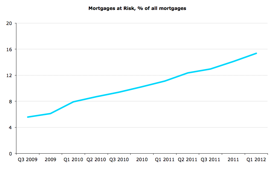
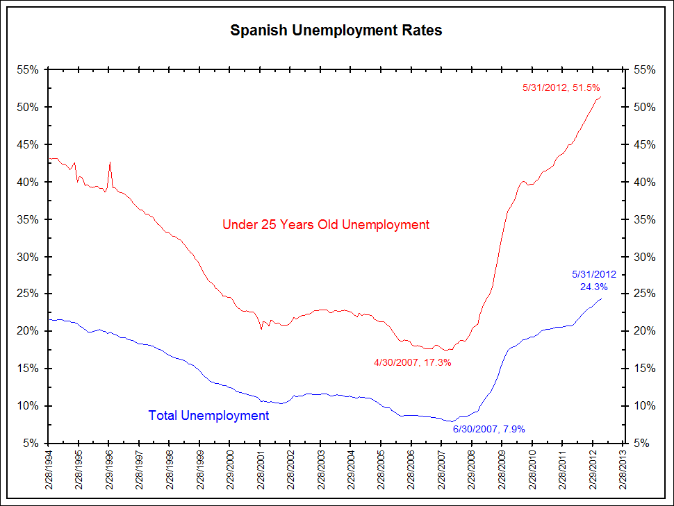


CHARTS: 


Box-out:
This was supposed to be a boom year for car sales as the threat of getting an unlucky ‘13’ stuck on your shiny new purchase for some years was supposed to spell a resurgence in motor trade fortunes. Alas, the latest stats from the CSO suggest that this hoped-for prediction is unlikely to materialise. In the first four months of 2012, new registrations of all vehicles have fallen 8.5% year on year and 60% on 2007. New private cars registrations have suffered an even deeper annual fall, down 10.2% year on year although since the peak they are down ‘only’ 56%. The news of the motor trade suffering is hardly surprising. Unemployment stuck above 14%, fear of forthcoming tax increases in the Budget 2013, plus the dawning reality that sooner or later interest rates (and with them mortgages costs) will climb sky-high are among the reasons Irish consumers continue to stay away from purchasing large ticket items. Cyclical consumption considerations are also coming into play. Over the last 4 years, Irish households barely replaced their stocks of white goods. Given the life span of necessary household appliances, the households are likely to prioritize replacing ageing dishwasher or a fridge over buying a new vehicle. Families compression with children returning back to parental homes to live and grandparents taking over expensive crèche duties are also likely to depress demand for cars. Lastly, there is a pesky consideration of the on-going deleveraging. Irish households have paid down some €36 billion worth of personal debts and mortgages in recent years. Still, Irish households remain the second most indebted in the Euro area. New cars registrations fall off in 2012 shows that in the end, sanity prevails over vanity and superstition, at the detriment to the car sales industry. 

7/6/2012: Irish Services PMI - May 2012


­­In the previous post (link here) I covered manufacturing PMI, showing a slight lift up in the growth rate from 50.1 in April (stagnant economy reading) to 51.2 in May (sluggish, but growth). More importantly, the 3mo average for March-May 2012 stood at 50.9 (weak expansion) compared to 48.9 average for December 2011-February 2012 (contraction).

Today’s Services PMI paints a weak picture in the other 48% of the private sectors economy in Ireland.

Headline Services PMI fell to 48.9 (contraction) in May from 52.2 in April. This marked the first month of sub-50 reading since January 2012. 12mo MA is at 51.2 and 3mo MA is at 51.1 in line with 12mo MA, slightly below 51.7 average for 2011.


This suggests that 5 months in 2012, growth conditions remain challenging. January-May 2012 average reading is 51.0, which, if sustained through 2012 will imply Services sectors growth of close to, but worse than a 2.15% real contraction in Services in 2011. Not exactly what I would call good news.

Of course, there are loads of various caveats to the above analysis, so don’t take it as some sort of a forecast.

New Business sub-index deteriorated from 52.7 in April to 49.6 in May, posting first usb-50 reading since January 2012. 12mo MA for the sub-index is now at 50.1, in effect implying that new business activity has been stagnant over the last 12 months. 3mo average is at 51.5 and the previous 3mo average was 50.2, some improvement on December-February period is still present. Good news, current 3mo average is ahead of same period averages for 2010 and 2011.


In line with broader indices, employment sub-index has fallen to 49.1 – returning to sub-50 level after March and April departures from the trend. Thus, 12mo MA for employment sub-index is now at 48.0 firmly signaling contraction in jobs in the sector. 3mo MA is at 50.3 owing to 51.9 spike in March, while previous 3mo average is 46.6. Current 3mo average and May level reading are both below the 3mo average for the same periods in 2011. 

Meanwhile, the giddy happiness signalled by the Services sector Confidence indicator bubbled up from 64.1 in April 2012 to 64.3 in May. The indicator runs on a silly scale well off the 50=neutral stance. Give you an example, in 2010, the indicator averaged around 66.7 and in 2011 it averaged 64.8. In both years, Irish Services sectors were, ahem… in a recession.


Output prices continued to fall, with the rate of decline accelerating to 44.4 from 44.9 between April and May. 3mo average through May is now at 45.4 and the previous 3mo average is 45.7. This marks continuation of below-50 readings in output prices since July 2008. Meanwhile, input costs rose at a faster pace (51.4) in May than in April (51.0), with 3mo average through May at 52.5, against previous 3mo average of 54.3.

Predictably, profitability was shot, again. Profitability sub-index fell to 45.8 in May from 47.5 in April.

More on profitability and employment in the following posts as usual.


7/6/2012: Spanish auction

Spanish auction results:
Sold €2.07bn of debt - above target of '€1-2 billion'
10-year bonds at average yield of 6.04%, bid-to-cover ratio of 3.29 up on previous auction cover of 2.56.
New issue close to secondary yields of 6.14%
Crunchy.


Tuesday, June 5, 2012

5/6/2012: Some recent links

Few past links worth highlighting:

An excellent article from PressEurop titled "The people have become a nuisance" focusing on real democratic deficit at the heart of modern Europe as exposed by the financial crisis.

An article on MEPs approving CCCTB.

And an article on symmetric pressure on Irish corporate tax rates from the other side of the pond.

A good summary (non-technical) of Basel III expected impact on European banks.

S&P Note on USD43-46 trillion refinancing cliff.

EU Commission assessment of the graveyard: Zombies Must Do as Zombies Have Done on fiscal deficits.

PMIs for June:
And add Spain at 41.8 for Services - the latest disaster. Along with Spanish unemployment chart worth taking a look at.

Soros on grave state of financial economics.

Excellent piece on the end of easy growth path for China.


Friday, June 1, 2012

1/6/2012: Museums & Visitors


Cool study:


A recent study by Brida, Juan Gabriel, Disegna, Marta and Scuderi, Raffaele, titled “Visitors of Two Types of Museums: Do Expenditure Patterns Differ?” (May 15, 2012). Available at SSRN: http://ssrn.com/abstract=2060840 looks at two different types of visitors differentiated by attendance of two types of museums: the museum of modern art and the archaeological museum.

Based on a survey of attendees to MART (Museum of Modern and Contemporary Art of Trento and Rovereto) and South Tyrol Museum of Archaeology (STMA), the study finds that there are, overall, two distinct profiles of visitors for each museum.

Overall, the analysis considered three different categories of expenditure:
  • Total spending excluding transportation reflects the ‘economic trace’ that the tourist leaves on the visited community.
  • Accommodation expenditure characterizes tourists and their decision of overnight stay.
  • All visitors instead may spend on food and beverage.
“Significant differences emerge between the two museums and concur in defining two distinct profiles of visitors.
  1. The average visitor [to MART] has a higher education level than in STMA and comes with families of smaller size and less frequently in presence of children.
  2. For [MART] tourists interested in its cultural value exert a significant and positive effect on total spending, [e.g.] positive coefficient of the number of museums visited, of visitors with higher education, and of those that declared to visit the museum to ‘learn’ something new.
  3. A further support to this interpretation is the negative effect of the ‘generalist’ visiting, that is those who think that the visit is something worthwhile or come to the museum for accompanying someone.
  4. The subset of those who decided to stay overnight considers MART as one of the attractions of the territory, but at the same time they are aware that visiting something that one ought to do. These overnight stayers visit MART mainly on weekends.
  5. The intensity of spending on accommodation is instead negatively related to the opinion of the visiting to the museum as a moment for learning.
  6. Also spending on food and beverage suggests a positive association with the ‘cultural’ tourist.
  7. The impact of STMA on the local economy is instead associated to a more ‘generalist’ profile of visitor.
  8. [STMA] is perceived more as one of the main attractions that are part of the tourist supply than for its strict ‘cultural’ value.
  9. This emerges also from the analysis of accommodation and food and beverage spending, where no particular proxy of ‘cultural’ aspects is related to spending.


1/6/2012: Irish CDS bounce up

Two charts - Irish CDS 5year:


Tough!

1/6/2012: PMIs May[hem] 2012

As of 11:00 GMT - here's where Europe's heading:


Via BusinessInsider: http://www.businessinsider.com/may-global-pmi-2012-5

1/6/2012: Irish Manufacturing PMI for May 2012

NCB Manufacturing PMIs for Ireland are out for May, so time to update charts.


Per release: "Operating conditions at Irish manufacturing firms improved again in May as output returned to growth and the expansion in new business was sustained. Increased workloads encouraged companies to take on extra staff, and the rate of job creation was solid during the month. Meanwhile, cost inflation remained elevated amid rising prices for fuel and other oil- related products."

Ok, running with numbers:
  • Overall Manufacturing PMI has posted a moderate expansion at 51.2 in May up on 50.1 in April 2012. May reading is still within 1/2 stdevs from zero expansion level of 50, but nonetheless, a strong improvement on April. May reading is below 51.5 in March. 
  • 12mo MA remains below 50 at 49.4, but 3mo MA is now above 50 at 50.9, compared to previous 3mo MA of 48.9.
  • 3mo MA activity remains well below same period 2011 - 54.5 and below same period 2010 - 53.5.
  • 6mo MA is about to cross 50, currently at 49.9.


Per chart above and the snapshot below:

  • Output index rose to 51 in May from 48.6 in April, with 12mo MA at 50.1 and 3mo MA at 50.8. Previous period 3mo MA was 48.8. Output activity remains subdued compared to same period 3mo MA in 2011 - 56.4 and 2010 - 57.7. 6mo MA is at 49.8, heading for 50.
  • Per release: "Higher new orders led firms to raise production during the month. Output increased slightly, following a reduction in the previous month. Production has risen in three of the past four months."
  • New orders index moderated the pace of growth in May from 51.4 in April to 51.1. 12mo MA is now at 49.1 and 6mo MA at 49.7. 3mo MA in May stood at 51.7, against previous 47.6 - representing a solid improvement. However, new orders remain subdued compared to same period 3mo MA in 2011 - 56.0 and 2010 - 55.4.
  • Per release: "New business at Irish manufacturing firms increased for a fourth successive month in May, with respondents mainly linking growth to higher new export orders."
  • New exports orders also moderated the pace of growth in May from 53.1 in April to 52.9. 12mo MA is now at 51.5 and 6mo MA at 52.1. 3mo MA in May stood at 53.7, against previous 50.5 - representing a solid pick up in growth. However, new orders remain subdued compared to same period 3mo MA in 2011 - 59.0 and 2010 - 59.5.
  • Per release: "New business from abroad rose at a solid pace as firms were reportedly able to generate sales from outside the eurozone."


Other sub-indices performed reasonably well with no surprises.


Per release: "A depletion of outstanding business also supported output growth in May, with backlogs decreasing at the sharpest pace since January. Manufacturers raised their employment for the
third month running in May amid increased workloads. The pace at which staff were taken on was solid, and the sharpest since March 2011." More on this once Services data is available.

"The rate of inflation of input prices remained sharp in May, and was only slightly slower than that seen in the previous month. According to respondents, the rise mainly reflected higher costs for fuel and other oil-related products. Strong competition largely prevented firms from passing on increased costs to clients, however, and prices charged were reduced fractionally." As usual, I will update profitability conditions changes once we have Services data, so stay tuned.

Overall, Irish Manufacturing is not exactly booming, but is clearly breaking the overall euro area trends. Robust exports exposures are supporting activity and are currently consistent with a shallow expansion in economic activity in Q2 2012.

1/6/2012: Gains in Competitiveness? Much done, yet even more to do


Much has been made of the fabled increases in Irish competitiveness in recent years. And to be honest, data does show some significant gains. But as this blog has pointed out repeatedly, these gains have not been (a) as straight forward as the Government would like us to believe, and (b) not a significant as to warrant the claims that we are one of the most competitive countries when it comes to labour productivity.

On (a) above, we know that most of the gains in Irish competitiveness during the crisis are accounted for by jobs destruction in heavily overheated construction and retail sectors. In other words, Irish average productivity improved because we pushed less productive workforce into emigration and unemployment, not because our more productive sectors increased their labour productivity.

On (b), here are the latest stats. All data is based on Harmonized Competitiveness indicators, unit labour costs, reported by the ECB. Latest data is through Q4 2011 and higher values reflect lower competitiveness.

Consider first the data for annual average readings:


Chart above suggests relative improvement in Ireland's position vis smaller member states of the euro area, but lack of significant gains compared to some groupings, especially those that combine more advanced economies in Europe. And chart below confirms the same:


Looking at the Q4 data - Irish competitiveness gains through 2011 have been far less impressive than annual averages suggest. Charts below show full sample of countries, followed by the EA12 euro area states excluding the 2004 Accession states.


Considered across the end-of-year figures, Irish unit labour costs remain well ahead of those in our closest competitors. Luxembourg - a country with virtually un-interpretable statistics due to huge imbalance between its workforce and population, as well as its economic output composition - is the only country of the old EA12 group that currently has lower labour competitiveness than Ireland.

What about pre-euro and euro-period changes? Chart below illustrates:


The introduction of the euro has resulted in deterioration in hci-based labour competitiveness metrics in all euro area economies, save for Austria, Finland and Germany. Largest deterioration took place in Slovakia and Estonia (catching up period, due to high entry differential), with Ireland posting third largest deterioration. The same remains even during the crisis period 2008-present, as illustrated in the chart below.


During the crisis, Irish hci-ulc index reading fell from 130.5 at the end of 2007 to 111.5 in Q4 2011 - the largest gain in competitiveness of all EA12 states. However, the rate of gains for Ireland has slowed down significantly in 2011. In 2009, the first year of improvements, competitiveness rose 7.1% on 2008, which was followed by a gain of 9.1% in 2010 and only 2.9% in 2011.

Tuesday, May 29, 2012

29/5/2012: Quick note on Structural Deficits and Growth

Per someone request: can growth result in larger structural deficit?

Answer is yes, it can. Here's how.

Equation 1:
Structural Deficit = Total Government Deficit -- Cyclical Deficit -- One-off Measures

(One-off Measures are emergency spending, one-off banks recaps etc)

So Structural Deficit = Government Deficit that would have prevailed if economy operated at 'full employment' (full capacity)

What is Cyclical Deficit in the above?
Equation 2:
Cyclical Deficit = Output Gap * Elasticity of Fiscal Balance
where
Output Gap = Potential (Full-Employment) Output of Economy -- Actual (realised) Output of Economy
Output Gap is expressed in % terms difference.
Elasticity of Fiscal Balance = 0.38-0.4 for Ireland and captures the percentage change in (Government expenditure net of Government revenue) per 1% change in output gap. DofF estimates this to be 0.4 and EU Commission estimates it to be 0.38 for Ireland.

Thus, from Equation 2 above:
Equation 3:
Cyclical Deficit  = [Potential GDP -- Actual GDP]*0.38     
for EU Commission, or replacing 0.38 with 0.4 above gets you approximation for DofF model.

Now, economic growth can happen at the point above 'Full Employment', in which case Output Gap will be negative, as potential GDP will exceed actual GDP, giving positive output gap - consistent with economy overheating.

Alternatively it can happen at 'Below Full Employment', so that output gap is negative (economy growing without overheating).

If growth happens when economy is overheating, in the equations above, cyclical deficit becomes positive, in other words, there is actual deficit. If it is happening in the economy that is not overheating, then cyclical deficit is negative, so there is cyclical surplus.

Now's for an interesting bit: both the EU Commission and the DofF estimate that in 2014, despite the fact that we are expected to run double-digit unemployment, Irish economy will be technically in 'overheating' or 'above full-employment' mode. This explains why even with shallow growth, in 2015 Ireland is still forecast to run 3.5% structural deficit (DofF forecast, which is ahead of 2.5% structural deficit forecast for the same year by the IMF).

In other words, if we hike growth even more, in 2015 over and above currently assumed by the DofF, so that our output gap will rise by 1% in 2015, this will result in an increase in Cyclical Deficit of 0.4%. This will result in subtracting a larger negative number in computation of Structural Deficit in the first equation above, thus increasing Structural Deficit.

In other words, if growth happens when economy is considered 'overheating' and that growth does not increase potential output of the economy, but only transient output, then such growth will increase, not decrease Structural Deficit, unless the state somehow taxes entire growth*0.4 out of the economy and does not spend the collected amounts. This can be done if we were to run a cash-based sovereign wealth fund that will not invest any of its proceeds back into the economy.

Logic? Who said economics supposed to have real world logic? Not me...

29/5/2012: Fiscal Compact - one very interesting view

I rarely post articles by others on this site, usually preferring links, alas the following article is not available on the web. Its full attribution goes to the Irish Daily Mail (Monday 28, 2012 edition) and it is written by one of the best - if not the best - commentators in the paper both sides of the pond - Mary Ellen Synon.

It is a must-read to understand the context of the Referendum, because it places our vote into the broader and more real context than any domestic debate we might have on merits or failings of the Treaty.

Please note, I am not advocating you follow Mary Ellen's conclusion on the vote - as you know, I am not advocating in favour of any direction of the vote. Make your own choice. I am posting this because I think that many risks highlighted in the article are real.

To be fair to the 'Yes' side, if any of you, readers, spot an excellent article on that side of the argument, I will be delighted to post it. So far, I have not come across one, but that might be due to the omission, rather than lack thereof. (see update below)

Thus, judge for yourselves:


Update: I remembered - the best argument for 'Yes' side I ever read is from another economist, one whose opinion I respect and who has provided many clarifications during this debate to my own occasionally erroneous positions - Professor Karl Whelan. Here's the link and here are his full remarks on the Treaty - certainly worth reading.


Sunday, May 27, 2012

27/05/2012: RPPI for April 2012: Implications for Nama

In the previous post I looked at the potential changes in the trends relating the RPPI and its components. Now - a quick update, as usual on implications of April Residential Property Price Index on Nama valuations.

Please keep in mind two things: 1) this relates only to residential property and is not fully reflective of the entire Nama portfolio, as both selection effects and portfolio composition effects would introduce significant differential for Nama actual losses, 2) LTEV and burden sharing assumptions apply in terms of averages, not specific to each type of property covered here. In other words, these numbers are simply comparative approximations and not exact forecasts of Nama losses.

  • Overall residential property price index has posted a decline of 49.89% on peak in April 2012. This corresponds to a decline of 36.7% on Nama LTEV valuations and 33.67% decline on Nama valuations inclusive of LTEV and net of burden sharing.
  • Recall that Nama first called 'the bottom' for property markets to occur at the end of Q1 2010. Alas, since then property prices have fallen - on aggregate - 27.09%.
  • Nama holds some houses. These are now down 48.41% on peak and 36.31% down on Nama cut-off valuation date, implying a decline of 33.27% on Nama valuations inclusive of LTEV and burden-sharing.
  • Nama holds loads of apartments, which are down 59.07% on peak and 41.13% down on Nama cut-off valuation date, implying that these are down 38.33% on Nama valuations inclusive of LTEV and burden-sharing.
Some pretty big figures out there.

27/05/2012: Residential Property Prices: April 2012

Much has been made in the media on the foot of the latest (April 2012) data for residential property prices in Ireland.

In light of this, let's do some quick analysis of the data. The core conclusions, in my opinion are:

  1. Data from CSO - the best we have - only covers mortgages drawdowns reflecting actual sales. So this is tied to mortgages issuance activity and is of limited use in the markets where cash sales are significant.
  2. If increases in prices are sustained, mortgages drawdowns might be reflective of improved credit flows or credit flows fluctuating along the bottom trend.
  3. The above two points strongly suggest that we need to see more sustained trend to draw any conclusions on alleged 'stabilization' of the market.
  4. Aside from seasonality, the data shows patterns of false bull-runs or 'stabilization' episodes in the trends that usually were followed by downward acceleration on the pre-stabilization trend. Not surprisingly, the core improvements in March-April 2012 are in exactly the segments of the markets where such false starts have been more pronounced in the past.
So caution is warranted. 

Top stats:
  • Residential property price index has fallen from 66.1 in February and March 2012 to 65.4 in April implying m/m change in overall prices of -1.06% - the shallowest monthly decline since July 2011, other than zero change in m/m prices recorded in March 2012. 
  • This m/m pattern of slower decline (to near zero rate of fall) from a steep previous drop, followed by re-acceleration in decline is something that is traceable to October 2010-January 2011, June-August 2011, July-September 2010, February-April 2010, October-December 2009, so caution is warranted in interpreting short-term 'stabilization' episodes.
  • Y/y index fell 16.37% in April, an acceleration on March 2012 y/y decline of 16.32%, but a very slight one. Current y/y decline is the second shallowest since November 2011, so no signs of stabilization here either. In fact, April 2012 y/y rate of decline was the 5th sharpest for any month since January 2010.
  • Index reading continues underperforming its 3mo MA which currently stands at 65.87.
  • Relative to peak, the index is now down 49.89%.
  • Thus, overall, by both, its absolute level, and its 3mo MA, as well as relative to peak, the index is at its new historic low. Stabilization is not happening anywhere at the levels terms.


Chart below shows sub-indices performance for houses and apartments. While it is clear that houses sub-index is the driver of overall prices, the apartments sub-index received much of attention in recent months. The reason for it is two consecutive months of increases in apartments prices. Details are below:


  • Overall, House prices fell in April 2012 to index reading of 68.1 from 68.9 in March, registering a m/m drop of 1.16%. This represents an acceleration from -0.14% m/m decline in March 2012. However, April m/m drop is the shallowest since July 2011. 
  • Despite the above, bot the index and the 3mo MA have again hit their lowest point in history of the series.
  • Y/y house prices are down 16.24% and this is the fastest y/y decline since November 2011. 
  • Relative to peak house prices are now down 48.41%.
  • Apartments prices index has improved from 48.6 in March 2012 to 49.6% in April 2012 (m/m rise of 2.06% following a 0.41% rise in March 2012).
  • However, m/m rises are not rare for the sub-index. Apartments prices subindex rose - in m/m terms - in November 2011 (+2.68%), December 2010 (+0.31%), December 2007 (+0.50%) and posted falt or near-flat (1/4 STDEV from zero reading) in February 2008, January 2011, May 2011, and December 2011. 
  • 3mo MA is now at 48.87% and this is the lowest on the record 3mo MA reading for the sub-index.
  • Y/y the decline in April was 17.88% while March 2012 y/y decline was 20.33%. This is the lowest y/y decline reading since January 2012. However, back in April 2011, y/y decline was 'only' 15.29% - shallower than in April 2012.
  • Relative to peak apartments prices are now down 59.97%.

Conclusion: any talk about 'price trends improvement' in apartments will have to wait for further confirmation of the upward trend.

Chart below shows trends for prices in Dublin - another focal point of attention for those claiming substantive change in property prices trends.


  • Dublin property prices sub-index has improved from 58.0 in march 2012 to 58.3 in April 2012, reaching exactly the same level as in January 2012. Thus, m/m index rose 0.52% which is slower than March 2012 m/m rise of 0.69%. Last time the sub-index posted non-negative m/m change was in July 2011 when it remained unchanged m/m and last time sub-index actually posted positive growth was in May 2011.
  • To see two consecutive monthly rises in the index, however, is rare. We would have to go to January-February 2007 for that. However, index posted a number 'near trend reversals' in the past marked on the chart. All turned out to be false calls and virtually all led to re-acceleration of the downward momentum compared to pre-event.
  • Y/y sub-index posted a decline of 17.30% against 18.31% in March 2012. In April 2011 y/y change was 12.96% - much shallower than current y/y decline.
  • 3mo MA is unchanged in April 2012 at 57.97 compared to March 2012, and is much lower than 71.27 registered in April 2011.
  • Relative to peak, house prices in Dublin are now 56.65% down which is identical to their position in January 2012.

Overall, all data points to potential stabilization that is in a very nascent state. However, this is certainly a local phenomena for now - with Apartments and Dublin properties showing some potential signs of improvement. Only the future can tell if:
  1. we are witnessing actual flattening of the trend, and/or
  2. we are witnessing a reversal of downward trend toward a positive (sustained) trend.

Friday, May 25, 2012

25/5/2012: Why I don't like Eurobonds


Three reasons I don't like the idea of the Eurobonds:


  1. Issuing Eurobonds to swap for existent Government debt is equivalent to attempting to treat debt overhang by relabeling the debt. While it might reduce the interest burden on the sovereigns suffering from more severe debt overhang, but that is a relatively shallow improvement, especially given that the heavier-indebted sovereigns are already being financed or about to be financed from a collective funding source of ESM.
  2. Issuing Eurobonds to create capacity for new borrowing is equivalent to fighting debt overhang with more debt. In addition to being seriously problematic in terms of logic, there is also a capacity constraint. Eurozone will sport 89.964% debt/GDP ratio this year and under current IMF projections this debt will remain above 90% (+/-1%) bound for 2012-2015. At these levels, debt exerts long term drag on future growth potential for the Euro area as a whole. And this region doesn't have much of cushion in terms of growth rates to sustain such drag.
  3. Issuing Eurobonds to generally drive down or harmonize the borrowing costs across the EA will simply replicate the very same conditions of cheap credit misaligned with relative sovereign risks that have been instrumental in creating the current crisis during the loose monetary policy pursued by the ECB. Except with a major difference this time around - loose credit costs will only apply to one side of the economy, namely the Public Sector. This is double troubling, because, in my view, it is the nature of the European disease that our policymakers are incapable of thinking about growth outside that supported by subsidies and neo-protectionism vis public expenditure. 
For these three reasons (not to mention lack of political infrastructure and the fact that once borrowing costs come down the sovereigns will simply engage in diverting 'savings' achieved to priming the public spending pump once again, setting their economies up for the scenario of lax structural reforms and raising the risk of increasing the strength of automatic fiscal destabilizers in the future cyclical downturns) I do not think Eurobonds represent a correct approach to dealing with this crisis.

Nor do I think it is reasonable to label Eurobond issuance a 'burden-sharing', unless Eurobonds are raised by a fully federal power presiding over the entire Euro Area - a power that is hard to imagine emerging for a number of reasons, including that Euro area is only a subset of a broader EU27 block.

I am with the Germans on this one - Eurobonds are a dangerous illusion of a solution.


Update: an interesting side-proposal is contained here. And a polar opposite to that - the senile ideas of one ex-ECB chief here.

25/5/2012: Mortgages in Arrears: Q1 2012

Latest mortgages arrears data from the CB of Ireland came in with a slight surprise that most of the media should have anticipated. During the launch of the annual report, the CBofI has pre-leaked some of the top-level figures for arrears, with media reports of 10.5% (or ca 80,000) of mortgages in arrears expected in Q1 2012 figures. Of course, given the usual tactic of first exaggerating, then underwhelming (presumably there's some psychological strategy working its magic somewhere here), it should have been expected that actual numbers - bad as they may be otherwise - will 'surprise' to the positive side relative to the leak-related expectations. It might have worked.

Alas, the end numbers - whether or not they are better than leaked out 'estimates' - are pretty dismal.

In Q1 2012, there were 764,138 mortgages outstanding amounting to €112,688.5 million. The latter number is €789 million down on Q4 2011 and€3.27 billion lower than Q1 2011 figure. So in 12 months, with foreclosures and restructuring factored in, Irish mortgagees were able to pay down just 2.82% of the mortgages outstanding. This is not exactly a massive rate of de-leveraging for heavily indebted households.

Of these, 77,630 mortgages were in arrears over 90 days (up 9.4% qoq and 56.5% yoy), with total outstanding amounts of €15,386 million (up 10% qoq and 60.3% yoy). Previous quarter-on-quarter increases were, respectively, 12.7% and 13.1%.

Repossessions in Q1 2012 stood at 961 up from 896 in Q4 2011.

Restructured mortgages:

  • At the end of Q1 2012, there were 38,658 mortgages restructured, but not in arreas, up 5.06% qoq (against previous qoq rise of 1.16%) and up 5.44% yoy.
  • In addition, there were 41.054 restructured mortgages that were in arrears, up 9.23% qoq against previous quarterly rise of 12.67%, and up 56.25% yoy.
Overall, defining at risk or defaulted mortgages as those mortgages that are currently in arrears (including restructured and in arrears), plus restructured but not in arrears mortgages and repossessions:
  • At the end of Q1 2012 there were 117,249 at risk or defaulted mortgages, constituting 15.34% of all mortgages outstanding and amounting to €21.72 billion, or 19.27% of total volume of mortgages outstanding.
  • Number of mortgages at risk or defaulted has increased 7.93% qoq in Q1 2012 as compared to a rise of 8.39% qoq in Q4 2011. Annual rise in Q1 2012 was 34.83%.
  • Volume of mortgages at risk or defaulted has increased 8.09% qoq in Q1 2012 as compared to a rise of 9.8% qoq in Q4 2011, and there was an annual increase of 37.67%.
  • In Q4 2011, mortgages that are at risk or defaulted constituted 14.13% of the total number of mortgages, while in Q1 2011 the proportion was 11.11%, and this rose to 15.34% in Q1 2012.
CHARTS:


Note: more on this next week.

Monday, May 21, 2012

21/5/2012: Quick note on US Markets' Crash Indices

The risk-off thingy is starting to bite - with a few frantic calls over the weekend from across the Atlantic. People are shifting strategies like feet in Swan Lake's pas de deux. Here's an nice set of charts that shows we are in a precarious starting point to the risk-off market indeed.

The Yale University Crash Index - latest data takes us only through April, shows that the base off which we have entered May markets is already loaded with high risk:


April 2012 Institutional Index came in at 26.94 reading, which compares unfavorably to historical average of 36.86 and to crisis period average of 31.27. Jittery markets mean that 2011-present average is 29.88 - worse than crisis period average and that April 2012 was even worse than that. Meanwhile, individual investors index showed usual lags, with lower pessimism in April at 28.47, which is a better reading than 26.57 for crisis period average and better than 24.76 for 2011-present average. Still, individual investors are more risk conscious than historical average of 33.70.

One interesting bit - disregarding the issue of lags, historical correlation between two indices is 0.76 while crisis period correlation is 0.82, which suggests that May reading should come down like a hammer for individual investors. The same is confirmed by looking at changes in indices volatility. Standard errors for Institutional investors responses have compressed from historical 3.82 average to crisis period 2.99 average to 2.85 average for the period since January 2011. Similarly, for individual investors, historical average standard error is 3.36, declining to 2.731 for crisis period and 2.724 average since January 2011.

Note that per charts above, since the beginning of the crisis in mid-2007 (data shows clear break in data at June 2007), Individual investors index has been flat trending (volatile along trend), while Institutional investors index has been trending down (with loads of volatility, too).