Saturday, January 2, 2021

2/1/21: Covid19 update: Countries with > 250K cases


In previous posts, I covered worldwide trends for Covid19 pandemic evolution (https://trueeconomics.blogspot.com/2021/01/2121-covid19-update-worldwide-numbers.html) and pandemic developments in Europe and the EU27 (https://trueeconomics.blogspot.com/2021/01/2121-covid19-update-europe.html). Here, let's take a look at the set of countries with more than 250,000 confirmed cases.

As of week 52 of 2020, there were 40 countries in this group, accounting for 90 percent of the world total number of cases, 92 percent of the global deaths and 64 percent of the world's population. 


Tables below provide summary statistics for these countries:


You can click on the charts to magnify them.

The same data reported by regions and continents:

And a table of summary statistics:


Some noteworthy observations from the above:

  • The U.S. is the worst performing major advanced economy when it comes to the pandemic trends: it ranks 2nd worst in the world in terms of its numbers of Covid19 cases per 1 million of population, 7th worst in the world in terms of its death rate per capita, but a reasonably-benign 25th in the world in mortality rate (deaths per positive test case). Using the three metrics mentioned, the U.S. ranks 6th worst performing country in the league of all countries with > 250,000 cases.
  • The UK ranks even worse than the U.S. The country ranks 15th worst in the world in the rate of infections (Covid19 positive tests per capita), and 5th worst in deaths per capita and deaths per positive case. Across all three metrics, the UK ranks third worst in the world.
  • Belgium ranks the worst major country in overall pandemic impact terms (cases per capita, deaths per capita and deaths per case), followed by Italy in the second place. The UK, as mentioned above ranks the third, Spain forth, Peru fifth, the US and Argentina tied in the sixth place, Hungary comes in 8th, Czechia 9th and France 10th. Thus, six out of the 10 worst hit countries in the world are EU27 members.
  • In mortality terms (deaths per 1,000 cases), Mexico is the worst-performing country with 88.42 deaths per 1,000 positive cases; followed by Iran (45.56), Peru (37.19), Italy (35.12) and the UK (30.52). Overall, only 6 countries have mortality rates > 30 per 1,000 positive tests.
  • There were 7 countries with more than 1,000 deaths per 1 million of population, and only 4 countries with infection rate of > 50,000 cases per 1 million of population.
Another summary table, showing relative contributions of each country to global cases and deaths, as well as their relative shares of total global population:


The above highlights once again the severity of the pandemic in the U.S., the UK and the EU27.

2/1/21: Covid19 update: Europe


Introducing new analysis for Europe and EU27 across the main metrics of the pandemic (see data note and coverage of worldwide trends here: https://trueeconomics.blogspot.com/2021/01/2121-covid19-update-worldwide-numbers.html). All data through week 52 of 2020.

Europe is continuing to experience Wave 2 of the pandemic, while EU27 is on the abating part of the pandemic curve, albeit with some volatility to the upside, especially in weeks 49-51. The above data is yet to fully reflect the beginning of the new strand of the virus (commonly referenced to the UK as the country of origin, although this appears to be a questionable reference point).

In terms of deaths, peak of the Wave 2 of the pandemic can now be timed to week 48, although in the last two weeks of 2020 there is some evidence emerging of re-amplification to the pandemic in Europe. 


Mortality rates have moderated at the peak of the Wave 2, hitting a trough at 23 per 1,000 cases, and staying at 23-24 since week 45:
Meanwhile, death rates per capita rose in the last week of the year to 797.4 per 1 million of population in EU27, up from 592.3 a month ago, and 651.5 in the Europe, up from 482.8 a month ago.


And a summary table of comparatives:


Overall, we can now call the peak of the Wave 2 of this pandemic at weeks 45 (in terms of new cases) and week 48 (in terms of deaths). That said, we can expect re-acceleration of both trends in weeks ahead as a new contagion wave develops following the last two weeks of the 2020. 


2/1/21: Covid19 update: Worldwide numbers


Starting the new year of data analysis for Covid19 pandemic, I have re-configured the charts and my database to reflect changes in ECDC reporting from daily to weekly aggregates, as reported through Thursday each week. The result is smoother data series, allowing for clearer analysis of the key trends. The downside, of course, is the lags in data reporting.

Please, note for the future: weekly data is subject to revisions by the ECDC.

First post, Worldwide figures and trends.

As of the last week of 2020, worldwide cases of positive tests have reached 80,177,400, with seventh consecutive week of above 4 million new cases reported on a weekly basis. The last week of the year data is subject to future revisions and reflects low accuracy of reporting due to holidays. Nonetheless, the pandemic shows no signs of de-acceleration globally in both cases and deaths.


As pointed out in the chart above, it is too early to call the peak of the Wave 3 of the pandemic, yet. Excluding the last week of the year, prior three weeks saw re-acceleration of the trend in new cases. Week 51 of 2020 saw the highest number of new cases on record at 4,534,601. 

Cumulated number of Covid19 related deaths reached 1,767,037 at the end of 2020, with week 52 marking the fifth consecutive week of > 70,000 new deaths per week. Week 51 marked the highest number of weekly deaths recorded to-date at 79,708. Again, given the nature of the data reporting during the last week of the year, it is too early to call the peak of the Wave 3 of the pandemic.


The mortality rate, measured as reported deaths per 1,000 cases continues to decline, but remains well above 20 deaths per 1,000 cases. The data is not, yet, reflective of the new (UK-originated) strand of the virus.


A summary table of the recent trends:


Based on monthly trends (4 weeks averages), the pandemic is showing no signs of abating in Africa, America (driven by the USA) and BRIICS, with signs of moderation off-the-peak in other parts of the world. In deaths, only Asia and Oceania are showing encouraging signs of the pandemic abating. 

Once again, even the tentative and weak signs of improvement in the pandemic dynamics mentioned above are subject to a lot of uncertainty, as the data covers the last week of 2020 and the Christmas period, both most likely contributing to underestimation of the pandemic severity.

Stay tuned for more analysis of the data.

Tuesday, December 15, 2020

15/12/20: A day of reckoning is due on debt, and when it comes the young will suffer most


My article on coming debt crisis and its impact on the younger generations (hint; it ain't Covid19 alone) is now available at The Currencyhttps://thecurrency.news/articles/29985/a-gathering-debt-a-day-of-reckoning-is-due-and-when-it-comes-the-young-will-suffer-most/


15/12/20: Of herd immunity and vaccine coverage


Even with two vaccines now in the Emergency Authorization, we are many months away from reaching herd immunity levels, and worse, it is not entirely clear that we actually can reach that point at all. McKinsey research on Covid19 vaccines currently either authorized or close to authorization is dire (see https://www.mckinsey.com/industries/healthcare-systems-and-services/our-insights/when-will-the-covid-19-pandemic-end). 

In basic terms, accounting for current immunity levels (effectively - infections-induced immunity) and assumed vaccines 95% effectiveness rate, but varying the assumed durability of the immunity gained from the vaccines, the U.S. will require 58-85% rate of vaccinations to reach herd immunity frontier (minimum level of immunity). One of the drivers for such high threshold for vaccinations is that, currently, no vaccine available is indicated for children.

While 58% threshold is hard, but feasible, 85% threshold is impossible, given the U.S. population heterogeneity in terms of attitude to vaccinations. American data on anti-vaccination advocates varies, but some recent indicators suggest that 23-25 percent of Americans are not willing to undertake Covid19 vaccinations (https://www.bostonglobe.com/2020/05/07/opinion/23-percent-say-they-wont-get-covid-19-vaccine/), and over time, the trend to avoid vaccinations has been rising prior to Covid19 pandemic (https://www.usnews.com/news/healthiest-communities/articles/2020-01-14/survey-fewer-people-now-support-vaccinating-their-kids-than-in-2001). A recent online survey of more than 2,000 U.S. adults, conducted by The Harris Poll found that 45 percent of Americans say something has caused them to doubt vaccine safety (https://www.infectioncontroltoday.com/view/45-percent-surveyed-american-adults-doubt-vaccine-safety).

Good luck getting far on the herd immunity curve with this crowd. 


Note: McKinsey assumes 95% efficacy of the vaccines. Pfizer-BioNTech vaccine efficacy of 95% estimate is based on small sample trials and is shown to be potentially  slightly lower (94%) for those in the age group of over 65. (see https://www.pfizer.com/news/press-release/press-release-detail/pfizer-and-biontech-conclude-phase-3-study-covid-19-vaccine). Actual efficacy range reported in the preliminary data from the larger study is not 95%, but 90.3% to 97.6% (see https://www.bmj.com/content/371/bmj.m4826). Thee administration of vaccines in all trials so far has been done in more tightly controlled environments than can be achieved in the case of mass distribution of these vaccines, and quality control in production and distribution of trial vaccines is probably much tighter too. Which suggests that the widely reported 95% figure is quite possibly an upper range of the efficacy estimates for the real world deployment. Using McKinsey's model, assuming 92% efficacy figure instead of 95%, the required rate of the U.S. population coverage of the vaccine to achieve minimum bound of herd immunity rises to 60%-88% range. 

Furthermore, assuming natural immunity levels of 10 percent (McKinsey use estimates of 0% to 25%) implies vaccine coverage requirement of around 72-75 percent of population. 

Yeah, I know, it gets tougher...  and so far, there are no tangible plans for any at scale distribution of the vaccines to the general population in the U.S. Not even my giant insurance provider can tell when and how this will be made available. Good luck if you are looking for one having no insurance, or having only basic catastrophic cover.


15/12/20: Impact of Covid19 on families & labor


Some interesting research on the less tangible differential impacts of Covid19 pandemic via McKinsey: families with children and families without children


In all categories, impact of the pandemic has been more severe on families with children. Predictably, as parents are facing increased demand on household work and higher pressure of increased density of living.

Closure of schools or flex-model (partial closure) are probably one of the key drivers:


Public safety during the pandemic might (rightly) be the overriding concern when it comes to designing strategic approach to managing the pandemic responses, but as the pandemic drags on, the above impacts are likely to cumulate. Something has to give. One example of appropriate response should be changing or suspending all traditional job performance assessment metrics, and doing so formally. Another point is that allowing increased mobility for smaller families, while keeping restrictions for larger families - an approach that is consistent with the argument that public health restrictions should be applied predominantly to families with greater vulnerabilities (e.g. families with children) is likely to widen the gap between the Covid19 impacts on families with kids and those without. A third point is that public supports should be extended and increased for families with children. 

These points might appear to be obvious in light of the above evidence, but they are by no means a norm in the public policies deployed in many places. 

In some areas, it is harder to design specific policy responses that can target the prevalence of the more severe impacts. For example, McKinsey reference a substantial gender gap in severity of the aforementioned effects: "Our survey data also show that more mothers struggle with household responsibilities and mental-health concerns compared with fathers (at 73 percent versus 65 percent, and 75 percent versus 69 percent, respectively, citing these challenges as either acute or moderate)." However, as McKinsey research shows, there are some responses that employers have been taking to try and mitigate overall negative impact of Covid19 pandemic on social and physical well-being:


The problem is that (1) the above measures are clearly not enough, and (2) the above measures are not targeted specifically to help families with children. Nor do all of these measures apply to all types of employees. In fact, the more vulnerable employees (termed contracts, contingent workforce, etc) are clearly put at a greater disadvantage by many of these measures. At least four of the ten measures listed in the chart above are clearly associated with increased risk of lower earnings and greater sense of precariousness in one's employment/career prospects. Something that is counter-productive in the pandemic over the long run, even if it appears to be accommodative in the short term. 

The implementation and effectiveness of the above measures are also wanting. Furthermore, the above responses tend to apply across the entire workforce, and do not reflect the fact that pressures of the pandemic are distributed disproportionately across different demographics (I mention families with children and women, but the same concern applies to POC households, LGBTQ+ households and so on):


Something has to give. And the public policy responses should lead, not lag, these developments.


Note: McKinsey's full research paper is available here: https://www.mckinsey.com/featured-insights/diversity-and-inclusion/diverse-employees-are-struggling-the-most-during-covid-19-heres-how-companies-can-respond

Thursday, December 10, 2020

10/12/20: U.S. Labor Markets Update: America's Scariest Charts

Continued unemployment claims are running below the 2008 GFC peak for the third week in a row, but adjusting to pre-Covid19 cycle unemployment roughs, we are still ways to go:


Despite making some serious inroads in reducing unemployment, U.S. labor markets are still half-alive and things are starting to look shaky:
  • Latest weekly change in continued unemployment figures is an increase of 230,000 - the first rise in 13 weeks.
  • Pre-Covid19 trough was at 1,702,000 continued claims. We are currently at 5,757,000.
  • Compared to pre-recession 12 weeks low, current unemployment claims are 334% higher or more than 3.3 times higher.
  • New claims are also rising: the latest confirmed data is a weekly increase of 23,977 - the largest in 5 weeks.
  • The latest preliminary data shows new claims up +228,982 in the week of December 5th, based in States' data.
Meanwhile, labor force participation rate is weak: down from 61.7 in October to 61.5 in November. Which is below 2020 average of 61.8, which itself is not impressive. And employment to population ratio is down from 57.4 to 57.3 in November too. Woeful:


Average duration of unemployment is rising:

And jobs creation is effectively stagnant:


Thus, in summary we have:
  • An uptick in new unemployment and continued unemployment
  • Decline in labor force participation
  • Anaemic jobs additions
  • Falling employment as a share of population
  • Widening duration of unemployment

Things are not getting 'back to normal'. 


Saturday, December 5, 2020

4/12/20: COVID19 Update: U.S. vs EU27

EU27 vs U.S. comparatives for COVID19 pandemic to-date:

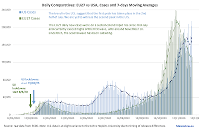
  • The U.S. retains higher death rate per 1 million population (844.6), than the EU27 (624.4). 
  • Current U.S. death rate per capita is 35% above the EU27, though this gap is still closing (it was 42% a week ago).
  • Gross counts of deaths in the U.S. >> the EU27 over 12/07 - 1/12.  This was reversed on 2/12, with total EU27 deaths currently at 278,914 vs the U.S. 276,316. 
  • Adjusting deaths to account for a 1 week lag in the onset of pandemic in the U.S., relative to the EU27, current U.S. deaths are 21,435 above those in the EU27
  • Adjusted for population and pandemic timing differences, the U.S. deaths are 77,048 above those in the EU27.
  • While the EU27 led the U.S. in new deaths and case counts through 20/11, since then, the U.S. has retaken the lead in new cases counts. 
  • Daily deaths counts in the U.S. are now expected to start exceeding those in the EU27 once again.

Starting with 20/11/2020, the U.S. once again overtaken the EU27 in the number of daily reported cases, based on 7-days moving average:


The data above is yet to reflect massive potential contagion event of Thanksgiving travel in the U.S. and the related movements of students from and back to the colleges and universities that allowed in-person teaching in the Fall 2020 semester.

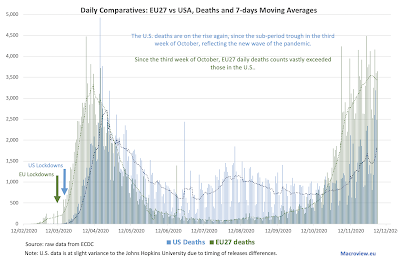
Shorter lags between contagion and diagnosis of COVID19 cases imply longer lags between new cases arrivals and hospitalisations, which in turn further elongates the lags between new cases detection and associated deaths counts. This is clearly evident from comparing the following figure dynamics with prior figure dynamics:

Put differently, current better performance by the U.S. compared to the EU27 in the second wave of the pandemic in terms of daily deaths counts is unlikely to remain for much longer. EU27 daily deaths trend appears to have peaked about a week ago, while the U.S. deaths trend remains upward-running. 

Little comfort for the wicked... right? 


As the chart above shows, even with more favourable deaths dynamics during the current wave of the pandemic, the U.S. deaths per capita remain horrifically above those in the EU27. Worse, over the last four days, we are seeing some tentative signs that the EU27 daily deaths counts might be moderating. Meanwhile, the opposite is taking place in the U.S.

4/12/20: COVID19 Update: Countries with > 100,000 cases

As of today, 67 countries around thee world have registered > 100,000 cases of COVID19. Here are the summary tables of core statistics covering these countries:


Summary stats:


Since the start of the second wave of the pandemic in Europe, EU27 are now once again having higher share of contributions to overall death counts (18.5% of world's total) than the corresponding share for thee U.S. (18.3%). Actual gap is 0.172 percentage points. However, in more recent days, EU27 new case numbers have been falling, while those in the U.S. continue to rise. This suggests that in weeks to come we are likely to see another reversal in deaths shares.

Just two weeks ago, combined share of global deaths accounted for by G7 countries plus Spain stood at 34.5%. Today, it is at 35.0%. For the U.S. the number shifted from 18.6% to 18.3% currently, while for the EU27 it rose from 16.6% to 18.5%. This clearly highlights the shift in the pandemic impact toward Europe in the last two weeks.

U.S. mortality rate from COVID19 has moderated over the last two weeks, falling from 21.9 deaths per 1,000 cases to 19.54. For the EU27, mortality actually rose from 23.0 to 23.3.

Overall, the worst performing country across three metrics of cases per capita, deaths per capita and deaths per 1,000 cases is Belgium, followed by Peru and Spain. Italy ranks the fourth, Argentina the fifth and the UK ranks the 6th worst performer,

The U.S. ranks 7th worst and the EU27 ranks 21st worst. 

24 countries have more than 500,000 cases and 14 have more than 1,000,000 cases. The U.S. is the only country with more than 10,000,000 cases at 14,139,703. The second largest number of cases is in India at 9,571,559. Brazil is the third with 6,487,084 cases. Only seven countries recorded more than 50,000 deaths so far, of which four recorded more than 100,000 deaths. The U.S. has the largest number of total COVID19-linked deaths in the world (276,316), followed by Brazil (175,270) and India (139,188).

4/12/20: COVID19 Update: Worldwide Cases and Deaths

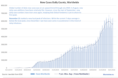
 Updating data for COVID19 pandemic worldwide:


Global number of daily new cases was on an upward trend through July 2020. In August, new daily case additions have been relatively flat. However, since the start of September, new daily case numbers have risen once again, implying that Global Pandemic is yet to attain its first overall peak.

New daily cases have appeared to peak for the current wave of the pandemic around November 21. However, since the start of December, 7 days moving average has resumed its upward momentum. This implies that we must exercise extreme caution in interpreting end of November timeline for the peaking of the second wave.

The chart above clearly shows the difficulty in interpreting global peak of the pandemic. Overall, notionally, we have experienced what appears to be three waves: 
  1. Wave 1 peaked around April 9th and the first trough took place around the end of April.
  2. Wave 2 started from the first days of May and peaked between August 1 and August 14.
  3. Wave 3 started from the second trough of August 27-29th and has (to-date) peaked around November 21.
However, statistically, neither Wave 1 nor Wave 2 attained a true peak, as post-local peak troughs were to shallow to genuinely mark a statistically significant deviation from each prior local peak.

In other words, there is little in the data to allow us to call the aforementioned Waves 1 & 2 as genuinely distinctive waves of the pandemic.

The above aside, back to data: looking at the daily deaths rates


Unlike new cases, daily deaths show more distinct waves patterns. Specifically, 
  1. Wave 1: peaking around April 22 generated a post-peak trough around June 3 that is statistically significantly below the peak values. This defines a statistically valid wave.
  2. Wave 2: starting from around June 7 and peaking around August 13. This wave ended in a trough of September 22 which is not statistically significant at 95% confidence level. This means it is harder to call this a genuine wave.
  3. Wave 3: starting from around October 23 and currently still accelerating. There is zero doubt that this is a well-defined wave.
Looking back at the more current data, deaths counts are rising steeply, with some slight moderation in the last few days. This moderation in the growth rates is highlighted in the chart below:


It is important to contextualise the above chart before drawing any conclusions. Growth rates in both deaths and new case counts have moderated. But this moderation is coming off extremely high levels in both time series. Put differently, suppose we start at a value of 100 and grow by 20% in one period. This means one period rise is 20% * 100 = 20 units. Suppose we start instead at 300 and grow by 10% in a period. This implies increase in units of 10% * 300 = 30 units. 

With this in mind, even moderated rates of growth wee have witnessed since the start of December are worrying. Here are two tables summarising monthly statistics for bot cases and deaths and growth rates statistics in both new cases and deaths. 


In summary, the pandemic continues to rage and it appears that much welcomed moderation in the new cases dynamics witnessed in the last week of November is unlikely to hold. Worse, within a week, we will be going into pre-holidays mode around the world and in the U.S. we will be also experiencing lagged cases uplifts due to Thanksgiving travel. 

Stay safe everyone: December will be a hellish month.


Thursday, December 3, 2020

3/12/20: Ireland PMIs: November


Ireland PMIs are out for November and they show the impact of the re-amplification of COVID19 impacts on the economy.

Services PMI fell from 48.3 in October to 45.4 in November, the lowest reading in 5 months and the third consecutive monthly reading sub-50. The pandemic period average is now at 39.3.

Meanwhile, Manufacturing PMI rose from 50.3 in October to 52.2 in November, marking the second consecutive month of readings above 50.0 mark. Pandemic period average is now at 48.2. 

Construction sector PMI (through mid-November) is at 48.6 - marking third consecutive month of sub-50 readings.

As the chart below illustrates, Manufacturing is the only sector that is providing growth momentum in the economy and much of that is down to multinationals. In services sector, activity of multinationals (which are doing well) is more than offset by continued declines in activities of domestic enterprises. 


Composite PMI posted a third consecutive month of sub-50 readings at 47.7 down from 49.0 in October. Markit's Composite PMI is calculated based on manufacturing and services indices. To rebalance the overall activity measure to include construction PMIs, I calculate my own 3-sectors index which is based on each sector contribution to Ireland's gross value added. With economic activity shifting toward manufacturing during the Covid19 pandemic, this index is becoming more weighted to reflect manufacturing sector PMI, hence the 3-sectors index rose in November to 50.2 from 49.7 in October.


Overall, the PMIs and my 3-sectors index are all pointing to entrenchment of the Covid19 pandemic headwinds in the Irish economic activity in November.