Sunday, May 4, 2014

4/5/2014: Some links & quotes from the week past


Few links to my recent comments in the media:


Saturday, May 3, 2014

3/5/2014: Crisis Impact Comparatives: GDP changes 2007-2013

A very interesting map plotting changes in the GDP across various European countries since 2007:


My own calculations using IMF database and showing more up-to-date data and broader set of GDP metrics covering all advanced economies ex-Luxembourg, San-Marino, and Latvia (you can click on the image to enlarge):


One sample of just European economies:


And two sets of summary tables pooling together Euro area 'peripherals' plus Iceland:


We can't really say we are much better off than Iceland, and we are certainly to-date worse off than Portugal, although we are better off than Greece.

Friday, May 2, 2014

2/5/2014: Ethnic Russians in Ukraine are Centuries-Old, Not Decades-Deep...

As someone just remarked on twitter, the proverbial sh*t just got real in Ukraine. And mightily it did - Ukrainian authorities report 31 dead in clashes in largely Russian-speaking Odessa. Other sources report 'dozens killed' - e.g. http://www.bbc.com/news/world-europe-27259620.

Here are two stills from the live broadcast by a Ukrainian channel of events in Odessa, showing the civilian firetruck being used by the pro-Kiev forces to attempt to break through opposition barricades. The broadcast showed personnel with what appeared to be field helmets on hiding under the cover of the truck.


Odessa is a serious flash point for three major reasons:

  1. It is largely Russian-speaking and highly ethnically diverse. The city has a very old Jewish diaspora (greatly reduced by the nazis during the WWII) and of its large (1 million) population, roughly 60% are ethnic Ukrainians, followed by 29% of Russians. It also has Armenian, Albanian, Azeri, Crimean Tatar, Bulgarian, Romanian etc diasporas. Even a Greek diaspora. The city is very much reflective of the current ethnic tensions - although majority of population is not ethnically Russian, main spoken language remains Russian, despite the language not being recognised as official. Historically, like most of Eastern Ukraine, Odessa was Russian - it was Russian in the 19th century when the city was the fourth largest in the Russian empire after Moscow, St Petersburg and Warsaw. Crucially to its history, Odessa was Russian ethnically all the way until mid 20th century. Notice that this is a direct contradiction to the extreme nationalist views being propagated in Ukraine that Russian population of Eastern and Southern Ukraine represented 'new colonisers' who arrived there after Stalin-induced Soviet Union-wide famine of the 1920s.
  2. Odessa is culturally and strategically aligned with Crimea (via sea linkages) and its Oblast borders Transnistria region of Moldova.
The push point in the conflict is, in my view, moving closer and closer to an open confrontation between Russia and Ukraine. 

And here is a voting map from the last elections, showing just how closely the South-Western Ukrainian area - including Odessa region - is aligned with the Eastern Ukraine:


Here is a handy map showing movements of Russian and Ukrainian troops (http://www.washingtonpost.com/blogs/worldviews/wp/2014/05/02/map-how-ukraine-and-russia-are-moving-toward-war/):


How did the Russians get into Ukraine, you might ask? Well, here is a handy guide (see note below):
  • Eastern Ukraine was added to Russian Empire in 1654-1667 with western border defined by River Dniper. These parts were first incorporated into the Ukrainian territories in 1919-1920 and then in 1922 Treaty that created the USSR. Here are the lands lost in the Polish War by Polish-Lithuanian Commonwealth and gained by Ukraine via Russia: http://en.wikipedia.org/wiki/File:Polish-Lithuanian_Commonwealth_1635.svg
  • Today's Western Ukraine was formed during one of the subsequent three partitions of Poland: http://en.wikipedia.org/wiki/File:Rzeczpospolita_Rozbi which also added significantly to the Ukrainian territories claimed today.
  • In 1783 Russia added Crimea and other parts of Tatar Crimean khanite, including Odessa.
  • Irony has it, as http://www.britannica.com/EBchecked/topic/612921/Ukraine/30071/Ukraine-under-direct-imperial-Russian-rule points, it was Russian imperial control that allowed Ukrainians to settle into Crimea and Southern Ukrainian territories. 
  • After WW2, Soviet Union largely expanded Ukrainian territory adding over 65,000 square miles and 11 million population (an increase of over 1/3 on pre-war period. The main expansion took place along the Curzon Line at the expense of Poland, Romania, Czechoslovakia.
  • Lastly, in February 1954, Russian Republic (RSFSR) 'gifted' Crimea to the Ukraine - from legally Russian territory (sub-part of the USSR). Only 22% of Crimean population at the time was Ukrainian (the rest were Tatars, other ethnic minorities and those, who Kiev supporters today frequently call post-genocide occupants of Ukraine coming from Russia, but in reality are Russian ethnicity residents of Crimea and Eastern Ukraine since 17th century).
Here is a summary map of what shaped the territory of the Ukraine prior to 2014:


These changes in the territories clearly indicate that ethnically Russian population is not a phenomena of colonisation post 1922 famine, but an outcome of centuries old movements of people with changes and reshaping of national, political, economic and cultural boundaries.

In my view, nationalist Kiev position resisting the initiation of the democratic process on federalisation of Ukraine is not sustainable. Ukraine now has to move fast into securing a roadmap to
  1. Orderly elections in May (the timing is unfortunate, but the commitment is irreversible); 
  2. Followed by pre-committed regional referenda on membership in the Ukrainian Federation (respecting any region that votes to exit); and
  3. Pre-committed process of democratic federalisation post exits of the secessionist regions.
I would have preferred to see Ukraine remain fully unified, territorially unaltered state with greater autonomy extended to the regions that wish to have it. I think that such Ukraine was possible under February 21st agreement, violated by the Maidan forces and by the current leadership in Kiev.

Alas, with every day passing, this hope of a unified Ukraine is becoming less and less feasible in the longer run and Kiev's insistence on avoiding orderly, democratic federalisation now threatens to lead to a civil war in the short run.

I hope I am wrong in this assessment...


Note: I do not care to make any of the above points to justify territorial break up of Ukraine. I never supported such a break-up in the first place. I am, however, interested in pointing out that nationalist rhetoric treating ethnic Russians (or any other ethnic group living in Ukraine) as being 'foreign' presence in the country is absurd, vile and does not contribute to the cause of unifying Ukraine and helping it preserve its own territorial integrity.

And, I am no less concerned about emerging Russian nationalism - not only in Ukraine, but also in Russia proper. This, however, is a matter for separate posts, maybe in some near future.

Sunday, April 27, 2014

27/4/2014: Ukraine-Slovakia Agreement on Reversed Shipments of Gas


Per today's reports (see: http://www.rosbalt.ru/main/2014/04/27/1262169.html), Ukraine reached an agreement with Slovakia for reverse-delivery of natural gas via Vojany-Uzhgorod pipeline. Shipments can start in October with maximum delivery of 3 billion cubic meters per annum, and from March 2015 the capacity can be raised to 10 billion cubic meters per annum.

As the article notes, from April 2, Russian President Vladimir Putin signed the decree annulling Kharkiv agreements that provided a discount on gas price for delivery to Ukraine of USD100 per 1,000 cubic meters, so starting from Q2 2014 Ukraine delivery is priced at USD385.5 per 1,000 cubic meters from USD268.5

Following this, on April 3, head of Gasprom Aleksey Miller said that taking into the account arrears on past gas deliveries, Ukraine gas deliveries will be priced at USD485 per 1,000 cubic meters.

Here is my earlier note on Ukrainian arrears relating to Russian gas deliveries and Ukrainian Government debt held by Russia: http://trueeconomics.blogspot.ie/2014/04/1042014-game-of-chicken-ukraine-debts.html.

Saturday, April 26, 2014

25/4/2014: A stretch of numbers here... a bond sale there... Greek Deficit in 2013


This week we had the data release by Eurostat showing the fiscal position of the euro area sovereigns for 2013, followed by the statement by the Troika (EU Commission, the ECB and the IMF) on Greece's fiscal position.

Based on data-driven Eurostat conclusions (see details here: http://trueeconomics.blogspot.ie/2014/04/2342014-some-scary-reading-from-eurostat.html) Greek fiscal deficit was 12.7% of GDP in 2013. Based on the Troika conclusions, Greece has managed to generate a budget surplus of 0.8% of GDP in 2013. The two numbers are so widely apart that the case of 'thou shalt not spin too much' comes to mind.

In reality, to arrive at 0.8% surplus, the Troika had to do some pretty extreme dancing around the real figures: they took out non-recurring spending out of the Greek deficits (all banks measures and all interest paid on gargantuan 175.1% of GDP Government debt). Just how on earth can debt interest payments be non-recurring is anyone's guess. But even removing that (to arrive at normal definition of primary deficits), the official primary deficit for Greece at the end of 2013 stands at 8.7% of GDP. The swing of 9.5% of GDP bringing this to a surplus of 0.8% is 'banks measures'.

The problem is that with 12.7% of GDOP deficit and 8.7% primary deficit in 2013 and with debt of 175.1% of GDP, Greece is plain simply and undeniably an insolvent state. This is precisely why exactly at the time of the above data publication and at the time when the Troika was extolling the virtues of the fiscal surplus in Greece, the very same European authorities praising Greek Government were announcing that they have engaged in a new round of debt relief negotiations with Greece (http://www.ft.com/intl/cms/s/0/9ec817d8-cadf-11e3-9c6a-00144feabdc0.html#axzz301XTTXyT).

Meanwhile, bust, bankrupted and in new default talks, Greek Government is hell-bent on buying votes into the upcoming European elections. Per FT account linked above:

"About 70 per cent of the [bogus Greek] primary surplus has already been allocated for current expenses rather than for writing down existing debt, according to the finance ministry. The government has set aside €524m as a one-off payment to low-income families and pensioners ahead of next month’s European elections. Another €320m will cover a projected deficit this year at IKA, the main social security organisation, following a decision agreed with international lenders to cut employers’ contributions."

This is truly epic: European authorities praising national Government for bogus surpluses that are explicitly being used to fund giveaways to vulnerable voters groups at the time of elections. This is 'reformed Europe'?

This is precisely the circus that is driving up valuations of peripheral bonds (http://mobile.bloomberg.com/news/2014-04-23/samaras-met-dimon-for-greek-bonds-on-way-to-a-400-return.html?alcmpid=markets) and that has an exactly negative correlation with the underlying strength / structural health of some of the peripheral economies (see my comment on this here: http://trueeconomics.blogspot.ie/2014/04/2542014-ecb-denmark-negative-rates.html).

26/4/2014: After-tax Disposable Incomes Around the World


Here is a very revealing set of data on income based across percentiles around the advanced economies:
http://www.nytimes.com/2014/04/23/upshot/the-american-middle-class-is-no-longer-the-worlds-richest.html?rref=upshot&_r=1

I encourage you to play with the chart - for example take a look at Germany vs US comparatives. Set aside Norway - a petro-dollars-fuelled minor economy by all possible metrics (I challenge you to find any serious Norwegian company in the modern economic sectors space - there will be barely any in sight). And keep in mind - the article fails to mention anything about the exchange rates effects on the comparable incomes across the world.

Look also at Ireland and Finland...

26/4/2014: How real was the property markets recovery in 2013?


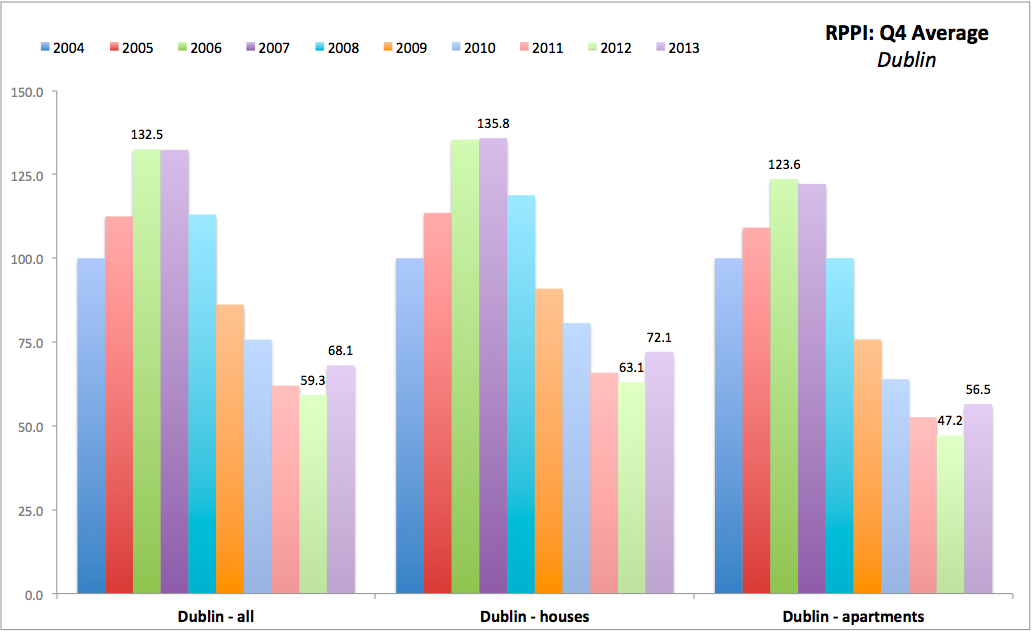
I am updating the annual series for Residential Property Prices in Ireland and here are some of the summary charts showing Q4 averages (end-of-year smoothed prices, that remove some of the volatility):


Key takeaways:

  • Reports of major recovery in the property markets over 2013 are a bit overdone. Here are the reasons why.
  • The recovery in Dublin in 2013 took the prices above the levels of 2011 and closer to 2010. Dublin all properties index finished 2013 at Q4 average of 68.1 which is well above 59.3 trough recorded in Q4 2012 and ahead of 62.0 recorded in Q4 2011. We are still less than 1/2 way to 2010, but overall jumping tow years back is a rather strong recovery.
  • Dublin recovery was also broadly supported in both houses segment and apartments segment.
  • However, outside Dublin - aka in the rest of the country - there is no recovery. National ex-Dublin all properties prices have fallen again in 2013 as they did in all other years starting with 2008 on. 
  • As the result of the prices dynamics in the rest of the country, 2013 'recovery' nationwide was able to lift prices off their crisis period troughs, but not enough to reach above the 2011-2012 declines. Thus overall index of nationwide properties is at 69.7 in Q4 2013 against 70.1 in Q4 2011. 
Are prices rising? They seem to be. Are prices rising above inflation? Yes. And this is one sign of a robust recovery. But are prices rising to make meaningful recovery toward pre-crisis levels (something that is required in order to rebuild household finances)? No. See more on this here: http://trueeconomics.blogspot.ie/2014/04/2642014-its-long-long-long-road-to.html

26/4/2014: It's a long... long... long... road to house prices recovery...


It is a virtually impossible task forecasting long-term price movements in property markets for small economies, like Ireland. The reason is that there are simply too many moving parts all with huge volatility built into the numbers. Take for example normally stable time series such as population. In the case of Ireland, wild swings in terms of net migration over the recent years saw 2006-2008 annual average net immigration of 80,300 per annum switching into a net annual emigration of 31,633 per annum in 2010-2012. While total change in 2007-2013 population in Ireland was 108,000, net migration swing was 111,930. You get the point: what we think the potential demand might be is not an exact science and in the case of Ireland it is not really much of any science whatsoever.

So setting aside actual economic models, what can we say about future property prices trends?

We can do a couple of simple dynamic exercises. Suppose that we are getting back to pre-crisis ‘normal’. This can mean pre-2001 rates of growth in prices or it can mean Celtic Garfield rates of growth. Many would say ‘The Bubble days are over’. So they may be. But suppose they are not. Suppose the rates of growth that prevailed over 2004-2007 are to return. The logical question is: if the boom were to come back, how long will it take property prices to recover? This is obviously a wildly optimistic scenario. But let’s entertain it, shall we?

Below I provide a table of estimated years by which current (end of 2013) prices indices for Irish residential property are likely to recover their real (inflation-adjusted) peak values consistent with pre-crisis years. In other words, the table shows years by which we can expect the crisis effects to be finally erased.

Take 3 scenarios:

Scenario 1: assume that from now on, average annual growth rates for property prices run at their 2004-2007 averages and that inflation averages 1.5 percent per annum (CPI). Adjust the pre-crisis peak for inflation that accumulated between 2007 and present.

Scenario 2: assumes the same as Scenario 1, but adjusts inflation expectation forward to 2 percent instead of 1.5 percent.

Scenario 3: assumes the same as Scenario 1, except we also take into assume average rates the average for 2004-2007 and 2012-2013 to reflect the popular argument that 2012-2013 years growth rates reflect ‘recovery’ in the markets, aka a departure from the crisis.

The last line in the table shows the average duration of the period of recovery – averaged across 3 scenarios. This means that the average is ‘geared’ or ‘leans’ more heavily toward Scenarios 1 and 2 which are by far much more optimistic than Scenario 3.

Do note that all three scenarios are wildly out of line with what we should expect in the long run from the property prices – appreciation at inflation + 0.2-0.5 percentage points margin.


Click on the table to enlarge

Key takeaway:

You might think we are in a recovery, but be warned – even under very unrealistically optimistic price growth projections – the effects of this crisis are likely to prevail well beyond 2025 in Dublin and beyond 2030 nationwide. Now, enjoy the property supplements and financial ‘analysts’ op-eds telling you that everything is going on swimmingly in the markets…

Friday, April 25, 2014

25/4/2014: ECB, Denmark & Negative Rates, 'Peripherals' & Russia: today's links


Rumours mills been busy of late with all the talk about ECB doing 'whatever it takes' to get inflation going again. See this for example: http://www.spiegel.de/international/europe/ecb-prepares-measures-to-combat-possible-deflation-a-965636.html

Here is the best take on Denmark's brief brush with ECB's (allegedly) favourite weapon: the negative deposit rates:
http://www.bloomberg.com/news/2014-04-24/danish-central-bank-exits-negative-rates-first-time-since-2012.html


But while we are on topic of things monetary and fiscal, here is Euromoney take on what's been happening in the markets for 'peripheral' sovereign debt (note: my comment at the bottom): http://euromoney.msgfocus.com/c/123DSxhABTIFoVxuegyp64hKZL and alternative link: http://www.euromoney.com/Article/3334400/Category/14091/ChannelPage/8959/Ireland-and-Spain-lead-the-way-on-a-long-road-back-for-the-eurozone-periphery.html

To give you more context, here is the full comment I made:
The numbers cited are even better summarised in my earlier post on the subject here: http://trueeconomics.blogspot.ie/2014/04/2342014-some-scary-reading-from-eurostat.html

Meanwhile, here's what has been happening in the sovereign debt markets today - CDS spreads:


And finally, Russian credit downgrade: http://in.reuters.com/article/2014/04/25/russia-economy-ratings-idINL6N0NH19I20140425

25/4/2014: Wholesale Prices in Ireland: March 2014


Deflation at consumer prices level is a two-edged sword. Whilst it normally rises savings and delays consumption, it also helps households stuck in debt to deleverage faster and it beefs up surplus savings available for investment.

But deflation at producer prices level is a case of gained competitiveness at the expense of future growth as it reduces value added in production and lowers future investment. It also leads to reduced hiring and can lead to cuts to the workforce.

Behold Ireland's pain...

According to CSO (http://www.cso.ie/en/releasesandpublications/er/wpi/wholesalepriceindexmarch2014/#.U1kL4-ZdWzg): we are now in full-blow deflationary spiral in terms of producer prices.

Drilling into specifics:

  1. Export prices down 3.6% y/y and domestic sales prices down 1.1% y/y. Yes, exports price changes can be down to FX volatility, but no - this means nothing much as lower prices still mean lower revenues.
  2. On upside: dairy products prices were up 12.6% y/y, wood and wood products prices up 10% y/y. Good news for least value-additive sectors of Irish economy. Other manufacturing prices were up 1.3%, beverages up 2.2%. And durable consumer goods industries prices up 1.3%.
  3. Beyond that, almost everything else is either flat or down. You can see the details in the last column in Table 2 linked above.
  4. One to watch: prices of energy products are down 17.2% y/y and petroleum fuels down 3.2%. Let's see if our heroes at state-controlled energy behemoths are going to pass any savings to consumers (hint: I doubt it).
So overall, not good news - sustained pressure on producer prices. Negative m/m inflation is now recorded in every months starting with October 2013 and on the annual basis, prices-signalled activities in the economy are running at the rates of growth consistent with late 2012-early 2013, not with a strong rebound. Of course, this is just a signal...

Thursday, April 24, 2014

24/4/2014: Where's that Fabled Property Boom in Ireland?..


Throughout 2013 and indeed starting from as far back as mid-2011, there has been a never-ending stream of 'good news' stories from the property markets. Many are real. Many are unverifiable. Some a complete nonsense.

Here is one forward-looking indicator for the health of the property market: planning permissions granted. And courtesy of CSO we can now update Q4 2013 data and thus compute full year 2013 results.

Here they are:

  1. Planning permissions granted for All Types of Construction fell 3.5% y/y in 2013 to an absolute historical minimum of 13,901 (data from 1992). Between 2011 and 2013 total number of planning permissions is down 13.1%. Compared to peak, these are now down 77.7%. There is no turnaround in sight judging by these numbers. In fact, 2013 was 6th consecutive year of y/y declines.
  2. Planning permissions granted for dwelling fell even more steeply: down 9% y/y in 2013 and down 23.6% since 2011. These too are now at historical low and in decline for seven years in a row. There is no turnaround here either.
  3. Other new construction (ex-dwellings) planning permissions posted a rise of 0.7% y/y in 2013 and are up 14.9% on 2011 levels. However, at 3,431 total, these are 4th lowest in history and below the levels recorded in any year between 1992 and 2009. Relative to peak these are down 82%, so steep increase since 2011 was (a) exhausted in 2013 (given weak 0.7% rise) and (b) appears to be based on sheer magnitude of the permissions collapse at the height of the crisis. Still, we might call this some evidence of something that might signal a turnaround.
  4. Planning permissions granted for extensions fell 3.6% y/y in 2013 and are down 12% on 2011 levels. These series hit absolute historical low in 2013 and mark 6 consecutive years of declines. 
  5. Planning permissions granted for alteration, conversion and renovation purposes rose 0.8% y/y in 2013, with series down 6.6% on 2011 levels. 2013 was the second lowest year on record. Again, this evidence is not consistent with a turnaround.
Two charts to illustrate:


In terms of floor area approved:
  1. 2013 saw increases of 4.4% y/y for all types of planning permissions granted. However, the increase was from the levels that were so low that even with 4.4% rise in 2013, 2013 levels are still 21.6% below those in 2011. 
  2. 2013 was the second lowest year on record for planning permissions (by floor area) granted for All Types of Properties, for dwellings, for other properties ex-dwellings.
  3. 2013 was the worst year on record for planning permissions granted on the basis of floor area for extensions.

Key takeaway: Planning permissions granted data shows no signs of a turnaround in building & construction sector in Ireland in 2013 and no signal of such turnaround in early 2014 either.

24/4/2014: Value Added in Irish Economy, 2010 data


CSO published analysis of value added in main sectors of the Irish economy for 2010 (yes, it takes them THAT long)... And the winners (in terms of being least important to adding value) are:

  1. Construction 
  2. Agriculture
  3. Manufacturing of food, beverages & tobacco
Per CSO summary: "The main constituents of output at basic prices in 2010 were service industries at €219.5 billion (65% of the total), production industries at €98.7 billion (29.2%), construction at €13.2 billion (3.9%) and agriculture, forestry & fishing at €6.4 billion (1.9%)."

It is really that simple: want more value-added in the economy? Pursue development of traded opportunities in Education, Health, Arts, make other domestic sectors more human capital-intensive (aka more productive and innovative), put them out into exports markets... Do what you might, just don't appoint more ministers for Agriculture or Building Construction. Instead focus on making our agriculture more innovation and productivity-focused, allow and encourage consolidation of production, push forward with reforms removing CAP subsidies from farming, in other words, pursue greater focus on growing value added component of our agricultural sector.

Here is the breakdown:


And in more details:


Footnotes to the above chart:
(1) Includes Manufacture of coke& refined petroleum products;
(2) Includes technical, administrative and support service activities
(3) Includes food and beverage service activities
(4) Includes Manufacture of furniture; 
(5) Includes repair of motor vehicles and motorcycles
(6) Includes compulsory social security
(7) Includes recreation activities and other services
(8) Includes Social work activities