Showing posts with label #COVIDUSA. Show all posts

Friday, April 2, 2021

2/4/21: America's Scariest Chart: U.S. Employment Situation

Now, the last of the series of posts on U.S. labor markets, concluding with America's Scariest Chart, plotting the index of employment (jobs) in the U.S. based on each recession-recovery cycle:


Despite some positive headline numbers on some labor market metrics, jobs creation in the U.S. is not  progressing well-enough to claim any end in sight for the Covid19-induced recession. Current reading for jobs index, relative to pre-recession highs is woeful. So woeful, today's state of U.S. markets ranks as the second worst jobs recession in modern history, so far, worse than the Great Recession. 

Good news is that in March, pace of recovery accelerated from a major slowdown experienced in the first two months of 2021. The bad news is, unless this pace is sustained, we are risking a scenario where unprecedented policy (fiscal and monetary) supports unleashed since the start of 2Q 2020 will be associated with a jobs recovery that is second-third worst in the modern history of U.S. recessions. Time will tell.


Note: 


2/4/21: U.S. Duration of Unemployment

One of the America's Scariest Charts - a long-term running issue I have been highlighting for a number of years now - is roaring back to prominence as Covid19 pandemic crisis continues to impact U.S. labor markets across virtually all possible metrics of health.


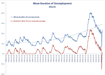
Here it is: the average duration of unemployment spells:


Unemployment spells become short at the start of the recession as new vintage unemployed join the ranks of long term unemployed. As the recovery sets in, unemployment duration starts to take into the account a different and changing mix of those on unemployment: the share of total unemployed who are short-term unemployed shrinks, the share of the longer term unemployed rises. Secularly, however, virtually every past recession since 1970s on has resulted in a longterm increase in average duration of unemployment during the recovery phase of the business cycle. In other words, the longer term unemployed became even longer-term unemployed. And now, the Covid19 pandemic joins the line of past recessions with continuing on this trend. 

Chart next compares each recession and subsequent recovery period since the end of the WW2 through current:


Based on the average duration of unemployment, we are now (in the Covid19 pandemic recession) are tracking the worst recession on record: the Great Recession. Weeks ahead will tell us, if indeed this will be a new record-breaking recession, beating the length of average unemployment spell established in the Great Recession. But for now, with all the recovery going around, the unemployed are becoming longer and longer-term unemployed.

Not exactly a picture of robust health being restored in the U.S. labor markets.

2/4/21: U.S. New Unemployment Claims

Continuing with the coverage of core statistics for the U.S. labor markets performance. This post covers new unemployment claims through March 20, 2021, with the last two weeks of data being preliminary estimates.

In the week through March 20, 2021, new unemployment claims fell to 656,789, or four weeks running total of 2,892,799 dipping below the peak of the Great Recession levels of 4 weeks total of 3,313,000. This is the good news.


The bad news is that latest reading would rank 58th worst in the history of the weekly series, if we are to exclude the Covid19 period. Another part of the bad news is that last week's weekly rate of decline of 100,412, the fastest rate of decline in four weeks, is actually slower than average weekly rate of decline for the pandemic period. 


4 weeks running average rate of improvement in new unemployment claims is just 14,943. Which means that at this rate of labor market improvements, it will take 30.6 weeks to regain pre-Covid lows of new claims.

Things are improving. But they are improving at less than impressive rates.


Note:


2/4/21: U.S. Non-Farm Payrolls

 In the first part of the series of updates on the U.S. labor markets, I covered continued unemployment claims (https://trueeconomics.blogspot.com/2021/04/2421-us-continued-unemployment-claims.html), followed by the second post covering labor force participation and employment-to-population ratio (https://trueeconomics.blogspot.com/2021/04/2421-us-labor-force-participation-and.html).

Now, consider total non-farm payrolls - a measure of jobs present in the economy:


Total non-farm payrolls rose in march 2021 to 143,400,000, up on 142,077,000 in February. However, the increase still leaves the payrolls 9,777,000 short of the pre-Covid19 highs. The rate of jobs addition rose in March to 1,323,000 from February growth rate of 1,097,000. Combined jobs expansions of February and March, however, are not sufficient to cover the jobs losses of 2,622,000 sustained in January 2021. Average monthly jobs recovery during the pandemic period is 1,195,000, which means that it will take ca 8 months at the average rate of jobs creation for the economy to regain its pre-Covid19 highs in jobs numbers.


2/4/21: U.S. labor force participation and employment to population ratio


In the previous post, I covered U.S. continued unemployment claims: https://trueeconomics.blogspot.com/2021/04/2421-us-continued-unemployment-claims.html, noting that decreases in unemployment counts are, in part, driven by workers dropping off unemployment rolls due to exits from the workforce and/or expirations of unemployment benefits. Here is the data on U.S. labor force participation rates and employment to population ratio through March 2021:


Things are still ugly when it comes to these two measures of labor markets health in the U.S: 

  • Latest reading for U.S. labor force participation rate at 61.5 is just a notch up on February's 61.3, but is unchanged on November 2020. Pandemic period average labor force participation rate is woefully low at 61.7, which is still higher than March 2021 reading. March reading is equivalent to the average reading for the decade of the 1970s which was marked by stagflation and high unemployment.
  • Latest reading for U.S. employment to population ratio is at 57.7 - an improvement on February reading of 57.3, and better than the pandemic period average of 56.9, but still comparable to the levels seen only in the early 1980s. 
Both metrics show the brutal nature of the current labor markets, where demand for skills is rising, including in manufacturing, while services jobs (and lower-skilled B2C services jobs in particular) are still hard to find.

Thursday, February 4, 2021

4/2/21: U.S. Labor Markets: America's Scariest Charts, Part 6

 Having covered some core stats relating to the U.S. labor markets in previous 5 posts:

  1. Continued Unemployment Claims (https://trueeconomics.blogspot.com/2021/02/4221-us-labor-markets-americas-scariest.html);
  2. Labor force participation rate and Employment-to-Population ratio (https://trueeconomics.blogspot.com/2021/02/4221-us-labor-markets-americas-scariest_4.html); 
  3. Non-farms payrolls (https://trueeconomics.blogspot.com/2021/02/4221-us-labor-markets-americas-scariest_16.html); 
  4. New (initial) unemployment claims data through January 30, 2021 (https://trueeconomics.blogspot.com/2021/02/4221-us-labor-markets-americas-scariest_57.html); and
  5. Average duration of unemployment (https://trueeconomics.blogspot.com/2021/02/4221-us-labor-markets-americas-scariest_41.html),
in this last post, we will focus on the overall employment index for the current recessionary cycle:


Currently, into month 10 data of the recession (December 2020), and employment index is reading close to the conditions in the recession of 1945, but better than the recession of 1953. We are still trending worse than any recession in modern period (post-Gold Standard), and that is quite an achievement (in negative terms). Dynamically, improvements in employment conditions have been flattening out from month 5 of the recession through month 8 and index improvements have slowed down to almost nil in months 9 and 10. Unless there is a significant reversal in this trend, by the end of 2021 we are likely to be around the same labor markets conditions as at the same time during the Great Recession. 

4/2/21: U.S. Labor Markets: America's Scariest Charts, Part 5

 The first four posts on the state of the U.S. labor markets have covered:

  1. Continued Unemployment Claims (https://trueeconomics.blogspot.com/2021/02/4221-us-labor-markets-americas-scariest.html);
  2. Labor force participation rate and Employment-to-Population ratio (https://trueeconomics.blogspot.com/2021/02/4221-us-labor-markets-americas-scariest_4.html); 
  3. Non-farms payrolls (https://trueeconomics.blogspot.com/2021/02/4221-us-labor-markets-americas-scariest_16.html); and
  4. New (initial) unemployment claims data through January 30, 2021 (https://trueeconomics.blogspot.com/2021/02/4221-us-labor-markets-americas-scariest_57.html)
In this post, let's take a look at the latest data on average duration of unemployment through December 2020:


As the chart above clearly shows, current average duration of unemployment spell is already higher than the peak of any prior recession other than the Great Recession. However, the duration remains relatively benign when we control for the business cycle (red line and the chart next).


Dynamically, it is hard to imagine average duration of unemployment to be staying around its current levels. Something to watch in months to come as an indicator of the direction of structural (as opposed to cyclical) unemployment. 


4/2/21: U.S. Labor Markets: America's Scariest Charts, Part 4

 The first three posts on the state of the U.S. labor markets have covered:

  1. Continued Unemployment Claims (https://trueeconomics.blogspot.com/2021/02/4221-us-labor-markets-americas-scariest.html);
  2. Labor force participation rate and Employment-to-Population ratio (https://trueeconomics.blogspot.com/2021/02/4221-us-labor-markets-americas-scariest_4.html); and
  3. Non-farms payrolls (https://trueeconomics.blogspot.com/2021/02/4221-us-labor-markets-americas-scariest_16.html)
In this post, let's take a look at new unemployment claims data through the week of January 30, 2021:


The data confirms the worrying trends cited in reference to continued unemployment claims. In the last week of January 2021, based on preliminary estimates published today, initial unemployment claims stood at 816,247 - a decline of just 23,525 on prior week reading. The 4-weeks cumulative initial unemployment claims are at 3,744,581, which only 103.433 down on prior 4 weeks period. Net, over the last 5 weeks, the reduction in initial unemployment claims stands at a miserly 19,725. 

Despite little media coverage, the U.S. labor markets remain stricken by the pandemic effects on economic activity. If we strip out data for the pandemic period-to-date, the latest weekly reading for initial unemployment claim ranks as the 10th highest in the history of the series. 


4/2/21: U.S. Labor Markets: America's Scariest Charts, Part 3

 In two prior posts, I covered two of America's Scariest Charts:

  1. Continued Unemployment Claims (https://trueeconomics.blogspot.com/2021/02/4221-us-labor-markets-americas-scariest.html) and 
  2. Labor force participation rate and Employment-to-Population ratio (https://trueeconomics.blogspot.com/2021/02/4221-us-labor-markets-americas-scariest_4.html)
Here, let's take a look at non-farm payrolls that measure employment levels in the economy.


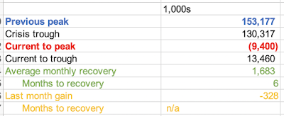
In December 202, employment growth stalled. In fact, non-farm payrolls fell 328,000 in the last month of 2020 to 143,777,000, or 9,400,000 below pre-pandemic peak. December was the first month of declines in employment since April 2020, but employment growth was relatively slow already in November when the U.S. economy added 603,000 jobs, the slowest pace of recovery after July for the entire period of recovery of May-November 2020.

This evidence further reinforces the argument that labor markets conditions in the U.S. remain abysmal, prompting American workers to slip out of the labor force. 

4/2/21: U.S. Labor Markets: America's Scariest Charts, Part 2

In the previous post, I covered the first set of data - Continued Unemployment Claims (https://trueeconomics.blogspot.com/2021/02/4221-us-labor-markets-americas-scariest.html) - that highlights the plight of American economy in the current crisis. Now, let's take a look at Labor Force Participation rate and Employment to Population ratio:


The chart and the table above highlight continued serious problems in the structure of the U.S. labor markets. While official continued unemployment claims are inching back toward some sort of a 'norm', much of so-called improvement in unemployment dynamics is actually accounted for by the dire state of labor force participation which is still trending below anything one might consider reasonable. Current labor force participation rate is 61.5 which is well below anything seen before the onset of the pandemic in March 2020. By a mile below. And in terms of historical perspectives, we have no modern recession (from 1980 onwards) that matches these lows of labor force participation. Structurally, this means that instead of gaining jobs, the unemployed simply roll off the cliff of unemployment assistance and drop out of the labor force, discouraged by the lack of meaningful decent jobs in the market. 

Employment to population ratio is a little better, but it is still stuck below pre-pandemic levels and is low compared to prior recessions' troughs. 

The conditions in the U.S. labor markets might be improving somewhat off the pandemic lows, but the situation overall remains dire. 


Saturday, December 5, 2020

4/12/20: COVID19 Update: U.S. vs EU27

EU27 vs U.S. comparatives for COVID19 pandemic to-date:

  • The U.S. retains higher death rate per 1 million population (844.6), than the EU27 (624.4). 
  • Current U.S. death rate per capita is 35% above the EU27, though this gap is still closing (it was 42% a week ago).
  • Gross counts of deaths in the U.S. >> the EU27 over 12/07 - 1/12.  This was reversed on 2/12, with total EU27 deaths currently at 278,914 vs the U.S. 276,316. 
  • Adjusting deaths to account for a 1 week lag in the onset of pandemic in the U.S., relative to the EU27, current U.S. deaths are 21,435 above those in the EU27
  • Adjusted for population and pandemic timing differences, the U.S. deaths are 77,048 above those in the EU27.
  • While the EU27 led the U.S. in new deaths and case counts through 20/11, since then, the U.S. has retaken the lead in new cases counts. 
  • Daily deaths counts in the U.S. are now expected to start exceeding those in the EU27 once again.

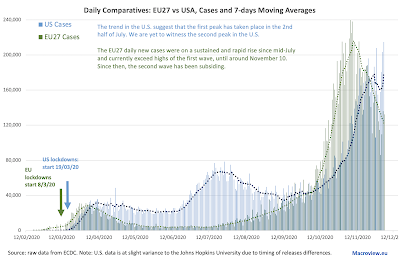
Starting with 20/11/2020, the U.S. once again overtaken the EU27 in the number of daily reported cases, based on 7-days moving average:


The data above is yet to reflect massive potential contagion event of Thanksgiving travel in the U.S. and the related movements of students from and back to the colleges and universities that allowed in-person teaching in the Fall 2020 semester.

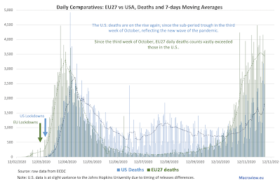
Shorter lags between contagion and diagnosis of COVID19 cases imply longer lags between new cases arrivals and hospitalisations, which in turn further elongates the lags between new cases detection and associated deaths counts. This is clearly evident from comparing the following figure dynamics with prior figure dynamics:

Put differently, current better performance by the U.S. compared to the EU27 in the second wave of the pandemic in terms of daily deaths counts is unlikely to remain for much longer. EU27 daily deaths trend appears to have peaked about a week ago, while the U.S. deaths trend remains upward-running. 

Little comfort for the wicked... right? 


As the chart above shows, even with more favourable deaths dynamics during the current wave of the pandemic, the U.S. deaths per capita remain horrifically above those in the EU27. Worse, over the last four days, we are seeing some tentative signs that the EU27 daily deaths counts might be moderating. Meanwhile, the opposite is taking place in the U.S.

4/12/20: COVID19 Update: Countries with > 100,000 cases

As of today, 67 countries around thee world have registered > 100,000 cases of COVID19. Here are the summary tables of core statistics covering these countries:


Summary stats:


Since the start of the second wave of the pandemic in Europe, EU27 are now once again having higher share of contributions to overall death counts (18.5% of world's total) than the corresponding share for thee U.S. (18.3%). Actual gap is 0.172 percentage points. However, in more recent days, EU27 new case numbers have been falling, while those in the U.S. continue to rise. This suggests that in weeks to come we are likely to see another reversal in deaths shares.

Just two weeks ago, combined share of global deaths accounted for by G7 countries plus Spain stood at 34.5%. Today, it is at 35.0%. For the U.S. the number shifted from 18.6% to 18.3% currently, while for the EU27 it rose from 16.6% to 18.5%. This clearly highlights the shift in the pandemic impact toward Europe in the last two weeks.

U.S. mortality rate from COVID19 has moderated over the last two weeks, falling from 21.9 deaths per 1,000 cases to 19.54. For the EU27, mortality actually rose from 23.0 to 23.3.

Overall, the worst performing country across three metrics of cases per capita, deaths per capita and deaths per 1,000 cases is Belgium, followed by Peru and Spain. Italy ranks the fourth, Argentina the fifth and the UK ranks the 6th worst performer,

The U.S. ranks 7th worst and the EU27 ranks 21st worst. 

24 countries have more than 500,000 cases and 14 have more than 1,000,000 cases. The U.S. is the only country with more than 10,000,000 cases at 14,139,703. The second largest number of cases is in India at 9,571,559. Brazil is the third with 6,487,084 cases. Only seven countries recorded more than 50,000 deaths so far, of which four recorded more than 100,000 deaths. The U.S. has the largest number of total COVID19-linked deaths in the world (276,316), followed by Brazil (175,270) and India (139,188).

4/12/20: COVID19 Update: Worldwide Cases and Deaths

 Updating data for COVID19 pandemic worldwide:


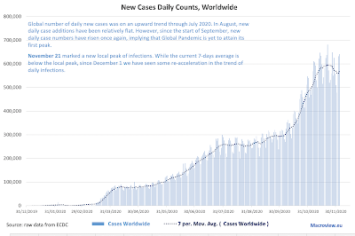
Global number of daily new cases was on an upward trend through July 2020. In August, new daily case additions have been relatively flat. However, since the start of September, new daily case numbers have risen once again, implying that Global Pandemic is yet to attain its first overall peak.

New daily cases have appeared to peak for the current wave of the pandemic around November 21. However, since the start of December, 7 days moving average has resumed its upward momentum. This implies that we must exercise extreme caution in interpreting end of November timeline for the peaking of the second wave.

The chart above clearly shows the difficulty in interpreting global peak of the pandemic. Overall, notionally, we have experienced what appears to be three waves: 
  1. Wave 1 peaked around April 9th and the first trough took place around the end of April.
  2. Wave 2 started from the first days of May and peaked between August 1 and August 14.
  3. Wave 3 started from the second trough of August 27-29th and has (to-date) peaked around November 21.
However, statistically, neither Wave 1 nor Wave 2 attained a true peak, as post-local peak troughs were to shallow to genuinely mark a statistically significant deviation from each prior local peak.

In other words, there is little in the data to allow us to call the aforementioned Waves 1 & 2 as genuinely distinctive waves of the pandemic.

The above aside, back to data: looking at the daily deaths rates


Unlike new cases, daily deaths show more distinct waves patterns. Specifically, 
  1. Wave 1: peaking around April 22 generated a post-peak trough around June 3 that is statistically significantly below the peak values. This defines a statistically valid wave.
  2. Wave 2: starting from around June 7 and peaking around August 13. This wave ended in a trough of September 22 which is not statistically significant at 95% confidence level. This means it is harder to call this a genuine wave.
  3. Wave 3: starting from around October 23 and currently still accelerating. There is zero doubt that this is a well-defined wave.
Looking back at the more current data, deaths counts are rising steeply, with some slight moderation in the last few days. This moderation in the growth rates is highlighted in the chart below:


It is important to contextualise the above chart before drawing any conclusions. Growth rates in both deaths and new case counts have moderated. But this moderation is coming off extremely high levels in both time series. Put differently, suppose we start at a value of 100 and grow by 20% in one period. This means one period rise is 20% * 100 = 20 units. Suppose we start instead at 300 and grow by 10% in a period. This implies increase in units of 10% * 300 = 30 units. 

With this in mind, even moderated rates of growth wee have witnessed since the start of December are worrying. Here are two tables summarising monthly statistics for bot cases and deaths and growth rates statistics in both new cases and deaths. 


In summary, the pandemic continues to rage and it appears that much welcomed moderation in the new cases dynamics witnessed in the last week of November is unlikely to hold. Worse, within a week, we will be going into pre-holidays mode around the world and in the U.S. we will be also experiencing lagged cases uplifts due to Thanksgiving travel. 

Stay safe everyone: December will be a hellish month.


Thursday, November 19, 2020

18/11/20: COVID19 Update: U.S. vs EU27

Comparatives for the pandemic development across the EU27 vs U.S.:

Thanks to an absolutely savage second wave of the pandemic, EU27 is now closing the gap with the U.S. in terms of total deaths, both in absolute terms and in per capita terms:


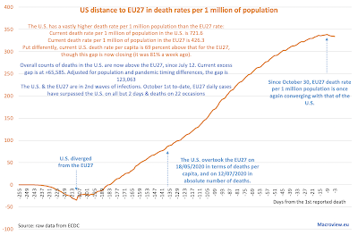
  • Deaths per capita: the U.S. has overtaken the EU27 since May 18, and the trend for the U.S. continued to be worse than that for the EU27 until early October.
  • EU27 death rate per capita has effectively flattened-out at around 308 per 1 million prior to August 2, but has been rising once again since then (498.1 currently).
  • U.S. deaths per capita continue to increase (760.1 currently).
  • The U.S. & EU27 are in 3rd (U.S.) and 2nd (EU27) waves of infections. Since Oct 1st, EU27 cases have surpassed the U.S. on all but 3 days & deaths on all but 16 days
The trends are horrifying, albeit in the EU27 we are now seeing potential decline in cases from the second peak. The U.S. appears to remain on the increasing trendline in terms of new cases: 


As the U.S. 3rd wave of new cases is blowing up, and the EU27 2nd wave appears to be subsiding, we are likely to see deaths accelerating once again in the U.S. and falling in the EU27, so the deaths gap between the U.S. and the EU27 is likely to revert back growing excess U.S. deaths.

  • Overall counts of deaths in the U.S. are now above the EU27, since July 12. 
  • Current excess gap is at +46,983, which is down on peak excess deaths gap of 68,152 attained a month ago. 
  • Adjusted for population and pandemic timing differences, the gap is 113,081. Put differently, 113,081 Americans would have been alive today were the U.S. responses to the pandemic similar to those adopted by the EU27.

Summary statistics really paint an awful picture: 
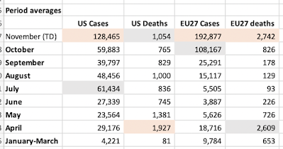
  • November has been thee worst month so far in this entire pandemic in terms of daily cases increases for both the EU27 and the U.S. 
  • In terms of deaths counts, the U.S. is still lagging behind the EU27, but November to-date is now ranks as the second worst month in daily deaths counts in the U.S. and the worst month in the EU27.


For more EU27 - U.S. comparatives, including comparatives to other countries, see: https://trueeconomics.blogspot.com/2020/11/181120-covid19-update-countries-with.html

Wednesday, November 18, 2020

18/11/20: COVID19 Update: Countries with > 100,000 cases

 Updating the tables for countries with more than 100,000 recorded cases of COVID19:


  • U.S. continues to lead globally in terms of deaths and new cases counts. On per-capita terms, the U.S. ranks 7th worst in the world in terms of cases per 1 million of population, 12th worst in terms of deaths per 1 million of population and 27th worst in the world in terms of deaths per 1,000 officially detected infections. The country has, by far, the most expensive (as a share of GDP) healthcare system in the world.
  • In contrast, were they treated as a single entity, BRIICS+Turkey have better than average performance in terms of number of cases, number of deaths per capita and an average (statistically)  rate of deaths per 1,000 cases.
  • Worldwide, 20 countries now have more than 500,000 cases and 5 countries of these have more than 50,000 deaths.
  • On per capita basis, the worst performing country in the world for cases counts is Qatar, followed by Belgium and Czechia, Armenia and Israel. In terms of deaths per capita, the worst country in the world is Belgium, followed by Peru, Spain, Argentina and Brazil. 
  • In deaths per 1,000 confirmed cases, the worst performing country is Mexico, followed by Ecuador, Bolivia, Egypt and Iran.


18/11/20: COVID19 Update: Worldwide Cases and Deaths

 Updating data on global COVID19 pandemic spread:

Some summary tables first;


November-to-date is an outlier month in terms of both, case numbers and deaths. While the former is in part driven by better availability of testing, the latter runs contrary to the expected outrun of improved testing: higher rates pf testing lead to earlier detection of the disease and, in theory, should lead to reduced deaths. Unfortunately, this is not the case. Daily average new deaths are running at 8.294 so far in November - a massive increase on October and the highest average for any month so far. Worse, thee geography of new cases has shifted from less-developed countries (South and Latin America, India etc) to more advanced economies (the U.S. and Europe), which should, in theory, see a reduction in daily deaths counts (due to better public health systems). This is not happening.


Table above shows dramatic jump in the rate of growth in deaths in November, compared to every prior month. It also suggests longer lags in deaths increases following cases increases, which may be due to earlier detection and younger cases demographics. This, however, is not comforting. Again, earlier detection and younger demographics should lead to slower rates of growth in deaths, not higher.

Charts for cases and deaths:


Moving averages clearly show relentless growth in the pandemic since the start of October for cases and the end of October for deaths. The global pandemic is accelerating, not abating.

Tuesday, November 17, 2020

16/11/20: Velocity of Money and the Glaciers of Complacency

Last time I looked at the velocity of money, things were going South fast: https://trueeconomics.blogspot.com/2020/05/27520-falling-velocity-of-money.html. And considering thee data through 3Q 2020, there is little improvement across the board:


You can barely notice 3Q 2020 uptick from the pandemic lows in all three measures, thee M1, M2 and MZM. And here are differentials:

Precautionary savings motives (blue line) remain extremely elevated, while investors' willingness to trade assets (in a bull market, a sign of more active management of portfolios) stays stubbornly low. Which implies that the shift from the pandemic impact to the recovery did not do much to alter demand for money, nor to break away from the monetary policy-supported glut of liquidity available to the economy as a whole and to the financial markets specifically. 

It is all as if we have frozen, from monetary policy point of view, in a singular tidal wave. A glacier of households' unease and investment markets complacency. 

Saturday, November 7, 2020

7/11/20: COVID19 Update: U.S. vs EU27

 U.S. is now in a full-blown third wave of the pandemic both in terms of daily case counts and deaths, and the EU27 is in a full-blown second wave:


Summary statistics:


Histograms for both:


7/11/20: COVID19 Update: Worldwide Cases and Deaths

 The pandemic is accelerating world-wide and the death toll is now rising at an alarming rate:


The chart above is the most alarming one: rates of growth in new cases and in daily deaths counts (the second derivative) are well-above their past months' averages. Death toll is rising by a third, daily, on average since the start of November. Covid-denialists have persistently argued that despite increases in the numbers of new cases, deaths were falling (they were not: August was the only month of negative growth in daily deaths). In fact, starting with September, daily deaths, on average, grew by double-digits percentage points, and the rate of growth accelerated in October by 80 percent compared to September. 

Global second wave of the pandemic is substantially more deadly (in absolute numbers) than the prior wave.