Showing posts with label Labor force participation rate. Show all posts

Friday, April 2, 2021

2/4/21: U.S. labor force participation and employment to population ratio


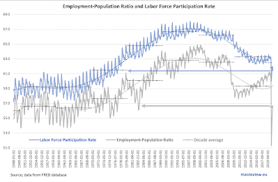
In the previous post, I covered U.S. continued unemployment claims: https://trueeconomics.blogspot.com/2021/04/2421-us-continued-unemployment-claims.html, noting that decreases in unemployment counts are, in part, driven by workers dropping off unemployment rolls due to exits from the workforce and/or expirations of unemployment benefits. Here is the data on U.S. labor force participation rates and employment to population ratio through March 2021:


Things are still ugly when it comes to these two measures of labor markets health in the U.S: 

  • Latest reading for U.S. labor force participation rate at 61.5 is just a notch up on February's 61.3, but is unchanged on November 2020. Pandemic period average labor force participation rate is woefully low at 61.7, which is still higher than March 2021 reading. March reading is equivalent to the average reading for the decade of the 1970s which was marked by stagflation and high unemployment.
  • Latest reading for U.S. employment to population ratio is at 57.7 - an improvement on February reading of 57.3, and better than the pandemic period average of 56.9, but still comparable to the levels seen only in the early 1980s. 
Both metrics show the brutal nature of the current labor markets, where demand for skills is rising, including in manufacturing, while services jobs (and lower-skilled B2C services jobs in particular) are still hard to find.

Thursday, February 4, 2021

4/2/21: U.S. Labor Markets: America's Scariest Charts, Part 2

In the previous post, I covered the first set of data - Continued Unemployment Claims (https://trueeconomics.blogspot.com/2021/02/4221-us-labor-markets-americas-scariest.html) - that highlights the plight of American economy in the current crisis. Now, let's take a look at Labor Force Participation rate and Employment to Population ratio:


The chart and the table above highlight continued serious problems in the structure of the U.S. labor markets. While official continued unemployment claims are inching back toward some sort of a 'norm', much of so-called improvement in unemployment dynamics is actually accounted for by the dire state of labor force participation which is still trending below anything one might consider reasonable. Current labor force participation rate is 61.5 which is well below anything seen before the onset of the pandemic in March 2020. By a mile below. And in terms of historical perspectives, we have no modern recession (from 1980 onwards) that matches these lows of labor force participation. Structurally, this means that instead of gaining jobs, the unemployed simply roll off the cliff of unemployment assistance and drop out of the labor force, discouraged by the lack of meaningful decent jobs in the market. 

Employment to population ratio is a little better, but it is still stuck below pre-pandemic levels and is low compared to prior recessions' troughs. 

The conditions in the U.S. labor markets might be improving somewhat off the pandemic lows, but the situation overall remains dire. 


Saturday, October 24, 2020

24/10/20: U.S. Labor Force Participation Rate is Falling, Again

One of thee major casualties of the COVID19 pandemic has been the U.S. labor market. However, with an allegedly robust recovery under way, we are seeing significant improvements across some metrics of labor markets health. In some, but not all.

Take labor force participation rate:


Labor force participation rate is a critical metric for gauging employment conditions in the economy, because it reflects not only the availability of jobs in the market, but the perception amongst the workers of thee health of the market. Since the start of the pandemic, LFP rate fell to its 2020 low of 60.0 in April, before recovering to the pandemic period high of 62.0 in July. Since then, it trended down once again and in September fell to 61.4. 

Let's consider this for a second. During the Great Recession and the Global Financial Crisis, the lowest LFP rate reached was 63.8. In the Dot.Com recession, that number was 65.9. In the 1990s recession it was 65.5. For the entire decade of the 1980s, the lowest reading for LFP rate was 63.0. In fact, the only decade with lower LFP rate than current is the decade of the 1970s. February 1977 was the last time we saw LFP rate at the level below September 2020 reading.

Things are marginally better for another measure of labor markets health: the Employment to Population Ratio (EPR), which currently sits at 56.7, lower than any recession reading prior to the COVID19 pandemic since the first recession of the 1980s. March 1983 was the last time we saw this reading until the COVID19 hit.

Give it a thought, folks, a 'historical recovery' is the one where there are just 567 people working (part time or full time. minimum wage or living wage) per each 1,000 working age adults. Or, described differently, an economy where only 614 working age adults our of 1,000 are either in employment or confident enough of their prospects for finding a job to bother searching for one.

Sunday, September 27, 2020

27/9/20: U.S. Labor Force Participation and Employment-Population Ratios

 Yesterday, I posted updates to the America's Scariest Charts series on the U.S. labor markets (see https://trueeconomics.blogspot.com/2020/09/26920-americas-scariest-charts-duration.html). Two commonly over-looked and under-reported labor markets statistics worth covering in any analysis of economic conditions in the country are:

  • The labor force participation rate, and
  • The employment to population ratio.
Both have been shockingly impacted by the COVID19 crisis, and both are experiencing only partial recovery to-date. 


As the chart above illustrates:

  • U.S. Labor Force Participation rate stood at 61.8 at the end of August 2020, a slight deterioration on July 2020 (62.0), but above the COVID19 trough of 60.0 in April 2020. Current level is below 2020 average of 61.9, which is itself the lowest decade average since the 1970s. Excluding CIOVID19 period, latest reading for the participation rate is the absolute lowest since May 1977.
  • U.S. Employment to Population ratio has fallen to its all-time lows in April 2020, and has recovered since. At the end of August is stood at 56.5 percent, up on 51.3 percent pandemic period low, and in-line with the 2020 average to-date. Before the start of the pandemic, the ratio stood at 60.9 and the previous decade average was 59.3. In historical comparatives terms, the latest reading for this indicator is the lowest (excluding the pandemic period lows) since early 1983.
In terms of both indicators, current conditions in the U.S. labor markets are worse than those encountered at the worst points of any recession since 1983, including the depths of the Global Financial Crisis. And this assessment comes after 3 months of the ongoing 'recovery'. 

Thursday, April 30, 2020

29/4/20: Surprising Effects of COVID19 on U.S. Labor Force


Mid-run COVID pandemic effects on U.S. employment, unemployment and labour force participation rates via: https://voxeu.org/article/labour-markets-during-covid-19-crisis-preliminary-view


The striking collapse in estimated participation rate is down to several factors, some expected, some less so. Per authors:

"Why do so many unemployed choose not to look for work? ... Prior to the crisis, most respondents out of the labour force claimed that it was because they were retired, disabled, homemakers, raising children, students, or did not need to work. Only 1.6% of those out of the labour force were claiming that they could not find a job as one of their reasons for not searching. At the height of the Covid-19 crisis with a much larger number of people now out of the labour force, we see corresponding declines in the share of homemakers, those raising children and the disabled. However, we see a large increase in those who claim to be retired, going from 53% to 60%. This makes early retirement a major force in accounting for the decline in the labour-force participation. Given that the age distribution of the two surveys is comparable, this suggests that the onset of the Covid-19 crisis led to a wave of earlier-than-planned retirements. With the high sensitivity of seniors to the Covid-19 virus, this may reflect in part a decision to either leave employment earlier than planned due to higher risks of working or a choice to not look for new employment and retire after losing their work in the crisis."

This is interesting and far-reaching. If true, such changes provide some - rather substantial - clearing of the path to promotion and career advancement by the older generation of GenX-ers. But it also might be a feature of the COVID-relted layoffs that could have been accompanied by the longer-term jobs destruction in sub-occupations and sub-sectors that tend to simultaneously attract senior or in-retirement workers and be associated with higher degree of person-to-person contacts, e.g. in basic services.

Either way, the implications for the younger generations of the COVID19 crisis remain highly uncertain, but for older generations, earlier retirement and forced retirement is usually associated with lower income in retirement. After all, people in retirement age were not working for purely social reasons before COVID19 pandemic hit.


Friday, July 26, 2019

26/7/19: Stop Equating Low Unemployment Rate to High Employment Rate


There is always a lot of excitement around the unemployment stats these days. Why, with near-historical lows, and the talk about 'full employment', there is much to be celebrated and traded on in the non-farm payrolls stats and Labor Department press releases. But the problem with all the hoopla around these numbers is that it too often mixes together things that should not be mixed together. Like, say, mangos and frogs, or apples and moths.

Take a look at the following data:

Yes, unemployment is low. Civilian unemployment rate is currently at seasonally-adjusted 3.7% (June 2019), and Unemployment rate for: 20 years and over, at 3.3%, seasonally adjusted. On 3mo average basis, last time we have seen comparable levels of Civilian unemployment was in 1969, and 20+ Unemployment rate was in 2000. Kinda cool, but also revealing: historical lows in unemployment require  Civilian unemployment metric to confirm. Which means that factoring in Government employment, things are bit less impressive today. But let us not split hairs.

Here is the problem, however: record lows in unemployment are not the same as record levels in employment. Low unemployment, in fact, does not mean high employment.

To see this, look at the solid red line, plotting Employment rate for 20 years and older population. The measure currently sits at 71.2 percent and the last three months average is at 71.1 percent.  Neither is historically impressive. In fact, both are below all months (ex-recessions) for 1990-2008. Actually, not shown in the graph, you would have to go back to 1987 to see the same levels of employment rate as today. Oops...

But why is unemployment being low does not equate to employment being high? Well, because of a range of factors, the dominant one being labor force participation. It turns out (as the chart above also shows), we are near historical (for the modern economy's period) lows in terms of people willing to work or search for jobs. Or put differently, we are at historical highs in terms of people being disillusioned with the prospect of searching for a job. Darn! The 'best unemployment stats, ever' and the worst 'willingness to look for a job, ever'.

U.S. Labor Force Participation rate is at 62.9 percent (62.8 percent for the last three months average). And it has been steadily falling from the peak in 1Q 2000 (at 67.3 percent).

When we estimate the relationship between the Employment rate and the two potential factors: the Unemployment rate and the Participation rate, historically (since 1970s) and within the modern economy period (since 1990) as well as in more current times (since 2000), and since the end of the Great Recession (since 2010) several things stand out:

  1. Unemployment rate is weakly negatively correlated with Employment rate, or put differently, decreases in unemployment rate are associated with small increases in employment; across all periods;
  2. Labor force participation rate is strongly positively correlated with Employment rate. In other words, small increases in labor force participation rate are associated with larger increases in employment; across all periods;
  3. Labor force participation rate, in magnitude of its effect on Employment rate, is roughly 14-15 times larger, than the effect of Unemployment rate on Employment rate; across all periods; and
  4. The relatively more important impact of Labor force participation rate on Employment, compared to the impact of Unemployment rate on Employment has actually increased (albeit not statistically significantly) in the last 9 years.
These points combined mean that one should really start paying more attention to actual jobs additions and employment rate, as well as participation rate, than to the unemployment rate; and this suggestion is more salient for today's economy than it ever was in any other period on record.

But above all, please, stop arguing that low unemployment rate means high employment. Bats are not cactuses, mangos are not moths and CNN & Fox kommentariate are not really analysts.

Monday, June 3, 2019

3/6/19: Three Periods in labor Force Participation Rate Evolution and Secular Stagnations


The state of the global labor markets is reflected not only in the record lows in official unemployment statistics, but also in the low labor force participation rates:


In fact, chart above shows three distinct periods of evolution of the labor force participation rates in the advanced economies, three regimes: the 1970s into 1989 period that is marked by high participation rates, the period of 1990-2004 that is marked by the steadily declining participation rates, and the period since 2005 that is associated with low and steady participation rates.

This is hardly consistent with the story of the labor markets spectacular recovery that is presented by the official unemployment rates. In fact, the evidence in the above chart points to the continued importance of the twin secular stagnations hypothesis that I have been documenting on this blog.

Monday, April 15, 2019

15/4/19: One order of "Bull & Sh*t" for the U.S. Labor Market, please


The 'strongest economy, ever'...


Despite a decade-long experiment with record-low interest rates, despite trillions of dollars in deficit financing, and despite headline unemployment numbers staying at/near record lows, the U.S. economy is not in a rude health. In fact, by two key metrics of the labor force conditions, it is not even in a decent health.

As the chart above clearly shows, both in terms of period averages and in terms of current level readings, Employment to Population Ratio (for civilian population) has remained at abysmally low levels, comparable only to the readings attained back in 1986. Meanwhile, labor force participation rate is trending at the levels consistent with those observed in 1978.

Dire stuff.

Update: Here is a chart showing how the current recovery compares to past recoveries (hint: poorly):