Monday, February 15, 2021

15/2/21: Pump & Dump, Illicit Finance and Market Inefficiency: Cryptos under Review

 A fascinating fresh survey of microeconomics literature on crypto currencies: "The Microeconomics of Cryptocurrencies" by Hanna Halaburda, Guillaume Haeringer, Joshua Gans, Neil Gandal (CESifo Working Paper 8841, 2021, NBER version link here: https://www.nber.org/papers/w27477).

The paper is really too extensive to summarize here, so I encourage everyone interested in cryptos to read it. I can, however, offer some non-priority ordered comments on some of the passages I find interesting and novel.

Let's start with 'efficiency' and the 'nothing-at-stake problem'. Authors reference Saleh (2019) which derives "sufficient conditions that guarantee that consensus" to fork is an equilibrium. "Saleh then derives two additional results. 

  1. "First, restricting the ability to large stakeholders facilitates and speeds up consensus in case of a fork. The intuition is that [large] stakeholders have the most to lose from a disagreement, i.e., from the persistence of two or more branches." This seems to me a built-in incentives mechanism for increasing concentration of holdings of cryptos. Just as monopolistic power can lead to cartelization and collusion, so is the need for faster / more efficient consensus on development can lead to market dominance and concentration. The side effect of this would be likely reduced liquidity and also likely manipulation of exchange rates. Neither is good for cryptos susceptible to concentration becoming actual money (unit of account, unit of storage, unit of exchange).
  2. Second, "Saleh finds that the lower the miners' reward the better. The reason behind this counter-intuitive result is that low rewards enable the accumulation of vested interest in the blockchain (i.e., miners have less incentives to cash out their tokens). Given this, preserving one's vested interest in the blockchain (the tokens) increase the incentives to favor consensus." This is ugly. It further compounds holdings concentration and reduces liquidity. Worse, by inducing longer holding time horizons, it risks potential over-reaction to price movements in the longer run, so that markets price discovery can be severely restricted, and financial bubbles can form and inflate faster and more viciously.
Another issue, relating to efficiency, is transaction costs: the paper reviews Huberman et al. (2019) on this. There are several problems relating to the Bitcoin system capacity to process and record information that relates to the way transaction fees are being priced and charged. These are largely consistent also with Easley et al. (2019). One is that "miners are not only engaged into a hashing race, but they also strategically select transactions to process in order to grab the highest fees." Another is that the system requires congestion to generate fees. The third is that once block rewards are exhausted, the system can lead to concentration of market power as miners will rely solely on transaction fees to exist. This power concentration can lead to higher costs of transactions, and "may result in turn in a weakening of the system's safeguards against double-spending".  Lastly, "if all users pay the fee, the deviation to no fee is very costly, because it automatically puts the no fee transaction at the very end of the queue. This cost may be higher than the fee itself." In other words, in the "all users pay" environment, system congestion can lead to highly costly delays in processing of information.

User adoption: "Foley et al. (2019) fi nd that approximately one-quarter of bitcoin users are involved in illegal activity, which they estimate to represent 46% of bitcoin transactions. Based on their estimates, the illegal use of bitcoin generates approximately $76 billion of illegal activity per year. In terms of comparison, they note that the scale of the US and European markets for illegal drugs is only slightly larger! They do find that since 2016 the proportion of bitcoin activity associated with illegal trade has declined, but the absolute amount of activity (in USD) has continued to increase."

"One example of illegal activity that currently flourishes with Bitcoin is "ransomware" attacks in which criminals exploit vulnerabilities in computer networks to "lock" fi les so that the user cannot access them. As documented in an article in the New York Times by Nathaniel Popper, in 2019, more than 200,000 organizations submitted files that had been hacked in a ransomware attack. This was a 40 percent increase from the year before,"

The literature on the subject is "consistent with what we know about adoption by large merchants. According to the Economist magazine using data from Morgan Stanley, in 2018, only three of the largest 500 online retailers accept Bitcoin for payments", which is down from five such retailers accepting Bitcoin in 2017. "The conventional wisdom for the lack of adoption of Bitcoin as a payment system is that very few "legal" goods are purchased using Bitcoin because its value is not stable and the system is very slow in processing transactions."

User intent: "Most of the empirical research we discussed... suggest that currently, bitcoin demand is driven by speculation alongside likely illegal intent. A broader claim about bitcoin demand is that it is used as a hedge against inflation" (or as a form of 'digital gold'). The paper argues that BTC/USD pricing of July 2019 or something around USD9,630 per BTC would be consistent with all cryptocurrencies taken as whole replacing 100% of the privately held investment gold in the world for the gold price of USD 1,444 per ounce. As we say before running a Category V rapid... "Good luck on the down".

Pump and dump coins: "Hamrick et al. (2018) present compelling evidence of pervasive pump-and-dump schemes resulting from a systematic analysis of multiple datasets ... they identify more than 3,000 pump-and-dump schemes over a just 6 month period in 2018." 


14/2/21: COVID19 Update: Sweden and Nordics

Prior posts on COVID19 stats updates covered:

Lastly, let's run through comparatives for COVID19 dynamics in Sweden vis-a-vis the rest of the Nordics.


No matter how you define the Nordics:
  • As Sweden's closest land-linked neighbors of Finland and Norway (Nordics 1); or
  • Adding to the two above Estonia and Iceland (Nordics 2); or
  • Expanding the set to also include Netherlands and Denmark
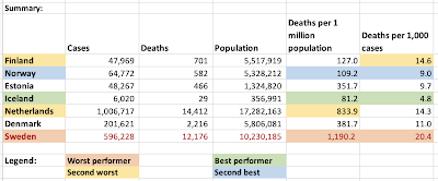
there is only one conclusion than can be drawn from the above charts: Sweden is not doing too well in terms of cases recorded and in terms of deaths recorded through the pandemic so far.  Sweden's mortality rate per capita is substantially (86%) higher than that of the Nordics 3. 

Here is just how poor Sweden's performance has been:


Sunday, February 14, 2021

14/2/21: COVID19 Update: U.S. vs EU27 comparatives

In previous posts, I covered the latest data for weekly Covid19 pandemic dynamics for:

  • Global data and trends: https://trueeconomics.blogspot.com/2021/02/14221-covid19-update-worldwide-data.html;
  • European & EU27 data and trends: https://trueeconomics.blogspot.com/2021/02/14221-covid19-update-europe-and-eu27.html; 
  • Data and trends for the most impacted countries and regions: https://trueeconomics.blogspot.com/2021/02/14221-covid19-update-most-impacted.html; and
  • Data on COVID19 dynamics in BRIICS countries: https://trueeconomics.blogspot.com/2021/02/14221-covid19-update-briics.html.
Now, as usual, EU27 (and Europe) comparatives to the U.S.

Start with new cases (weekly totals): 

Since the start of the pandemic, the U.S. has experienced three waves, against the EU27's two. The EU27's 2nd wave appears to have crested in week 45 of 2020, while the U.S.' current wave continued to rise until Week 1 of 2021. Over the last 8 weeks, US new cases exceeded those in the EU27 by 3,574,708 and population-size adjusted deaths by 29,150.

Next, weekly deaths:

The EU27's 2nd wave appears to have crested in week 48 of 2020 in terms of deaths, while the U.S.' current, third, wave continued to rise through week 3 of 2021. The EU27 weekly deaths counts show little signs of significant moderation since the Wave 2 peak, however, and are still running above Wave 1 peak.

Neither the U.S., nor the EU27 show any significant signs of deaths moderation that can be expected to occur in line with decline in new cases and vaccinations. This is surprising, because EU27 new cases moderated substantially since the peak of Wave 2.

Cumulated deaths per capita:


Since the start of Wave 2 in the EU27 (Wave 3 in the U.S.), EU27 deaths per capita have been converging with those in the U.S.

At the start of the EU27 Wave 2, U.S. total deaths per capita exceeded those in the EU27 by 87%. In week 5 of 2021, excess U.S. deaths compared to the EU27, cumulated over the period of pandemic stood at 96,595, or 108,1787 on the age-adjusted basis. 

In other words, U.S. cumulated deaths now exceed those in EU27 by 20.8 percent on population-size adjusted basis and by 23.3%. 

U.S. excess mortality compared to the EU27 and Europe, once we account for population differences is still rising:

In highly simplified terms, the U.S. pandemic experience has been associated with a cumulative excess mortality, compared to the EU27 and Europe of between 96,595 and 160,584 cases, respectively, based solely on differences in population sizes.

If older European and EU27 demographics are factored in, these excess U.S. deaths rise to 108,200 and 134,800, respectively.

I recently covered some new research on the policy-level failures in the U.S. during the COVID19 pandemic (see https://trueeconomics.blogspot.com/2021/02/3221-cost-of-trumps-failures-to-act-on.html). In simplified terms, the numbers above are shocking: were the U.S. to match policy responses in the EU27, we could have expected a death toll 96,600-108,200 lower than we currently observe. 

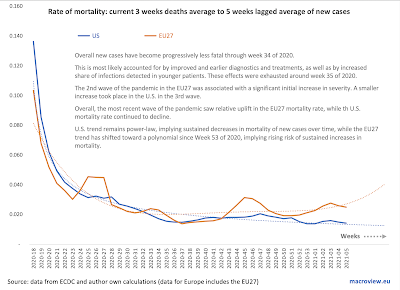
The U.S., however, managed much better than the EU27 in terms of deaths per case or the morbidity rate of the disease:


Overall new cases have become progressively less fatal through week 34 of 2020. This is most likely accounted for by improved and earlier diagnostics and treatments, as well as by increased share of infections detected in younger patients. These effects were exhausted around week 35 of 2020.

The 2nd wave of the pandemic in the EU27 was associated with a significant initial increase in severity. A smaller increase took place in the U.S. in the 3rd wave. Overall, the most recent wave of the pandemic saw relative uplift in the EU27 mortality rate, while the U.S. mortality rate continued to decline.
U.S. trend remains power-law, implying sustained decreases in mortality of new cases over time, while the EU27 trend has shifted toward a polynomial since Week 53 of 2020, implying rising risk of sustained increases in mortality.

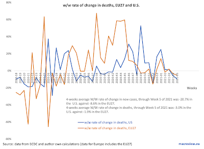
In terms of the rate of change in weekly deaths: 


4-weeks average W/W rate of change in new cases, through Week 5 of 2021 was -20.7% in the  U.S. against -8.6% in the EU27.  4-weeks average W/W rate of change in deaths, through Week 5 of 2021 was -3.0% in the  U.S. against -1.9% in the EU27. 

A summary of the U.S.-EU27 comparatives:


14/2/21: COVID19 Update: BRIICS

 In previous posts, I covered the latest data for weekly Covid19 pandemic dynamics for:

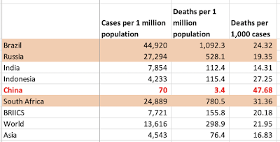
Now, let's take a closer look at the pandemic dynamics in the BRIICS (Brazil, Russia, India, Indonesia, China and South Africa).


In broadly defined terms, there is an ongoing decline in both new cases and new deaths over the last week across all BRIICS. That said, it is too early to call the peaking of the second wave of this pandemic in terms of deaths counts, since weekly counts remain extremely high and show only one week of sustained declines. The good news is that last week's declines were evident in all BRIICS. Another good news is that we now have at least four consecutive weeks of declines in new cases across the entire group, except for Indonesia, where we only have one week of declines, and China. 

A summary table:


14/2/21: COVID19 Update: Most impacted countries


Previous posts on the COVID19 update covered global numbers and trends (https://trueeconomics.blogspot.com/2021/02/14221-covid19-update-worldwide-data.html) and European & EU27 trends (https://trueeconomics.blogspot.com/2021/02/14221-covid19-update-europe-and-eu27.html).

Here are some comparatives across all countries with the highest rates of detected infections (> 5% of population):


Note: I highlighted countries with > 10 million population.

Another way of looking at this is to take countries with more than 250,000 confirmed cases, as presented in the next set of tables:


Comparing regions to the above countries:

And looking at the countries by population relatives:

The table above really drives home the depth of the crisis in Europe and the U.S. U.S. accounts so far fo 20 percent of global deaths, having just 4.3 percent of the global population. This gives the U.S. second worst ratio of its share of global deaths to its share of world population. Only the UK exceeds the U.S. in this horrific metric. The EU27 fall in the third place, below the U.S. with 21.4% of the world's deaths and 5.8% of the global population. 


14/2/21: COVID19 Update: Europe and EU27

 Summary table from the previous post covering worldwide trends (https://trueeconomics.blogspot.com/2021/02/14221-covid19-update-worldwide-data.html) puts Europe and EU 27 in the context of global trends:


The chart next shows weekly data dynamics for new cases for EU27 and Europe:


Both Europe and EU27 have experienced two waves of the pandemic, with the second wave characterized by two key features:
  1. Long and slow decline in the new cases counts, lasting from the peak of the wave around Week 45 of 2020; and 
  2. Re-acceleration in the wave into another local peak at Week 1 of 2021. 
The quick reversals of decline trend around Weeks 51-53 of 2020 is a worrying sign that improvements in overall pandemic trends are fragile.


The fragility of the trend in terms of improvements are even more evident in the numbers of new weekly deaths. Both Europe and EU27 are yet to confirm the peaking of the second wave of the pandemic in terms of weekly new deaths. Nominally, the peaks of the most recent wave in Week 49 of 2020 in the EU27 and Week 3 of 2021 in Europe have not, yet, been followed by accelerating or deepening declines in the deaths counts.

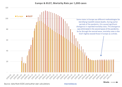
One clear positive trend remains in terms of mortality rates per case:


The caveat to the above is a slight uplift in mortality around Week 51 of 2020 as shown in the above.

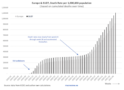
Cumulated deaths per capita are exhibiting a slight slowdown over time (slope) but are still increasing at a rate massively in excess of what was witnessed during the period of Week 19-43 of 2020. In other words, we are not yet out of the woods, even compared to the pandemic dynamics of the Summer 2020.

As with global figures, it is too early to say anything about vaccinations effects on general trends.


14/2/21: COVID19 Update: Worldwide Data

 Worldwide trends for COVID19 pandemic in terms of cases and deaths:


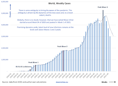
There is some ambiguity in timing the waves of the pandemic. This ambiguity is driven by the dynamics of the new cases and, to a lesser extent, deaths. Globally, we have exited Wave 3 that started around Week 34 of 2020 and peaked in Week 1 of 2021. Promising dynamics aside, latest level of new infections remains at the levels well above Waves 1 and 2 peaks.


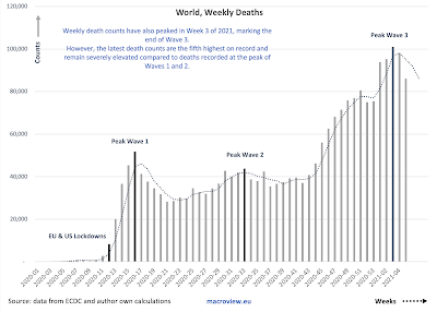
Weekly death counts have also peaked in Week 3 of 2021, marking the end of Wave 3. However, the latest death counts are the fifth highest on record and remain severely elevated compared to deaths recorded at the peak of Waves 1 and 2.


Recent decreases in mortality rate are most likely attributable to three key drivers: (1) earlier detection of cases due to improved testing; (2) younger demographics of those with confirmed infections; and (3) improved treatments in the earlier stages of the disease. The decrease in mortality appears to have stabilized and is slightly reversing in the first 5 weeks of 2021. This is the most worrying aspect of the three trends discussed above.

Here is a summary table, with green cells showing improvements and red cells showing deterioration in dynamics:


Last week's deaths have shown an improvement on 4 weeks average in all regions world-wide, and this has been consistent across all (excluding Asia) regions also in terms of new cases 4 weeks average compared to prior 4 weeks average. Deaths, however, are still up on the 4weeks average relative to prior 4 weeks average basis in most regions, with exception of two.

For now, it is hard to attribute the above improvements to vaccinations (long term solutions) and the improved dynamics are probably more consistent with a natural flow of the pandemic wave, reflecting tightening of restrictions on social activities in virtually all major geographies following the holidays season. This, along with the rapidly growing prevalence of the new, more infective, strands of the virus suggests that the gains made in recent weeks are at a risk of reversals. 


Sunday, February 7, 2021

6/2/21: Longer Trends in Economic Uncertainty


Quite dramatic trends in terms of rising economic uncertainty over the last 21 years:


And, not surprisingly, the rise of uncertainty in Europe, the U.S., and globally pre-dates the Covid19 pandemic. In fact, Europe has been experiencing dramatically elevated uncertainty levels since the start of the Euro area crisis, while the U.S. saw a virtually exponential rise in uncertainty from 2017 on. Global measures of uncertainty have been running high through 2016 and rose dramatically thereafter. 

While amelioration in the Covid19 pandemic dynamics is likely to lower the levels and the volatility of the uncertainty in global economic systems, it is highly unlikely to return us to the pre-Global Financial Crisis state of affairs.

Friday, February 5, 2021

4/2/21: The Impact of the Business Closures on Covid-19 Infection Rates

 In a recent post, I covered the impact of the failure at the Federal level to implement more robust measures on rents and tenure security for households (see: https://trueeconomics.blogspot.com/2021/02/3221-cost-of-trumps-failures-to-act-on.html). Another interesting aspect of the U.S. experience during the pandemic relates to the policies concerning the closure of essential vs non-essential businesses. A recent (January 2021) study by Song, Hummy and McKenna, Ryan and Chen, Angela T. and David, Guy and Smith-McLallen, Aaron, titled: "The Impact of the Non-Essential Business Closure Policy on Covid-19 Infection Rates" (NBER Working Paper No. w28374: https://ssrn.com/abstract=3772613) looked at the implications of this specific policy response to the Covid-19 pandemic.

Per authors, durig the pandemic, "many localities instituted non-essential business closure orders, keeping individuals categorized as essential workers at the frontlines while sending their non-essential counterparts home". The authors examined "the extent to which being designated as an essential or non-essential worker impacts one’s risk of being Covid-positive following the non-essential business closure order". The study used data for the State of Pennsylvania, accounting for the intra-household transmission risk experienced by the workers' cohabiting family members and roommates. 

The study estimated that:

  • "... workers designated as essential have a 55% higher likelihood of being positive for Covid-19 than those classified as non-essential; in other words, non-essential workers experience a protective effect. 
  • "While members of the health care and social assistance sub-sector contribute significantly to this overall effect, it is not completely driven by them. 
  • "We also find evidence of intra-household transmission that differs in intensity by essential status. Dependents cohabiting with an essential worker have a 17% higher likelihood of being Covid-positive compared to those cohabiting with a non-essential worker. Roommates cohabiting with an essential worker experience a 38% increase in likelihood of being Covid-positive. 
  • Overall, "analysis of households with a Covid-positive member suggests that intrahousehold transmission is an important mechanism."
In summary: "Our findings suggest that essential workers and their cohabitants (whether dependents or other primary policyholders sharing the same address) are at substantially higher risk of being positive for Covid-19 than are non-essential workers and their cohabitants. Conversely, non-essential workers and their cohabitants experience a protective effect against the risk of Covid-19 infection as a result of the nonessential business closure policy." 

And the kicker: "the designation of some workers as essential and others as non-essential during the pandemic has increased the health risk profile of some jobs while reducing it for others, all while other underlying aspects of these jobs (e.g., monetary compensation) remain minimally affected." In other words, the essential workers carry risk without carrying associated risk premium in their compensation (monetary or non-monetary).

Thursday, February 4, 2021

4/2/21: U.S. Labor Markets: America's Scariest Charts, Part 6

 Having covered some core stats relating to the U.S. labor markets in previous 5 posts:

  1. Continued Unemployment Claims (https://trueeconomics.blogspot.com/2021/02/4221-us-labor-markets-americas-scariest.html);
  2. Labor force participation rate and Employment-to-Population ratio (https://trueeconomics.blogspot.com/2021/02/4221-us-labor-markets-americas-scariest_4.html); 
  3. Non-farms payrolls (https://trueeconomics.blogspot.com/2021/02/4221-us-labor-markets-americas-scariest_16.html); 
  4. New (initial) unemployment claims data through January 30, 2021 (https://trueeconomics.blogspot.com/2021/02/4221-us-labor-markets-americas-scariest_57.html); and
  5. Average duration of unemployment (https://trueeconomics.blogspot.com/2021/02/4221-us-labor-markets-americas-scariest_41.html),
in this last post, we will focus on the overall employment index for the current recessionary cycle:


Currently, into month 10 data of the recession (December 2020), and employment index is reading close to the conditions in the recession of 1945, but better than the recession of 1953. We are still trending worse than any recession in modern period (post-Gold Standard), and that is quite an achievement (in negative terms). Dynamically, improvements in employment conditions have been flattening out from month 5 of the recession through month 8 and index improvements have slowed down to almost nil in months 9 and 10. Unless there is a significant reversal in this trend, by the end of 2021 we are likely to be around the same labor markets conditions as at the same time during the Great Recession. 

4/2/21: U.S. Labor Markets: America's Scariest Charts, Part 5

 The first four posts on the state of the U.S. labor markets have covered:

  1. Continued Unemployment Claims (https://trueeconomics.blogspot.com/2021/02/4221-us-labor-markets-americas-scariest.html);
  2. Labor force participation rate and Employment-to-Population ratio (https://trueeconomics.blogspot.com/2021/02/4221-us-labor-markets-americas-scariest_4.html); 
  3. Non-farms payrolls (https://trueeconomics.blogspot.com/2021/02/4221-us-labor-markets-americas-scariest_16.html); and
  4. New (initial) unemployment claims data through January 30, 2021 (https://trueeconomics.blogspot.com/2021/02/4221-us-labor-markets-americas-scariest_57.html)
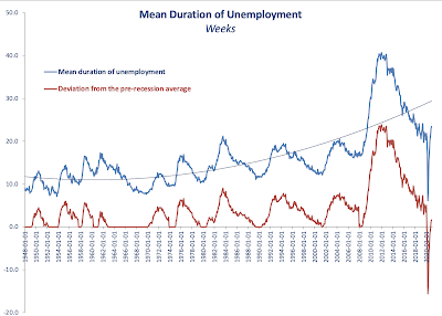
In this post, let's take a look at the latest data on average duration of unemployment through December 2020:


As the chart above clearly shows, current average duration of unemployment spell is already higher than the peak of any prior recession other than the Great Recession. However, the duration remains relatively benign when we control for the business cycle (red line and the chart next).


Dynamically, it is hard to imagine average duration of unemployment to be staying around its current levels. Something to watch in months to come as an indicator of the direction of structural (as opposed to cyclical) unemployment. 


4/2/21: U.S. Labor Markets: America's Scariest Charts, Part 4

 The first three posts on the state of the U.S. labor markets have covered:

  1. Continued Unemployment Claims (https://trueeconomics.blogspot.com/2021/02/4221-us-labor-markets-americas-scariest.html);
  2. Labor force participation rate and Employment-to-Population ratio (https://trueeconomics.blogspot.com/2021/02/4221-us-labor-markets-americas-scariest_4.html); and
  3. Non-farms payrolls (https://trueeconomics.blogspot.com/2021/02/4221-us-labor-markets-americas-scariest_16.html)
In this post, let's take a look at new unemployment claims data through the week of January 30, 2021:


The data confirms the worrying trends cited in reference to continued unemployment claims. In the last week of January 2021, based on preliminary estimates published today, initial unemployment claims stood at 816,247 - a decline of just 23,525 on prior week reading. The 4-weeks cumulative initial unemployment claims are at 3,744,581, which only 103.433 down on prior 4 weeks period. Net, over the last 5 weeks, the reduction in initial unemployment claims stands at a miserly 19,725. 

Despite little media coverage, the U.S. labor markets remain stricken by the pandemic effects on economic activity. If we strip out data for the pandemic period-to-date, the latest weekly reading for initial unemployment claim ranks as the 10th highest in the history of the series. 


4/2/21: U.S. Labor Markets: America's Scariest Charts, Part 3

 In two prior posts, I covered two of America's Scariest Charts:

  1. Continued Unemployment Claims (https://trueeconomics.blogspot.com/2021/02/4221-us-labor-markets-americas-scariest.html) and 
  2. Labor force participation rate and Employment-to-Population ratio (https://trueeconomics.blogspot.com/2021/02/4221-us-labor-markets-americas-scariest_4.html)
Here, let's take a look at non-farm payrolls that measure employment levels in the economy.


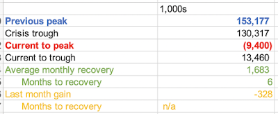
In December 202, employment growth stalled. In fact, non-farm payrolls fell 328,000 in the last month of 2020 to 143,777,000, or 9,400,000 below pre-pandemic peak. December was the first month of declines in employment since April 2020, but employment growth was relatively slow already in November when the U.S. economy added 603,000 jobs, the slowest pace of recovery after July for the entire period of recovery of May-November 2020.

This evidence further reinforces the argument that labor markets conditions in the U.S. remain abysmal, prompting American workers to slip out of the labor force. 

4/2/21: U.S. Labor Markets: America's Scariest Charts, Part 2

In the previous post, I covered the first set of data - Continued Unemployment Claims (https://trueeconomics.blogspot.com/2021/02/4221-us-labor-markets-americas-scariest.html) - that highlights the plight of American economy in the current crisis. Now, let's take a look at Labor Force Participation rate and Employment to Population ratio:


The chart and the table above highlight continued serious problems in the structure of the U.S. labor markets. While official continued unemployment claims are inching back toward some sort of a 'norm', much of so-called improvement in unemployment dynamics is actually accounted for by the dire state of labor force participation which is still trending below anything one might consider reasonable. Current labor force participation rate is 61.5 which is well below anything seen before the onset of the pandemic in March 2020. By a mile below. And in terms of historical perspectives, we have no modern recession (from 1980 onwards) that matches these lows of labor force participation. Structurally, this means that instead of gaining jobs, the unemployed simply roll off the cliff of unemployment assistance and drop out of the labor force, discouraged by the lack of meaningful decent jobs in the market. 

Employment to population ratio is a little better, but it is still stuck below pre-pandemic levels and is low compared to prior recessions' troughs. 

The conditions in the U.S. labor markets might be improving somewhat off the pandemic lows, but the situation overall remains dire. 


4/2/21: U.S. Labor Markets: America's Scariest Charts, Part 1


Updating my series of America's Scariest Charts, here is the latest reported data (through the week of January 23rd) on continued unemployment claims:


In absolute terms, official continued unemployment claims stood at 4,592,000 during the week of January 23, 2021, 193,000 down on week prior and 935,000 down on the month prior. The four weeks-average rate of decline in continued claims is at 120,000 per week, an improvement on 4-weeks average of 103,250 weekly rate of decline a week ago, but worse than 177,250 average rate of decline recorded a month ago.

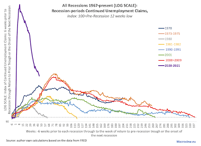
Mapping the same series in comparison to other recessions:


The log scale ameliorates, visually, the extreme nature of unemployment dynamics during the current recession, which is now into its 46th week running. Compared to all prior recessionary episodes, current week 46 reading is still the worst of all post-WW2 recessions. 

Some recent research (reviewed here: https://trueeconomics.blogspot.com/2021/02/3221-cost-of-trumps-failures-to-act-on.html) suggests that U.S. policy errors in dealing with pandemic could have increased infection rates by 8.7-14.2 percent. Translating these potential effects into unemployment suggests that more robust public policy interventions at the Federal level could have, potentially, reduced current unemployment rolls by some 425,000-693,000.


Wednesday, February 3, 2021

3/2/21: The Cost of Trump's Failures to Act on Covid19: Case of Housing Market Interventions


COVID-19 pandemic has been associated with a range of deep and dramatic policy interventions, including rolling lockdowns, monetary and fiscal policies interventions, wide ranges of subsidies and supports, but also measures relating to addressing the risk to households and companies arising from the pre-pandemic financial commitments. 

One of the most, potentially, impactful measures has been adoption of a range of policy interventions that aimed to reduce the impact of income shocks on housing availability. In addition to targeting reduction of financial burden of the pandemic shocks on households, the measures also targeted the objective of lowering the risk of spread of the disease via promotion of housing stability.

A recent paper, by Jowers, Kay and Timmins, Christopher D. and Bhavsar, Nrupen and Hu, Qihui and Marshall, Julia, titled "Housing Precarity & the Covid-19 Pandemic: Impacts of Utility Disconnection and Eviction Moratoria on Infections and Deaths Across US Counties" (January 2021, NBER Working Paper No. w28394: https://ssrn.com/abstract=3772641) looked into the effectiveness of housing markets interventions in the latter context. 

Per authors, "housing precarity, which includes both the risk of eviction and utility disconnections or shut-offs, reduces a person’s ability to abide by social distancing orders and comply with hygiene recommendations."

The authors found that 

  1. "...policies that limit evictions are found to reduce COVID-19 infections by 3.8% and reduce deaths by 11%.
  2. "Moratoria on utility disconnections reduce COVID-19 infections by 4.4% and mortality rates by 7.4%."
"Had such policies been in place across all counties (i.e., adopted as federal policy) from early March 2020 through the end of November 2020, ... policies that limit evictions could have reduced COVID-19 infections by 14.2% and deaths by 40.7%. (emphasis is mine) [While], for moratoria on utility disconnections, COVID-19 infections rates could have been reduced by 8.7% and deaths by 14.8%."

These are genuinely huge numbers. Assuming the effects are non-additive, the lower end estimate of human losses to Covid19 pandemic due to the Trump Administration's failure to act coherently and resolutely in imposing similar policies to support households' tenancy in rental and mortgages markets across the U.S. is in the range of > 40 percent. If the effects are additive, the magnitude of the preventable deaths rises to well over 50 percent.


3/2/21: EU-US Trade Policies Dynamics


Evolutionary dynamics of the U.S.-EU trade policy changes via S&P Global:


3/2/21: Monetary Easing and Stock Market Valuation

There has been quite a puzzling development in recent years in the monetary policy universe. A decade plus of ultra low interest rates has been associated with rising, not falling, risk premium in investment markets. In other words, a dramatically lower cost of new and carried debt induced by lower interest rates - a driver for lower risk, is being offset by something else. What?

Laine, Olli-Matti paper "Monetary Policy and Stock Market Valuation" (September 18, 2020, Bank of Finland Research Discussion Paper No. 16/2020: https://ssrn.com/abstract=3764721) tries to explain. 

To start with, some theory - especially for my students in the Investment and Financial Systems courses. Per author, "the value of a stock is the present value of its expected future dividends... Hence, the changes in stock prices must be explained by 

  • either changes in dividend expectations or 
  • changes in discount rates. 

The discount rate, or (approximately) expected rate of return, can be thought as a sum of a risk-free rate and a risk premium. Theoretically, monetary policy should have an effect on stock prices through the risk-free rates. In addition, monetary policy should affect dividend expectations, for example, through the output or debt interest payments of firms. The effect on the risk premium (not to mention the term structure of risk premia), however, is less clear."

Looking at Eurostoxx50 index components, Laine shows "...that the average expected premium has increased considerably since the global financial crisis. This change is explained by the change in long-horizon expected premia. ... monetary policy easing has had a positive impact on the expected average premium."

Specifically (emphasis added): "a negative shock to the shadow rate is estimated to increase average expected premium persistently. Instead, the results show that monetary policy easing temporarily decreases short-term expected [risk] premia. This means that expansionary monetary policy steepens the slope of the term structure of risk premia."

This is not exactly new, as Bernanke and Kuttner (2005) observed that "expansionary monetary policy generates an immediate rise in equity prices followed by a period of lower-than-normal excess returns. ...However, Bernanke and Kuttner (2005) do not study the effect on the long-run excess returns. My results show that effect on long-horizon expected premia has a different sign. This effect on long-horizon premia seems to more than offset the effect on short-horizon premia."

Interestingly, "Contractionary monetary policy increases the short-term premia temporarily, but decreases long-horizon premia persistently. The effect on average expected premium is negative. Thus, monetary policy tightening actually makes stocks expensive relative to the expected stream of dividends. The results provide no evidence that expansionary monetary policy causes stock market bubbles..."

Here is (annotated by me) a chart showing evolution of implied and actual risk premia:


From theory perspective, therefore, monetary policy "can affect equity prices through the dividend expectations, expected risk-free rates or expected premia":
  • "The effect of expansionary monetary policy on the dividend expectations is probably positive, because expansionary monetary policy can be expected to increase output and firms’ earnings.
  • "Expansionary policy probably lowers the risk-free rates, but it is also possible that the effect is totally different. Central bank’s rate cut can increase risk-free rates, if people think that the rate cut eventually increases inflation. 
  • "As for the expected premium, the sign of the effect is unclear. ... Gust and López-Salido (2014) show theoretically that expansionary monetary policy lowers the premium ... where asset and goods markets are segmented. When it comes to quantitative easing, ... investors who have sold their assets to the central bank rebalance their portfolios into riskier assets, which lowers their expected returns. ... Theoretically, it is also possible to argue that monetary policy easing actually increases the expected premium. If one assumes that there exists mispricing like Galí (2014) and Galí and Gambetti (2015), then the sign of the response is ambiguous. ... This means that monetary policy easing increases the expected premium implied by dividend discount model (see Galí and Gambetti, 2015, p. 250-252)."

So, onto the empirical results by Laine: 

  1. "Interest rates have declined considerably since the global financial crisis, yet the expected average stock market return has remained quite stable at around 9 percent. This implies that expected average stock market premium has increased remarkably. This rise is mainly explained by the premia over a discounting horizon of four years.
  2. "These results may seem unintuitive as the prices of stocks have risen, and ratios like price-to-earnings have been historically high. However, high price-to-earnings ratios do not necessarily mean that stocks are expensive, because the value of a stock is the present value of its expected future dividends.
  3. "When it comes to the role of monetary policy, the results show that monetary policy easing decreases short-horizon required premia, but increases longer-horizon premia
  4. "The effect on expected average premium is positive, i.e. expansionary monetary policy lowers the prices of stocks in relation to the expected dividend stream."


2/2/21: Daylight Saving Time and Carbon Emissions


We usually associate reduction of carbon emissions with reduced consumption, as opposed to variation in timing of consumption, but this association is both too simplistic and also erroneous. Here is why: shifting more consumption activities toward periods of the day when energy generation mix is cleaner (e.g. daylight, when solar can be contributing more to the energy mix) can, quite literally, reduce overall emissions.

Right? Yep. Here is a nice piece of evidence from a natural experiment in Turkey. "In October 2016, Turkey chose to stay on DST all year round." This shifted a lot more consumption by the public from late afternoons to early mornings. As reported in Bircan, Cagatay and Wirsching, Elisa study "Daylight Saving All Year Round? Evidence from a National Experiment" (December, 2020, EBRD Working Paper No. 251, https://ssrn.com/abstract=3751336), overall levels of consumption did not change much, but "the policy has a strong intra-day distributional effect, increasing consumption in the early morning and reducing it in the late afternoon. This change in the load shape reduced generation by dirtier fossil fuel plants and increased it by cleaner renewable sources that can more easily satisfy peak load generation. Emissions from generation decreased as a result." 

Overall, the authors "find that staying on DST during winter months may have led to a reduction in CO2 emissions of between 1,500 and 8,200 tons per day. Hence, the policy change has an unforeseen but beneficial effect of reducing greenhouse gas (GHG) emissions, as generation by “cleaner” power plants substitutes generation from “dirtier” ones to satisfy changes in intra-day demand."

Incidentally, the study does not appear to have considered the effects of solar in their study that should have increased the CO2 abatement effects. It is unclear to me as to why...

2/2/21: The Disaster of Investing via Smartphones?

Some stuff I've been reading that (sometimes) falls into current newsflow: 

Kalda, Ankit and Loos, Benjamin and Previtero, Alessandro and Hackethal, Andreas paper, titled "Smart(Phone) Investing? A within Investor-Time Analysis of New Technologies and Trading Behavior"from January 2021 (NBER Working Paper No. w28363, https://ssrn.com/abstract=3772602) :

The authors tackle an interesting issue relating to the automated and low cost investing platforms (proliferating in this age of fintech). Per authors (emphasis is mine, throughout): "Technology has dramatically changed how retail investors trade, from placing orders using direct dial-up connections in the 1980s or Internet-based trading in the 1990s to the more recent rise of robo-advisers. With few exceptions, the introduction of these new technologies is generally associated with a decline in investor portfolio efficiency." In addition, "whether good or bad for investors, it is accepted that new technologies influence investor behavior". 

In this unique study, the authors used data that comes "from two large German retail banks that have introduced trading applications for mobile devices. For over 15,000 bank clients that have used these mobile apps in the years 2010-2017, we can observe all holdings and transactions, and, more important, the specific platform used for each trade (e.g., personal computer vs. smartphone). [As the result of having such a granular data over time] we can conduct all our main tests comparing trades done by the same investor in the same month across different platforms."

The authors present four sets of results:

  1. "First, we study if the use of smartphones induces differences in the riskiness of trades. Comparing trades by the same investor in the same year-month, we find that the probability of purchasing risky assets increases in smartphone trades compared to non-smartphone ones
    • "smartphone trades involve assets with higher volatility and more positive skewness. [Thus], smartphones increase the probability of buying lottery-type stocks by 67% of the unconditional mean for smartphone users."
  2. "Second, we examine the effects of smartphones on the tendency to chase past returns. We find that smartphones increase the probability of buying assets in the top decile of the past performance distribution. Smartphones increase the probability of buying assets in the top 10 percent of past performance by 12.0 percentage points (or 70.6% of the unconditional mean)." In other words, smartphones trades involve severe and pervasive biases in investor decision making.
  3. "Third, we investigate if investors selectively use smartphone to execute their risky, lottery-type, and trend-chasing trades. In this scenario, investors could simply substitute their trades from one device to another, without any real consequences for their overall portfolio efficiency. ....We find that, following the launch of smartphone apps, investors are—if anything—more likely to purchase risky and lottery-type assets and to chase hot investments also on non-smartphone platforms. ...this evidence potentially suggests that investors are learning to become overall more biased after their initial use of smartphones to trade."
  4. "...smartphone effects are stronger during after-hours (i.e. following exchange closure). Institutional differences between trading on official exchanges and in after-hours markets do not drive this heterogeneity. Given that individuals are more likely to rely on the more intuitive system [System 1-type] later in the day (Kahneman,2011), stronger effects during after-hours are consistent with smartphones facilitating trades based more on [intuitive] system thinking."

As an interesting aside, it is worth noting that the above results have nothing to do with the demographic biases or the potential lack of trading experience by smartphone-using investors. As noted by the authors: "German investors that adopt smartphone trading are, on average, 45 years old with nine years of experience investing with the banks."

Another aside is that authors also tested if the adverse effects of smartphones-based trading can be attributed to the first / early usage of these devices. It turns out not: "The effects of smartphones are stable from the first quarter of usage up to quarter nine or afterwards. The effects on volatility and skewness of trades, and probability of purchasing past winners are also stable over time."

To conclude: "Collectively, our evidence suggests that investors make more intuitive (system 1-type) decisions while using smartphones. This tendency leads to increased risk-taking, gambling-like activity, and more trend chasing. Previous studies have linked these trading behaviors to lower portfolio efficiency and performance. Therefore, the convenience of smartphone trading might come at a cost for many retail investors."

Ouch! Then again, this is fitting well with what we are observing happening in the markets these days: amplified herding, trend chasing, lottery-like speculative swings in investment capital flows, recency effects of overbidding for previously outperforming stocks and so on. 


Monday, February 1, 2021

1/2/21: The Unbearable Lightness of Winning?

My recent article for The Currency on some tight corners to be navigated by the Biden-Harris Administration as the Democrats grapple with controlling the two branches of the State: https://thecurrency.news/articles/33887/biden-harris-and-the-unbearable-lightness-of-winning/