Sunday, February 14, 2021

14/2/21: COVID19 Update: Europe and EU27

 Summary table from the previous post covering worldwide trends (https://trueeconomics.blogspot.com/2021/02/14221-covid19-update-worldwide-data.html) puts Europe and EU 27 in the context of global trends:


The chart next shows weekly data dynamics for new cases for EU27 and Europe:


Both Europe and EU27 have experienced two waves of the pandemic, with the second wave characterized by two key features:
  1. Long and slow decline in the new cases counts, lasting from the peak of the wave around Week 45 of 2020; and 
  2. Re-acceleration in the wave into another local peak at Week 1 of 2021. 
The quick reversals of decline trend around Weeks 51-53 of 2020 is a worrying sign that improvements in overall pandemic trends are fragile.


The fragility of the trend in terms of improvements are even more evident in the numbers of new weekly deaths. Both Europe and EU27 are yet to confirm the peaking of the second wave of the pandemic in terms of weekly new deaths. Nominally, the peaks of the most recent wave in Week 49 of 2020 in the EU27 and Week 3 of 2021 in Europe have not, yet, been followed by accelerating or deepening declines in the deaths counts.

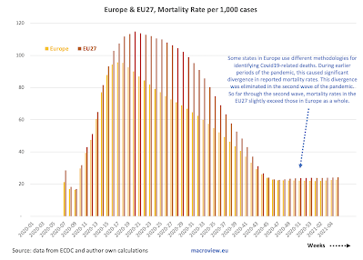
One clear positive trend remains in terms of mortality rates per case:


The caveat to the above is a slight uplift in mortality around Week 51 of 2020 as shown in the above.

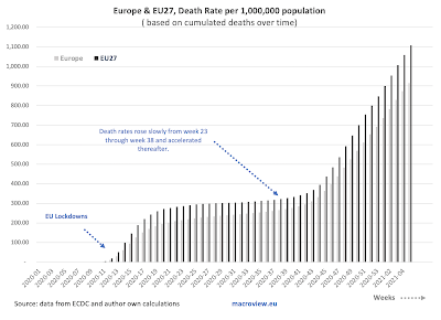
Cumulated deaths per capita are exhibiting a slight slowdown over time (slope) but are still increasing at a rate massively in excess of what was witnessed during the period of Week 19-43 of 2020. In other words, we are not yet out of the woods, even compared to the pandemic dynamics of the Summer 2020.

As with global figures, it is too early to say anything about vaccinations effects on general trends.


14/2/21: COVID19 Update: Worldwide Data

 Worldwide trends for COVID19 pandemic in terms of cases and deaths:


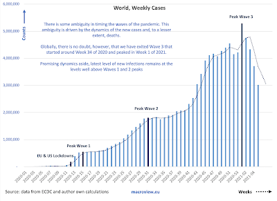
There is some ambiguity in timing the waves of the pandemic. This ambiguity is driven by the dynamics of the new cases and, to a lesser extent, deaths. Globally, we have exited Wave 3 that started around Week 34 of 2020 and peaked in Week 1 of 2021. Promising dynamics aside, latest level of new infections remains at the levels well above Waves 1 and 2 peaks.


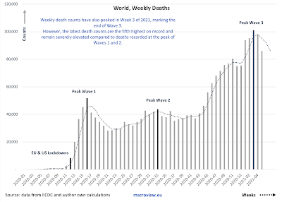
Weekly death counts have also peaked in Week 3 of 2021, marking the end of Wave 3. However, the latest death counts are the fifth highest on record and remain severely elevated compared to deaths recorded at the peak of Waves 1 and 2.


Recent decreases in mortality rate are most likely attributable to three key drivers: (1) earlier detection of cases due to improved testing; (2) younger demographics of those with confirmed infections; and (3) improved treatments in the earlier stages of the disease. The decrease in mortality appears to have stabilized and is slightly reversing in the first 5 weeks of 2021. This is the most worrying aspect of the three trends discussed above.

Here is a summary table, with green cells showing improvements and red cells showing deterioration in dynamics:


Last week's deaths have shown an improvement on 4 weeks average in all regions world-wide, and this has been consistent across all (excluding Asia) regions also in terms of new cases 4 weeks average compared to prior 4 weeks average. Deaths, however, are still up on the 4weeks average relative to prior 4 weeks average basis in most regions, with exception of two.

For now, it is hard to attribute the above improvements to vaccinations (long term solutions) and the improved dynamics are probably more consistent with a natural flow of the pandemic wave, reflecting tightening of restrictions on social activities in virtually all major geographies following the holidays season. This, along with the rapidly growing prevalence of the new, more infective, strands of the virus suggests that the gains made in recent weeks are at a risk of reversals. 


Sunday, February 7, 2021

6/2/21: Longer Trends in Economic Uncertainty


Quite dramatic trends in terms of rising economic uncertainty over the last 21 years:


And, not surprisingly, the rise of uncertainty in Europe, the U.S., and globally pre-dates the Covid19 pandemic. In fact, Europe has been experiencing dramatically elevated uncertainty levels since the start of the Euro area crisis, while the U.S. saw a virtually exponential rise in uncertainty from 2017 on. Global measures of uncertainty have been running high through 2016 and rose dramatically thereafter. 

While amelioration in the Covid19 pandemic dynamics is likely to lower the levels and the volatility of the uncertainty in global economic systems, it is highly unlikely to return us to the pre-Global Financial Crisis state of affairs.

Friday, February 5, 2021

4/2/21: The Impact of the Business Closures on Covid-19 Infection Rates

 In a recent post, I covered the impact of the failure at the Federal level to implement more robust measures on rents and tenure security for households (see: https://trueeconomics.blogspot.com/2021/02/3221-cost-of-trumps-failures-to-act-on.html). Another interesting aspect of the U.S. experience during the pandemic relates to the policies concerning the closure of essential vs non-essential businesses. A recent (January 2021) study by Song, Hummy and McKenna, Ryan and Chen, Angela T. and David, Guy and Smith-McLallen, Aaron, titled: "The Impact of the Non-Essential Business Closure Policy on Covid-19 Infection Rates" (NBER Working Paper No. w28374: https://ssrn.com/abstract=3772613) looked at the implications of this specific policy response to the Covid-19 pandemic.

Per authors, durig the pandemic, "many localities instituted non-essential business closure orders, keeping individuals categorized as essential workers at the frontlines while sending their non-essential counterparts home". The authors examined "the extent to which being designated as an essential or non-essential worker impacts one’s risk of being Covid-positive following the non-essential business closure order". The study used data for the State of Pennsylvania, accounting for the intra-household transmission risk experienced by the workers' cohabiting family members and roommates. 

The study estimated that:

  • "... workers designated as essential have a 55% higher likelihood of being positive for Covid-19 than those classified as non-essential; in other words, non-essential workers experience a protective effect. 
  • "While members of the health care and social assistance sub-sector contribute significantly to this overall effect, it is not completely driven by them. 
  • "We also find evidence of intra-household transmission that differs in intensity by essential status. Dependents cohabiting with an essential worker have a 17% higher likelihood of being Covid-positive compared to those cohabiting with a non-essential worker. Roommates cohabiting with an essential worker experience a 38% increase in likelihood of being Covid-positive. 
  • Overall, "analysis of households with a Covid-positive member suggests that intrahousehold transmission is an important mechanism."
In summary: "Our findings suggest that essential workers and their cohabitants (whether dependents or other primary policyholders sharing the same address) are at substantially higher risk of being positive for Covid-19 than are non-essential workers and their cohabitants. Conversely, non-essential workers and their cohabitants experience a protective effect against the risk of Covid-19 infection as a result of the nonessential business closure policy." 

And the kicker: "the designation of some workers as essential and others as non-essential during the pandemic has increased the health risk profile of some jobs while reducing it for others, all while other underlying aspects of these jobs (e.g., monetary compensation) remain minimally affected." In other words, the essential workers carry risk without carrying associated risk premium in their compensation (monetary or non-monetary).

Thursday, February 4, 2021

4/2/21: U.S. Labor Markets: America's Scariest Charts, Part 6

 Having covered some core stats relating to the U.S. labor markets in previous 5 posts:

  1. Continued Unemployment Claims (https://trueeconomics.blogspot.com/2021/02/4221-us-labor-markets-americas-scariest.html);
  2. Labor force participation rate and Employment-to-Population ratio (https://trueeconomics.blogspot.com/2021/02/4221-us-labor-markets-americas-scariest_4.html); 
  3. Non-farms payrolls (https://trueeconomics.blogspot.com/2021/02/4221-us-labor-markets-americas-scariest_16.html); 
  4. New (initial) unemployment claims data through January 30, 2021 (https://trueeconomics.blogspot.com/2021/02/4221-us-labor-markets-americas-scariest_57.html); and
  5. Average duration of unemployment (https://trueeconomics.blogspot.com/2021/02/4221-us-labor-markets-americas-scariest_41.html),
in this last post, we will focus on the overall employment index for the current recessionary cycle:


Currently, into month 10 data of the recession (December 2020), and employment index is reading close to the conditions in the recession of 1945, but better than the recession of 1953. We are still trending worse than any recession in modern period (post-Gold Standard), and that is quite an achievement (in negative terms). Dynamically, improvements in employment conditions have been flattening out from month 5 of the recession through month 8 and index improvements have slowed down to almost nil in months 9 and 10. Unless there is a significant reversal in this trend, by the end of 2021 we are likely to be around the same labor markets conditions as at the same time during the Great Recession. 

4/2/21: U.S. Labor Markets: America's Scariest Charts, Part 5

 The first four posts on the state of the U.S. labor markets have covered:

  1. Continued Unemployment Claims (https://trueeconomics.blogspot.com/2021/02/4221-us-labor-markets-americas-scariest.html);
  2. Labor force participation rate and Employment-to-Population ratio (https://trueeconomics.blogspot.com/2021/02/4221-us-labor-markets-americas-scariest_4.html); 
  3. Non-farms payrolls (https://trueeconomics.blogspot.com/2021/02/4221-us-labor-markets-americas-scariest_16.html); and
  4. New (initial) unemployment claims data through January 30, 2021 (https://trueeconomics.blogspot.com/2021/02/4221-us-labor-markets-americas-scariest_57.html)
In this post, let's take a look at the latest data on average duration of unemployment through December 2020:


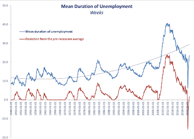
As the chart above clearly shows, current average duration of unemployment spell is already higher than the peak of any prior recession other than the Great Recession. However, the duration remains relatively benign when we control for the business cycle (red line and the chart next).


Dynamically, it is hard to imagine average duration of unemployment to be staying around its current levels. Something to watch in months to come as an indicator of the direction of structural (as opposed to cyclical) unemployment. 


4/2/21: U.S. Labor Markets: America's Scariest Charts, Part 4

 The first three posts on the state of the U.S. labor markets have covered:

  1. Continued Unemployment Claims (https://trueeconomics.blogspot.com/2021/02/4221-us-labor-markets-americas-scariest.html);
  2. Labor force participation rate and Employment-to-Population ratio (https://trueeconomics.blogspot.com/2021/02/4221-us-labor-markets-americas-scariest_4.html); and
  3. Non-farms payrolls (https://trueeconomics.blogspot.com/2021/02/4221-us-labor-markets-americas-scariest_16.html)
In this post, let's take a look at new unemployment claims data through the week of January 30, 2021:


The data confirms the worrying trends cited in reference to continued unemployment claims. In the last week of January 2021, based on preliminary estimates published today, initial unemployment claims stood at 816,247 - a decline of just 23,525 on prior week reading. The 4-weeks cumulative initial unemployment claims are at 3,744,581, which only 103.433 down on prior 4 weeks period. Net, over the last 5 weeks, the reduction in initial unemployment claims stands at a miserly 19,725. 

Despite little media coverage, the U.S. labor markets remain stricken by the pandemic effects on economic activity. If we strip out data for the pandemic period-to-date, the latest weekly reading for initial unemployment claim ranks as the 10th highest in the history of the series. 


4/2/21: U.S. Labor Markets: America's Scariest Charts, Part 3

 In two prior posts, I covered two of America's Scariest Charts:

  1. Continued Unemployment Claims (https://trueeconomics.blogspot.com/2021/02/4221-us-labor-markets-americas-scariest.html) and 
  2. Labor force participation rate and Employment-to-Population ratio (https://trueeconomics.blogspot.com/2021/02/4221-us-labor-markets-americas-scariest_4.html)
Here, let's take a look at non-farm payrolls that measure employment levels in the economy.


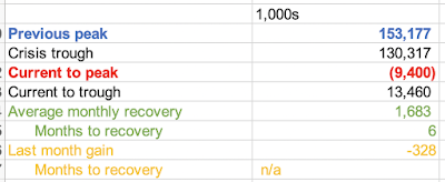
In December 202, employment growth stalled. In fact, non-farm payrolls fell 328,000 in the last month of 2020 to 143,777,000, or 9,400,000 below pre-pandemic peak. December was the first month of declines in employment since April 2020, but employment growth was relatively slow already in November when the U.S. economy added 603,000 jobs, the slowest pace of recovery after July for the entire period of recovery of May-November 2020.

This evidence further reinforces the argument that labor markets conditions in the U.S. remain abysmal, prompting American workers to slip out of the labor force. 

4/2/21: U.S. Labor Markets: America's Scariest Charts, Part 2

In the previous post, I covered the first set of data - Continued Unemployment Claims (https://trueeconomics.blogspot.com/2021/02/4221-us-labor-markets-americas-scariest.html) - that highlights the plight of American economy in the current crisis. Now, let's take a look at Labor Force Participation rate and Employment to Population ratio:


The chart and the table above highlight continued serious problems in the structure of the U.S. labor markets. While official continued unemployment claims are inching back toward some sort of a 'norm', much of so-called improvement in unemployment dynamics is actually accounted for by the dire state of labor force participation which is still trending below anything one might consider reasonable. Current labor force participation rate is 61.5 which is well below anything seen before the onset of the pandemic in March 2020. By a mile below. And in terms of historical perspectives, we have no modern recession (from 1980 onwards) that matches these lows of labor force participation. Structurally, this means that instead of gaining jobs, the unemployed simply roll off the cliff of unemployment assistance and drop out of the labor force, discouraged by the lack of meaningful decent jobs in the market. 

Employment to population ratio is a little better, but it is still stuck below pre-pandemic levels and is low compared to prior recessions' troughs. 

The conditions in the U.S. labor markets might be improving somewhat off the pandemic lows, but the situation overall remains dire. 


4/2/21: U.S. Labor Markets: America's Scariest Charts, Part 1


Updating my series of America's Scariest Charts, here is the latest reported data (through the week of January 23rd) on continued unemployment claims:


In absolute terms, official continued unemployment claims stood at 4,592,000 during the week of January 23, 2021, 193,000 down on week prior and 935,000 down on the month prior. The four weeks-average rate of decline in continued claims is at 120,000 per week, an improvement on 4-weeks average of 103,250 weekly rate of decline a week ago, but worse than 177,250 average rate of decline recorded a month ago.

Mapping the same series in comparison to other recessions:


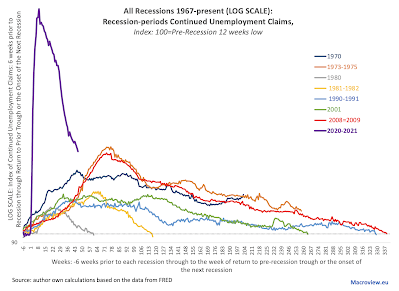
The log scale ameliorates, visually, the extreme nature of unemployment dynamics during the current recession, which is now into its 46th week running. Compared to all prior recessionary episodes, current week 46 reading is still the worst of all post-WW2 recessions. 

Some recent research (reviewed here: https://trueeconomics.blogspot.com/2021/02/3221-cost-of-trumps-failures-to-act-on.html) suggests that U.S. policy errors in dealing with pandemic could have increased infection rates by 8.7-14.2 percent. Translating these potential effects into unemployment suggests that more robust public policy interventions at the Federal level could have, potentially, reduced current unemployment rolls by some 425,000-693,000.


Wednesday, February 3, 2021

3/2/21: The Cost of Trump's Failures to Act on Covid19: Case of Housing Market Interventions


COVID-19 pandemic has been associated with a range of deep and dramatic policy interventions, including rolling lockdowns, monetary and fiscal policies interventions, wide ranges of subsidies and supports, but also measures relating to addressing the risk to households and companies arising from the pre-pandemic financial commitments. 

One of the most, potentially, impactful measures has been adoption of a range of policy interventions that aimed to reduce the impact of income shocks on housing availability. In addition to targeting reduction of financial burden of the pandemic shocks on households, the measures also targeted the objective of lowering the risk of spread of the disease via promotion of housing stability.

A recent paper, by Jowers, Kay and Timmins, Christopher D. and Bhavsar, Nrupen and Hu, Qihui and Marshall, Julia, titled "Housing Precarity & the Covid-19 Pandemic: Impacts of Utility Disconnection and Eviction Moratoria on Infections and Deaths Across US Counties" (January 2021, NBER Working Paper No. w28394: https://ssrn.com/abstract=3772641) looked into the effectiveness of housing markets interventions in the latter context. 

Per authors, "housing precarity, which includes both the risk of eviction and utility disconnections or shut-offs, reduces a person’s ability to abide by social distancing orders and comply with hygiene recommendations."

The authors found that 

  1. "...policies that limit evictions are found to reduce COVID-19 infections by 3.8% and reduce deaths by 11%.
  2. "Moratoria on utility disconnections reduce COVID-19 infections by 4.4% and mortality rates by 7.4%."
"Had such policies been in place across all counties (i.e., adopted as federal policy) from early March 2020 through the end of November 2020, ... policies that limit evictions could have reduced COVID-19 infections by 14.2% and deaths by 40.7%. (emphasis is mine) [While], for moratoria on utility disconnections, COVID-19 infections rates could have been reduced by 8.7% and deaths by 14.8%."

These are genuinely huge numbers. Assuming the effects are non-additive, the lower end estimate of human losses to Covid19 pandemic due to the Trump Administration's failure to act coherently and resolutely in imposing similar policies to support households' tenancy in rental and mortgages markets across the U.S. is in the range of > 40 percent. If the effects are additive, the magnitude of the preventable deaths rises to well over 50 percent.


3/2/21: EU-US Trade Policies Dynamics


Evolutionary dynamics of the U.S.-EU trade policy changes via S&P Global: