Saturday, June 20, 2020

20/6/20: World COVID Data Update: The Theory of Back to Normal


Relaxation of the Covid19 pandemic restrictions is gaining momentum worldwide, with clusters of renewed concerns over the 'second peak' or 'second wave' dynamics. The problem is that global pandemic numbers remain extremely worrying:

Total new cases are hitting all-time highs:


The orange box represents, roughly, the range of earlier data that triggered the lockdowns. It is clear that worldwide numbers are sustainably above that range. The 7-day running average is horrific and trending up at an accelerating rate. The slope of the current 7-day moving average is now similar to what we observed in the peak period of contagion in Europe.

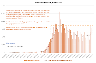
Total daily deaths are also on the rise, once again:


Once again, the orange box related current deaths to the European lockdowns initiation deaths. The 7-day moving average is on the rise, once again.

Yes, on per-capita basis, the pandemic has moderated, primarily due to different geographies of concentration of new cases and new deaths. However, European lockdowns periods coincided with more robust testing in Europe and in advanced economies in Asia, while current period of globally spiking cases and rising deaths is coincident with less robust public health systems in less developed countries, implying that current numbers are most likely coming from much larger underestimates of actual cases and deaths.

Friday, June 19, 2020

19/6/20: Fox News, COVID19 Social Distancing and COVIDIOTS?


How influential is the U.S. mainstream media in defining public attitudes toward pandemic risk, decision-making under severe uncertainty and risks to their own health? It turns out - hugely influential.

A new paper from a group of U.S. economists, titled "The Persuasive Effect of Fox News: Non-Compliance with Social Distancing During the Covid-19 Pandemic" (authored by Andrey Simonov, Szymon Sacher, Jean-Pierre Dube, and Shirsho Biswas, May 17, 2020 https://bfi.uchicago.edu/wp-content/uploads/BFI_WP_202067.pdf) finds that:

  • "The average partial effect of Fox News viewership in a zipcode implies that 1 percentage point increase in cable viewership reduces the propensity to stay at home by 8.9 percentage points compared to the pre-pandemic average." 
  • "A persuasion rate of Fox News on noncompliance with stay-at-home behavior during the crisis of about 33.5% − 50% across our various social distancing metrics."
  • Simple regression (OLS) analysis o"generate a positive and statistically significant effect of Fox News viewership from early March onwards."
  • More robust, IV estimates. "are considerably larger and indicate a take-off in the Fox News effect in early March and a stabilization in mid March, almost immediately after the declaration of a national emergency."
  • "Since the supply-side measures, such as business closures, start to happen only two weeks later after the take-off of Fox News effects, the magnitudes of the viewership effects reflect the persuasive effect of Fox News on viewers and not a feedback effect from the equilibrium response of firms, at least early on."
  • "Our findings for CNN are inconclusive, with imprecise point estimates centered near zero."

Thursday, June 18, 2020

18/6/20: Cheap Institutional Money: It's Supply Thingy


In a recent post, I covered the difference between M1 and MZM money supply, which effectively links money available to households and institutional investors for investment purposes, including households deposits that are available for investment by the banks (https://trueeconomics.blogspot.com/2020/06/what-do-money-supply-changes-tell-us.html). Here, consider money instruments issuance to institutional investors alone:

Effectively, over the last 12 years, U.S. Federal reserve has pumped in some USD 2.6 trillion of cash into the financial asset markets in the U.S. These are institutional investors' money over and above direct asset price supports via Fed assets purchasing programs, indirect asset price supports via Fed's interest rates policies and QE measures aimed at suppression of government bond yields (https://trueeconomics.blogspot.com/2020/05/21520-how-pitchforks-see-greatest.html). 

Any wonder we are in a market that is no longer making any sense, set against the economic fundamentals, where free money is available for speculative trading risk-free (https://trueeconomics.blogspot.com/2020/06/8620-30-years-of-financial-markets.html)?

18/6/20: America's Scariest Charts Updated


Weekly data for initial unemployment claims for the week ending June 13, 2020 is out, so here are the updated 'America's Scariest Charts':

Index of employment, benchmarked to the pre-recession peak employment:


Estimated total non-farm payrolls:


And initial unemployment claims, half-year running sum:


Today's initial unemployment claims came in at 1,561,267 for the week ending June 6, 2020 (final estimate), slightly up on previous preliminary estimate. For the week ending June 13, 2020, non-seasonally adjusted initial unemployment claims came in at a preliminary estimate of 1,433,027.

A summary table to put these numbers into historical comparative:


Some recent context on the latest official employment numbers from earlier this month is provided here: https://trueeconomics.blogspot.com/2020/06/11620-americas-scariest-charts-updated.html.

Sunday, June 14, 2020

13/6/20: Gold Coins Sales are Up, and the Markets are Screaming Something New


Some interesting movements in demand for gold coins in recent months, worth watching:


Price is up, and volume of sales is quite volatile. Still, sales are hitting highs.

  • Following weaker y/y January and February, March 2020 sales rose almost x10 y/y in volume and average coin sold size rose from 0.5 oz in March 2019 to 0.674 oz in March 2020. 
  • April 2020 sales were x3.25 times sales in April 2019 by volume, with average coin size rising to 1.0 oz. May saw a major fall-off in demand m/m but still posted sales x2.26 time those of May 2019, with average coin sold size down to 0.538 oz per coin. 
  • Through June 13, June monthly sales are already x2.75 times higher than sales for the entire month of June 2019, with average coin size sold so far this June running at 0.985 oz per coin, against 0.625 oz per coin in June 2019. 
It seems investors still showing little signs of moderating safe haven demand for gold, despite robust performance in the financial markets until this week profit-taking blowout. 

Gold can be seen as both a hedge and safe haven against a range of key financial and political risks, but it can also be viewed as a long-run wealth storage tool, and, given its liquid nature, as a precautionary savings instrument for tail risks. If the current demand remains robust in the face of rising gold prices, we are likely witnessing a risk-return relationship/expectations shift amongst the savers and investors, away from considering trend-driven investment strategy of thee recent years and in favour of investing against a major concern for significant tail risks driving the markets in months and years ahead.

Saturday, June 13, 2020

13/6/2020: What Do Money Supply Numbers Tell Us About Social Economics?


What do money supply changes tell us about social economics? A lot. Take two key measures of U.S. money supply:

  • M1, which includes funds that are readily accessible for spending, primarily by households and non-financial companies, such as currency outside the U.S. Treasury, Federal Reserve Banks, and the vaults of depository institutions; traveler's checks; demand deposits; and other checkable deposits. 

  • MZM, which is M2 less small-denomination time deposits plus institutional money funds, or in more simple terms, institutional money and funds available for investment and financial trading.
Here we go, folks:


Does this help explain why Trumpism is not an idiosyncratic phenomena? It does. But it also helps explain why the waves of social unrest and protests are also not idiosyncratic phenomena. More interesting is that this helps to explain why both of these phenomena are tightly linked to each other: one and the other are both co-caused by the same drivers. If you spend a good part of 20 years pumping money into the Wall Street while largely ignoring the Main Street, pitchforks will come out. 

The *will* bit in the sentence above is now here.

12/6/20: American Love Affair with Debt: Part 2: Leverage Risk


I have earlier updated the data on the total real private economic debt in the U.S. as of the end of 1Q 2020 here: https://trueeconomics.blogspot.com/2020/06/12620-american-love-affair-with-debt.html

So, just how much is the U.S. economic growth dependent on debt? And have this dependency ben rising or falling prior to COVID19 pandemic onset? Well, here is your answer:


Using data through 1Q 2020, U.S. dependency on debt to generate economic growth in the private sector shot through the roof (see dotted red line above). In other words, U.S. corporate sector is leveraged to historical highs when the corporate debt levels are set against corporate value added.

All we need next is to see how 2Q 2020 COVID19 pandemic figures stack against this. A junkie hasn't been to a rehab, and the methadone clinic is closed...

12/6/20: American Love Affair With Debt: Pre-COVID Saga


Latest data for debt levels at the U.S. non-financial businesses and households (including non-profits) is out this week. So here are the charts and some stats:


There has been a bit of rush back in 1Q 2020 (the latest data available) to load up on loans by both private households and private businesses. 
  • Non-financial business debt rose 7.86% y/y in that quarter, before COVID19 pandemic fully hit the U.S. economy. For comparison, previous quarter, debt rose *just* 4.81% y/y and 8 quarters annual growth rates average through 4Q 2019 was *only* 6.21%. Not only the U.S. businesses levered up over the last two years at a pace faster than nominal GDP growth, but their reckless abandon went into an overdrive in 1Q 2020.
  • U.S. households and non-profit organizations serving them were not far behind the U.S. businesses. Debt levels in the U.S. households & NPOs rose 3.75% y/y in 1Q 2020, up on 3.26% y/y growth rate in 4Q 2019 and on 3.32% average growth rate over the two years through 4Q 2020. Which, in part, probably helps explain how on Earth financially-stretched American households managed to buy up a year worth of toilet paper supplies in one week in April.
Thus, overall, real private economic debt in the U.S. has ballooned in 1Q 2020, rising to USD 33.092 trillion. This marked y/y growth rate of 5.80% in 1Q 2020, up on 4.03% growth in 4Q 2019 and on 4.73% average growth over two years through 4Q 2019:

 
And yes, leverage risks in the private sector have increased as the result of these figures. At the end of 1Q 2020:
  • U.S. non-financial businesses debts stood at 78.07% of GDP, an all-time high since the post-WW2 data started;
  • U.S. households and NPOs debts stood at 75.6% of GDP, marking an official end to the post-Global Financial Crisis 'deleveraging' period that saw debt/GDP ratio declining to the low of 74.2% in 4Q 2019.
  • Total non-financial private real economic debt stood at 153.67%, the highest level since 1Q 2011.

Friday, June 12, 2020

12/6/20: Summary of the Eurosystem Response Measures to COVID19


Great and tight summary of the Eurosystem monetary policies deployed in response to COVID19 pandemic: https://blocnotesdeleco.banque-france.fr/en/blog-entry/monetary-policy-measures-taken-eurosystem-response-covid-19.  Cumulative total through the end of May, EUR 1.27 trillion.


12/6/20: Post-COVID19 and Human Capital


My The Currency article this week is covering the issues of key talent in start ups and early stage enterprises post-COVID19 pandemic: https://www.thecurrency.news/articles/18174/after-a-crisis-history-shows-many-domestic-businesses-will-struggle-to-retain-rock-star-employees.

I cover the summary points of the article here: https://twitter.com/GTCost/status/1270438048950480896?s=20.


12/6/20: Russia COVID19 Update


Updating data for Russia on cases and deaths:


Russian cases trends remain uncomfortably high and showing no indication of a significant moderation. In the last seven days, new case counts cumulatively fell from 70,920 in the period through 05/06/2020 to 61,328 in the period of the seven days through 12/06/2020. Note: I am using ECDC data based on European time of reporting. While notionally, this shows a decline in the number of new cases reported over the seven days period, this decline is not significant enough to herald abatement of the pandemic pressures, nor is it sustained over the longer period of time, yet. 

Omitting the aberrational outlier in the new cases reported on 02/06/2020, current daily new cases counts are very narrowly in line with the daily counts reported starting from May 17, 2020.

In other words, daily cases data does not support a proposition that Russia should be lifting pandemic containment measures at this time.

Death counts are also relatively stable, and once again omitting the reporting outlier on 02/06/2020, Russia's death counts on the daily basis continue to run within the range that has been established since 21/05/2020. 

Here the death rates (adjusted and unadjusted) for per-1,000 cases basis:


Russia continues to report lower per-case death rates than BRIICS peers. In fact, amongst the countries with more than 10,000 cases recorded (50 countries with the highest case numbers), Russia's current death per 1,000 cases rate ranks 44th, with just 6 other countries reporting lower rate. In contrast, Russia ranks 19th highest in the group in the number of cases per 1 million population, and 28th highest in death rate per 1 million population. Interestingly, on the combined ranks measure across three metrics, Russia is statistically 'average' within the group of 50 countries heaviest hit by the pandemic. The same stands for the median (given that data is severely non-Gaussian, we have to consider both, and more). 

12/6/20: U.S. vs EU27 COVID19 Data Update


Updating comparatives between the U.S. and the EU27 in terms of case counts, deaths, and death rates:


The above shows overall data for cases and deaths counts. The U.S. is showing no moderation in trend and new cases and deaths reported, despite the country being hell-bent on exiting COVID19 pandemic restrictions. The data is yet to show any significant impacts of the ongoing social protests and unrest, which are coming down the line.

Next up, comparatives to the EU27:


Adjusting for the differences in the onset of the pandemic, the U.S. has overtaken EU27 in terms of deaths from the pandemic some days ago and it continues to pull away. Even in absolute day-to-day comparatives, the gap in total deaths counts between the EU27 and the U.S. is closing rapidly. This is important, because the U.S. pandemic is crucially of later vintage than that in the EU27, implying that:
  • The U.S. should have lower deaths counts and death rates due to improvements in treatment of COVID19, detection of COVID19 cases and earlier interventions enabled by this lag, compared to the EU27;
  • The U.S. should have faster rates of detection of COVID19 cases, leading not only to lower mortality, but also to faster exhaustion of the pandemic curve in terms of new daily cases.
None of the above is happening, implying that the pandemic itself and the public health system response to the pandemic in the U.S. is worse than in the EU27.

To see this more clearly, here are the U.S. death rates per 1 million population difference to the EU27:


The above numbers and trends are woeful for the U.S. and clearly signal poor management of the pandemic response in the country.