Showing posts with label pandemic. Show all posts

Wednesday, June 23, 2021

23/6/21: Covid19 Deaths and Income Inequality


An interesting, although intuitively straight forward note on the determinants of Covid19 deaths: https://twitter.com/youyanggu/status/1407418434955005955

As Youyang Gu @youyanggu states, "I believe income inequality is the single best predictor of total Covid deaths in the US. Not income, but income *inequality*. The R^2 is surprisingly high: 0.35."

There are some potentially important issues with this analysis (some are explored here: https://github.com/jsill/usstatecovidanalysis/blob/main/usStateCovidAnalysis.pdf), but the conclusion seems to be qualitatively robust. 


Tuesday, June 8, 2021

8/6/21: This Recession Is Different: Corporate Profits Boom


Corporate profits guidance is booming. Which, one might think, is a good signal of recovery. But the recession that passed (or still passing, officially) has been abnormal by historical standards, shifting expectations for the recovery to a different level of 'bizarre'.

Consider non-financial corporate profits through prior cycles: 


Chart 1 above shows non-financial corporate profits per 1 USD of official gross value added in the economy. In all past recessions, save for three, going into recession, corporate profit margins fell below pre-recession average. Three exceptions to the rule are: 1949 recession, 1981 recession and, you guessed it, the Covid19 recession. In other words, all three abnormal recessions were associated with significant rises in market power of producers over consumers. And prior abnormal recessions led to subsequent need for monetary tightening to stem inflationary pressures. Not yet the case in the most recent one.

The second chart plots increases in corporate profit margins in the recoveries relative to prior recessions. Data is through 1Q 2021, so we do not yet have an official 'recovery' quarter to plot. If we are to treat 1Q 2021 as 'recovery' first quarter, profits in this recovery are below pre-recovery recession period average by 2 percentage points. Again, the case of two other recessions compares: the post-1949 recession recovery and post-1980s recovery are both associated with negative reaction of profits to economic cycle shift from recession to recovery.

Which means two things:

  1. Market power of producers is rising from the end of 2019 through today, if we assume that 1Q 2021 was not, yet, a recovery quarter (officially, this is the case, as NBER still times 1Q 2021 as part of the recession); and
  2. Non-financial corporate profits boom we are seeing reported to-date for 2Q 2021 is a sign not of a healthier economy, but of the first point made above.
In effect, some evidence that Covid19 pandemic was a transfer of wealth from people to companies that managed to trade through the crisis. 

Tuesday, April 27, 2021

26/4/21: What Low Corporate Insolvencies Figures Aren't Telling Us


One of the key features of the Covid19 pandemic to-date has been a relatively low level of corporate insolvencies. In fact, if anything, we are witnessing virtually dissipation of the insolvencies proceedings in the advanced economies, and a simultaneous investment boom in the IPOs markets. 

The problem, of course, is that official statistics - in this case - lie. And they lie to the tune of at least 50 percent. Consider two charts:
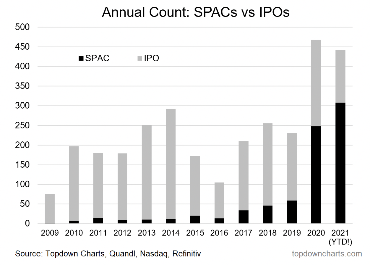
And


The chart from the IMF is pretty scary. 18 percent of companies are expected to experience liquidity-related financial distress and 16 percent are expected to experience insolvency risk. The data covers Europe and Asia-Pacific. Which omits a wide range of economies, including those with more heavily leveraged corporate sectors, and cheaper insolvency procedures e.g. the U.S. The estimates also assume that companies that run into financial distress in 2020 will exit the markets in 2020-2021. In other words, the 16 percentage insolvency risk estimate is not covering firms that run into liquidity problems in 2021. Presumably, they will go to the wall in 2022. 

The second chart puts into perspective the IPO investment boom. Vast majority of IPOs in 2020-2021 have been SPACs (aka, vehicles for swapping ownership of prior investments, as opposed to generating new investments). The remainder of IPOs include DPOs (Direct Public Offerings, e.g. Coinbase) which (1) do not raise any new investment capital and (2) swap founders and insiders equity out and retail investors' equity in. 

The data above isn't giving me a lot of hope, to be honest of a genuine investment boom. 

We are living through the period of fully financialized economy: the U.S. government monetary and fiscal injections in 2020 totaled some $12.3 trillion. That is more than 1/2 of the entire annual GDP. Since then, we've added another $2.2 trillion. Much of these money went either directly (monetary policy) or indirectly (Robinhooders' effect) into the Wall Street and the Crypto Alley. In other words, little of it went to sustain real investment in productive capital. Fewer dollars went to sustain skills upgrading or new development. Less still went to support basic or fundamental research. 

In this environment, it is hard to see how global recovery can support higher productivity growth to bring us back to pre-pandemic growth path. What the recovery will support is and accelerated transfer of wealth:

  • From lower income households that saved - so far  - their stimulus cash, and are now eager to throw it at pandemic-deferred consumption; 
  • To Wall Street (via corporate earnings and inflation) and the State (via inflation-linked taxes).
In the short run, there will be headlines screaming 'recovery boom'. In the long run, there will be more structural unemployment, less jobs creation and greater financial polarization in the society. Low - to-date - corporate insolvencies figures and booming financial markets are masking all of this in the fog of the pandemic-induced confusion. 


Friday, April 23, 2021

23/4/21: There are no 'social' winners amidst this pandemic


No one is left unscarred by the #covid19 pandemic when it comes to public approval trends for the major social stakeholders in Ireland: 

Source: Core Research. 

Broadly-speaking, the above is expected, although Core Research report contains one glaring omission: it does not survey public attitudes to media/press. Worse, the three improving stakeholder groups are also the three least impacted: own employer, citizens and large companies. Meanwhile, approval of the government is still nosediving. 

Covid pandemic is certainly testing Irish (and other countries') key institutional frameworks. The fallout from these tests is going to be long-lasting and deep. We went into the pandemic with huge deficits of trust in key institutions of our societies. And we are becoming more polarized and less enthusiastic in our support for these institutions since then.

Saturday, April 17, 2021

17/4/21: Collapsing Labor Force Participation: A Secular Trend


For those of you following this blog this would be a familiar sight: I have been worrying about the underlying structure of the U.S. labor markets for some time now. The ongoing recovery appears to be relatively robust in terms of headline figures, e.g. GDP growth rates and declining continued unemployment claims. But in reality, it has been nothing but the return to trends that persisted before the pandemic - trends that are extremely worrying.

I covered the fact that longer term unemployment has now gone through the roof: https://trueeconomics.blogspot.com/2021/04/14421-share-of-those-in-unemployment-27.html. And beyond this, there is a bigger problem of historically low levels of labor force participation. We are witnessing a massive pull-away within the skills distribution in the U.S. economy: there are shortages of skilled labor, including in manufacturing, and there is massive outflow of people from the labor markets in lower skills groups.


Just look at the absolute disaster of the 'recovery' when it comes to people who have left the workforce alltogether:


And consider the gender mix in this: 

1. Women labor force participation is down:

2. Men participation has collapsed:

The above appears to show more benign trend in female labor force participation trend than in male, and... here comes the kicker: women labor force participation currently sits around the levels comparable to 1987; men - at around ... well... never.


The above table puts matters into perspective: the gap between the pandemic period and prior high participation period is almost 5 times larger for men than for women. But... the gap between women and men participation rates in the pandemic period and pre-pandemic period is much smaller: at roughly 48% higher for men than for women. For the latest data point (March 2021) the latter gap is roughly 80%. In other words, the dynamics in terms of labor force participation for women are becoming much less benign, relative to men. than they were during the pre-pandemic period.

To put this into a different perspective: secular pre-pandemic trend for men were woeful. They were less so for women. But pandemic is accelerating longer term pressures on both men and women in pushing them out of the labor force.

If you think this is a 'robust' recovery, you really need to think a bit harder: we are having a secular stagnation in the female labor force and we are having a long term depression in the male labor force. And these trends are not subject to demographics of aging. 

Wednesday, April 14, 2021

14/4/21: The share of those in unemployment > 27 weeks is rising


One way to look at the state of the real (as opposed to financialized and corporate-value focused) economy is to look at unemployment. And one of the strongest indicators of longer term changes in the structure of the real economy is the fate of the longer term unemployed. Here is an interesting snapshot of data: the percentage of those unemployed for 27 week or longer in the total pool of the unemployed. The higher the number, the more structural is the unemployment problem. 


If the above is not clear enough, here is the same data expressed in the form of the range for each 12 months period (rolling) between maximum share of the longer term unemployed in the overall pool of unemployment and the minimum share:


All of the above suggests we are in deep trouble. And this trouble has been persistent since the Great Recession: we are witnessing a dramatic increase in the duration of unemployment spells. Part of this is due to the impact of Covid19 pandemic concentrated in specific sectors. Part of this is down to the generosity of unemployment benefits supplements and direct subsidies during the pandemic. Part of it is also down to the longer term changes in the U.S. labor markets and changes in households' composition and investment/consumption patterns.

Irrespective of the causes, the problem is obvious: the longer the person remains unemployed, the sharper is the depreciation of skills and their employability. If this (post-2008) experience is the 'new normal', America is developing a massive class of disillusioned and human capital poor workers. 


Thursday, April 8, 2021

8/4/21: No Inflation Cometh?


Having written about strengthening signals of rising inflation globally and in the U.S. in particular before, here is today's note from Markit on the matter: https://ihsmarkit.com/research-analysis/global-price-gauge-hits-new-high-as-input-cost-inflation-accelerates-sharply-Apr21.html 

To quote: global inputs inflation pressures are at their highest since 2008:


By sector:


Factory gate prices are scaling up:

Manufacturing supply shortages at nearly historical highs:
Prices of all, but financial services and consumer services are up through the roof:

Profit margins are being demolished:

And consumer goods prices are going through the roof:

Which means that targeting 2-3% inflation at current monetary policies is plain bonkers. Unless Central Banks are willing to entertain inflation at +5-10 percent above current, the rates must go up. Keep leveraging, everyone. Credit cards, margin trades and mortgages are about to get 'uncertain'... 

Tuesday, April 6, 2021

6/4/21: Edelman Trust Barometer: the Age of Cognitive Dissonance?

Some shocking, genuinely shocking data from the Edelman Global Trust Barometer for 2021. Let's take a look. 

Start with this: 

Welcome to the world where sociopaths like Jeff Bezos are both trusted to be competent and perceived to be ethical. 

Meanwhile, at least w are catching up with what is happening in the tech sector:

And with the Social Media...


But we can't be human without some serious cognitive dissonance... Healthcare is now the second most trusted sector of business in America. Yep, the same private healthcare that had to rely on public / State / Federal money and logistics to distribute vaccines. The same private healthcare that could not organize vaccinations. The same private healthcare that, effectively, bankrupted and overcharged millions of Americans for emergency treatments during the pandemic. 

Back to Social Media:

I am not quite sure what people 'trust' in terms of information delivered via 'search engines', exactly. A search engine provides access to information, but it does not provide  or produce information. So drop this daft category from the analysis and what you have? Traditional Media is barely above the water, when it comes to trust. Owned Media and Social Media are below the waterline. If you control for the partisanship divide in the U.S. political landscape, most likely the vast majority of those trusting Traditional Media are... well, Democrats. The vast majority of those who distrust Social Media are... well, Democrats. Converse holds for the Republicans. One way or the other, massive shares of American population do not have trust in anything relating to quality control or verifiability of information sources.

This year's barometer is a scary reading. In most basic terms, NGOs and Business are the only two sets of institutions that are perceived ethical. Business' perception in this area is dangerously close to being marginal. Perceived incompetency of the Government is vastly greater than perceived competency of Business.  Media is virtually the exact mirror reflection of business. We trust no one in terms of information we receive. And we love those who are making money by not caring for us - American Healthcare. We lap up anything our employers communicate, but we believe they are telling us bullshit when it comes to their social and environmental sustainability efforts or to the risks of us being displaced by them with AI and technology. 

Is there much 'social fabric' left that hasn't been torn up, yet?.. 

Monday, April 5, 2021

5/4/21: The Coming Wave of Financial Repression


In a recent article for The Currency, I covered the topic of the forthcoming wave of financial repression, as Governments worldwide pursue non-conventional fiscal tightening in years to come: Make no mistake, financial repression is coming in the UShttps://thecurrency.news/articles/36547/make-no-mistake-financial-repression-is-coming-in-the-us/


Sunday, September 27, 2020

26/9/20: America's Scariest Charts: Continued Unemployment Claims


Updating my charts for the continued unemployment claims:


The latest data is covering the period through September 12, 2020.

  • On a non-seasonally-adjusted basis, there were 13,355,586 Americans with continued unemployment claims in the week of September 12, 2020, an increase of 212,869 on the week prior, but 9,438,559 down on the COVID19 peak reached in the week of May 9, 2020. At the lowest point in pre-COVID expansion period, weekly continued claims stood at 1,350,834. 
  • In the last 4 weeks through September 12, 2020, average decline in continued unemployment claims was 461,476. At this rate of decline, it will take the U.S. economy 26-27 weeks to recover its pre-COVID19 lows in terms of continued unemployment.
  • Current level of continued unemployment claims implies 9.14% unemployment rate.
Per charts above - covering seasonally-adjusted data that has been subject significant methodological revisions starting with September 2020:
  • It would take thee U.S. economy 33 weeks from September 12, 2020 to complete full recovery to pre-COVID19 levels of continued unemployment claims
  • In seasonally-adjusted terms, unlike in terms of raw data discussed above, September 12, 2020 continued unemployment claims stood at 12,580,000 down 167,000 on week prior. 
I will be covering new or initial unemployment claims in the net post, so stay tuned. 

Monday, August 24, 2020

23/8/20: America's Scariest Charts: Continued Unemployment Claims


Having updated non-farm employment data (https://trueeconomics.blogspot.com/2020/08/23820-americas-scariest-charts.html), let's take a look at continued unemployment claims, as reported through the first week of August.

A chart to start with:


Continued unemployment claims are still falling.
  • The weekly rate of declines is improving. Most current week on week decline is 636,000, an improvement on prior week/week decline of 610,000. $ weeks average weekly rate of decline is 326,750. 
  • Latest continued unemployment claims are at 14,844,000 which is down from the COVID19 peak of 24,912,000 set in the week of May 9, 2020. 
  • We have registered reductions in continued claims in 11 out of the 13 weeks since the peak claims.
Here is the chart comparing historical records of recovery in continued claims to the current crisis perid:
And the same on the log scale

Comparing current continued claims to pre-recession period claims:

  • Current levels of claims are 8,687,000 higher than pre-recession period high, 13,195,000 above the pre-recession trough and 13,142,000 above the claims registered in the last  month before the onset of the recession.
The key takeaways from this are: 
  1. What matters from now on is not so much the level of the recession peak, but the rate or the speed of the recovery toward pre-recession 'normal'. So far, the rate of recovery has been fast. If sustained, we might be able to avoid much of the damage that arises from long-term unemployment duration. 
  2. The rate of benefits expirations will also matter a lot. We are looking at eligibility for unemployment dropping with weeks ahead, and the supplemental payment to unemployment insurance also falling off. As the two effect bite, the impact on the overall economy from reduced unemployment support schemes can be pronounced, triggering renewed recessionary risk. 
Stay tuned for the analysis of the first time unemployment claims figures next.

23/8/20: America's Scariest Charts: Employment


Good news, folks, just in time for the Republican National Convention. The latest data, through July 2020, shows some recovery in non-farm payrolls numbers that is bound to make a feature in political chest-beating coming up next week.

Behold the chart:

In basic terms:

  • July non-farm payrolls stood at 139,582,000, up 1.291% on June, and up 9,279,000 on the COVID19 pandemic trough (April 2020). 
  • Average monthly rate of jobs recovery has been so far 3,093,000 through July. Which is worse than 3,749,500 average rate of recovery recorded through June. In other words, we are potentially seeing a slowdown in jobs recoveries.
  • At current average monthly rate of recovery, it will take us just over 4 months to regain jobs lost to COVID19 pandemic, assuming no further slowdown in the rate of recovery (a strong assumption).
  • Currently, non-farm payrolls sit 12,881,000 below their pre-COVID19 peak employment levels, attained in February 2020.
Some of these are good news. Assuming the recovery dynamics remain unchallenged by:
  1. Natural rate of moderation in jobs recoveries
  2. Renewed pressures of COVID19 (see the latest on this here:https://trueeconomics.blogspot.com/2020/08/23820-covid19-update-us-vs-eu27.html), or a second wave of the pandemic
  3. The ravages of political uncertainty surrounding November 3 elections (not only Presidential).
One side note: the above comparatives are current-to-past. These, of course, do not take into the account where the U.S. employment figures would have been, absent COVID19 pandemic crisis. Whilst estimating potential employment levels is a hazardous exercise, taking a simple exponential trend (decaying over time) from August 2018 through the latest reported period implies potential July employment level ex-COVID19 of 153,267,800. Which is not that much of a gap to the pre-crisis peak. 

Another side note: if we assume that the rate of decay in jobs additions that prevailed between June and July 2020 (-17% decay) continues into the future (also a strong assumption), jobs recovery to the pre-crisis peak will take us through May 2021. For the pre-pandemic trend case, the recovery will take us into March 2022.

More data analysis of the U.S. labor markets is coming up in subsequent posts, stat tuned. 

Saturday, July 25, 2020

25/720: Updated: America's Scariest Charts: Unemployment Claims


Updating my Scariest Charts for the latest data, through thee week of July 18, 2020:

First, a summary table and chart for changes in the Initial Unemployment Claims:


Next: Continued Unemployment Claims through the week of July 11, 2020:


Key takeaways this week:

Continued unemployment claims changes:

  • Latest count at 16,197,000, down from 17,304,000 a week ago - a decline driven by both, re-gained jobs and exits from unemployment benefits;
  • Latest week w/w decline is faster than in any of the prior weeks of the current recession;
  • Latest counts are 14,495,000 above the levels recorded in the first week of the current recession and are 14,548,000 above pre-recession trough;
  • At last week's rate of decline, we have 13 weeks of unemployment claims to work through before recovering to pre-recession levels; based on the last 4 weeks average - 19 weeks.
New unemployment claims changes:
  • Latest new unemployment claims filed figures are the lowest in the current recession cycle, but materially close to those recorded in the week of July 4, 2020;
  • Nonetheless, we are now in 18 weeks of continued new unemployment claims filings in excess of 1 million per week.
Longer term view:
  • Discontinuation of emergency $600/week unemployment support payment or curtailing of the benefit is likely to push both of the above series down in the short run in mid- to late-August, with a knock-on longer term effect of increasing longer term unemployment claims in September and onward. 

Thursday, July 16, 2020

16/720: Updated: America's Scariest Charts: Unemployment Claims


New data for the week prior on continued and new unemployment claims continues to support a view of a relatively slow and slowing-down recovery in the U.S. labour markets.

Continued unemployment claims:


Continued unemployment claims in the week of July 4 amounted to 17,338,000 down 422,000 on prior week. A week before, the rate of decline was 1,000,000, and in 4 weeks prior to the the week of July 4, 2020, average weekly rate of decline was 711,500. Current 4 weeks average rate of decline is 737,750 driven by two weeks of > 1 million declines. The good news is that we now have 8 consecutive weeks of drops in continued unemployment claims. The bad news is that we do not know how much of the decline from the COVID19 pandemic peak is down to benefits expirations, or due to benefits cancelations due to some income being earned, with restored income being below pre-COVID19 levels. In other words, we have no clue as to whether jobs being restored are of comparable quality to jobs lost.

Next, Initial Unemployment Claims: these remain troubling too. In the week of July 11, 2020, there were 1,503,892 new initial unemployment claims filed, the highest number in 5 weeks.


As the table above highlights, we now have more than 17 weeks of new unemployment claims filings in excess of 1 million. Note: new unemployment claims filings can reflect many factors, including:

  1. A person becoming newly unemployed;
  2. A person who was unemployed and temporarily left unemployment insurance coverage due to receipt of irregular earnings;
  3. A person who was unemployed, and run out of benefits coverage, taking a temporary job, but re-listing as an unemployed at that job expiration; 
  4. A person who was unemployed before but did not secure past unemployment benefits; and
  5. A person who was unemployed but was denied prior benefits due to various reasons.
Here is the history of the Initial Unemployment Claims, smoothed out to a 3mo moving sum:


An updated employment outlook for July 2020:


Friday, July 10, 2020

10/7/20: America's Scariest Charts Updated


Updating my series of 'America's Scariest Charts' for the latest data releases this week.

First: continued unemployment claims for data through the week of June 27th.


Continued unemployment claims fell from 18,760,000 in the week of June 20 to 18,062,000 in the week of June 27. Continued claims are now down 6,850,000 from their pandemic-period peak, which implies a decline of 978,571 per week since the peak. Based on the last two weeks' average weekly decline, it will take around 28 weeks to return continued unemployment claims to the pre-COVID19 levels.

Now, putting current crisis into historical perspective, the following chart uses log scale to show COVID19 recession experience in relation to all past recessions:


Next, new unemployment claims for the week of July 4, 2020. New claims in that week stood at 1,399,699, down slightly on the new claims in the eek prior at 1,431,343. Table below provides a summary:

Updated non-farm payrolls forecast for July 2020, based on June data for payrolls and the first data for July on changes in unemployment claims:


Average duration of unemployment is still completely swamped by the force and speed of the COVID19 onset, but is rising toward recession-consistent above-average territory:


Saturday, July 4, 2020

3/7/20: Labor Market COVID19ed


I have been running a regular update on my 'America's Scariest Charts' covering labor markets developments (see most recent one here: https://trueeconomics.blogspot.com/2020/07/2720-americas-scariest-charts-updated.html). These charts rely heavily on two data sets: Non-Farm Payrolls data (monthly frequency), and initial unemployment claims (weekly frequency). I ignored for now two other data series:

  1. Average duration of unemployment: this is, of course, rising, but from low levels, as the COVID19 crisis is still relatively young; and
  2. Continued unemployment insurance claims: these data have been also proximate to the initial unemployment claims through the period of February-May.
Now, with two months of some jobs recovery, it is worth looking at (2) above. So here they are: continued unemployment claims charts:

Let us start with history:


There is no scaling in the above chart, just the numbers of people claiming unemployment insurance on continued basis. Which is telling: in recessions, these rise; in recoveries they fall. You can see that the lowest unemployment claims tend to happen some months before the onset of the subsequent recession. And recoveries take long. Of course, in the 1970s, there were fewer people in the labour force and, therefore, the absolute numbers of the unemployed were also lower.

Which means, it is worth rescaling each episode of rising and falling unemployment claims to the pre-recession levels ('norm') and to the recession peaks, taking into the account how long does it take unemployment claims accumulated during the recession to drop back to the levels of pre-recession claims.

So, methodology. I define 'normal' unemployment claims level as being the lowest level attained in the 12 weeks preceding each recession. This is set as an index of 100 for every recession. We look at the period of 6 weeks prior to the onset of the recession to identify the starting level of recession in terms of unemployment levels (these are weeks -6 through 1 on the X-axis). We then look at subsequent weeks (non-negative values on the X-axis) and plot index of unemployment claims (current unemployment claims normalized to the 'normal' level) through the recession and into the recovery, mapping these until one of the two events occurs:

  1. Either the index returns back to 100 - meaning unemployment claims finally are restored to the level of the pre-recession levels or the 'normal'; or
  2. In cases where this does not happen, until the onset of the next recession.

First, let us do this for all recessions since 1967 (when the data starts) through the end of 2019 - ignoring for now the COVID19 period.

Lots of interesting stuff in the above.

  • 2008-2009 Great Recession was long - longer than any other recession - in terms of labor markets recovery to 'normal' levels of unemployment claims. It was also sharp - second sharpest on record - in terms of the mass of unemployment claims at the peak of the recession. 
  • Legacy of the 1990-1991 recession was also painfully long, but shallower on the impact side (peak levels of unemployment claims). 
  • Epic 1973-1975 recession was horrific: it had a long lasting impact on unemployment claims and, in fact, it never got the point of returning unemployment claims levels back to the pre-recession 'normal'. 
  • We normally think of the 2001 recession as being 'technical' - caused just by the gyrations in the stock markets, aka the dot.com bubble burst. But in reality it too was pretty long in terms of its impact on the unemployed and it was pretty sharp as well.

And so on... but now, time to bring in the COVID19 pandemic. Let us start by just plotting it with the rest of the data. Boom!


The COVID19 pandemic made so many people claim unemployment insurance - on continued basis, not just one-off first time claims that anyone can file - that you can no longer meaningfully consider the rest of the recessions in comparison. In data analysis, we say that COVID19 pandemic is an influential outlier - it distorts our analysis of all other recessions. In this case, it is useful to use logarithmic scale to visualize the data. So here it is:

 
Even with log-transform, as above, the COVID19 crisis is off-the charts! No one has ever seen anything like this. Which we know.

The recovery from the pandemic has been sharp as well (steeper slope than in other recessions), but both charts above highlight the fact that whilst the U.S. economy is restoring some jobs during May-June re-opening period, the process of restoring these jobs is slow. Unlike what you hear from the White House and the Republican Party and its media, we are not in a 'tremendous recovery' and there is no 'roaring growth'. There is a mountain of pain that is being chipped away. At a current rate of 'chipping away', it can take the jobs markets some 10 months to come back to the pre-COVID19 'normal'. But that assumes that there will be no permanent or long-term jobs losses from the pandemic and the aftermath of the pandemic. It also assumes that the second wave of COVID19 infections that the U.S. is currently experiencing is not going to lead to such losses of jobs, and will not result in return to April-May levels of restrictions, and will not trigger a third wave of pandemic in Autumn. All three 'ands' must hold to get to that 10 months recovery. 


Stay tuned, I will be updating this chart as we go.

Friday, July 3, 2020

3/7/20: ECB Jumping the Proverbial Shark?


ECB's money-printing press has been running overtime these weeks. So let's put the Euro area central banks' monetary policy shenanigans into perspective, comparing them to the Global Financial Crisis (GFC) related measures, the Euro area sovereign debt crisis and the subsequent painful recovery:


Good thing: ECB has deployed COVID19 response at scale and fast. Bad thing: it is highly uncertain how much growth all of this activism is going to sustain. From 2000 through 1Q 2020, there is zero (statistically) relationship between current GDP growth (nominal) and ECB assets accumulation in the same year and in prior year:


Even ignoring statistical significance, the relationship itself is not positive, especially in the lagged data. In other words, there is absolutely no evidence of causality from ECB asset purchases to higher economic growth. While reasons for this results are complex (and not really a matter for this post), there are some serious questions to be asked as to how much tangible growth is being sustained by the Central Bank's activism. On the other side of the same argument, if we assume that the ECB purchases of assets are effective at sustaining growth in the Euro area economy, then we must have some serious questions as to what the Euro area economy is capable of producing in terms of GDP growth without such interventions.

In simple terms: we are damned if we do, and damned if we do not:

  • Either monetary activism is not effective at sustaining growth, or
  • If monetary activism is effective, then the state of the economic institutions overall is so dire, it remains comatose even with extraordinary supports from Frankfurt.

Neither is a pleasant conclusion. And there is not a third alternative.

Just in case you need a reality check on how poor Euro area's growth has been, here is a summary: