Monday, January 2, 2017

2/1/17: U.S. Unemployment Duration is Still Record-Busting


Throughout recent years, the recovery meme, played across the mainstream media in the U.S. has provided endless support to President Obama’s approval ratings. During POTUS 2016 election, the said meme was used by Hillary Clinton to challenge the ‘things aren’t so great in America’ views of Bernie Sanders and, subsequently, the echoes of the same from Donald Trump. Since the election, the recovery story has been billed as the ‘strong economy’ legacy that President Obama will be leaving for his predecessor to mess with - the basis for setting up the incoming Trump Administration for any potential fall, should economic fortunes of the recovery were to falter.

The central point of the U.S. recovery story - absent any appreciable growth in productivity, capital investment, and sectoral value added - was the only bright spot on the U.S. economic horizon: the labour markets. In fact, the U.S. headline unemployment figures have shown very strong gains, and jobs creation has been robust, with more recent data showing improvements (at long last) in households’ incomes. All of these indicators can and have been robustly challenged in terms of the extent to which they show true nature of improvements. However, they have been taken, predominantly, as read. Improvements are improvements, and gains are gains.

And as the readers of my blog and media articles would have known, the story is never complete, if one looks only at headline figures. Reality is always more complex.

So to show you this complexity at work, let’s look at one official indicator of the health of the labour markets in the U.S. - duration of unemployment. If the U.S. economy is really awash with jobs, and if the true unemployment rate is really sitting at 4.9 percent, the duration of unemployment should not only be declining on average, but it should be closer to ‘normal’ non-recessionary reading. Right?

Take a look at the following chart based on data from the St Louis Federal Reserve database, Fred:


Yes, duration of unemployment peaked in January 2011 at 40.7 weeks and since then fallen to 26.3 weeks (as of November 2016), but 26.3 weeks for average unemployment benefits duration is still above any previous recession since 1948 on.

Now, as er return to normalcy. During 1990-1991 and 2001 recessions, recovery failed to completely reduce average duration of unemployment back to pre-recessionary norms. In simple terms, after the end of recession, in 1990-1991 and 2001 downturns, on average, unemployed people remained in unemployment longer than before recessions. These were the first two recession on record that resulted in this change in structural unemployment duration.

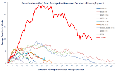
Now, consider 2008 recession. Chart below illustrates what happened to the ‘new normal’ duration of unemployment spells. Specifically, chart below plots the difference between average duration of unemployment during recession and recovery and the average duration of unemployment in 12 months prior to the onset of each recession. Returning to normal here would mean getting duration gap closer to zero.


Again, current (since 2008) recovery is clearly the worst for all post-recessionary episodes on record. Currently, duration of unemployment is 9.5 weeks, on average, longer than it was during the last 12 months of pre-2008 recession. Which is bad enough to be worse than the peak deviation for any recession in modern history.

What is happening here? The fabled U.S. jobs creation recovery is really a combination of several factors. One of these is genuine increases in jobs being created, which drives unemployment down. Another is demographic: U.S. labour force is expanding, and as it does, employment creation get swallowed by new entrants into labour force, while many existent unemployed are either exiting the labour force, or remaining on unemployment benefits longer. Of course, putting younger workers to work is a good thing. But squeezing older unemployed out of workforce is not.

There are serious problems with highly elevated (to-date) duration of U.S. unemployment that few politicians are willing to talk about. For one, longer duration of unemployment implies lower probability of transition into employment. Secondly, it also implies higher probability of future unemployment in future recessions. Thirdly, it implies more severe losses in skills, human capital, health, social well-being, etc. In other words, costs of unemployment rise faster for longer duration of unemployment.

Which makes you pause and think: is the legacy of the Obama administration on jobs is that impressive? Really? Well, stay tuned for more...

Saturday, December 31, 2016

30/12/16: In IMF's Forecasts, Happiness is Always Around the Corner


Remember the promises of the imminent global growth recovery 'next year'? IMF, the leading light of exuberant growth expectations has been at this game for some years now. And every time, turning the calendar resets the fabled 'growth recovery' out another 12 months.

Well, here's a simple view of the extent to which the IMF has missed the boat called Realism and jumped onboard the boat called Hope


Table above posts cumulative 2010-2016 real GDP growth that was forecast by the IMF back in September 2011, against what the Fund now anticipates / estimates as of October 2016. The sea of red marks all the countries for which IMF's forecasts have been wildly on an optimistic side. Green marks the lonely four cases, including tax arbitrage-driven GDPs of Ireland and Luxembourg, where IMF forecasts turned out to be too conservative. German gap is minor in size - in fact, it is not even statistically different from zero. But Maltese one is a bit of an issue. Maltese economy has been growing fast in recent years, prompting the IMF to warn the Government this year that its banking sector is starting to get overexposed to construction sector, and its construction sector is becoming a bit of a bubble, and that all of this is too closely linked to Government spending and investment boom that cannot be sustained. Oh, and then there are inflows of labour from abroad to sustain all of this growth. Remember Ireland ca 2005-2006? Yep, Malta is a slightly milder version.

Notice the large negative gaps: Greece at -21 percentage points, Cyprus at -18 percentage points, Finland at -15 percentage points and so on... the bird-eye's view of the IMF's horrific errors is:

  • Two 'programme' countries - where the IMF is one of the economic policy 'masters', so at the very least it should have known what was happening on the ground; and 
  • IMF's sheer incomprehension of economic drivers for growth in the case of Finland, which, until the recession hit it, was the darling of IMF's 'competitiveness leaders board'.  

Median-average miss is between 4.33 and 4.97 percentage points in cumulative growth undershoot over 7 years, compared to IMF end-of-2011 projections.

So next time the Fund starts issuing 'happiness is just around the corner' updates, and anchoring them to the 'convincing' view of 'competitiveness' and 'structural drivers' stuff, take them with a grain of salt.

Friday, December 30, 2016

30/12/16: Corporate Debt Grows Faster than Cash Reserves


Based on the data from FactSet, U.S. corporate performance metrics remain weak.

On the positive side, corporate cash balances were up 7.6% to USD1.54 trillion in 3Q 2016 y/y, for S&P500 (ex-financials) companies. This includes short term investments, as well as cash reserves. Cash balances are now at their highest since the data records started in 2007.

But, there’s been some bad news too:

  1. Top 20 companies now account for 52.5% of the total S&P500 cash holdings, up on 50.8% in 3Q 2015.
  2. Heaviest cash reserves are held by companies that favour off-shore holdings over repatriation of funds into the U.S., like Microsoft (USD136.9 billion, +37.8% y/y), Alphabet (USD83.1 billion, +14.1% y/y), Cisco (USD71 billion, +20.1% y/y), Oracle (USD68.4 billion, +22.3%) and Apple (USD67.2 billion, +61.4%). Per FactSet, “the Information Technology sector maintained the largest cash balance ($672.7 billion) at the end of the third quarter. The sector’s cash total made up 43.6% of the aggregate amount for the index, which was a jump from the 39.3% in Q3 2015”
  3. Despite hefty cash reserves, net debt to EBITDA ratio has reached a new high (see green line in the first chart below), busting records for the sixth consecutive quarter - up 9.9% y/y. Again, per FactSet, “at the end of Q3, net debt to EBITDA for the S&P 500 (Ex-Financials) increased to 1.88.” So growth in debt has once again outpaced growth in cash. “At the end of the third quarter, aggregate debt for the S&P 500 (Ex-Financials) index reached its highest total in at least ten years, at $4.57 trillion. This marked a 7.8% increase from the debt amount in Q3 2015.” which is nothing new, as in the last 12 quarters, growth in debt exceeded growth in cash in all but one quarter (an outlier of 4Q 2013). 3Q 2016 cash to debt ratio for the S&P 500 (Ex-Financials) was 33.7%, on par with 3Q 2015 and 5.2% below the average ratio over the past 12 quarters.


Net debt issuance is also a problem: 3Q 2016 posted 10th highest quarter in net debt issuance in 10 years, despite a steep rise in debt costs.


While investment picked up (ex-energy sector), a large share of investment activity remains within the M&As. “The amount of cash spent on assets acquired from acquisitions amounted to $85.7 billion in Q3, which was the fifth largest quarterly total in the past ten years. Looking at mergers and acquisitions for the United States, M&A volume slowed in the third quarter (August - October) compared to the same period a year ago, but deal value rose. The number of transactions fell 7.3% year-over-year to 3078, while the aggregate deal value of these transactions increased 23% to $564.2 billion.”

The above, of course, suggests that quality of the deals being done (at least on valuations side) remains relatively weak: larger deals signal higher risks for acquirers. This is confirmed by data from Bloomberg, which shows that 2016 median Ebitda Multiple for M&A deals of > USD 1 Billion has declined to x12.7 in 2016 from an all-time high in 2015 of x14.3. Still, 2016 multiple is the 5th highest on record. In part, this reduction in risk took place at the very top of M&As distribution, as the number of so-called mega-deals (> USD 10 billion) has fallen to 35 in 2016, compared to 51 in 2015 (all time record). However, 2016 was still the sixth highest mega-deal year in 20 years.

Overall, based on Bloomberg data, 2015 was the fourth highest M&A deals year since 1996.


So in summary:

  • While cash flow is improving, leading to some positive developments on R&D investment and general capex (ex-energy);
  • Debt levels are rising and they are rising faster than cash reserves and earnings;
  • Much of investment continues to flow through M&A pipeline, and the quality of this pipeline is improving only marginally.


Source: https://www.bloomberg.com/gadfly/articles/2016-12-30/trump-set-to-refill-m-a-punch-bowl-in-2017

Thursday, December 29, 2016

29/12/16: Drowning in Debt


Recently, I posted about the return - with a vengeance - of one of the key drivers of the Global Financial Crisis and the Great Recession, the rapid rise of the debt bubble across the global economy. The original post is available here: http://trueeconomics.blogspot.com/2016/12/161216-root-of-2007-2010-crises-is-back.html

There is more evidence of the problem reaching beyond corporate finance side of the markets for debt. In fact, in the U.S. - the economy that led the de-risking and deleveraging efforts during the early stages of the recovery - household debt is now once again reaching danger levels.

Chart 1 below shows that, based on data from NY Federal Reserve through 3Q 2016, full year 2016 average household debt levels are likely to exceed 2005-2007 average by some 3 percent. In 3Q 2016, total average household debt was around USD98,312, a level comparable to USD98,906 in 2006.


And Chart 2 shows that overall, aggregate levels of household debt and per capita levels of household debt both are now in excess of 2005-2007 averages.


Finally, as Chart 3 below indicates, delinquencies rates are also rising, despite historically low interest rates and booming jobs markets. For Student Loans and Car Loans, 3Q 2016 delinquencies rates are 1 percentage points and 3.8 percentage points above the 2005-2007 average delinquency rates. For Mortgages, current delinquency rates are running pretty much at the 2005-2007 average. Only for Credit Cards do delinquency rates at the present trail behind the 2005-2007 average, by some 2 percentage points.

Now, consider the market expectations of 0.75-1 percentage increase in Fed rates in 2017 compared to 3Q 2016 (we are already 0.25 percentage points on the way with the most recent Fed decision). Based on the data from NY Fed, and assuming average 2015-2016 growth rates in credit forward, this will translate into extra household payments on debt servicing of around USD1,085-USD1,465 per annum depending on the passthrough rates from policy rate set by the Fed and the retail rates charged by the banks.

Given the state of the U.S. household finances, this will be some tough burden to shoulder.

So here you have it, folks:
1) Corporate debt bubble is at an all-time high
2) Government debt bubble is at an all-time high
3) Household debt bubble is at an all-time high.
Meanwhile, equity funding is slipping even for the usually credit-shy start ups.

And if you want another illustration, here is total global Government debt, based on IMF data:


We’ve learned no lessons from 2008.


Sources for data:
https://www.nerdwallet.com/blog/average-credit-card-debt-household/
https://www.newyorkfed.org/microeconomics/data.html
http://www.imf.org/external/pubs/ft/weo/2016/02/weodata/index.aspx

Wednesday, December 21, 2016

19/12/16: Market Anomalies and Data Mining: Some Pretty Tough Love from Data


Investment anomalies (or in other words efficacy of exogenous factors in determining abnormal returns to investment) are a matter of puzzle for traditional investment analysis. In basic terms, we normally think about the investment as an undertaking that offers no ‘free lunch’ - if markets are liquid, deep and, once we control for risk factors, taxes and transaction costs, an average investor cannot expect to earn an above-market return. Put differently, there should be no ways to systematically (luck omitting) beat the market.

Anomalies represent the case where some factors do, in fact, generate such abnormal returns. There is a range of classic anomalies, most commonly known ones being Small Firms Outperform, January Effect, Low Book Value, Under-dogs or Discounted Assets or Dogs of the Dow, Reversals, Days of the Week, etc. In fact, there is an entire analytics industry built around markets that does one thing: mine for factors that can give investors a leg up on competition, or finding anomalies.

One recent paper have identified a list of some 314 factors that were found - in the literature - to generate abnormal returns. As noted by John Cochrane: “We thought 100% of the cross-sectional variation in expected returns came from the CAPM, now we think that’s about zero and a zoo of new factors describes the cross section.”

A recent paper published by NBER and authored by Juhani Linnainmaa and Michael Roberts (see link below) effectively tests this Cochrane’s proposition. To do this, the authors “examine cross-sectional anomalies in stock returns using hand-collected accounting data extending back to the start of the 20th century. Specifically, we investigate three potential explanations for these anomalies: unmodeled risk, mispricing, and data-snooping.” In other words, the authors look into three reasons as to why anomalies can exist:

  1. Unmodeled risk reflects the view that some of risk premium paid out in the form of investment returns is not captured by traditional models of risk-return relations;
  2. Mispricing reflects the view that markets’ participants routinely and over long run can misplace risk; and
  3. Data-snooping view implies that anomalies generate returns in the historical data that do not replicate in forward-looking implementation because these anomalies basically arise from ad hoc empirical data mining.

The authors argue that “each of these explanations generate different testable implications across three eras encompassed by our data: (1) pre-sample data existing before the discovery of the anomaly, (2) in-sample data used to identify the anomaly, and (3) post-sample data accumulating after identification of the anomaly.”

In their first set of tests, the authors focus on profitability and investment factors, because prior literature shown that “these factors, in concert with the market and size factors, capture much of the cross-sectional variation in stock returns.”

Finding 1: the authors “find no statistically reliable premiums on the profitability and investment factors in the pre-1963 sample period… Between 1963 and 2014, these factors average” statistically and financially significant returns on average of “30 and 25 basis points per month, respectively.”

Finding 2: “The attenuations of the investment and profitability premiums in the pre-1963 data are representative of most of the other 33 anomalies that we examine. Just eight out of the 36 (investment, profitability, value, and 33 others) earn average returns that are positive and statistically significant at the 5% level in the pre-1963 period.

Finding 3: All of the measures of abnormal returns used in the study generate premiums that “decrease sharply and statistically significantly when we move out of the original study’s sample period by going either backward or forward in time.” In other words, anomalies tend to disappear or weaken every time the authors significantly broaden time horizon beyond that which corresponds to the time horizon used in the original study that uncovered such an anomaly.

As authors note, “these findings are consistent with data-snooping as the anomalies are clearly sensitive to the choice of sample period."

How? "...If the anomalies are a consequence of multidimensional risk that is not accurately accounted for by the empirical model (i.e., unmodeled risk), then we would have expected them to be similar across periods, absent structural breaks in the risks that matter to investors. Similarly, if the anomalies are a consequence of mispricing, then we would have expected them to be larger during the pre-discovery sample period when limits to arbitrage, such as transaction costs, were greater.”

But there is a note of caution due. “Our results do not suggest that all return anomalies are spurious. The average in-sample anomaly earns a CAPM alpha of 32 basis points per month (t-value = 10.87). The average alpha is 13 basis points (t-value = 4.42) per month for the pre-discovery sample and 14 basis points (t-value = 4.06) for the post-discovery sample. Although these estimates lie far below the in-sample numbers, they are highly statistically significant.”

The kicker is that “investors, however, face the uncertainty of not knowing which anomalies are real and which are spurious [or due to data mining], and so they need to treat them with caution. …because data-mining bias affects many facets of returns—averages, volatilities, and correlations—it is best to test asset pricing models out of sample," or absent such opportunity (perhaps due to tight data) - by selecting a model / factor that "is able to explain half of the in-sample alpha".


Full paper: Linnainmaa, Juhani T. and Roberts, Michael R., The History of the Cross Section of Stock Returns (December 2016). NBER Working Paper No. w22894. https://ssrn.com/abstract=2880332

Tuesday, December 20, 2016

19/12/16: Why Investment-less Growth: Explaining Secular Stagnation in Investment


One key component of the supply side secular stagnation is the notion that in recent years, corporate investment in the U.S. and other advanced economies have declined on a secular trend (or structurally). With low investment, there is low productivity growth and weak wages growth. The end result is not only lower economic growth, but also declining long term potential growth.

Since the thesis of supply side secular stagnation started making rounds in the economic policy literature, quite a few economists jumped into the debate proposing various explanations to the phenomena. To-date, however, there have not been an empirical study that looked at all reasonably plausible explanations on offer to assess which can account for the decline in capital investment.

German Gutierrez Gallardo and Thomas Philippon, in there paper “Investment-Less Growth: An Empirical Investigation” published this month by NBER do exactly that. The authors “analyze private fixed investment in the U.S. over the past 30 years.”

First, the authors establish that indeed, “investment is weak relative to measures of [firm] profitability and valuation – particularly Tobin’s Q, and that this weakness starts in the early 2000’s.” In other words, whilst firms remain profitable, they simply do not reinvest their profits at the same rate today as in the 1990s.

Per authors, there are “two broad categories of explanations: theories that predict low investment because of low Q, and theories that predict low investment despite high Q.”

As a reminder, Tobin’s Q is a ratio of total market value of the firm to total asset value of asset held by the firm. In simple terms, higher Q means that market value of the firm is higher relative to the cost of replacing the capital and other assets owned by the firm. Thus, a Q between 0 and 1 means that the cost to replace a firm's assets is greater than the value of its stock, so the stock is considered to be undervalued. A Q greater than 1 in contrast implies that a firm's stock is more expensive than the replacement cost of its assets, so the stock is overvalued.

So under the fist argument, if we observe low Q, firms are undervalued by the market and have no incentive to invest as they cannot raise capital for such investment from the markets that perceive the firm’s asset value to be already high (or above the firm value established in the market).

Under the second argument, something other than market valuations drives firm decision to invest or not. What that ‘something other’ is is a matter of various theories.

  1. Some theories postulate that in the presence of financial market imperfections (high costs, low liquidity supply, high risk premiums etc), low investments prevail even when Q is high (market value of the firm >> total assets value). 
  2. Other theories, including the one that is currently most favoured as an explanation for dramatic decline in productivity growth in recent years (over the alternative explanation of the ‘secular stagnation’ thesis), the problem is that even with high Q, there might be low investment because there is mis-measurement in the markets as to the value of total assets of the firm. This can happen when there are intangible (hard to value) assets held by the firm, or when assets are dispersed across different currencies, markets and geographic, making them hard to value. It is worth noting that the argument of intangibles is commonly used today to argue that there is no real secular stagnation or decline in productivity growth because “things are simply not measured properly anymore”.
  3. Another view is that decreased competition (either due to technology - e.g. mega aggregators platforms such as google and apple, or due to regulation, or due to trade wars raging on, or broader trend of regionalisation of trade, etc) can reduce investment even in the times of higher Q (high market valuations).
  4. Finally, there is always a view that firms might under-invest because of short-termism in management strategies or due to restrictive investment climate induced by tighter risk governance (the latter point may overlap with regulatory constraints).


The authors find no support for the first argument. In other words, they find that low Q is not causing low investment. No surprise here, as markets are hardly in the mood of attaching low value to firms. In fact, we have been going through a massive uplift in M&As and equity valuations.

Which means that low investment is happening despite high market valuations - we are in the second set of arguments.

The authors “do not find support for theories based on risk premia, financial constraints, or safe asset scarcity”. They also find “only weak support for regulatory constraints.”

“Globalization and intangibles explain some of the trends at the industry level, but their explanatory power is quantitatively limited,” and does not provide support for aggregate - across economy - explanation of low investment.

So here comes the kicker: “we find fairly strong support for the competition and short-termism/governance hypotheses. Industries with less entry and more concentration invest less, even after controlling for current market conditions. Within each industry-year, the investment gap is driven by firms that are owned by quasi-indexers and located in industries with less entry/more concentration. These firms spend a disproportionate amount of free cash flows buying back their shares.”

Let’s sum this up: short-termism is a problem that holds firms from investing more, and it is more pronounced in industries with less competition. Firms which are owned by investors or funds that focus on indexing (pursue investment returns in line with broader indices, e.g. benchmarking to S&P500) invest less. The investment part of secular stagnation thesis, therefore, is linked at least indirectly to financialization of the economies: the greater is the weight of broad markets in investor decision-making, the lower the investment and the shorter is the time horizon, it appears.


Full paper: Gutierrez Gallardo, German and Philippon, Thomas, Investment-Less Growth: An Empirical Investigation (December 2016). NBER Working Paper No. w22897. https://ssrn.com/abstract=2880335

Monday, December 19, 2016

19/12/16: Income Polarization in the U.S.: Building Blocks of Trumplitics


Having just reviewed some fresh evidence on the trends and underlying drivers of declining wage growth rates in the U.S. post-Global Financial Crisis (GFC) in the previous post here: , now let’s take a look at some current state of research on income inequality dynamics. In general, relative income dynamics can be driven by increases in income at the top of the income distribution relative to the rest of the distribution - the so-called 1% effect or inequality factor; or by decreases in income distribution at the bottom of distribution - another inequality factor; or they can be driven by the decline in incomes in the middle of income distribution relative to both top earners and bottom earners (polarisation).

A new study from the IMF concerns with the latter type of dynamic. Titled “Income Polarization in the United States” and authored by Ali Alichi, Kory Kantenga, Kory and Juan Solé, study documents “the rise of income polarization - what some have referred to as the 'hollowing out' of the income distribution - in the United States, since the 1970s.”

The key findings are:


“While in the initial decades more middle-income households moved up, rather than down, the income ladder, since the turn of the current century, most of polarization has been towards lower incomes.” In other words, the middle class is increasingly joining the poor, rather than the upper classes.

And this holds for all demographic cohorts or the U.S. population:

CHARTS: Middle-Income Population 1970-2014 (percent of total population with the same characteristic)
 So the younger cohorts are now experiencing more hollowing out of the middle class than the older cohorts and this trend started manifesting itself around 2000.

 Education no longer protects the middle class, either.

And in racial terms, there is more marked decline in the fortunes of the middle class for the whites, whilst the recovery of the 1990s-2007 period in the fortune of the African-Americans  has been reduce by more than 50 percent since the onset of the GFC.

Similarly to race trends, gender trends offer nothing to be proud of.

“…after conditioning on income and household characteristics, the marginal propensity to consume from permanent changes in income has somewhat fallen in recent years.” Put differently, when today’s middle class workers receive a wage increase, they tend to save more and spend less out of that increase than before. This can only occur if today’s middle class workers are saving more from wages increases. Incidentally, the authors also show that the same has taken place for higher income households.


Secular decreases in MPC can reflect either increased investment (from savings) or increased precautionary savings (including savings used to buffer against liquidity risks). Unfortunately, the authors do not look into which effect is at play here, or (if both are) which effect dominates.

And here is another conclusion from the authors worth noting: “Income polarization has risen substantially in the past four decades—much the same, if not even faster than inequality.”


Which, of course, helps explain why we are witnessing activist voting by the disenchanted, angry middle class voters. You can blame political candidates, you can blame the media, you can blame outside forces and powers. But you can't avoid one simple conclusion: the U.S. middle class is pis*ed off with the status quo. For one very good reason that the status quo doesn't work for them.


Full study here: Alichi, Ali and Kantenga, Kory and Solé, Juan A., Income Polarization in the United States (June 2016). IMF Working Paper No. 16/121. https://ssrn.com/abstract=2882555

19/12/16: U.S. Wages (Lack of) Growth: a Structural Crisis


One of the persistent features of today’s economy is the decline in wage growth and lower returns to human capital, relative to financial capital. Starting with 2010 - the onset of the so-called ‘recovery’ from the Great Recession - annual hourly earnings rose only 2 percent (data through 2015), which is about 1.5 percentage points lower than prior to the Global Financial Crisis (GFC).

This phenomena is not exactly new, but it is becoming increasingly alarming from the point of view of contagion from economic displacement risks to political risks. You don’t need to travel far to spot the issue: just consider the recent U.S. Presidential elections, dominated (apart from dirt flinging between the candidates) by the plight of the disappearing middle class.

A recent paper by Stephan Danninger (IMF), linked below, titled  “What's Up with U.S. Wage Growth and Job Mobility?” tries to determine the key reasons for this change in the structure of the U.S. economy.

Danger documents the problem in chart 1 below:


The above chart shows that the decline in wages growth has been pronounced in the face of other labour market dynamics, including the unemployment rate. Which suggests that structural change or structural factors should be more pronounced as the drivers of this trend. This contrasts with previous recessions, when cyclical factors dominate during the early stages of recovery. Per Danninger, evidence points to the fact that following “the deep recession and slow recovery” the U.S. have witnessed “skill erosion and reduced employability of marginal workers. Once labor demand picked up and employment reached workers less attached to the labor market, low entry wages, suppressed average wage growth.”

However, in addition to the above factors, “Davis and Haltiwanger (2014) and Haltiwanger (2015) have pointed to a secular decline in labor market fluidity and business dynamism as possible factors. With productive firms growing less rapidly and the speed of labor reallocation across sectors flagging, technological advances permeate slower through the economy. Labor productivity has been strikingly low in recent years averaging only 0.5 percent during 2013–15 and moves up the wage ladder have become rarer.”

Institutional factors also contribute to anaemic wage growth: “…declines in workers’ bargaining power as a result of less unionization and the emergence of alternative employment arrangements of the “gig” economy (Card and Krueger 2016; Mach and Holmes 2008) have further weighed on average income gains.”

To better disentangle role of cyclical and structural factors, Danninger poses three questions:
1) “Is labor market repair still weighing on recent wage growth?”
2) “Has the relationship between labor market slack and wage growth permanently changed, i.e. has the Wage-Growth Phillips curve flattened?” Note: Wage-Phillips curve implies inverse relationship between money wage changes and unemployment
3) “Focusing on job-to-job mobility, what is driving the decline in labor market churning?”

So key findings are: 

1) “…post-GFC larger declines in local unemployment rates are associated with smaller increases in average wages. …after controlling for the tightness of the local labor market, decreases (increases) in local (county-level) unemployment rates tend to reduce (raise) the average hourly wage rate in the same locality. The preferred interpretation of this effect is a moderating offset of average wage growth through the entry (exit) of low wage earners. This interpretation is consistent with recent findings that the reintegration of workers at the margins of the labor market is holding down median wage rates (Daly and Hobijn 2016).” In other words, when unemployment rises, layoffs predominantly impact those with lower wages (earlier in their careers, part-timers, contract employees, and those with lower productivity), and when unemployment starts to fall, re-hires tend to be of lower average quality than those who managed to stay in employment through the period of higher unemployment.

2) “…structural changes in the labor market are also affecting wage growth”. Which is the main kicker of the paper. Structural changes are those that extend beyond cyclical - recession-linked - factors and as such are long-term trends. Per Danninger, “the wage-growth-Phillips curve has flattened. Declines of unemployment rates …provide a smaller boost to wage growth after the GFC than in the past. …after 2008 wages of full-time full-year employed do not commove with local unemployment rates, while they did prior to the
GFC. …Labor market data up to 2014 no longer show evidence of a similar kink in the post GFC period.”


3) “Job-to-job change rates—associated with higher wage growth—have declined well before the GFC. …post 2000 demographic changes, in particular labor force aging or changes in education, cannot account for the sustained decline in job-to-job transition rates. Rather job-to-job turnover rates have fallen in all education and age groups, irrespective of the tightness of the regional labor market. This common feature is not easily explained by more positive interpretations, such as better job matching or higher return to job tenure (Molly et al 2016).” Traditionally, those who change jobs - job-to-job movers - earn higher wage premia in terms of moving to higher wage growth jobs from lower wage growth jobs. This no longer holds.


As Danninger notes, “these findings have important implications for future wage growth. In the near term, as continued job growth reduces the remaining employment gap — and with it headwinds from the re-employment of low-wage workers—average wage growth is expected to accelerate.”


“However, a return to sustained high wage growth rates is uncertain. The
flattening of the wage-Phillips curve post-GFC points to broader structural changes in the labor market.”

So in summary, including my take on this:

  • Job-turnover rates have fallen and continue to decline. 
  • “Job-to-job transitions — associated with higher wage growth — have slowed across all skill and age groups”
  • The above means that the new - post-GFC - labour markets are no longer consistent with ‘normal’ recoveries and that we might be in a structural period of decline in wages growth.
  • This, in turn, suggests that both secular stagnations (demand and supply theses) are cross-linked through the labour markets (lower wages growth triggers lower demand growth, leading to slower investment, resulting in slower productivity growth).


Full paper is available here: Danninger, Stephan, What's Up with U.S. Wage Growth and Job Mobility? (June 2016). IMF Working Paper No. 16/122. https://ssrn.com/abstract=2882557

Friday, December 16, 2016

16/12/16: The Root of the 2007-2010 Crises is Back, with a Vengeance


There are several fundamental problem in the global economy, legacies of the past 20 years - from the mid 1990s on - that continue to drive the trend toward secular stagnations (see explainer here: http://trueeconomics.blogspot.com/2015/07/7615-secular-stagnation-double-threat.html).

One key structural problem is that of excessive reliance on credit (or debt) to drive growth. We have seen the devastating effects of the rapidly rising unsustainable levels of the real economic debt (debt that combines government obligations, non-financial corporate debt and household debt) in the case of 2008 crises.

And we were supposed to have learned the lesson. Supposed to have, because the entire conversation about structural reforms in banking and capital markets worldwide was framed in the context of deleveraging (reduction of debt levels). This has been the leitmotif of structural policies reforms in Europe, the U.S., in Australia and in China, and elsewhere, including at the level of the EU and the IMF. Supposed to have, because we did not that lesson. Instead of deleveraging, we got re-leveraging of economies - companies, households and governments.

Problem Case Study: U.S. Corporates

Take the U.S. corporate bonds market (that excludes direct loans through private lenders and intermediated loans through banks) - an USD8 trillion-sized elephant. Based on the latest research of the U.S. Treasury Department, non-banking institutions - plain vanilla investment funds, pension funds, mom-and-pop insurance companies, etc are now holding a full 1/4 of U.S. corporates bonds. According to the U.S. Treasury, these expanding holdings of / risk exposures to corporate debt are now "a top threat to stability" of the U.S. financial system. And the warning comes at the time when U.S. corporate debt is at an all-time high as a share of GDP, based on the figures from the Office of Financial Research.

And it gets worse. Since 2007, corporate debt pile in the U.S. rose some 75 percent to USD8.4 trillion, based on data from the Securities Industry and Financial Markets Association - which is more than USD8 trillion estimated by the Treasury. These are long-term debt instruments. Short term debt obligations - money market instruments - add another USD 2.9 trillion and factoring in the rise of the value of the dollar since the Fed meeting this week, closer to USD3 trillion. So the total U.S. corporate debt pile currently stands at around USD 11.3 trillion to USD 11.4 trillion.

Take two:

  1. Debt, after the epic deleveraging of the 2008 crisis, is now at an all-time high; and
  2. Debt held by systemic retail investment institutions (insurance companies, pensions funds, retail investment funds) is at all time high.

And the risks in this market are rising. Since the election of Donald Trump, global debt markets lost some USD2.3 trillion worth of value. This reaction was driven by the expectation that his economic policies, especially his promise of a large scale infrastructure investment stimulus, will trigger inflationary pressures in the U.S. economy that is already running at full growth capacity (see here: http://trueeconomics.blogspot.com/2016/12/151216-us-economic-policies-in-era-of.html). Further monetary policy tightening in the U.S. - as signalled by the Fed this week (see here: http://trueeconomics.blogspot.com/2016/12/151216-long-term-fed-path-may-force-ecb.html) will take these valuations down even further.

Some estimates (see https://www.bloomberg.com/news/articles/2016-12-16/republican-tax-reform-seen-shrinking-u-s-corporate-bond-market) suggest that the Republican party corporate tax reforms (that might remove interest rate tax deductibility for companies) can trigger a 30 percent drop in investment grade bonds valuations in the U.S. - bonds amounting to just under USD 4.9 trillion. The impact would be even more pronounced on other bonds values. Even making the estimate less dramatic and expecting a 25 percent drop across the entire debt market would wipe out some USD 2.85 trillion off the balancesheets of the bonds-holding investors.

As yields rise, and bond prices drop, the aforementioned systemic retail investment institutions will be nursing massive losses on their investment books. If the rush to sell their bond holdings, they will crash the entire market, triggering potentially a worse financial meltdown than the one witnessed in 2008. If they sit on their holdings, they will be pressed to raise capital and their redemptions will be stressed. It's either a rock or a hard place.


Problem Extrapolation: the World

The glut of U.S. corporate debt, however, is just the tip of an iceberg.

As noted in this IMF paper, published on December 15th, corporate leverage (debt) has been on a steady march upward in the emerging markets (http://www.imf.org/external/pubs/ft/wp/2016/wp16243.pdf).


And in its Fiscal Monitor for October 2016, the Fund notes that "At 225 percent of world GDP, the global debt of the nonfinancial sector—comprising the general government, households, and nonfinancial firms—is currently at an all-time high. Two-thirds, amounting to about $100 trillion, consists of liabilities of the private sector which, as documented in an extensive literature, can carry great risks when they reach excessive levels." (see http://www.imf.org/external/pubs/ft/fm/2016/02/pdf/fm1602.pdf)

Yes, global real economic debt now stands at around USD152 trillion or 225 percent of world GDP.

Excluding China and the U.S. global debt levels as percentage of GDP are close to 2009 all time peak. Much of the post-Crisis re-leveraging took place on Government's balancehseets, as illustrated below, but the most ominous side of the debt growth equation is that private sector world-wide did not sustain any deleveraging between 2008 and 2015. In fact, Advanced Economies Government debt take up fully replaced private sector debt growth rates contraction. Worse happened in the Emerging Markets:

So all the fabled deleveraging in the economies in the wake of the Global Financial Crisis has been banks-balancesheets deleveraging - Western banks dumping liabilities to be picked up by someone else (vulture funds, investors, other banks, the aforementioned systemic retail investment institutions, etc).

And as IMF analysis shows, only 12 advanced economies have posted declines in total non-financial private debt (real economic debt) as a share of GDP over 2008-2015 period.  Alas, in the majority of these, gains in private deleveraging have been more than fully offset by deterioration in government debt:

Crucially, especially for those still believing the austerity-by-cuts narrative presented in popular media, fiscal uplift in debt levels in the Advanced Economies did not take place due to banks-rescues alone. Primary fiscal deficits did most of the debt lifting:

In simple terms, across the advanced economies, there was no spending austerity. There was tax austerity. And on the effectiveness of the latter compared to the former you can read this note: http://trueeconomics.blogspot.com/2016/12/10122016-austerity-three-wrongs-meet.html. Spoiler alert: tax-based austerity is a worse disaster than spending-based austerity.

In summary, thus, years of monetarist activism spurring a massive rise in corporate debt, coupled with the utter inability of the states to cut back on public spending and the depth of the Global Financial Crisis and the Great Recession have combined to propel global debt levels past the pre-crisis peak to a new historical high.

The core root of the 2007-2010 crises is back. With a vengeance.

Thursday, December 15, 2016

Sunday, December 11, 2016

11/12/16: Legal Frameworks Relating to State-led Cyber Attacks


This is a blog about economics and finance, not politics. Alas, geopolitical risks do impact economic risks and they materially influence financial markets. I am trying to stay out of the political analysis and hence offer little in terms of my own thinking on the matter. But that does not mean I should not share with you other analysts' views that I find informative, interesting or thought-provoking. I do so on Twitter, without endorsing (via retweets or 'likes' or shares) any given position, so I shall be able to do the same here, on the blog.

So here is an interesting piece of analysis, from an insightful source, relating to the allegations of Russian State influencing the U.S. election 2016: https://www.project-syndicate.org/commentary/kremlin-cyber-attacks-american-election-by-joseph-s--nye-2016-12?referrer=/xmGEziA4LU. In my opinion, this analysis is particularly valuable because it offers a calm assessment of the treaties and legal frameworks relating to cyber attacks.

Worth a read.


Update 12/12/16: Another take on the legal aspects of alleged intervention here: https://www.bloomberg.com/view/articles/2016-12-12/how-u-s-could-respond-to-russian-intervention-in-trump-election