Saturday, January 7, 2012

7/1/2012: Irish Exchequer Results 2011 - Capital v Current Spending Trends

In the previous posts we considered Exchequer results for 2011 for tax receipts and headline expenditure items. In this post we look at the capital and current spending composition breakdown for total spending.

One core assertion that was made in the previous posts is that capital spending carried the main load of Exchequer spending adjustments in 2011. Overall, year on year, total net cumulative voted spending by the Irish state declined 1.6% or €721 million. At the same time, current expenditure went up by 2.2% or €903 million. Capital expenditure dropped 27.4% year on year in 2011 or €1,623 million.

Table below highlights the yearly changes over the crisis period:


The table above clearly shows that while during the crisis Net Voted Current Spending went up by €663 million, capital spending has declined by €4,265 mln on aggregate. The table also shows that despite all the austerity discourse, our Net Current expenditure was rising in 2010 and 2011, while our capital expenditure was declining to compensate for these increases.

In addition, the table highlights the trend that shows current expenditure rising at accelerating rate in 2010 and 2011 and capital expenditure falling at accelerating rate in 2011 relative to 2010.

If capital spending by the state constitutes either a 'Keynesian' stimulus (as claimed by the Governments over the years) or an investment in future productive capacity of our economy (as also claimed by the Governments in the past), we are now into a third consecutive year of bleeding the economy dry.

And the dynamics are best illustrated by referencing to the longer time horizons:


So current expenditure share of total spending by the Government now stands at 90.6%, up from 2010 level of 87.3% and 1998-2002 average share of 82.3%. On the other hand, capital investment share of total Government spending has dropped from 21.7% average for 1998-2002 period to 21.0% in 2008 and to 14.6% in 2010. In 2011 this share declined to below 10.4%.


 Between 2000 and 2010, Irish State invested in new capital stock some €66.26 billion of funds. Assuming 8% combined amortization and depreciation on this stock implies the need for continued gross investment of ca €5.3 billion annually. This means that 2011 Net Capital Spending fell some €1.01 billion short of covering the depletion of the state-financed capital stock.

The above, of course, is a rather crude calculation, since amortization and depreciation are at least in part covered from the current spending and since we use net voted capital spending figure for the capital stock measurements, but it does clearly suggest that current rates of capital investment cannot be sustained in the long term. And hence, much of the savings that have driven our Exchequer deficit improvements to-date are not sustainable either.

7/1/2012: Irish Exchequer Results 2011 - Expenditure


In the previous post I looked at the tax revenues side of the Exchequer figures for 2011. The core conclusions emerging from that analysis was that:

Irish Exchequer tax receipts did not perform well in 2011 compared to both 2010 and the target, with most of the improvement (some 80%) accounted for by reclassification of the Health Levy as tax revenue and addition of the temporary, extra-Budget 2011 Pensions Levy.

Irish Exchequer tax revenues for 2011 cannot be interpreted as being indicative of any serious improvement. Factoring in Pensions Levy and delayed receipts (Corporation Tax receipts for December carried over into 2012), overall Exchequer revenue fell 3.1% short of the target set in Budget 2011, not 2.5% claimed by the Department of Finance.

The above shortfall amounts to 0.66% of the expected 2011 GDP and 0.81% of our expected GNP and comes after significant increases in taxation burden passed in the Budget 2011, suggesting that the economy’s capacity to generate tax revenues based on the current structure of taxation is exhausted.


Subsequent posts on the topic of Exchequer balance will focus on overall balance, capital spending dynamics and relative distribution of tax burdens. This post focuses on the expenditure side of the Exchequer balance.

In general, there are good reasons as to why discussion of the expenditure side of the Exchequer balance is a largely useless exercise, rendered such by:
-       Constant re-alignment and renaming of departments, and
-        Changes in the departmental revenues (as in the case with the Health Levy reclassification) impacting the Net Voted Expenditure on Health

Here’s a good post on the above caveats from Dr Seamus Coffey which is worth a read.


So let’s consider some of the higher level figures.

Overall Net Voted Expenditure for 2011 came in at €45.711 billion, or €723 million (-1.56%) below 2010 levels and with a savings of €3.602 billion (-7.3%) on 2008. The target for 2011 expenditure was set at €46.022 billion and the end outrun implies that the Government has under-spent the target by €311 million. Note: I am referencing the original Budget 2011 target, as referenced, for example, in End-June 2011 - Analysis of Net Voted Expenditure. The Department for Finance reference figure for the annual 2011 target is €46.151 billion or €129 million ahead of the original estimate. This discrepancy is reflected in part in the capital carryover figures for 2010-2011 and 2011-2012.


Year on year, 2011 marks the third year of declining cuts. In 2009 yoy spending fell €2.150 billion, in 2010 it declined by €0.730 billion and in 2011 the drop was €0.723 billion. In proportional terms, expenditure declined 4.56% in 2009, 1.57% in 2010 and 1.58% in 2011. Cumulated net expenditure ‘savings’ since 2008 are now standing at a miserly €3.602 billion. Given that over the same period we accumulated €81.017 billion of deficits clearly shows the inadequate extent of cost reductions in the public services. Whichever way you spin it, to cover just ½ of already accumulated deficits out of cost savings achieved so far would take decades, and that before we factor in interest payments and the fact that much of the ‘savings’ delivered to-date comes out of temporary cuts to capital spending. More on this in the forthcoming analysis of capital and current spending.

Now, since we cannot clearly de-alienate actual spending, let us at the very least consider the spending priorities. These have changed over the years and changed in the direction that, while inevitable in the current crisis, is worrisome nonetheless.


Please keep in mind that although I did try to adjust as much as possible for changes in departments compositions, the data below is not fully reflective of these. Nonetheless, it does present some interesting changes in the overall spending dynamics.

As shown above,
-       Agriculture, Food and the Marine net voted spending constituted 3.36% of the total spending in 2008. This now has fallen to 2.28%.
-       Tourism, Culture and Sport accounted for 1.43% of the total spending in 2008 and is now down to 0.60%.
-       Communications, Energy and Natural Resources share actually rose from 0.54% in 2008 to 0.55% in 2011.
-       Defence saw a relatively shallow decline from 2.16% in 2008 to 1.93% in 2011.
-       Education and Skills – the third highest spending department in 2008 and 2011 – remained relatively static with 18.31% of total spending in 2008 and 18.07% in 2011.
-       Jobs, Enterprise and Innovation share of total spending fell from 2.94% in 2008 to 1.73% in 2011.
-       Environment, Community and Local Government spending fell from 6.41% in 2008 to 3.39% in 2011 – the drop that largely reflects changes in the departmental composition.
-       Finance share of spending declined from 2.83% in 2008 to 0.75% in 2011 – a dramatic fall.
-       Foreign affairs and Trade, despite gaining a new function of Trade have seen their share of spending decline from 1.99% in 2008 to 1.51% in 2011.
-       Health – the largest spender in 2008 at 27.45% dropped to the second place in spending distribution with 28.25% in 2011 despite having lost a number of functions. Adding back Children function to the DofH, the department spending share rose to 28.7% in 2011.
-       Justice and Equality accounted for 5.25% in 2008 and this dropped to 4.84% in 2011.
-       Social Protection rose from being the second highest spending department in 2008 with 19.06% (virtually identical share to that of Education) to the first highest spending department in 2011 with 29.16%.
-       Public Expenditure and Reform – a new department that, at least in my opinion is failing to show much value for money so far – has managed to rake in spending amounting to 1.71% of total net voted expenditure in 2011 – higher spending priority than Foreign Affairs and Trade, almost identical priority to Jobs, Enterprise and Innovation, more than double the spending priority of the Department of Finance. Let us presume - for a moment - that the Department has two important, related, but not fully coincident functions: bring down current spending (since bringing down capital spending is no-brainer) and produce longer-term reforms of public services (which is not all about cuts, of course). Given the numbers achieved to-date - see forthcoming post on capital and current expenditure reductions - one should have serious questions about the new department value for money.
-       Taoiseach group saw its spending priority virtually unchanged over the years, declining marginally from 0.38% in 2008 to 0.37% in 2011.
-       Transport – the department with significant compositional changes – has seen its spending share decline from 6.47% in 2008 to 4.18% in 2011.


So overall, top 3 departments accounted for 64.83% of total net voted spending in 2008 and this figure rose to 75.48% in 2011. The rate of increase in these expenditure shares has accelerated over the years. Year on year, share of the three top spending departments in overall expenditure rose 2.97 percentage points in 2008-2009, 3.80 percentage points in 2009-2010 and 3.89 percentage points in 2010-2011. Once Children function is added back to Health, the rate of increase in 2010-2011 jumps to 4.34 percentage points.

Top 4th and 5th ranked departments (Justice and Equality and Transport) saw their combined share of spending declining from 11.71% in 2008 to 9.02% in 2011. This largely reflects changes in composition of the Department of Transport.

Together, Social Protection, Health and Children accounted for 46.51% of the spending in 2008 and this now is up at 57.88% in 2011. In other words, almost €6 per every €10 spent by the state goes to finance the two functions that constitute in traditional nomenclature social welfare benefits and social benefits (note that private spending on health is netted out via departmental receipts in the net expenditure figures). Education accounts for roughly the same share – ca 18% of total spend – in 2011 as in 2008. Economic sectors departments (other than Transport) used to account for 6.84% of the total spend in 2008 and this is now down to 4.56% in 2011.

In short, the priority of the Government spending over the years of the crisis has shifted firmly away from supporting economy’s productive capacity and delivering structural subsidies to ‘social and environmental pillars’, to serving social welfare functions and preserving as much as possible public health spending. It is worth noting that the latter, of course, has been achieved by shifting more costs burden onto the shoulders of health insurance purchasers.

Thursday, January 5, 2012

5/1/2012: Irish Exchequer Results 2011 - Tax Receipts

Irish Exchequer returns for 2011 are in and there has been much in the line of fireworks celebrating the 'strong' results. Alas, these celebrations are revealing more about the nature of the Exchequer figures analysis deployed by the Government spin doctors than about the real dynamics in tax revenues and spending reforms.

In this post, let's take a look at the tax performance over 2011.

Income tax receipts came in at the grand total of €13.798 billion this year, 22.4% up on 2010 and 16.6% up on 2009. Alas, the gross year on year gain of €2.522 billion achieved in 2011 is accounted for by re-labeling of the former health levy into income tax component. In 2010 the state collected €2.018 billion worth of health levies receipts which were not classified as a tax measure. This year, it was classed as such, and although we do not know just how much of the health levy has been collected, netting out 2010 receipts for this revenue head out of the 2011 tax receipts leaves us with an increase in income tax like-for-like of closer to €500 million year on year. And these net receipts would imply income tax still down on 2009 levels.

Overall, income tax was down €327 million on target set in Budget 2011 - a shortfall of 2.3% - not dramatic, but hardly confidence-instilling. 

The chart below illustrates trends over time, but one has to keep in mind that 2011 figures are gross of USC (and thus Health Levy receipts).

More revealing (as these compare like-for-like) are VAT receipts:


As the chart above illustrates, VAT receipts came in at €9.741 billion in 2011, down 3.57% on 2010 and 8.71% on 2009. Now, we are talking some real numbers here. While income tax 'improvements' were in reality very much marginal, VAT deterioration is very significant. VAT receipts are down 4.8% or €489 million on 2011 target and the receipts are off €360 million on 2010 and €929 million on 2009. VAT receipts are running €4.76 billion behind, compared to 2007 levels. 

Corporation tax is shrinking. Official numbers show Corpo receipts are at €3.52 billion in 2011, down €404 million on 2010. These include €261 million in delayed receipts, so year on year Corpo receipts are down really €143 million. This might look small, but for the economy that is allegedly 'recovering' the dynamic is poor. In percentage terms, Corporation tax receipts are off 10.29% yoy and 9.74% on 2009. Compared to 2007, corporate taxes are down €2.871 billion (disregarding the late receipts).


Relative to target, once December delayed payments are factored in, Corporation tax has fallen short of the projections by €239 million. In overall official terms, the tax is down €500 million on traget (-12.4%).


Another big tax head is the Excise. This came in exactly at the same level as 2010: €4.678 billion. Excise receipts are down just €25 million on 2009, but significantly lower - by €1.16 billion relative to 2007. Excise taxes are now basically in line with Department projections for Budget 2011. 

Stamps are up, but this is solely due to the pension levy introduction. Leve of Stamps receipts in 2011 reached €1.391 billion, which is €431 million ahead of 2010 and €461 million ahead of 2009. But once we factor out pension levy receipts, Stamps are actually down €26 million on 2010 and just €4 million ahead of 2009 levels. Compared to 2007 Stamps are down a massive €2.25 billion once pension levy is accounted for. And Stamps are down on target as well - by some €21 million.


When it comes to capital taxes, combined CAT and CGT receipts came in at €660 million or 12.9% ahead of 2010 receipts, although still 17.1% down on 2009 levels.

Both tax heads combined were bang-on on target.

So overall, of top 5 tax heads, 3 were behind the target despite the fact that Income tax included reclassification of tax revenues under USC, one was bang on target and one was ahead of target once temporary pensions levy is added, but behind target when this is netted out. In a summary, 4 out of 5 tax heads have underperformed the target and one came in at virtually identical levels to target. Where's, pardon me, the fabled 'improvements' and 'stabilization' in Exchequer revenues that Minister Noonan has been talking about?

Overall tax revenue stood at €34.027 billion in 2011, which is 7.16% ahead of 2010 and 2.97% ahead of 2009. However, if we are to correct for reclassified Health levy receipts and temporary pensions levy receipts, tax revenues for 2011 were at €31.552 billion, or 0.63% below those in 2010. tax rates went up, tax revenues went down, folks. Not what one would term an improvement in performance.

Even using dodgy apples-for-oranges accounting procedures deployed by the Government, tax revenues are down 2.5% on the Budget 2011 target. How on earth can anyone claim this to be 'stabilizing' performance or an 'improvement' defies any logic. 

Let's do the sums: 
  • 2011 total tax revenues were €873 million behind Budget 2011 projections. These included non-tax revenue of at least €2 billion (Health levy) that was re-branded as tax revenues this time around, plus €457 million hit on pensions (not in the Budget 2011) and a delayed set of corporate returns of €261 million. So overall, tax revenues are down on target not €873 million, but €1.069 billion. 
  • At the same time 2010-2011 outrun surplus claimed by the DofF at €2.522 billion in reality is a revenue gain of just €308 million.
That means that the Exchequer revenues side performance was really surprisingly unimpressive.

5/1/2012: 2012 Debt redemptions - select euro area countries

A very revealing summary of 2012 bond redemptions by country and month, courtesy of the zerohedge.com (link here):

Cracking! While Germany won't have (most likely) any problem rolling €193.1 billion worth of paper other countries are in for a potentially (an highly likely) bumpy rides for France at €289.9 billion, Italy at €337.1 billion, Spain at €147.9 billion and GPI at combined €79.2 billion. This year won't be the real test for Ireland, however, with just €5.6 billion of paper coming up for refinancing, but it will be a testing year for PIIGS in general with €564.2 billion worth of sovereign debt to be rolled.

And here's the data for scheduled rollovers relative to country GDP as projected by the IMF:
This can easily get ugly.

Wednesday, January 4, 2012

4/1/2012: EU Commission new logo

In the Really-Really-Really Important News of the Day: the EU Commission has a new logo... ahem... yes, a NEW LOGO:

Notice the two distinct sets of correlated lines - one set ascending, another descending, separated by a clear space with no sign of continuity between the two sets, presumably to summarize the emerging dis-Union of those states that are set to grow in the future, from those that are set to contract. Also note the 'growth' group dynamic is shallower than the dynamic of decline in the 'drop-outs' group.

There is also a semiotically potentially revealing positioning of the flag and the banner - off centre, more into the growth set of lines, possibly suggesting that the EU is now becoming more of a 'growth club' or alternatively 'de hell with dem slower periphery states' club?

So how about a new tag line: EU - a Union for Disunity?

Disclaimer: I am obviously take a proverbial p***ss, but., as Russians say - every joke contains at least a grain of reality...

Tuesday, January 3, 2012

3/1/2012: Government debt - maturity v overhang

There are some good reports on the massive debt rollover in G7 and BRICs in 2012 - see a summary here. That can lead non-economists to confuse total outstanding Government debt with that maturing in 2012. Here's the summary of Government debt projections for G7 and BRICs for 2012 and 2016 based on September 2011 WEO database from the IMF.


So overall:

  • Back in September 2011, the IMF projected total G7 Government debt to reach US$43.02 trillion, or 123% of the expected 2012 GDP
  • BRICs 2012 Government debt is projected to reach US$4.9 trillion or 34% of GDP
  • Total G7+BRIC Government debt outstanding for 2012 is expected to be US$47.92 trillion or 97% of GDP
  • The above figures show why public debt in G7 nations is such a concern for the markets and the real economies.
  • By 2016, G7 Government debt is expected to rise to US$51.01 trillion or 127% of GDP. These projections are based on rather rosy assumptions that were built into September WEO forecasts and since then have been revised down, although there is no comprehensive database data incorporating these revisions available yet (it should come out in April 2012).
  • Absolute debt levels for G7 Governments are expected to rise for all countries except Canada and Germany. Relative to GDP, Government debt levels are expected to rise between 2012 and 2016 in Japan and the US.
So that US$ 7.6 trillion figure of maturing Government debt for G7+BRICs mentioned in the Bloomberg article linked above - that is just 15.9% of the total Government debt of these countries outstanding that matures in 2012. Not to be confused with the whole debt mountain...

3/1/2012: Are we really still 'filthy rich'?

Parts of Irish media love GDP per capita comparatives within the EU27. Years after the Celtic Tiger went belly up, the Irish Times and RTE and some (though not all) Left-of-Centre alternative media trumpet our allegedly stellar performance in this metric as the evidence that more should be taxed out of the 'rich' to pay for 'vital services'. Parts of international Right-of-Centre media still refer to these comparatives as the evidence of the 'Low Tax' Irish miracle at work. Both are missing the core point I have been raising over the last decade (since moving to Ireland, really): GDP is irrelevant metric for Irish economic well-being.

Take, for example, the following 'latests' data released last month by the eurostat. In 2010, Irish GDP per capita stood at 28 percent premium over EU27 average and at 18.5% premium over EA17 (euro area). This 'achievement' made us look like the third highest income economy in EU27, and the 5th highest earning population when Norway, Switzerland and Iceland are added into the equation. Our GDP per capita was ahead of Iceland (111% of the EU27 average) and was second only to Luxembourg and Netherlands. Even more significantly, although our standing compared to EU27 did drop from 133% in 2008 to 128% in 2009 and 2010, our rank did not change. We were the 3rd highest 'income' economy in per capita terms in 2008 and we were, allegedly, that in 2010.

Now, that claim alone should put a grain of doubt into the wheels of the 'spend more, tax more' machine here. Afterall, we, in Ireland, have experienced the worst recession on record in 2008-2010. And yet, the indicator is showing us doing 'Just Grrreat!'

Of course, we know that somewhere around 20% of the GDP is expatriated with little benefit to the economy by the MNCs. And shaving off these 20% off the 128% premium we allegedly possess leaves us with an approximate GNP-linked premium of 102% - just above Italy at 101%. This would rank Ireland as 12th highest income economy in EU27. But in addition, what GNP and GDP don't measure and yet all of us know, Ireland's cost of living is well ahead of the EU27 average. Which means that while nominally we might earn slightly more than the average European, in terms of what these earnings buy us we should be much further behind. The alleged 'competitiveness gains' so much lauded by the Government help, but they shouldn't make as much of a difference to consumers, since these gains are primarily adversely impacting their earnings, not the cost of things we spend our money on. Deflation in the private sectors of economy over the last 3 years has been matched by inflation in the State-controlled sectors.

So the eurostat, handily, reports another metric of real incomes and wellbeing in the state - the Actual Individual Consumption per Capita - a measure that takes into account both public and private sources of individual consumption. And here, folks, we are much less of a 'high achiever'. In 2010 Irish AIC was 102% of the EU27 average - exactly where it should be once we control GDp for GDP/GNP gap. Which makes us 13-14th highest ranked economy in EU27. Or in other words, an average performer. Worse than that, our performance here was on par with italy (102%) and just 1 percentage point ahead of Greece. Barring the PIIGS we were the worst performing economy in the group of advanced EU27 member states.

And rebasing the data to compare against the EA17 average (euro area average) shows things are pretty much dire in Ireland. Back in 2008 we had AIC of 102% of the EA17 average. that fell to 96% in 2009 and 95% in 2008. This 7 percentage points drop in ireland's relative standing is the worst of all EA17 states. For comparison, in Greece the decline was 3 percentage points. Chart below illustrates:
Now, there's a chart RTE and Irish Times won't show you. And not only because it requires doing some research in the form of recalibrating the data, but because it won't fit the philosophy of 'Ireland is Still Rich. Tax Ireland!' that both outfits are so keen supporting.

Monday, January 2, 2012

2/1/2012: Sunday Times January 1 - 2012 Economy Forecast

This is an unedited version of my Sunday Times article for January 1, 2012.


Happy New Year and the best wishes to all of you fond of reading up on economics this morning.

Having just closed the book on the fourth year of the crisis, one can only hope that 2012 will be the year of the return of the global and Irish economic fortunes.

I wish I could tell you that this will be so with some sort of certainty. That ‘exports-led growth’ will open the way for reduced unemployment and that ‘real reforms’ will take place to the benefit of those of us living here and restore the confidence of the proverbial international investors. Alas, the only reality we can glimpse from the road we travelled since 2008 is that this year will be marked by the same fiscal uncertainty, growth volatility and markets psychosis that were the hallmarks of the years past.

So in line with the New Year’s Day tradition for forecasts, lets take a look at the crystal ball and ask two questions.

Question number one: Where are we today on the road of the global economic and financial crises resolution?

At the macroeconomy level, the US has completed some two-thirds of the required private sector deleveraging. This means that by the very end of 2012 we might see some signs of life in the US consumer demand and household investment, assuming the credit system globally does not experience another seizure. Until this takes place, corporate balance sheets will remain focused on hoarding cash and capex is unlikely to re-start. The US economy is likely to bounce around the growth rates just above zero, with moderate risk of a recession in the first half of 2012.

The three black swans for the global economy are: the risk of the deficit blowout and the lack of Congressional consensus on dealing with the US debt mountain that can destabilize the Treasury market; China’s economy teetering on the brink of an asset crisis and growth slowdown; and the euro area hurtling toward a disorderly collapse. Should any one of these materialising, there will be an unprecedented shift in global investment portfolia with gold and a handful of international blue chip corporates becoming the only stores of value. Unlikely as it might seem, such a scenario will cause a new Great Depression worldwide.

Barring the catastrophe identified above, global demand will most likely remain subdued in 2012, with previous pockets of growth – e.g. the emerging markets, the beneficiaries of exceptionally low cost of carry-trade finance from QE funds in the US in 2009-2010 – becoming mired in a significant growth slowdown.

Europe is likely to be on the receiving end of the poor global growth newsflows.

Germany was the driver of European growth in 2011 and its exports performance (up 13.4% in 2010 and 8.5% in 2011) looks set for a severe test in 2012. In months ahead, the ECB will drive down key interest rates to 0.5-0.25 percent from the current 1.0 percent to accommodate the default-bound euro area sovereigns. However, in the climate of deleveraging banking sector, this move will fail to stimulate private demand. Government spending in Germany is also set to fall in 2012, by 0.4-0.5 percent. As the result, we can expect German GDP to contract in Q4 2011 and Q1 2012. Annual rate of growth is likely to fall from 2.9% in 2011 to 0.2-0.4% in 2012.

France is now forecast to enter a shallow recession between Q4 2011 and Q1 2012 with annual growth falling from 1.6% in 2011 to zero percent in 2012. The downside risk for the second largest euro area economy is that fiscal adjustments planned to-date can be derailed by lower growth. In this case, France can remain in a shallow recession through 2012.

Overall, euro area growth looks set for some negative downgrades in months ahead. We can expect GDP to remain flat in 2012, having shown expansion of 1.5 percent in 2011. Personal consumption will be static, investment will shrink by 1.2 percent and Government spending will contract 0.3 percent. Exports growth will fall 10-fold, from 2011 annual rate of 6.3 percent.


This provides the backdrop to the second question of the day: What will 2012 bring to Ireland?

We are all familiar with the fact that Irish economy is highly volatile and subject to a number of push and pull factors ranging from global demand for Irish exports, to foreign conditions for debt crisis resolution in the common currency area.

Assuming no major disruptions to the current global environment, we can look at two possible scenarios.

Scenario 1 involves benign assumptions of continued growth in agricultural output, modest resilience in exports, moderating contraction in construction sector, and only slightly deeper reduction in public spending compared to 2011. Crucially, this scenario assumes virtually no nominal change in the services sector activity, a moderate rise in net taxes and a slight decrease in profits by the multinational enterprises expatriated abroad. All in, Scenario 1 yields estimated rate of growth in real GDP of 0.8% and GNP growth of 0.7%.

Less benign Scenario 2 with shallower growth in agricultural and exporting sectors activity, as well as services sectors contraction, yields growth forecast of -0.6% for real GDP and -0.9% for GNP. In this adverse scenario, Irish economy is likely to end 2012 with real GNP 13% below the peak 2007 levels.

These small differences in forecasts are, however, compounded year on year, as illustrated by the historical divergences between previous Department of Finance forecasts and realised rates of growth in the chart.


The range of risks we face is a daunting one, but there is also a narrow range of potential outcomes that present an upside for the battered economy.

In terms of the sovereign risk, recent discontent with the Budget 2012 has translated into dramatically reduced approval ratings for both Fine Gael and Labor. These are likely to persist on the back of higher taxes and a potential increases in unemployment in the retail sector and other services, post-January sales. By mid-2012, lower growth and overly optimistic projections on tax revenues and expenditure reductions will mean that the Coalition will face a stark choice of either further reducing capital expenditure, or levying some sort of a new revenue raising measure. Discontent of the backbenchers will only increase as time moves closer to the Budget 2013, possibly forcing the Government to adopt some structural reforms on the expenditure side and rethink its policy on future tax increases.

The latest projections by the Economist Intelligence Unit put peak Government debt/GDP ratio at 120-125% in 2013. At this stage, there will be a belated restructuring deal struck with EU that will see debt/GDP ratio falling to below 100%. The pressure for such a deal will be building up throughout 2012 and we might see some positive moves during the year.

Banks will be nursing continued losses, with mortgages showing a more visible trend toward deterioration, while business insolvencies will continue driving significant losses behind the façade. Again, pressure of these losses will become more apparent in late 2012, just around the time banks capital buffers begin to dwindle once again.

With economy bouncing up and down along the generally stagnant growth trend, the Government will continue its search for excuses for avoiding deep reforms. Thus, 2012 will be the year of silent risks build up in Irish economy, culminating in a major blow-out in late 2012 or early 2013. Welcome to the Groundhog Year Number Five.


Box-out:

Most recent data for Ireland’s external accounts shows that in Q3 2011 our balance of payments stood at a surplus of €838 million, comprising a current account surplus of €850 million and a capital account deficit of €12 million. For the nine months of 2011, the current account has registered a deficit of €669 million, an improvement of just €125 million on the deficit in the same period of 2010. Over the same time, balance of payments deficit fell from €771 million in the nine months through September 2010 to €675 million for the first nine months of 2011. Which raises the following question: given that we continue running current account and balance of payments deficits, what external surpluses does the Government foresee for the near future that can possibly make a dent in our public debt overhang? Since the onset of the current exports boom in the beginning of 2010, Ireland’s average quarterly current account surplus has been a meagre €13 million. At this rate, it will take Ireland Inc some 190 years to pay down just €10 billion of debts, even if these debts were costing us nothing to finance.

2/1/2012: Latest Composite Leading Indicators for Q4 2011

Latest leading economic indicators for Q4 2011 for OECD are not showing any real signs of economic recovery for the euro area. Here are some of the details (please note, data is through October, so forward signal is for November-December 2011).

For Australia, Q4 2011 indicator is now down at 100.55 against Q3 2011 reading of 100.80. 3mo MA is 100.71 against previous 3mo MA of 100.89. For comparative purposes, 2007 average reading was 101.96, 2009 average of 96.07 and 2010 average 101.13. 2011 average to-date is 100.99.

Canada's CLI is at 99.66, ahead of Q3 2011 reading of 99.42. 3mo MA is at 99.62 and previous 3mo MA was 100.72. 2011 average to-date is 100.90, well behind 102.13 average for 2010 and 101.26 average in 2007.

France current reading is at 98.13 slightly behind Q3 2011 at 98.60. 3mo MA is at 98.69, behind previous 3mo MA of 100.96. 2011-to-date average is at 101.16, behind 2010 average of 103.38 and 2007 average of 101.37.

Germany's current reading is at 98.28, down from 99.10 in Q3 2011 with current 3mo MA at 99.26, down from the previous 3mo MA of 102.93 - one of the highest rates of slowdown at 3.57%. 2011-to-date average is at 102.77, down from 2010 average of 104.08 and 2007 average of 103.96.

Ireland (for our local interest) is at 96.99 against Q3 2011 of 96.19 - one of the handful of countries (such as Greece) that shows some improvement. 3mo MA is at 100.40 against previous 3mo MA of 101.00. 2011-to-date reading is at 100.94 against 2010 average of 99.74 and 2007 average of 105.28.

Italy is currently reading at 96.55, down from 97.47 in Q3 2011. Current 3mo MA is at 97.50 down from 100.46 for previous 3mo MA - a decline of 2.95%. 2011-to-date average is 100.58 against 2010 average of 103.93 and 2007 average of 101.69.

Japan current reading is at 101.33 against previous reading of 101.55. 3mo MA at 101.62 down from 102.69 for previous 3mo MA. 2011-to-date average is 102.65 against 2010 average of 100.78 and 2007 average of 102.29.

Spain latest reading is 100.16 against previous reading of 100.65. 3mo MA is at 100.52 against previous 3mo MA of 101.18 and 2011-to-date average is at 101.38 against 2010 average of 102.86 and 2007 average of 102.52.

UK current reading is at 98.64 against previous reading of 99.01, with current 3mo MA of 99.14 against previous 3mo MA of 101.13 (-1.96%). 2011-to-date average is at 101.02 against 2010 average of 103.14 and 2007 average of 102.13.

US current reading is at 100.95 down from the previous reading of 101.25. 3mo MA is at 101.24, down from previous 3mo MA of 102.37 (-1.11%). 2011-to-date average is at 102.20 and 2010 average was 100.39, while 2007 average was 103.20.

In terms of EA17, current reading for the euro area stands at 98.53, down from previous reading of 99.13. 3mo MA currently stands at 99.20 against previous 3mo MA of 101.67 (down 2.43%). 2011-to-date average is at 101.75 against 2010 average of 103.34 and 2007 average of 102.81.

Big Euro Area 4 economies index is now at 98.12, down from the previous reading of 98.77. 3mo MA is at 98.88, down from 101.66 for the previous 3mo MA (-2.74%) and 2011-to-date average is at 101.66, down from 103.77 average for 2010 and 102.44 average for 2007.

Charts to illustrate:


Sunday, January 1, 2012

1/1/2012: That debt overhang problem: replay

I am delighted to note that John Mauldin is also stressing the issue of total real economic debt overhang that I have been vocal about for some time now. Here's his 2012 predictions post: http://www.businessinsider.com/mauldin-collateral-damage-2011-12
that also contains this delightful chart:


And, spot the one country that stands out? Yep, that's Ireland - second to Japan in terms of total combined debt/GDP ratio, and well ahead of Japan when GNP is referenced in the above.

I have highlighted the issue of debt overhang and the long term real growth drag exerted by it in a number of articles now, including articles in the Sunday Times, the Globe and Mail, Ireland's Village magazine and on this blog. At last, analysts are starting to pay attention to the issue.

1/1/2012: Groundhog Year 2012 - part 2

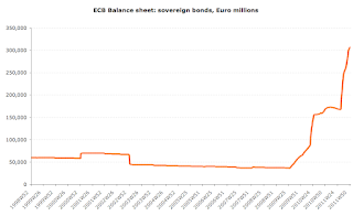
And on with another summary of 2011. One side of the euro area economy had a boom year in 2011, unlike the rest of us. The boom, of course, was of a very dubious nature, but it is set to continue through 2012. That side was the ECB balance sheet.

Check out the following charts to spot the 'up year' for ECB's 'assets':


But what about ECB's capacity to carry these? Well, of course, ECB doesn't really function like a regular bank, but were it, with capital and reserves finishing 2012 at €81.481bn against total assets of €2,733.2 billion, ECB's leverage currently stands at 3,354%, which is well above 2000-2004 average of 1,372% and 2005-2008 average of 2,180% and 2009 level of 2,609% and 2010 level of leverage of 2,565%.

And, of course, more financial wizardry to come in 2012, folks. So brace yourselves for another 'up-and-up they go' year at ECB.

1/1/2012: Groundhog Year 2012 - part 1

In the tradition of looking back at the year passed, let's take a quick view of one of my favorite indicators for risk assets fundamentals: the VIX index.

CBOE Volatility Index finished the year well off the inter-year highs, but nonetheless in an unpleasant territory. VIX closed December 2011 at an elevated 23.40, ahead of December 2010 close of 17.75, 2009 close of 21.68 and only behind the December 2008 levels of 40.00. December 2007 close was 22.50 and December 2006 was 11.56.

More unpleasant arithmetic emerges when we consider inter-annual performance. Historical maximum for daily close (from January 1990 through present) is 80.86, while maximum for 2010-present was 48.00 set on August 8, 2011.

The historical average for VIX is 20.57, while the average for January 2008-present is 27.74, for January 2010-present is 23.38 and for 2011 as a whole - 24.20, implying that wile 2011 was not the worst performing year on the record, it was certainly worse than 2010. Table below summarizes annual data comparatives.

Average intra-day volatility actually marks 2011 as the worst year on record. Average intra-day spread for VIX stands at 9.28 in 2011 against 8.97 in 2010-present and 9.08 in 2008-present. And both 3mo and 1mo dynamic standard deviations posted poor performance for VIX in 2011, making it the worst year on the record other than 2009. VIX dynamic 1mo semi-variance closed the year on 7.80 and annual average of 4.26 against 2010 average of 3.96 and 2009 average of 5.78.

Charts below highlight the fact that 2011 was a poor year for fundamentals-based analytics:


All above suggest that volatility is the starting point for 2012. Welcome back to the New 'Groundhog Day' Year.