Showing posts with label #Pandemic. Show all posts

Friday, April 2, 2021

2/4/21: COVID19: BRIICS

 As warned last month, BRIICS are now in a new wave of the pandemic, just like the rest of the world:


The new wave is worse than the previous one in terms of new weekly case counts and deaths. Brazil and India are leading the new cases pandemic, while Brazil leads in terms of deaths. Russia is relatively stable on deaths counts at highly elevated levels, while India death counts (highly suspicious in terms of low numbers throughout the entire 2021 so far) are now rising once again.

Table above shows summary of dynamics in current weekly cases and deaths relative to the prior 4 weeks average. 

These numbers strongly indicate that risk of pandemic will continue to spill over across the world, with no country immune to the new wave developing, until reaching 'herd immunity' levels via immunizations, assuming no adverse mutations in the virus.

1/34/21: COVID19: Most impacted countries

 Here is a set of summary tables for world's most impacted countries:


First, 17 countries with more than 7% of population tested positive:


And 16 countries with more than 0.15% of population dead:


Most are smaller in population countries. Outliers to this rule are:
  • The U.S. that enters both of the lists as the only country with population > 15 million
  • Mexico that enters the list for highest mortality countries (alongside the U.S.) - the only two countries on the list with population > 100 million
  • Spain, UK and Italy are the three countries on the deadliest countries list with population between 45 million and 99 million.
The new wave starting means I should update the table for most impacted countries based on case counts alone. Prior to this week, I tracked countries with > 250,000 cases. There are now too many of these to make this table meaningful, so in days ahead, I will update the methodology to report countries with > 500,000 cases. Stay tuned. 

Instead, here is the list of countries and regions with > 3 percent of total global cases:


Most of these are now starting a new wave of the pandemic. 


1/4/21: COVID19: Europe and EU27

 Both Europe and the EU27 are now in a new wave, Wave 3, of the pandemic, just as the rest of the world (https://trueeconomics.blogspot.com/2021/04/1421-covid19-worldwide-data.html). There is no denying that fact:


Over the last 4 weeks, average number of weekly cases is up massive 37% compared to prior four weeks' average in Europe and a whooping 40% in the EU27. Deaths are lagging 4-weeks on 4-weeks changes, so by this metric, we are seeing a decline of 18% in Europe and 15% drop in the EU27. But, controlling somewhat for lags, current latest weekly death counts are up 11% on 4 weeks average in both Europe and the EU27. 

Sign of things to come: week 12/2021 rate of new cases is up 22% on 4-weeks average in Europe and 19% in the EU27. So the data suggests things are more likely to get worse in terms of both, new cases and new deaths. 

Brace yourselves... 

1/4/21: COVID19: Worldwide Data

Last time I updated the numbers for global Covid19 pandemic, we were starting to spot the early signs of a new wave, Wave 4 emerging in new cases counts. Now, sadly, we can confirm exactly this development.


The virus does not care much for the bloviation of political leaders around the world. It does not care for Joe Biden's plans for the Fourth of July or State leaders' dreams of the Spring Break raves going on. It doesn't give a damn is European political establishment is running around the place like headless chickens, constantly re-jigging and gerrymandering performance and risk metrics in a desperate attempt to appease one side of electorate having previously tried to appease the other. The virus might care about the rates of vaccinations, but, hey it isn't worried too much: the rates are abysmally low (especially in Europe), and virtually in-extant in the emerging markets. If anything, with all this circus of 'policymaking' around, the virus is comfortably mutating. And, as mutations go, the ones that matter are the ones that reduce efficacy of our already senile public health interventions. 

Aptly, the lags between the new wave launching in case numbers and the new wave starting to rise in deaths counts are pretty much identical to what we have seen in the past:


Yeah, right folks, deadliness of the virus is also staying put - steady as it has been going since the start of the now-firmly-forgotten Wave 3:


You get the view, right? The dressage of politicos promising 'relaxation' of controls is once again being followed by a blowout of the pandemic. And, in case you wondered, unless your version of 'relaxation of controls' involves gulping warm beer on Florida beaches during the Spring Break, don't bother: real constraints are still in place. Sure, Sam Jr can go to school. Sure he won't see much improvement in his studies, sure you do get a few hours of daily day-care-by-teachers so you can ... wait... do what? Hit the Walmart? Cause you either have a job working from home, you have a job working in quasi-normal environment pre-pandemic-style, or you won't have a job, since 'opening' doors ≠ getting customers into them. 

Never mind. For now, happy April 1. We don't need jokes played on us. We are the jokers in all of this charade. The virus killed 2,798,756 people around the world - that we know of - and rising...

Look at the differences in 4 weeks average changes and current on 4 weeks average change:


... That is Wave 4. And it started. 

Sunday, March 14, 2021

13/3/21: COVID19 Update: BRIICS

Previous posts covered updates for Covid19 pandemic stats:

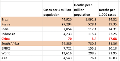
In this update, let's take a look at the dynamics of the pandemic in BRIICS (Brazil, Russia, India, Indonesia, China and South Africa) group of countries.

First, weekly case counts:


Brazil is leading BRIICS into what appears to be a new wave, Wave 4 of the pandemic. All other BRIICS countries are showing sustained moderation in new cases. There is also a much smaller uptick in new cases in India.

A similar picture emerges from weekly deaths data:


A summary table of per capita cases and deaths, as well as mortality rates.


One feature of the above dynamics is the state of uncertainty these highlight in the Emerging and Developing economies with respect to the recent improvements in the pandemic numbers. Sitting in the West, it is, perhaps (depending on the location) easy to slip into a state of overconfidence and complacency, as vaccines become more widely distributed and politicians trumpet the sight of 'normalcy' on the horizon. The problem with this worldview is three-fold:
  1. This pandemic will not go away until we reach - globally - levels of vaccinations and infections that deliver global 'herd immunity', which would require 90%+ immunity cover; and
  2. As long as there are large pools of the virus in the world at large, there will be higher likelihood (note: we do not know probability) of virus mutations that can render acquired immunity irrelevant, and
  3. We are currently not doing anything near enough to deliver vaccines to the countries outside the Advanced economies world.  

13/3/21: COVID19 Update: Most impacted countries

 In previous posts, I covered updates for Covid19 pandemic figures for:

  • Worldwide data: https://trueeconomics.blogspot.com/2021/03/12321-covid19-update-worldwide-data.html, and
  • Europe and the EU27 countries: https://trueeconomics.blogspot.com/2021/03/13221-covid19-update-europe-and-eu27.html.
Now, world's worst hit countries and regions.


World's 5 worst impacted countries by the number of cases per capita (the first table above), with ranks 1 = worst:

  1. Andora
  2. Montenegro
  3. Gibraltar
  4. Czechia
  5. San Marino
The U.S. ranks 9th worst in the world - the only country with more than 100 million population. There are three countries with population over 10 million but below 100 million on the list: Belgium (15th) and Portugal (11th), plus Czechia.

World's 5 worst impacted countries by the number of deaths per capita (the second table above), with ranks 1 = worst:
  1. Gibraltar
  2. San Marino
  3. Czechia
  4. Slovenia
  5. Belgium
The U.S. ranks 12th in the world - the only country with more than 100 million population in the list of worst-impacted in terms of deaths per capita. Notably, there are two countries with population between 50 million and 99 million on the list of the worst impacted countries by deaths per capita: Italy (ranked 8th worst in the world), and the UK (ranked 6th worst in the world). There are further 4 countries on the list with population over 10 million, but less than 50 million: Belgium and Czechia already referenced above, plus Portugal (ranked 11th), and Span (ranked 14th).


Two tables above summarize key statistics for the countries with more than 250,000 cases of Covid19 recorded. The table also provides overall rankings for these countries in terms of their performance across three metrics: cases per capita, deaths per capita and deaths per case.

Notably, ten worst countries based on these combined metrics are (once again, rank = 1 implies the worst overall performance):
  1. Belgium
  2. UK
  3. Italy
  4. Hungary (tied with Italy)
  5. Portugal
  6. Czechia
  7. Spain
  8. U.S.
  9. Bulgaria (tied with U.S.)
  10. Peru
Across major regions:


Note: in the above table, regions are ranked as countries, though countries' rankings do not include regions. Thus, if the EU27 was treated as a country, it would rank 19th worst in the list of countries. If we remove EU27 member states from the list, the EU27 itself would rank 9th worst in the list, just below the U.S. which continues to perform worse than the EU27, but only marginally. 

Finally, countries' and groups' shares of deaths relative to their share of world population:


The U.S. is the second worst performing major country with its ratio of its share of world deaths to its share of world's population standing at 4.7. The UK is the worst, with a ratio of 5.6 and the EU27 third worst with a ratio of 3.8. 

Saturday, March 13, 2021

13/2/21: COVID19 Update: Europe and EU27

Updating Covid19 data for Europe and EU27 for the period through Thursday this week. In line with global data trends (covered here: https://trueeconomics.blogspot.com/2021/03/12321-covid19-update-worldwide-data.html), Europe and the EU27 are starting to show some tentative signs of a risk of new wave of the pandemic emerging.


  • Both Europe and EU27 have experienced two waves of the pandemic, with the second wave characterized by two key features: 1) long and slow decline in the new cases counts, lasting from the peak of the wave around Week 45 of 2020; and 2) Re-acceleration in the wave into another local peak at Week 1 of 2021 and bottoming out in Week 6.
  • Since Week 7, we are in a potential start of Wave 3, as noted in the chart above.
  • Both Europe and EU27 are indicating the bottoming out of Wave 2 around Week 9 of 2021 in terms of death counts.
  • Weekly death counts are yet to show the potential start of Wave 3 that appears to be showing in the weekly case counts data.
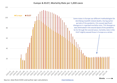
  • Some states in Europe use different methodologies for identifying Covid19-related deaths. During earlier periods of the pandemic, this caused significant divergence in reported mortality rates. This divergence was eliminated in the second wave of the pandemic. So far through the second wave, mortality rates in the EU27 slightly exceed those in Europe as a whole.

As noted in the table above, this week's counts of new cases are up 12% on 4 weeks-average in Europe and up 16% in the EU27. This is the worst performance for any region, save Oceania, where data quality is highly unreliable. Death counts dynamics clearly lag new cases dynamics, and it remains to be seen if the more recent uplifts in new cases do indeed mark a new wave of the pandemic.


12/3/21: COVID19 Update: Worldwide Data

Updating charts for weekly worldwide numbers covering the Covid19 pandemic, here is the data through Thursday this week:


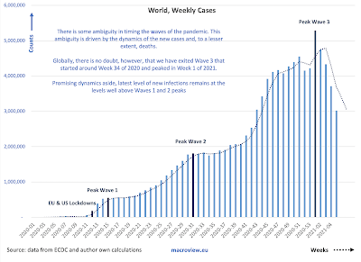
  • In terms of case counts: there is some ambiguity in timing the waves of the pandemic, driven by the dynamics of the new cases and, to a lesser extent, deaths.
  • Globally, there is no doubt, however, that we have exited Wave 3 that started around Week 34 of 2020, peaked in Week 1 of 2021, and, it appears to have bottomed out in Week 7 of 2021.
  • The latest level of new infections remains well above Waves 1 and 2 peaks. 
  • More ominously, since Week 8 of 2021, we are seeing a potential re-emergence of a new wave, Wave 4.
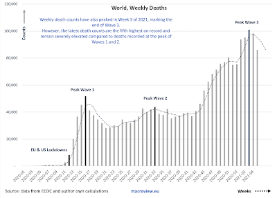
  • Weekly death counts have also peaked in Week 3 of 2021, marking the end of Wave 3. 
  • However, the latest death counts are still well above peaks of Waves 1 and 2, and as is the case with new cases, last two weeks have witnessed a new uplift in the deaths counts, potentially marking the beginning of a new wave.
  • Recent decreases in mortality rate are most likely attributable to three key drivers: (1) earlier detection of cases due to improved testing; (2) younger demographics of those with confirmed infections; and (3) improved treatments in the earlier stages of the disease.
  • The decrease in mortality appears to have stabilized and slightly reversed in the first 5 weeks of 2021.

Combined evidence suggests moderation in the global pandemic has been ongoing for some time now, however, new cases are rising once again across most major regions:


The good news is, we are out of the Wave 3 of the pandemic. The bad news is, even with significant in-roads in terms of vaccinations, we are still seeing an uptick in new cases in the last two weeks.


Sunday, February 14, 2021

14/2/21: COVID19 Update: BRIICS

 In previous posts, I covered the latest data for weekly Covid19 pandemic dynamics for:

Now, let's take a closer look at the pandemic dynamics in the BRIICS (Brazil, Russia, India, Indonesia, China and South Africa).


In broadly defined terms, there is an ongoing decline in both new cases and new deaths over the last week across all BRIICS. That said, it is too early to call the peaking of the second wave of this pandemic in terms of deaths counts, since weekly counts remain extremely high and show only one week of sustained declines. The good news is that last week's declines were evident in all BRIICS. Another good news is that we now have at least four consecutive weeks of declines in new cases across the entire group, except for Indonesia, where we only have one week of declines, and China. 

A summary table:


14/2/21: COVID19 Update: Most impacted countries


Previous posts on the COVID19 update covered global numbers and trends (https://trueeconomics.blogspot.com/2021/02/14221-covid19-update-worldwide-data.html) and European & EU27 trends (https://trueeconomics.blogspot.com/2021/02/14221-covid19-update-europe-and-eu27.html).

Here are some comparatives across all countries with the highest rates of detected infections (> 5% of population):


Note: I highlighted countries with > 10 million population.

Another way of looking at this is to take countries with more than 250,000 confirmed cases, as presented in the next set of tables:


Comparing regions to the above countries:

And looking at the countries by population relatives:

The table above really drives home the depth of the crisis in Europe and the U.S. U.S. accounts so far fo 20 percent of global deaths, having just 4.3 percent of the global population. This gives the U.S. second worst ratio of its share of global deaths to its share of world population. Only the UK exceeds the U.S. in this horrific metric. The EU27 fall in the third place, below the U.S. with 21.4% of the world's deaths and 5.8% of the global population. 


14/2/21: COVID19 Update: Europe and EU27

 Summary table from the previous post covering worldwide trends (https://trueeconomics.blogspot.com/2021/02/14221-covid19-update-worldwide-data.html) puts Europe and EU 27 in the context of global trends:


The chart next shows weekly data dynamics for new cases for EU27 and Europe:


Both Europe and EU27 have experienced two waves of the pandemic, with the second wave characterized by two key features:
  1. Long and slow decline in the new cases counts, lasting from the peak of the wave around Week 45 of 2020; and 
  2. Re-acceleration in the wave into another local peak at Week 1 of 2021. 
The quick reversals of decline trend around Weeks 51-53 of 2020 is a worrying sign that improvements in overall pandemic trends are fragile.


The fragility of the trend in terms of improvements are even more evident in the numbers of new weekly deaths. Both Europe and EU27 are yet to confirm the peaking of the second wave of the pandemic in terms of weekly new deaths. Nominally, the peaks of the most recent wave in Week 49 of 2020 in the EU27 and Week 3 of 2021 in Europe have not, yet, been followed by accelerating or deepening declines in the deaths counts.

One clear positive trend remains in terms of mortality rates per case:


The caveat to the above is a slight uplift in mortality around Week 51 of 2020 as shown in the above.

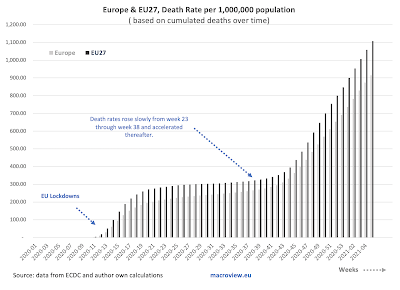
Cumulated deaths per capita are exhibiting a slight slowdown over time (slope) but are still increasing at a rate massively in excess of what was witnessed during the period of Week 19-43 of 2020. In other words, we are not yet out of the woods, even compared to the pandemic dynamics of the Summer 2020.

As with global figures, it is too early to say anything about vaccinations effects on general trends.


14/2/21: COVID19 Update: Worldwide Data

 Worldwide trends for COVID19 pandemic in terms of cases and deaths:


There is some ambiguity in timing the waves of the pandemic. This ambiguity is driven by the dynamics of the new cases and, to a lesser extent, deaths. Globally, we have exited Wave 3 that started around Week 34 of 2020 and peaked in Week 1 of 2021. Promising dynamics aside, latest level of new infections remains at the levels well above Waves 1 and 2 peaks.


Weekly death counts have also peaked in Week 3 of 2021, marking the end of Wave 3. However, the latest death counts are the fifth highest on record and remain severely elevated compared to deaths recorded at the peak of Waves 1 and 2.


Recent decreases in mortality rate are most likely attributable to three key drivers: (1) earlier detection of cases due to improved testing; (2) younger demographics of those with confirmed infections; and (3) improved treatments in the earlier stages of the disease. The decrease in mortality appears to have stabilized and is slightly reversing in the first 5 weeks of 2021. This is the most worrying aspect of the three trends discussed above.

Here is a summary table, with green cells showing improvements and red cells showing deterioration in dynamics:


Last week's deaths have shown an improvement on 4 weeks average in all regions world-wide, and this has been consistent across all (excluding Asia) regions also in terms of new cases 4 weeks average compared to prior 4 weeks average. Deaths, however, are still up on the 4weeks average relative to prior 4 weeks average basis in most regions, with exception of two.

For now, it is hard to attribute the above improvements to vaccinations (long term solutions) and the improved dynamics are probably more consistent with a natural flow of the pandemic wave, reflecting tightening of restrictions on social activities in virtually all major geographies following the holidays season. This, along with the rapidly growing prevalence of the new, more infective, strands of the virus suggests that the gains made in recent weeks are at a risk of reversals. 


Friday, February 5, 2021

4/2/21: The Impact of the Business Closures on Covid-19 Infection Rates

 In a recent post, I covered the impact of the failure at the Federal level to implement more robust measures on rents and tenure security for households (see: https://trueeconomics.blogspot.com/2021/02/3221-cost-of-trumps-failures-to-act-on.html). Another interesting aspect of the U.S. experience during the pandemic relates to the policies concerning the closure of essential vs non-essential businesses. A recent (January 2021) study by Song, Hummy and McKenna, Ryan and Chen, Angela T. and David, Guy and Smith-McLallen, Aaron, titled: "The Impact of the Non-Essential Business Closure Policy on Covid-19 Infection Rates" (NBER Working Paper No. w28374: https://ssrn.com/abstract=3772613) looked at the implications of this specific policy response to the Covid-19 pandemic.

Per authors, durig the pandemic, "many localities instituted non-essential business closure orders, keeping individuals categorized as essential workers at the frontlines while sending their non-essential counterparts home". The authors examined "the extent to which being designated as an essential or non-essential worker impacts one’s risk of being Covid-positive following the non-essential business closure order". The study used data for the State of Pennsylvania, accounting for the intra-household transmission risk experienced by the workers' cohabiting family members and roommates. 

The study estimated that:

  • "... workers designated as essential have a 55% higher likelihood of being positive for Covid-19 than those classified as non-essential; in other words, non-essential workers experience a protective effect. 
  • "While members of the health care and social assistance sub-sector contribute significantly to this overall effect, it is not completely driven by them. 
  • "We also find evidence of intra-household transmission that differs in intensity by essential status. Dependents cohabiting with an essential worker have a 17% higher likelihood of being Covid-positive compared to those cohabiting with a non-essential worker. Roommates cohabiting with an essential worker experience a 38% increase in likelihood of being Covid-positive. 
  • Overall, "analysis of households with a Covid-positive member suggests that intrahousehold transmission is an important mechanism."
In summary: "Our findings suggest that essential workers and their cohabitants (whether dependents or other primary policyholders sharing the same address) are at substantially higher risk of being positive for Covid-19 than are non-essential workers and their cohabitants. Conversely, non-essential workers and their cohabitants experience a protective effect against the risk of Covid-19 infection as a result of the nonessential business closure policy." 

And the kicker: "the designation of some workers as essential and others as non-essential during the pandemic has increased the health risk profile of some jobs while reducing it for others, all while other underlying aspects of these jobs (e.g., monetary compensation) remain minimally affected." In other words, the essential workers carry risk without carrying associated risk premium in their compensation (monetary or non-monetary).

Thursday, February 4, 2021

4/2/21: U.S. Labor Markets: America's Scariest Charts, Part 6

 Having covered some core stats relating to the U.S. labor markets in previous 5 posts:

  1. Continued Unemployment Claims (https://trueeconomics.blogspot.com/2021/02/4221-us-labor-markets-americas-scariest.html);
  2. Labor force participation rate and Employment-to-Population ratio (https://trueeconomics.blogspot.com/2021/02/4221-us-labor-markets-americas-scariest_4.html); 
  3. Non-farms payrolls (https://trueeconomics.blogspot.com/2021/02/4221-us-labor-markets-americas-scariest_16.html); 
  4. New (initial) unemployment claims data through January 30, 2021 (https://trueeconomics.blogspot.com/2021/02/4221-us-labor-markets-americas-scariest_57.html); and
  5. Average duration of unemployment (https://trueeconomics.blogspot.com/2021/02/4221-us-labor-markets-americas-scariest_41.html),
in this last post, we will focus on the overall employment index for the current recessionary cycle:


Currently, into month 10 data of the recession (December 2020), and employment index is reading close to the conditions in the recession of 1945, but better than the recession of 1953. We are still trending worse than any recession in modern period (post-Gold Standard), and that is quite an achievement (in negative terms). Dynamically, improvements in employment conditions have been flattening out from month 5 of the recession through month 8 and index improvements have slowed down to almost nil in months 9 and 10. Unless there is a significant reversal in this trend, by the end of 2021 we are likely to be around the same labor markets conditions as at the same time during the Great Recession. 

4/2/21: U.S. Labor Markets: America's Scariest Charts, Part 5

 The first four posts on the state of the U.S. labor markets have covered:

  1. Continued Unemployment Claims (https://trueeconomics.blogspot.com/2021/02/4221-us-labor-markets-americas-scariest.html);
  2. Labor force participation rate and Employment-to-Population ratio (https://trueeconomics.blogspot.com/2021/02/4221-us-labor-markets-americas-scariest_4.html); 
  3. Non-farms payrolls (https://trueeconomics.blogspot.com/2021/02/4221-us-labor-markets-americas-scariest_16.html); and
  4. New (initial) unemployment claims data through January 30, 2021 (https://trueeconomics.blogspot.com/2021/02/4221-us-labor-markets-americas-scariest_57.html)
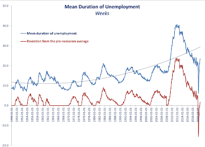
In this post, let's take a look at the latest data on average duration of unemployment through December 2020:


As the chart above clearly shows, current average duration of unemployment spell is already higher than the peak of any prior recession other than the Great Recession. However, the duration remains relatively benign when we control for the business cycle (red line and the chart next).


Dynamically, it is hard to imagine average duration of unemployment to be staying around its current levels. Something to watch in months to come as an indicator of the direction of structural (as opposed to cyclical) unemployment. 


4/2/21: U.S. Labor Markets: America's Scariest Charts, Part 4

 The first three posts on the state of the U.S. labor markets have covered:

  1. Continued Unemployment Claims (https://trueeconomics.blogspot.com/2021/02/4221-us-labor-markets-americas-scariest.html);
  2. Labor force participation rate and Employment-to-Population ratio (https://trueeconomics.blogspot.com/2021/02/4221-us-labor-markets-americas-scariest_4.html); and
  3. Non-farms payrolls (https://trueeconomics.blogspot.com/2021/02/4221-us-labor-markets-americas-scariest_16.html)
In this post, let's take a look at new unemployment claims data through the week of January 30, 2021:


The data confirms the worrying trends cited in reference to continued unemployment claims. In the last week of January 2021, based on preliminary estimates published today, initial unemployment claims stood at 816,247 - a decline of just 23,525 on prior week reading. The 4-weeks cumulative initial unemployment claims are at 3,744,581, which only 103.433 down on prior 4 weeks period. Net, over the last 5 weeks, the reduction in initial unemployment claims stands at a miserly 19,725. 

Despite little media coverage, the U.S. labor markets remain stricken by the pandemic effects on economic activity. If we strip out data for the pandemic period-to-date, the latest weekly reading for initial unemployment claim ranks as the 10th highest in the history of the series.