Tuesday, June 30, 2020

30/6/20: COVID19 Impact on SMEs and Employment


Some really good mapping in terms of financial exposures/risk and COVID19 vulnerabilities within the U.S. small and medium enterprises sectors, via McKinsey & Co:

Source: https://www.mckinsey.com/featured-insights/americas/which-small-businesses-are-most-vulnerable-to-covid-19-and-when. Interactive graphs: https://covid-tracker.mckinsey.com/small-business-vulnerability.

Additional: vulnerabilities across jobs https://covid-tracker.mckinsey.com/vulnerable-jobs/industry-occupation.

30/6/20: Long-Term Behavioral Implications of COVID19 Pandemic


My article on the behavioural economics and finance implications of COVID19 pandemic is now available on @TheCurrency website: https://www.thecurrency.news/articles/19675/debt-distress-and-behavioural-finance-the-post-pandemic-world-be-marked-by-deep-and-long-lasting-scars.


Hint: dealing with COVID19 impact will be an uphill battle for many and for the society and economy at large.

This is a long read piece, covering general behavioural fallout from the pandemic, and Ireland-specific data.

29/6/20: The Scale and Distributional Effects of Monetary Activism During Pandemic


A neat summary of global monetary policy supports deployed during the COVID19 pandemic via McKinsey & Co:


In effect, globally, monetary authorities are underwriting government and private corporate debt for larger companies. This, naturally, will lead to reduced investment and competition from smaller firms, including more innovative ones, raising the relative cost of debt to these companies. Both, directly and indirectly, the monetary policies favour equity investment in top-tier, larger companies, effectively increasing not only the cost of debt, but the cost of capital in the medium term for smaller and medium-sized companies.

Monday, June 29, 2020

29/6/20: Arithmetic and Retail Sales: Ireland's Case


Monthly v annual, downside v upside... when it comes to rates of change, COVID19 is a good reminder of how hard, intuitively, arithmetic can be...

Take Irish retail sales. Gloriously, monthly changes in retail sales are booming, up 29.5% m/m in volume and 28.4% in value. A 'V-shaped' thingy. Un-gloriously, year on year the sales are 26.6% in volume and 29.1% in value. But here's the ugly thingy: suppose a year ago you were retailing 1 unit (in volume or value). Annual rate of change in these was around 2.55% over 2016-2019 for value and 4.4% in volume. Which means you were 'rationally' expecting to be selling 1.0255 units in value and 1.044 units in volume around this time 2020. You are selling, instead 0.705 units in value and 0.734 units in volume. You have, prudently, planned your investment and spending allocations, based on similar expectations. Your reality is that you are down 31.3 percent on where you were supposed to be in value and 29.7 percent in volume. Notice the 'wedge' between volume and value. Deeper deterioration in value than in volume means not only that your revenue fell off, but that you are working harder to deliver on what revenue you do derive. In basic terms, you now need to be selling roughly 5 percentage points more of volume to derive the same euro value.


In simple analogy terms, you are trying to swim back to shore in a gale-force head wind, with a 12 feet swell, and against a roaring riptide. But otherwise, it's a 'V-shaped' looking thingy...

29/6/20: Eurocoin Growth Indicator June 2020


Using the latest Eurocoin leading growth indicator for the Euro area, we can position the current COVID19 pandemic-related recession in historical context.

Currently, we have two data points to deal with:

  1. Q1 2020 GDP change reported by Eurostat (first estimate) came in at -3.6 percent with HICP (12-mo average) declining from 1.2 percent in January-February to 1.1 percent in March.
  2. Q2 2020 Eurocoin has fallen from 0.13 in March 2020 to -0.37 in June 2020 and June reading is worse than -0.32 recorded in May. This suggests continued deterioration in GDP growth conditions, with an estimate of -2.1 percent decline in GDP over 2Q 2020. HICP confirms these: HiCP dropped from 1.1 percent in March 2020 to 0.9 percent in May. 
Here are the charts:


We are far, far away from the growth-inflation 'sweet spot':


Sunday, June 28, 2020

28/6/20: COVID19 Update: Top 50 Countries


Here are summary tables of stats for COVID19 pandemic for top 50 countries by cumulative number of cases, plus EU27:

First a 'heat map' legend.


28/6/20: COVID19 Update: US vs EU27


Updating charts for the pandemic development in the U.S. and the EU. Take your pick...


You can see acceleration dynamics in the U.S. cases in the chart above, and in rates below.


The U.S. is now a case-study on how not to do public health response. Now, daily cases and deaths:


There are some big revisions, especially in death counts, in the data. Both, U.S. and EU27 reporting remains shoddy and lagged. Even 7-day moving average (mid-point of 'prevalent' duration of contagious stage for COVID19) is pretty volatile. One additional caveat is that deaths do not fully reflect health impact of COVID19, since those who recover from the disease often suffer catastrophic long-term damage to their lungs.

28/6/20: COVID19 Update: World Cases and Deaths


Updating data for global COVID19 pandemic


There are no good news.

  • Global case numbers hit an all-time high on June 27th, and run above 180,000 per day in the last three days. 
  • Global deaths are trending up, rising above 6700 on June 27th - the highest reading since June 17th and 11th highest number on record. 


Saturday, June 27, 2020

26/6/20: Longer-Term Impact of COVID19 on Growth

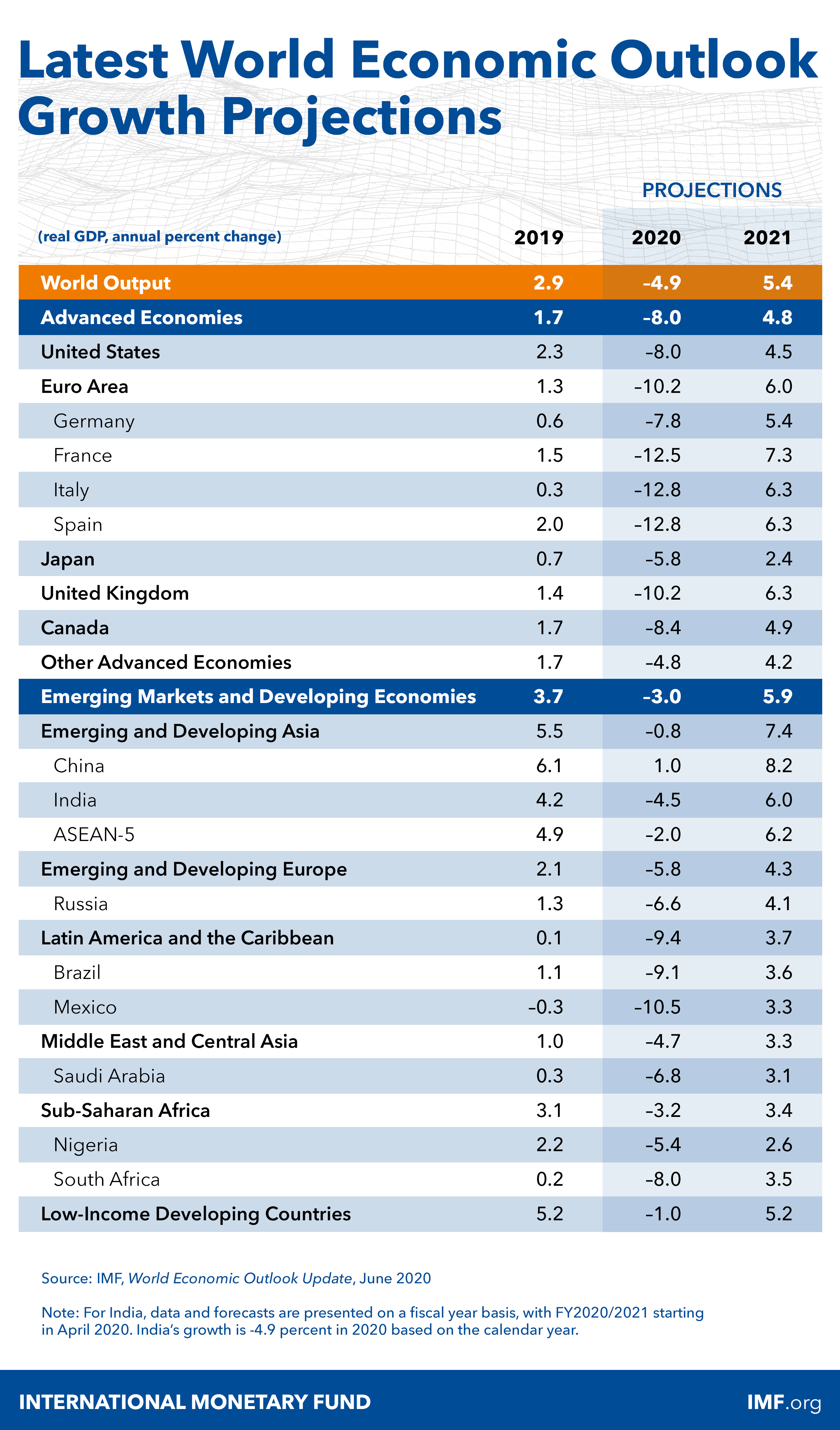
IMF published updated forecasts this week, and here the summary:

World Economic Outlook, June 2020, Growth Projections table

IMF has stopped doing 5 year forecasts this April, due to uncertainty induced by the COVID19 pandemic. 

Looking at the longer run effects of the pandemic, based on October 2019 (pre-Covid19 trends), and earlier growth trend before the Global Financial Crisis (GFC) puts COVID19 pandemic into historical perspective:


The differences between the above trend lines are telling. 

Globally, GFC resulted in a permanent loss of real income that amounts to a cumulative decline of ca 17 percent over 17 years (2008-2024). COVID19 is forecast to result in additional permanent loss of 3.2 percent within 5 years 2020-2024.

Eurozone has been hit even harder. GFC resulted in a permanent loss of real income to the tune of 12.8 percent while COVID19 is currently set to yield a permanent additional loss of income to the tune of 7.1 percent over less than 1/3rd of the post-GFC trend line duration. 

The numbers above are rather 'indicative', in so far as any and all forecasts past 2020 are perilous at the very best. But you get the picture: we are witnessing two consecutive events that result in permanent deviation of economic activity away from the prior trends. And both events are sharp. Even with a 'V-shaped' recovery, we are in trouble (because a V-shaped recovery taking us into mid-2020 means recovering end-of-2019 levels of economic activity, while losing 1.5-2 years of growth momentum (recall, economy was slowing down in H2 2019 on its own, without COVID19). 

As we say... [ok, well, may we do not say it often, but...] this picture is f*ugly... 


Friday, June 26, 2020

26/6/20: Trade Restrictions: European Companies


BOFIT newsletter out today highlights the scale of restrictive trade measures applicable to the EU exporters across a number of significant markets:


Of eleven countries included, three managed to lower trade and investment barriers applying to the EU companies over 2017-2019 period, two countries had unchanged barriers, and six showed increasing barriers to trade and investment. In a way, this reflects a shift away from trade and investment globalization focus on the last three decades toward more regionalized and even protectionist policies.

COVID19 pandemic is likely to accelerate this trend.

25/6/20: America's Scariest Charts Updated


Trump cheers today's unemployment figures... and...


Week of June 13th non-seasonally adjusted new unemployment claims were revised up to 1,463,363, from 1,433,027 published a week ago.

First estimate for the week of June 20th came in at 1,457,373.

Total initial unemployment claims filed so far during the COVID19 pandemic now sit at a massive, gargantuan 43,303,196, while estimated jobs losses (we only have official data for these through May, so using June unemployment claims to factor an estimate) are at 24,033,000. Putting this into perspective, combined losses of jobs during all recessions prior to the current one from 1945 through 2019 amount to 31,664,000.

A visual to map things out:


Charted differently:

Let's put this week's number into perspective: last week marked 14th worst week from January 1, 1967 through today. Here is tally of COVID19 initial claims ranks in history:


This is pretty epic, right? We are cheering 14th worst week in history. Note: all 14 worst weeks in history took place during this pandemic.

Of course, not all of the last week's initial unemployment claims are new claims. Initial claims can arise from people who have been kicked off prior unemployment rolls, who were denied unemployment filed earlier and so on. But the numbers above are dire. Disastrously dire. No matter how we spin the table.

25/6/20: COVID19 Update: Global Pandemic Rates


Summary of global, G7, and BRIICS case and deaths counts and rates:


25/6/20: COVID19 Update: EU27 v USA


As explained in the charts: the absolute basket case of the U.S. response to the COVID19 pandemic continues to take its costly toll:


Note: there are some quirks in the data, including due to revisions of cases and deaths, as well as due to differences in reporting timings. I use ECDC data that itself relies on confirmation of global data from the Johns Hopkins University database, as well as CDC and other databases.

In the charts above, I track the dates of the earliest imposition of lockdowns in the EU (case of Italy) and the U.S. (starting with California). In terms of both deaths and cases, the U.S. is currently running (daily and 7-day moving averages) at much higher rates of the pandemic than the rates that triggered the lockdowns. 

25/6/20: COVID19 Update: World Cases and Deaths


As explained in the charts: although geography of cases and deaths continues to shift to Latina America and Africa, Western nations are starting see pockets of increased cases. This is happening during the summer season in the Northern Hemisphere, making current increases more worrying.


The pandemic has not gone away. And any 'normalization' in these circumstances must be taken with extreme caution. Which is, currently, being abandoned more than adhered to.

Thursday, June 25, 2020

24/6/20: COVID19 Social Impact: June 2020 Ireland


Interesting insights from the CSO on some impacts of COVID19 pandemic on general population: https://www.cso.ie/en/releasesandpublications/ep/p-sic19eep/socialimpactofcovid-19surveyjune2020asnapshotofexperiencesandexpectationsinapandemic/.

The following are of significant medium and long-term concern:

  1. Health impact 1: 40.9% of all respondents to the survey report increased body weight since the start of the COVID19 restrictions, against 13.7% who report weight loss.
  2. Health impact 2: "49.0 of newly labour inactive respondents (those in employment before the onset of the COVID19 crisis and currently not working) reported an Increase in weight. This compares with 37.6% of respondents that are currently working."
  3. Health impact 3: The above health effects are most likely primarily driven by stress. For example: "Analysis of weight change by household composition found that a higher percentage of adults living in households with children reported having gained weight (47.5%) when compared with adults living alone (35.2%)." Given that households with children faced the pressure of not only own lockdown-related factors, but also the burden of caring for children and the pressures of home-schooling, changes in the health status are likely to be signifcantly driven by stress.
  4. Precautionary savings: "Of respondents that reported reduced expenditure and/or an increase in income, just over half (51.1%) said that they have/will put additional money into Savings."
  5. Workplace: Of the respondents who reported as working from home, 19.6% stated they do not have adequate work space and/or equipment. "Almost one in five (18.5%) respondents reported being Very or Extremely concerned about their employer’s ability to provide a safe work environment in the context of COVID-19."
What does this mean for business? Some thoughts:
  • We are likely to see stronger focus on health and well-being when it comes to consumers voting with their Euros in months and years to come. Smaller, natural and sustainability-focused brands are likely to have an opportunity space as long as they can maintain value proposition. 
  • The above also supports increased demand for personalisation of goods and services being supplied to consumers, a trend that will accelerate should COVID19 restrictions persist or even re-accelerate. 
  • Financial implications of COVID19 will reinforce workplace and brand effects: as consumers return to work, they will increasingly demand greater safety and more direct engagement with their employers and brands. 
  • Production processes will shift toward ensuring tighter control and quality delivery by the brands, which means that co-manufacturing and outsourcing will be less favoured by consumers than in-house production. 
  • Direct-to-Consumer channels of sales will become more important, as they provide greater assurances to consumers of quality, provenance and ESG-impacts attributes of their suppliers.
  • On investment side: organic cash flow-funded investment will become more important in years to come. This will be driven by greater preference amongst retail investors for liquidity and by the re-discovery of the need for cash-based safety buffers amongst the companies. Low cost of funding in the bonds markets and in the banking channel will also disfavour households shifting out of their precautionary savings accumulated during the pandemic.
I am sure there will be other disruptive factors at play as well. 

Wednesday, June 24, 2020

24/6/20: German Business Sentiment for June: Mixed Signs of the Ongoing Recovery


Germany's ifo Institute published June survey results for business confidence, reflecting the latest changes arising from the graduate, but fast, 'normalization' of economic activities. There are some improvements in forward expectations, set against virtually no improvement in current conditions:


The gap between pre-COVID19 and current conditions sentiment remains massive, with trough to current reading improvement of just 2.4 points, compared to the pre-crisis to trough fall of 20.2 points. Expectations (6 months forward) gains 11.9 points on the trough, with pre-crisis to trough decline of 21.5 points. This implies that forward expectations are now just over half-way into recovering pre-COVID19 levels, but current conditions assessment still shows dire state of the economy.

So far, current conditions dynamics do not suggest a V-shaped recovery, but there is some hope in terms of expectations. Manufacturing and construction sectors dominate negative outlook. Services sectors current assessment is matched by forward expectations, while trade sectors are showing more robust recovery across the board.

Monday, June 22, 2020

21/6/20: Does Populism in Politics Matter in COVID19 Pandemic Outcomes?


I spent some time over the last day and a half crunching through some interesting data on COVID19 cases and deaths in Europe, using two data sets:
  1. The usual ECDC data set on daily cases and deaths, allowing me to compute - through 20/06/2020 both deaths per 1 million population and cases per 1 million population for EU27, UK and Switzerland, Iceland and Norway, plus Serbia.
  2. The Timbro Institute's index data for measuring extent of populist parties and politicians influence in Europe (same countries).
In theory - often discussed these days on social media - populist leaders and parties tend to place lower emphasis on scientific research and expertise in shaping their policies. This should naturally imply that more populist-leaning governments and governing systems potentially should be associated with higher numbers of cases of COVID19 and higher death rates per capita. Also, in theory, when voters express persistent and rising - over the number of years - support for populists, such voter preferences should also influence core policies positions occupied by the mainstream parties, pulling these parties somewhat closer toward adopting at least some features of the 'winning' populists.

So, I tested if European states' outcomes in terms of the extent of contagion (cases per million, variable Y1) and the degree of mortality from the COVID19 pandemic (deaths per million, variable Y2) were related to 
  • Variable X1: 2018-2020 average share of populist vote in each country
  • Variable X1A: 2020 share of populist vote in each country
  • Variable X2: 2018-2020 average share of right wing populist vote in each country
  • Variable X2A: 2020 share of right wing populist vote in each country
The data is not pretty, so I run a barrage of regressions with different specifications: inverse, linear, polynomial up to d(3), log-log, log-linear, power, compound, sigmoid, logistic and exponential. Of all specifications, using a range of tests, I have selected the best-fit specification which turns out to be exponential. 

The results are shocking.

1) There was not a single case where there was a significant (statistically AND econometrically) relationship between the popularity of populist votes and worsening of the outcomes of the pandemic either in terms of how many people got infected (officially) and how many people died (also, officially). In other words, we can firmly not accept the proposition that higher degree of populism in the electoral politics of the countries AND higher degree of right-wing populism relate to worse outcomes in the COVID19 pandemic.

2) X1 variable: 2018-2020 average share of populist vote in each country has a very weak (but statistically significant at 10% confidence) and negative relationship with the number of cases of COVID19. In other words, with a lot of caution, we can reject the hypothesis that higher share of populist votes is associated with worse outcomes in terms of the number of COVID19 cases reported. Or, put differently: higher share of populist votes over 2018-2020 time horizon appears to be associated with lower number of reported infections. 

2)For X1A variable (2020 share of populist votes) things are statistically indifferent from zero: share of populist vote appears to have no statistical relationship to COVID 19 deaths and cases

3) X2 variable: 2018-2020 average share of right wing populist vote in each country yields exactly the same conclusions as X1 variable. with one slight modification: the negative relationship between the COVID19 cases reported and the average share of right-wing populist votes is slightly stronger than for X1 variable.

4) X2A variable: 2020 share of right wing populist vote in each country yields the same results, qualitatively, as X2 variable.

Here is the example of X1 variable effects:


Now, there are many ways in which we can derive intuitive analysis to accompany the above results, including, but not limited to:
  1. Data on COVID19 pandemic is shoddy. We are relying on reported cases which are a function of testing. Data on deaths relies on reported deaths which reflect different methodologies of designating deaths from COVID19 and different time lags, etc. One might be tempted to say that the above results reflect the possibility that countries with more right-wing or any populism in their voting have under-reported data on cases and deaths. It is, of course, a possibility. But, the countries selected above are all European countries, with precedence of populist voting stronger in a number of advanced EU & EEA member states. These countries tend to report more accurate data to begin with. In addition, as far as I am aware, ECDC did not issue any clarifications or caution notes on any EEA member states in terms of their reporting of COVID19 data. So low quality of COVID19 pandemic data is either present relatively uniformly across the present set of countries, or is not systematic in nature. Which, in turn, means that quality of data should not be a significant source of distortions to the analysis.
  2. Even from the chart above, you can see that the negative results are driven by a cluster of 3 outliers on the X1 axis and 1 outlier on the Y1 and Y2 axes. I formally tested for these outliers and removing all of them does not change the fact that the data shows NO statistically valid relationship between worsening of COVID19 outcomes and the greater presence of populism in voter preferences. So, again, this is an unlikely culprit for the overall results.
  3. Omitted variables and model specification biases. These can, of course, play a role. The thing is that I did perform a non-parametric ANOVA and rank correlations and rank regressions analysis on the data, and, once again, I found absolutely NO effects in COVID19 data reactions to populist preferences of the voters, neither in quartiles analysis, nor in rank analysis.
Final thought: the paradoxical lack of the effect of populism on the COVID19 pandemic outcomes so far might be down to something else. European states, especially EEA states, are predominantly mature democracies with well-developed institutions. 3-10 years of rising populism may impact their political systems and policy formation mechanisms, but the time span might be too low for the quality of institutions (health systems, public health systems, bureaucratic systems, etc) to change dramatically. I will be looking into these factors later, so stay tuned. 

Saturday, June 20, 2020

20/6/20: COVID19 Impact on Learning & Education


McKinsey's handy graphic summarizing expected and actual outcomes of the racial inequality in terms of access to learning and education during the lockdowns phase of the pandemic:


Pretty self-explanatory.

20/06/20: COVID19 Update: Sweden v Other Nordics


Sweden is a now a verifiable basket case amongst the Nordic countries when it comes to the country management of the COVID19 pandemic:


The two charts above show that Sweden performance in both daily cases and deaths has been truly shockingly poor, compared to all other Nordic countries combined. The same is true in country-by-country comparatives.

In fact, based on ECDC data, were Sweden to perform as all other Nordics (including Estonia), its total number of cases of COVID19 registered would currently stand at 22,890, against its actual count of 54,443, and its death toll would have been 2,113 against its actual death toll of 4,877.

20/6/20: Russia COVID19 Update: Too Early For Going Back To Normal


Russia is taking a page from the U.S. book on 'How Not to Do Pandemics' entering a major restrictions relaxation stage too early:


New cases numbers are running slightly (statistically not significantly) below the trend, but are still trending at an alarming rate (chart above). In the week through 20/06/2020, Russia averaged 8,234 new cases per day which is only slightly below 8,798 average for the week through 13/06/2020. 7 day average for deaths at 179.6 in the week through 20/06/2020 is above the same for the 7 days through 13/06/2020 that stands at 169.6.

Both, actual and adjusted death rates per official case are still moving up:


In simple terms, Russia is not ready to go to a more relaxed restrictions regime, yet.

20/6/20: EU vs USA Covid19 Update


Currently, compared to the pre-lockdown dynamics, daily cases and deaths in the U.S. warrant continued, if not accelerated severity of lockdowns, as opposed to relaxation of restrictions:


In Europe, in contrast, new cases are relatively benign and currently running (on a sustained medium term basis) below the levels at which the wide-spread lockdowns have been introduced.

On a per-capita basis, the U.S. now performing consistently worse than the EU27 in terms of new cases, daily deaths counts and dynamics in both:


In summary, the U.S. is currently the worst global basket case in managing the COVID19 pandemic. My take on the underlying causes: https://twitter.com/GTCost/status/1273999784089497606?s=20

20/6/20: World COVID Data Update: The Theory of Back to Normal


Relaxation of the Covid19 pandemic restrictions is gaining momentum worldwide, with clusters of renewed concerns over the 'second peak' or 'second wave' dynamics. The problem is that global pandemic numbers remain extremely worrying:

Total new cases are hitting all-time highs:


The orange box represents, roughly, the range of earlier data that triggered the lockdowns. It is clear that worldwide numbers are sustainably above that range. The 7-day running average is horrific and trending up at an accelerating rate. The slope of the current 7-day moving average is now similar to what we observed in the peak period of contagion in Europe.

Total daily deaths are also on the rise, once again:


Once again, the orange box related current deaths to the European lockdowns initiation deaths. The 7-day moving average is on the rise, once again.

Yes, on per-capita basis, the pandemic has moderated, primarily due to different geographies of concentration of new cases and new deaths. However, European lockdowns periods coincided with more robust testing in Europe and in advanced economies in Asia, while current period of globally spiking cases and rising deaths is coincident with less robust public health systems in less developed countries, implying that current numbers are most likely coming from much larger underestimates of actual cases and deaths.

Friday, June 19, 2020

19/6/20: Fox News, COVID19 Social Distancing and COVIDIOTS?


How influential is the U.S. mainstream media in defining public attitudes toward pandemic risk, decision-making under severe uncertainty and risks to their own health? It turns out - hugely influential.

A new paper from a group of U.S. economists, titled "The Persuasive Effect of Fox News: Non-Compliance with Social Distancing During the Covid-19 Pandemic" (authored by Andrey Simonov, Szymon Sacher, Jean-Pierre Dube, and Shirsho Biswas, May 17, 2020 https://bfi.uchicago.edu/wp-content/uploads/BFI_WP_202067.pdf) finds that:

  • "The average partial effect of Fox News viewership in a zipcode implies that 1 percentage point increase in cable viewership reduces the propensity to stay at home by 8.9 percentage points compared to the pre-pandemic average." 
  • "A persuasion rate of Fox News on noncompliance with stay-at-home behavior during the crisis of about 33.5% − 50% across our various social distancing metrics."
  • Simple regression (OLS) analysis o"generate a positive and statistically significant effect of Fox News viewership from early March onwards."
  • More robust, IV estimates. "are considerably larger and indicate a take-off in the Fox News effect in early March and a stabilization in mid March, almost immediately after the declaration of a national emergency."
  • "Since the supply-side measures, such as business closures, start to happen only two weeks later after the take-off of Fox News effects, the magnitudes of the viewership effects reflect the persuasive effect of Fox News on viewers and not a feedback effect from the equilibrium response of firms, at least early on."
  • "Our findings for CNN are inconclusive, with imprecise point estimates centered near zero."

Thursday, June 18, 2020

18/6/20: Cheap Institutional Money: It's Supply Thingy


In a recent post, I covered the difference between M1 and MZM money supply, which effectively links money available to households and institutional investors for investment purposes, including households deposits that are available for investment by the banks (https://trueeconomics.blogspot.com/2020/06/what-do-money-supply-changes-tell-us.html). Here, consider money instruments issuance to institutional investors alone:

Effectively, over the last 12 years, U.S. Federal reserve has pumped in some USD 2.6 trillion of cash into the financial asset markets in the U.S. These are institutional investors' money over and above direct asset price supports via Fed assets purchasing programs, indirect asset price supports via Fed's interest rates policies and QE measures aimed at suppression of government bond yields (https://trueeconomics.blogspot.com/2020/05/21520-how-pitchforks-see-greatest.html). 

Any wonder we are in a market that is no longer making any sense, set against the economic fundamentals, where free money is available for speculative trading risk-free (https://trueeconomics.blogspot.com/2020/06/8620-30-years-of-financial-markets.html)?

18/6/20: America's Scariest Charts Updated


Weekly data for initial unemployment claims for the week ending June 13, 2020 is out, so here are the updated 'America's Scariest Charts':

Index of employment, benchmarked to the pre-recession peak employment:


Estimated total non-farm payrolls:


And initial unemployment claims, half-year running sum:


Today's initial unemployment claims came in at 1,561,267 for the week ending June 6, 2020 (final estimate), slightly up on previous preliminary estimate. For the week ending June 13, 2020, non-seasonally adjusted initial unemployment claims came in at a preliminary estimate of 1,433,027.

A summary table to put these numbers into historical comparative:


Some recent context on the latest official employment numbers from earlier this month is provided here: https://trueeconomics.blogspot.com/2020/06/11620-americas-scariest-charts-updated.html.