Monday, April 20, 2020

20/4/20: Oil


The madness of Oil (see an explainer below):


As I said a few minutes back: at this rate, within a couple of days, it will make sense to start re-injecting the stuff back into the wells, as opposed to storing it.

An explainer:

Quite a number of folks - including journalists - have confused the above data and the 'reported' price of oil today for the actual price of oil. It is not as simple as that. Actual price of oil did not fall below zero, though for some grades it has been below zero before and is still staying there now. So what all of this really means?

Q1: Is price of oil below zero? The answer is "it depends on what price of oil one takes". Let me explain.

First, there are several major grades of oil. The two most popular are:

  • Brent North Sea Crude (commonly known as Brent Crude). Brent originates in Brent oil fields and other sites in the North Sea. Brent is a benchmark price for African, European, and Middle Eastern crude oil producers, covering, roughly two-thirds of the world's crude oil production.
  • West Texas Intermediate (commonly known as WTI) and this is a benchmark oil for North America.
  • Urals grade oil is Russian oil
  • Fateh grade oil or Dubai Fateh is the most important crude oil benchmark for Asia
  • Iran Heavy and Iran Light are benchmarks for Iranian oil.

The percentage of sulfur in crude oil varies across the grades and fields of extraction, and this percentage basically determines the amount of processing required to refine oil into energy products. "Sweet crude" is a term that refers to crude oil that has less than 1% sulfur: Brent at 0.37% and WTI at 0.24%. And both Brent and WTI are "sweet". So, "sweet" oils carry a market premium, as refineries can process these at lower cost. 

Fateh sulphur content is around 2%, Urals at 1.35%, and other grades are described here: https://en.wikipedia.org/wiki/List_of_crude_oil_products. Higher sulphur content oil trades at a discount on WTI - or used to, roughly, prior to 2008 GFC. Since GFC, U.S. supply of WTI oil has been growing more robustly than Brent supply, so the relationship reversed (see chart below).

Now, notice the above table also shows "Port of Sale". This is an important feature of trading and pricing of oil and it matters in today's oil price determination too. Bear with me.

So, let's focus on WTI and Brent. 
  • Brent is traded at a discount on WTI because it is harder to process
  • WTI is traded in the futures markets - with contracts signed and priced today for future delivery. The NYMEX (New York Mercantile Exchange) division of the CME (Chicago Mercantile Exchange) trades futures contracts of WTI. Physical delivery for WTI futures occurs in Cushing, Oklahoma. Futures are contracts that must be delivered in physical delivery if held to maturity. In other words, futures are NOT options. Options can be left to expire and the bearer does not have to take a delivery of the commodity on which the option is written. With futures, if you bough June 2020 delivery of oil contract for 1,000 barrels at, say $22, and you hold it to expiration (at the end of May 2020), you will have to take physical delivery of 1,000 barrels of oil in Cushing, OK, no matter what. 
  • Brent crude oil futures trade on the Intercontinental Exchange (ICE), and are traded with delivery internationally. In other words, Brent futures contracts are deliverable to specific country, not to one location globally, as is the case with WTI.
So, now, what happens if your hold a contract for oil, deliverable in May 2020, at 8:00 am EST today? You have two actions you can take. Today happens to be the day when May 2020 contracts mature for WTI. You can: (1) let contract mature and take delivery of oil in Cushing, OK in May, paying the price of the contract - say $22 per barrel. Or (2) you can sell the contract today, before it matures, to someone else who will then face a choice of (1) or (2) herself. 

If you opt for (1), you will need somewhere to store 1,000 barrels and a transport from Cushing, OK to wherever that storage facility is. Both cost money. And, worse, the former is not available, since we are experiencing a glut of oil. You can pay to store your oil on board transport - e.g. on board a tanker sitting in the Gulf of Mexico, or on-board railroad cars. This is hellishly expensive, even if you own the said tanker or railroad cars. So you will not do this. Worse, yet, there is so much crude out there in storage already, that short-of-demand refineries are not buying oil today. Which means you will be paying high costs of storing this stuff for weeks to come.

If you opt for (2), you need a buyer of the contract that can do (1). And these are not available, because everyone is short storage and everyone is facing a market with no buyers for this stuff for weeks. 

So you dump your May futures contracts at a negative price just to get rid of the obligation to take physical delivery of oil in May. And this is exactly what happened today with May futures (charts above) for WTI.

Now, the same did not happen today in the Brent markets. Why? Because Brent, as noted above, is deliverable across a number of countries, not just Cushing, OK. Which means you can shift location of delivery to find a more-likely-available storage facility for it, or a more-ready-to-buy refinery. In chart 2 above, top red line did not fall as much today - these are Brent futures for May contracts.

Here is the spot price of oil for Brent and WTI:


And here it is over the last year:

Today's prices are not in the chart. So here they are:


Observe negative prices on some lower quality (high sulphur - ugly) stuff in the above. These are down to the lack of refineries willing to take low quality crude when there is a glut of higher quality key stuff available. And note that Brent is nowhere near $0 today. 

Blend of WTI and Brent is another way to look at oil prices. And here is a table from the CME showing different month contracts for the blend:


Yes, may delivery is ugly. June and on, however, is well above $20 per barrel. 

20/4/20: US vs EU #COVID19 comparatives


Adjusting for the starting date of the pandemic:

  • Good news for the U.S.: U.S. deaths from COVID19 trend is continuing to trend flatter than the comparable EU trend. 
  • Bad news for the U.S.: deaths are continuing to rise and new cases additions are growing much faster than those in the EU. 

Death rates and infection rates comparatives are:


Sunday, April 19, 2020

19/4/2020: Two Scariest Charts in Economic History


I have been posting quite a bit on U.S. unemployment and jobs destruction numbers coming from the COVID-19 pandemic. So here are two charts to watch into the future, and I will be updating these throughout the crisis here.

The first chart plots evolution of non-farm payrolls index for each official recession. I used as the index base average payroll numbers for 6 months prior to the first month of the recession. I then compute and plot the index from month 1 of the recession through the last month prior to the next recession.


The second chart is the average duration of unemployment claims or average weeks unemployed. Again, series start from the first month of officially-declared recession and run until the subsequent recession.

Both charts illustrate the contradictory nature of the post-2008-2009 recession recovery. Whilst the recovery has been the longest in duration (chart 1 above), it has not been the most dramatic in terms of employment creation relative to prior pre-recession peak (line "2008-2009" solid segment runs longer than any other line, but does not gain heights of at least 6 prior recoveries.  Per chart 2 above, recovery from 2008-2009 recession has been associated with unprecedented length of duration of unemployment. The series here stop at the end of February 2020, so they do not account for the recent jobs losses, simply because there has not been, yet, official announcement of a recession.

You can read on March-April jobs losses here: https://trueeconomics.blogspot.com/2020/04/16420-four-weeks-of-true-unemployment.html and in the context of prior recessions here: https://trueeconomics.blogspot.com/2020/04/18420-shocking-wave-of-jobs-destruction.html.

Stay tuned, as I will be updating these two charts as data arrives.

19/4/20: BRICs PMIs Q1 2020


Coronavirus early impact on the global economy is quite evident now through the BRIC economies PMIs that cover the first two months of the pandemic:


One country breaking the ranks so far on this is India, where the pandemic was registered only in mid-March, resulting in 'distancing' restrictions being imposed only in the second half of the last month of the 1Q. 

Even accounting for India's relatively lagged impact of the COVID19, BRIC quarterly PMIs (note: I use simple average for each country monthly PMIs and weigh these by each BRIC economy's respective share of the Global GDP, adjusted for differences in prices and exchange rates):
  • BRIC Composite Manufacturing PMI for 1Q 2020 came in at 49.1 - statistically significantly below 50.0, indicating a recession, and marking the weakest reading since 1Q 2009. Nonetheless, BRIC Manufacturing PMI was above the Global Manufacturing PMI of 48.4.
  • BRIC Composite Services PMI for 1Q 2020 was at 44.9, weakest on record, and below Global Services PMI of 45.6. BRIC reading for 1Q 2020 was consistent with a recession.
  • Global Composite PMI at 45.9 was the weakest on record and basically in-line with the BRIC's average of Manufacturing and Services PMIs. Brazil Composite PMI at 46.9 and Russia Composite PMI at 47.7 were recessionary, but better performing that the Global Composite PMI, while India's Composite PMI of 54.8 was completely out of alignment with the Global economy and the rest of the BRICs. China Composite PMI of 42.0 was weaker than the Global Composite PMI owing to the earlier start of the pandemic in China.

18/4/20: Shocking Wave of Jobs Destruction in the U.S.


The last four weeks witnessed an unprecedented level of jobs shut down in the U.S. (and elsewhere in the world). My earlier post here https://trueeconomics.blogspot.com/2020/04/16420-four-weeks-of-true-unemployment.html provided some comparatives. But here is a summary of jobs losses in every U.S. recessions from 1945 through 2019, and comparative figures for jobs losses in March to mid-April 2020:


Put simply, last four weeks of U.S. jobs shut downs are roughly equivalent to the total jobs losses in all U.S. recessions 1945-2002, or, looking in the opposite direction, to all jobs losses in every recession from 1960 through 2009.

As an important aside, U.S> recoveries have been slower and slower in recent decades in terms of jobs creation. 2007-2009 recession took 76 month to restore jobs numbers to pre-recession peak, while 2001 recession took 47 months. In fact, the last four recessions rank as the worst, second worst, fourth worst and fifth worst in terms of jobs recoveries.

This is not to say that the post COVID-19 shutdown recovery is going to be even longer - after all, the last four weeks saw shut down of jobs, not necessarily destruction of jobs, so some of the shut down jobs will be restored as soon as economic activity recovers. Nonetheless, the above numbers really are shocking.

Saturday, April 18, 2020

18/4/20: Singapore, Korea and Japan: Flattening into Trouble?


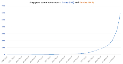
New cases are spiking in the 'safe haven' of #COVID19 pandemic: Singapore


And, worse, South Korea is now witnessing re-infection of those who have previously tested positive for coronavirus: 160 people who have been previously confirmed as having recovered from coronavirus have now tested positive again.

In Japan, that 'successfully' flattened the curve in the past, the healthcare system is now running out of ICU beds. So, many "Japanese emergency rooms are even turning away patients suffering from strokes, heart attacks or external injuries" per Axios: https://www.axios.com/japan-singapore-coronavirus-infections-a617efde-3e04-4baf-9a65-377f10454acf.html. Japan has also hit a second peak this week:


While the second peak is lower than the first one, 5 day total new cases around the previous peak was 3,349 against the current peak of 2,706: the difference not as big as would be required not to strain the resources of the healthcare system already carrying previous peak patients.

Friday, April 17, 2020

17/4/20: Error Runs in COVID19 reported data


In my previous post, I referenced some preliminary stats relating to my analysis of significant outliers in the data on the number of cases reported by different countries (see: https://trueeconomics.blogspot.com/2020/04/17420-covid19-updated-charts-and.html). Here are more detailed results:

By country (listing only countries with > 5,000 cases as of April 17, 2020):


And a summary set of statistics (top part is for countries > 5,000 cases and bottom part for countries with > 1,000 cases):

By way of explaining: I have used two methods for detecting observations of 'suspect quality' or 'outliers':

  • Firstly, I am only focusing on outliers below the 'normal reporting trend' (potential under-reported observations);
  • Secondly, I use two criteria (labeled 1. and 2. in the tables above): 1. relates to the cases where an observation is below the trend and reported day count is < 20 cases; 2. relates to the cases where an observation is below the trend and reported day count is < 50
In all of the above, I am only looking at 'suspect' observations after the date when the country in question reported its first 50 or higher daily count. The reason for this is that it is a commonly accepted view that during the early stages of contagion (small number of cases reported daily), the data does not exhibit a trend.

Final explanation: for trend, I used country-fitted power law trends.

Feel free to draw your own conclusions about different countries, based on this data, but for those interested in my insights:

Highest death rate so far on per capita basis is observed in 
  • Belgium at 425.2 persons per 1 million of population, with decent quality of data (potential error range of 0%-9.5%)
  • Spain at 409.4 persons per 1 million of population, with very strong data quality (0%-2.3% potential error range)
  • Italy at 366.9 persons per 1 million of population, with zero potential error in cases reporting
  • France at 267.5 persons per 1 million of population and zero potential error in reported cases
  • UK at 206.5 persons per 1 million of population and zero to 2.5% potential error in reported cases.
The above results broadly remain unchanged when one controls for duration of the contagion period (number of days since > 50 cases were reported for the first time).

Highest rates of infection (per 1 million of population) have been recorded in
  • Spain - 3,913
  • Switzerland - 3,129
  • Belgium - 3,048
  • Italy - 2,796
  • Ireland - 2,743
Adjusting for the days since the onset of contagion, the rates of infection are the highest in:
  • Spain - 91 per day in contagion stage
  • Ireland - 85.45
  • Switzerland - 74.51
  • Belgium - 72.56
  • Portugal - 53.9
Adjusting for the days since the onset of contagion, the rates of infection are the lowest in:
  • India 0.37
  • China 0.67
  • Indonesia 0.69
  • Pakistan 1.03
  • Japan 1.72


17/4/20: COVID19 Updated Charts and Outliers


Updating two charts for #COVID19 pandemic today:

First: US vs EU chart:

Second: Russia chart:

Since I included no commentary on Russian data in the chart itself, it is worth noting that data so far indicates no data suppression or mis-reporting. This is confirmed by analysis of 'outliers' in the data. I have looked at all countries with > 1,000 cases reported and considered observations on cases reported that fall out of trend line from the time when the country cumulated cases counts reached > 50 cases. For example, if a country reported 127 cases in day T, followed by 139 cases in day T+1, and suddenly showed 0 cases in T+2, followed by 99 cases in T+3, the date of T+2 was marked as an 'outlier'. I ignored all cases where 'outlier' suspect dates were above 20 cases, even if the number was still outside the range of the trend-defined 'norm'.

Note: these outliers can be a function of tests arrivals dates, availability of tests, hospitals reporting dates and other differences that have nothing to do with 'Government manipulation'. All in, 43 countries out of 77 with more than 1,000 cases have reported at least one outlier.

Russia had 3.45% of days reporting appearing as extreme outliers. 30 out of the total 77 countries on the list had higher percentage of outliers days than Russia. Median for 77 countries was 2.9%, mean was 5.9% and STDEV was 8.6%.

Only two of these countries, namely Russia (3.45% of observations countable as outliers) and China (13.3% of observations being outliers), has been accused in the Western media of releasing politically manipulated data. China, of course, has a very high percentage of observations that can be identified as outliers, while Russia is, basically, middle-of-the-road.

16/4/20: Lessons in Corporate Finance: COVID19


My article summing up some corporate finance lessons from the COVID19 crisis is now available at The Currencyhttps://www.thecurrency.news/articles/14752/as-we-rebuild-the-economy-we-need-to-escape-the-perilous-spiral-of-corporate-debt.


Thursday, April 16, 2020

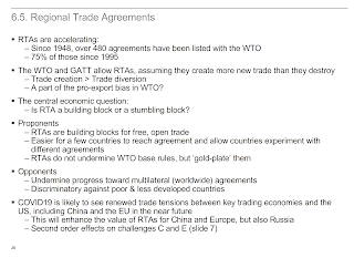
16/4/20: The BRICS+ challenge to institutional unipolarity and U.S. hegemony 2020 Lecture


My slides from the talk I gave yesterday to the MA in Non-Proliferation and Terrorism Studies students @MIIS on the COVID-updated topic of challenges to Pax-Americana in post-Bretton Woods institutional frameworks (IMF, WB, etc). You can click on each slide to enlarge.