Saturday, December 1, 2012

1/12/2012: Greek Deal 3.0


If you need to read anything at all on Greek 'Deal' 3.0 signed in November this year, go no further than this post from Yanis Varoufakis. Lethally direct & brutally correct assessment, in my view.

If you want to understand why 120% debt/GDP ration by 2020 or 2022 is not attainable absent OSI, see my note here.

1/12/2012: Irish banking Reforms: are things getting better?


In the previous post, I discussed changes in irish banking system systemic stability in 2012 (January-November). But here's a longer range view - from September 2010 on through November 2012.

Now, keep in mind: since September 2010, Irish banks had

  1. Massive recaps (2011-2012)
  2. Full reform and deleveraging programmes, approved by the EU and Irish authorities
  3. Rounds of increases in charges on customers to beef their own interest margins
  4. Vast subsidies from the ECB and CBofI
  5. Subsidies from the Government via deposits (see here)
  6. According to the Government, BofI (largest bank) has completed its deleveraging programme, while AIB (second largest bank) is ahead of target
  7. Massive sales of riskiest assets to Nama that crystalized losses and led to recaps, which are now completed
  8. According to the Government have bee operating in more benign environment of property prices stabilization
  9. Benefited from a 88% rally in Government bonds which they stuffed onto their balancesheet over 2010-present like there is no tomorrow
and so on. In other words, there are tomes and tomes of Government sponsored propaganda to suggest that things are going honky-dory in the banking sector in Ireland. Here's what Head of the Department of Finance had to say this week about the banking sector 'progress' (emphasis is mine):

"With PCAR capital investments and the Bank of Ireland sale, confidence started to return to the banking sector. [this refers to 2011]"

"In 2012 we have witnessed further tangible signs of stability. …Even though non-performing loans continue to grow; here again there are tentative signs that in the mortgage arrears area the growth in new arrears has been arrested. 

The banks still have a lot of work to do to roll out sustainable mortgage solutions, but this process is underway.

Importantly, confidence is returning to our banking system following its recapitalisation.  Deposits across the Irish system are up 2.5% with stronger growth recorded by AIB, BOI and PTSB (which are up 5.3%).

We are in a situation now where the domestic banking system is getting stronger, albeit from a very weak starting point.
  • The large scale balance sheet restructuring has been completed;
  • BOI have completed the disposal of non-core portfolios
  • AIB have substantially completed their disposals. 
  • The funding gap has been significantly reduced and the drawing on Eurosystem funding by our government supported going-concern banks continues to decline, and is now less than €60 billion (excluding IBRC).
  • Importantly, as I said earlier deposits are growing and the banks are back in the funding markets."
So, in other words, we should expect Ireland's banking system to have performed well in progressing since 2009-2010 lows?

Here's the chart:

In reality, courtesy of Euromoney surveys, we know that Irish banking system stability has deteriorated, not improved, between September 2010 and November 2012, and this deterioration was the second largest amongst 37 European countries.

1/12/2012: Ireland - still the second worst banking sector in EA


Another Euromoney risk survey on and the results for the banking sector are out:


Ireland's banking sector zombies are ranked as 4th least safe in the entire Europe of 37 countries. Next to Greece (3rd least safe), and Macedonia (1 place ahead of Ireland - 5th least safe). Iceland, having defaulted and demolished its banks, ranks 7th least safe. Note, Ireland remains the second weakest banking sector in the EA17.

Of course, our 'leaders' would say that yes, things are bad, but they are improving... hmm...


Are they? Well, sort of. Ireland's score (higher score, greater systemic stability) have risen in 11 months of 2012, but the rise was far from spectacular. Ireland's improvement in the score is 7th largest in the sample, behind that for Iceland.

Ireland's gap to the peers (Advanced Small Open Economies) in overall score is about 4.4 points. 11 months of heroic Government reforms have yielded a gain of 0.2 points in Irish position, and the deterioration in the overall euro area climate has resulted in a decline in the average ASOE score of 0.07 points. This means the spread improved in favour of Ireland by less than 0.3 points in 11 months - a rate of 'reforms' that can close the current gap, assuming continued deterioration in ASOE average, over  161 months. In other words, unless the 'reforms' in Ireland's banks start bearing fruit much faster than they have done in 11 months of 2012 so far, it will take us 13.4 years to reach ASOE average levels of banking system stability.

1/12/2012: Irish Government deposits with Zombie Banks


On the foot of the analysis of deposits from Irish Residents, one might ask a question if the Irish Government deposits within the Irish banking system are significantly skewed in favour of the Covered Group of banks (Irish domestic banks largely owned by the Government).

The hart below plots the ratio of Irish Covered Banks Deposits from Irish Residents as a percentage of all same category deposits within the Domestic Banks group:


And the subsequent chart plots Government deposits in Domestic group and within Covered group:


Per first chart above, it is pretty clear that Irish Government deposits are biased in favour of the Covered banks and that this bias has risen dramatically during the current crisis (since the beginning of 2008). Of course, the effect of this bias is two-fold:

  1. This represents a direct subsidy from the Exchequer to the Covered Banks at the expense of non-Covered banks, and
  2. This results in lowering the deposit rates that Covered Banks must charge to attract depositors.
Now, some more detailed stats on the same subject:
  • In October 2008, 75.49% of all Resident Deposits within the Domestic System were banked at the Covered Institutions. This represented a decline of 0.505% on September 2012 and a drop of 3.67% on October 2011.
  • Share of Covered Banks in total Domestic Resident deposits was down on 3mo average basis (q/q and y/y) and on 6mo average basis
  • In October 2012, share of Covered Banks in total Domestic banking system resident deposits was down 3.67% on October 2011, down 7.44% on October 2010 and down 6.56% on October 2009.
  •  While total share of Covered Banks in domestic deposits has declined, in Government deposits their share has risen. In October 2012 Covered Banks' share of Government deposits rose to 91.992% (up 1% m/m and 0.8% y/y). The said share is no up 1.92% on October 2010.
Let's take a look at longer term series:
  • Prior to 2008, average share of Covered Banks in total resident deposits was 78.7% and this fell to 75.3% for the average from 2008 through present, with 3mo average through October 2012 share now at 75.7%.
  • Prior to 2008, average share of Covered Banks in Private Sector resident deposits was 75.7% and this fell to 73.6% for the average from 2008 through present, with 3mo average through October 2012 share now at 72.8%.
  • Prior to 2008, average share of Covered Banks in Government deposits was 81.5% and this rose to 92.4% for the average from 2008 through present, with 3mo average through October 2012 share now at 90.9%.
While Private Sector seemingly is diversifying away from Irish banking zombies, Irish Government is increasingly subsidizing them. Given the Government simultaneously deposits with the banks that it owns and guarantees, one wonders if such apparent and blatant subsidization of the domestic covered institutions through deposits holdings by the Government is (1) consistent with competition rules present in the EU, and (2) consistent with good practices of risk management.

1/12/2012: Much Hype on Little Signs: Private Sector Deposits in October


Much hoopla is doing rounds these days about the 'rise in October deposits' in irish banking system. Head of the Department of Finance has referenced the 'welcome news' in his most recent speech and the Central Bank has cheerfully noted as much in the release published last night. Alas, as usual, the reality is not as encouraging as the 'Green Jerseys' crowd might suggest it is.

Let's cut some fog of numbers here.

First, Domestic Group of banks:

  • Total Deposits in Domestic Group of banks (covering all banks registered to operate in Ireland) rose from €206,363mln in September to €208,633mln in October. In other words, deposits rose 1.1% m/m (reversing a -0.19% contraction m/m in September 2012).
  • However, total deposits in Domestic Group are down 16.6% y/y in October 2012, oops... volatility in m/m figures seems to be clouding the minds at the 'Green Jerseys' clubhouse. And worse:
  • More worrying: 3mo average deposits through October 2012 are down 7.9% on 3mo average deposits through July 2012, and are down 16.8% on 3mo average through October 2011. 
  • Likewise, 6mo average through October 2012 is down 10.0% on 6mo average through April 2012 and is down 15.4% on 6mo average through October 2011.
  • Some might say that these averages are down because of some exits of banking institutions from Ireland, but that is simply false, as data for Covered Banks (see below) shows an even more disastrous trend.
  • Now, October 2012 levels of total deposits from Irish Residents are down 16.6% on October 2011, down 31.2% on October 2010 and down 32.8% on October 2009. Only Borat would cheer these trends with a 'Good news' headline.
Much of the above data trends is driven by the Monetary & Financial Institutions deposits changes. Much, but not all. 
  • Government deposits with Domestic Banks rose 25.9% m/m in October having posted a 6.0% rise in September 2012. Year on year, Government deposits are up 44.8% in October 2012 and they were up 2.4% in September 2012. Virtually all trends on Government deposits are up.
  • In contrast, Private Sector deposits with Domestic banks grew only 1.16% m/m in October 2012 and 2.2% in September 2012. 
  • In longer term trends, Private Sector deposits didn't fare that well: 3mo average through October 2012 rose 0.06% on 3mo through July 2012, while it was up 0.73% y/y. 6mo average was up 1.2% in October 2012, compared to 6mo average through April 2012, but down 1.25% in y/y terms.
  • Now, for dysmal science analysis of the Private Sector deposits: in october 2012, Private Sector Deposits in Domestic Group of banks were up 2.2% on October 2011, down 13.0% on October 2010 and down 18.0% on October 2009.
  • Borat back, please.
Let's take a look at the levels of change in Domestic Group deposits:
  • Cheerful increase in total Irish residents' deposits in Domestic Group of banks amounted to €2,270mln in October compared to September 2012, with only €923mln of that - less than half - accumulating in Covered Banks. Looks like foreign banks are beating Irish zombies in the deposits gathering game.
  • There was a rise of €1,663 million in Private Sector deposits in the Domestic Group of banks in October, compared to September. Of this, only €574mln - roughly one third - landed in Irish banks, with 2/3rds going to foreign banks.
  • Borat would say that the above shows success in restructuring Irish banking system. More even-headed analysis suggests success in foreign banking system operating in Ireland.
Now, Covered Banks (aka Irish Banking Zombies):
  • Total Residents' deposits in Covered Banks were up €923 million in October 2012 (+0.59%) m/m, reversing a -0.01% decline in September. Y/y deposits are down 19.63% - worse performance than in September 2012 (-19.26%).
  • Let's put things into perspective: in a year to October 2012, Irish Residents' deposits in Covered Banks shrunk €38.5 billion. In the 'cheers inducing' month of October 2012 they rose €923mln. Simple math suggests that it will take us 48 months of these 'improvements' to get back to where Irish Residents' deposits were back in October 2011.
  • But there's more: Total Residents' deposits in Covered Banks in October 2012 were -19.63% below October 2011, -36.35% below October 2010, -37.64% lower than in October 2009. You get my point - Covered Banks (which were supposedly reformed, repaired, recaped per Department of Finance & CBofI, ages ago) are still performing woefully worse than foreign banks operating in Ireland.
  • Government deposits with Government-owned banks rose €695 million m/m in October (+27.2% m/m and +45.92% y/y), outstripping increases in private deposits of €574mln (+0.55% m/m and +3.3% y/y).
  • Private Sector Irish Residents' deposits with Covered Banks fell -0.75% on 3mo average basis through October 2012 compared to 3mo average through July 2012, although these are up 2.80% y/y. On another positive note, 6mo average for Irish Residents' Private Sector deposits with Covered Banks rose 1.8% on 6mo average through April 2012.
  • Nonetheless, Irish Residents' Private Sector deposits with Covered Banks in October 2012 were still down 15.8% on same period of 2010 and down 20.7% on same period 2009.
  • Switching back to more positive bit of news: Private Sector deposits with Domestic Banks were up €3.121bn in October 2012 y/y, and up €3.379bn for deposits with Covered Banks, which means that y/y Irish Covered Banks are generating stronger activity in attracting Private Sector Residents' deposits than foreign banks.
Here are some charts illustrating the above trends:


1/12/2012: US birth rate hit an all-time record low in 2011


The 2011 preliminary data for the US released this week showed 3,953,593 births in the US, a 1% decrease (-45,793) compared to 2010. The US fertility rate of 63.2 per 1,000 women age 15-44 years has now "declined to the lowest rate ever reported for the United States."
Full release here: http://www.cdc.gov/nchs/data/nvsr/nvsr61/nvsr61_05.pdf

In other words, the US birth rate is now below where it was during the WW2 years and the Great Depression.


Per release:

  • The number of births declined for most race and Hispanic origin groups in 2011, whereas the rate declined only for Hispanic, non-Hispanic black and AIAN women. 
  • The birth rate for teenagers 15-19 years fell 8 percent in 2011 (31.3 births per 1,000 teenagers 15-19 years), another record low, with rates declining for younger and older teenagers and for all race and Hispanic origin groups. 
  • The birth rates for women in their twenties declined as well, to a historic low for women aged 20-24 (85.3 births per 1,000). 
  • The birth rate for women in their early thirties was unchanged in 2011 but rose for women aged 35-39 and 40-44.  
  • The birth rate for women in their late forties was unchanged in 2011. 
The worrisome trend here is not the decline in teenage births, obviously, but a combination of dramatic fall-off in the birth rates for 20-24 and 25-29 age groups. In addition, increases in 40-44 age group and 35-39 age group are associated with smaller family sizes.


  • The first birth rate in 2011 (25.4 births per 1,000) was the lowest ever recorded for the United States. 
  • The birth rate, the number of births, and the percentage of births to unmarried women each declined for the third consecutive year.  
  • The birth rate was 46.1 birth per 1,000 unmarried women aged 15-44 and the percentage of births to unmarried women was 40.7. 


There are two trends working through here:
  1. The birth rate in the US has declined in every year since 2007 when the total number of births reached over 4.3 million - an effect attributable to the severity of the economic crisis. As the top chart clearly shows, this is similar to what was experienced during the Great Depression, albeit at a shallower scale. Same took place in the 1970s. The effect of the Great Recession is now more moderate than in the earlier years of the crisis, with 1% decline y/y in 2011 following on 2% drop in 2010 and 3% drop in 2009.
  2. Long-term trend to the downside in overall birth rates - the trend clearly present since the late 1950s. The rate of this long-term decline in the US is still benign compared to Europe. In Germany, birth rate currently stands around 1.36 children per woman, while in the US it is at 1.9.

Friday, November 30, 2012

30/11/2012: Moody's downgrade ESM and EFSF


Moody's downgrade of ESM and EFSF: here.

The downgrade was driven by two factors:

  1. Moody's downgrade of France - the second largest provider of callable capital in the case of the ESM and as a guarantor country in the case of the EFSF.
  2. "Moody's view that there is a high correlation in credit risk among the entities' supporters is consistent with the evolution to date of the euro area debt crisis and the close institutional, economic and financial linkages among the major euro area sovereigns. As a result, the credit risks and ratings of the ESM and the EFSF are closely aligned to those of its strongest supporters."
Another point of interest: "Moody's acknowledges that the ESM benefits from credit features that differentiate it from the EFSF, including the preferred creditor status and the paid-in capital of EUR80 billion. However, in Moody's view, these credit features do not enhance the ESM's credit profile to the extent that it would warrant a rating differentiation between the two entities."

Update: here's a good take on some of the issues involved in the downgrade: http://dealbreaker.com/2012/11/efsf-conveniently-downgraded/

30/11/2012: Greek debt distribution


Updated Greek debt shares based on latest 'deal' (to my post on impossibility of 120% debt/GDP target http://trueeconomics.blogspot.ie/2012/11/15112012-impossibility-of-greek-2020.html)


via MacroMonitor

30/11/2012: Eurocoin continues to signal EA17 downturn in November


In November euro area leading growth indicator Eurocoin stood at -0.29 % which is the same level as in October. This reading "reflects the opinions of households and businesses, as recorded by the surveys, which overall remain still unfavourable, though signs of an easing of pessimism emerged in some euro-area countries less affected by the sovereign debt tensions". Some details can be found at http://eurocoin.cepr.org/index.php?q=node/148 .

Reading below zero signals contraction in economic activity and the Eurocoin is now under water for 14 months in a row. The reading of -0.29 is the 3rd lowest the indicator reached during the current downturn. 


Consistent with the current slowdown, the price-growth dynamics suggest that there is an opening for further ECB easing:


Per above, it is quite obvious that we are stuck in the quick sand of being very near the zero-rate bound and no improvements in growth.

Per below, current inflation is still above the target, but the direction of change is encouraging:

In particular, latest inflationary pressure easing appears to be in line with ECB expectations and suggest that inflation is relatively well anchored, although still ahead of the ECB formal target.

Furthermore, 3-mo MA for Eurocoin through November 2012 is at -0.3 and 6mo MA at -0.273, both close to -0.31 average for the crisis period of 2008-2009.

The mixed bag of indicators is firmly shifting toward some action from the ECB soon.

30/11/2012: 'Other' European SOE is back in growth


While the euro area zombie economy continues to contract (more on this later tonight) that shrunk 0.6% y/y in Q3, Swiss economy is expanding, after posting a contraction in Q2 2012. That's right - that 'other Europe' SOE is expanding despite the fact CHF is tied to the sick euro. Swiss economy grew 0.6% q/q in Q3 2012 at annualized rate of 2.3%, beating consensus expectations (+0.2% q/q). In Q2 2012 Swiss economy contracted 0.5% annualized.

Today’s GDP data were encouraging but other indicators including the manufacturing PMI (see chart below) have remained weaker recently. Overall, our forecasts for Swiss GDP growth remain unchanged: 1.0% for the full year 2012 and 1.5% for 2013. Y/y growth was +0.3% in Q2 2012 (a downward revision from +0.5% estimate) and +1.4% in Q3 2012.

Swiss growth was driven by exports which rose 1.2% y/y in Q3 2012 and domestic consumption which was up 2.5% y/y. However, fixed investment fell on quarterly basis, although remaining up 1.4% on y/y basis.

Switzerland recorded an increase of 2.8% in foreign resident population (inward migration) between 2010 and 2011 - a trend that is most likely remained in 2012. In Q3 2012 employment grew at 1.9% y/y and is now 1.9% above the pre-crisis peak levels. Meanwhile, euro area employment is 2.6% below the pre-crisis peak levels, while in the US employment is still 3.1% down on pre-crisis levels.

Tuesday, November 27, 2012

27/11/2012: Neural Data and Investor Behavior


Fascinating stuff... really: a new study, titled "Testing Theories of Investor Behavior Using Neural Data" by Cary Frydman, Nicholas Barberis, Colin Camerer, Peter Bossaerts and Antonio Rangel (link) finds that "...measures of neural activity provided by functional magnetic resonance imaging (fMRI) can be used to test between theories of investor behavior that are difficult to distinguish using behavioral data alone."

How so? "Subjects traded stocks in an experimental market while we measured their brain activity. Behaviorally, we find that, our average subject exhibits a strong disposition effect [the robust empirical fact that individual investors have a greater propensity to sell stocks trading at a gain relative to purchase price, rather than stocks trading at a loss] in his trading, even though it is suboptimal."

More so: "We then use the neural data to test a specific theory of the disposition effect, the “realization utility” hypothesis, which argues that the effect arises because people derive utility directly from the act of realizing gains and losses. [Note to my Investment Theory (TCD) and Financial & Business Environments (UCD) students - we talked about direct utility derived from actual transactions, plus indirect utility effects of learning from same... remember?..] Consistent with this hypothesis, we find that

  • activity in an area of the brain known to encode the value of decisions correlates with the capital gains of potential trades, 
  • that the size of these neural signals correlates across subjects with the strength of the behavioral disposition effects, and that 
  • activity in an area of the brain known to encode experienced utility exhibits a sharp upward spike in activity at precisely the moment at which a subject issues a command to sell a stock at a gain."
Awesome! We might not be wired for living in the world of uncertainty, but we might be somewhat wired for deriving utility out of uncertain gambles?

Now, that's what I call taking investment to MRI and getting results... well, might be not investable results, but...

Sunday, November 25, 2012

25/11/2012: Irish Current Account and Government Debt


In the previous post I highlighted the problem presented by the EU Budget changes in the near future to the sustainability of Irish debt dynamics. I referenced expert opinions on the role of current account surpluses in determining these dynamics. here is an example from early 2011 (emphasis is mine):

"... this dependency [2010 bailout] of Ireland on foreign support is difficult to understand given that the country has not lived continuously above its means in the past.  Ireland has run a current account deficit (which means the country uses more resources than it produces) only for a few years; and if one totals the current account balances over the last 25 years, one arrives at a foreign debt of about €30 billion.  This should not be too difficult to finance given that it represents only about 20% of the country’s GDP of €150 billion. Moreover, Ireland is on track to run a current surplus this year and should thus not have any need for additional foreign funds."

Here's a problem - the above, as I noted in the previous post is based on some rather unpleasantly non-sustainable assumptions. Here's the arithmetic, based on IMF WEO data.


As chart above shows, Irish cumulated current account balances for the period 1980-2009 totalled -€39 billion, that's where the 'about €30 billion' miracle figure coming from. Alas, over the same period of time, Ireland received €39.4 billion worth of net transfers from the EU, which counted as a positive addition to the current account. Netting these out, Irish real 'external balance' cumulative for 1980-2009 was -€78.4 billion. Worse than that, net of EU subsidies, Ireland have run external deficits in every decade from 1980 through 2009. In other words, using the expert turn of phrase, Ireland used more resources than it produced in every decade through 2009. 

Now, was it true that Ireland 'has run a current account deficit only for a few years'? Why, here's a chart plotting Ireland's current account balances:


Gross of EU transfers, Ireland run current account deficits in 1980-1986, 1989-1990, and 2000-2009, which means that it run deficits over 19 out of 30 years between 1980 and 2009, which is more than 63% of the time. Ireland run current account deficits almost 58% of the time in the period of 1980-2012. Hardly 'a few years'. More importantly, removing EU net subsidies, Ireland has managed to run current account deficits every year between 1980 and 2012 except in 1996 and 2010-2012. That means that Ireland was using more resources than it produced in 29 out of 33 years since 1980, or 88% of the time.

For the last bit, let us recall that back in the 1990s (the period of Ireland's rapid recovery from debt overhang of the 1980s) Irish current account surpluses relative to General Government Debt stood at 26.8% (using 1999 level of General Government Debt and the cumulated current account surpluses, inclusive of EU transfers throughout the decade of 1990-1999). For the period of 2010-2017, the IMF projections imply the same ratio of less than 17.5%. 

Let's take a closer look at these comparatives. Irish debt peaked (for 1980-1999 period) in 1987 at 109.24% of GDP and was deflated on foot of a current account surpluses cumulated at 26.8% ratio to 1999 debt trough. For the period of 2000-2017, the debt will peak at 119.31% of GDP in 2013 and is expected to deflate at a maximum surplus rate of 17.5% (all based on IMF projections) before we allow for EU budgetary reductions for 2014-2022 period (which can bring this number closer to 14%). 

Again, one has to wonder if the argument that current account surpluses can really be viewed as a serious enough potential source for wrestling Ireland out of the debt trap. And that is before we start worrying about the potential drivers for these surpluses, such as:
  • The 1990s exports boom driven by a combination of very robust US and UK growth expansions during the 1990s;
  • The 1990s convergence race for Ireland to catch up with the EU capital and income levels - something that is now firmly exhausted as the potential for growth; and
  • Significant net transfers from the EU during the 1987-1999 period that totalled some €12.6 billion which in 2014-2022 are likely to turn into net contributions to the EU from Ireland.

Saturday, November 24, 2012

24/11/2012: EU Transfers to Ireland - boom or bust?


There's been some debate recently as to the size and importance of EU subsidies to Ireland and the EU budgetary allocation in the context of Irish economic growth. Here are the facts.

First up, the summary of EU subsidies, contributions and net subsidies:

Next, using the IMF WEO database, the netting of the EU Net Receipts out of of our GDP and GDP per capita:


Factoring in the net receipts into growth equation:

The above clearly shows that lower volatility in receipts has contributed to smoothing of the GDP growth rates in most periods, but exacerbated 1991 and 2001-2002 slowdowns. EU net receipts also helped fuel (not significantly, though) 2004-2006 bubble and failed to provide any support for the economy in 2008-2010 collapse.

The reason for small effect of supports in recent years is very clear from the charts below:


However, the most dramatic effect the subsidies had was registered on the side of our external balance. Recall that international 'experts' love the idea of Irish Current Account surpluses as the driver for sustainability of our debt. Herein, however, rests the problem:


The logic of 'experts' arguments is that Ireland can sustain current levels of Government debt because we have potential to generate current account surpluses vis-a-vis the rest of the world. And their evidence of that rests on their reading of past (1991-1999) current account positions. Alas, once we net out net transfers from EU from these... the picture changes. In the entire pre-2010 history, Ireland generated current account surplus (net of EU subsidies) in only one year, namely 1996. When one realises that debt sustainability for Ireland requires current account surpluses to be in excess of 3% on average over the next 10-15 years, one has to be slightly concerned by the prospect (as 2014-on suggests under the current EU Budget proposals) that Ireland will no longer be a net recipient of EU subsidies. Here's what happens were Ireland to become net contributor to the EU budget in 2014-on at a rate of 1/2 of 2009-2011 annual subsidy received. Our average annual CA surplus (per IMF projections for 2013-2017) should run at 3.585% of GDP, but factoring in EU potential budgetary changes it is likely to run at 2.825% of GDP. And since the path of the CA surpluses is expected to decline (as IMF projects) in 2016-2017, then it is unlikely that the CA surpluses will be in excess of 3% over the period through 2022. So what about that 'sustainability' of Irish debt levels, then?


Friday, November 23, 2012

23/11/2012: France's fall from economic Olympus


 Charting France's descent into the newsflow hell:


So the current state of economic affairs is now:

  1. Structural downturn (see grey-shaded turning point indicator in the first chart above) 
  2. Worse than current crisis period average (from January 2008 through today)
  3. Comparable to Q1 2010 reading at levels and to Q4 2008 reading levels
  4. Worse than the lowest reading for 2002-2003 downturn period
  5. Worse than the average for the early 1990s recession
  6. Almost as bad as the lower points of the 1980s recession

23/11/2012: Global & Irish Outlook: few slides


My slides from today's presentation on the longer-range outlook for the Irish economy (and global) - you can click on each slide to open a larger image:

Thursday, November 22, 2012

22/11/2012: Net cash - EU27


Via zerohedge.

In case you wonder who funds who in EU in 2012:


Do note that all peripheral economies of the EA are net recipients of EU funds and that is on top of the lending of funds by various European mechanisms. 

Wednesday, November 21, 2012

21/11/2012: Brave Face of the Eurogroup is not enough


Headlines from yesterday's eurogroup summit hitting this morning wires are far from encouraging:


Dutch finance minister Dijsselbloem says Greece may cost extra money
Says: Not in a hurry on Greece.
20 Nov 2012 - Economic commentary -
09:12 EU's Van Rompuy is to present a new EU budget proposal at start of summit
09:03 Greece PM Samaras and EU's Juncker are to meet in Brussels tomorrow
09:00 German Chancellor Merkel tells lawmakers Greece's financing hole through 2016 can be filled with combination of lower rates and increased EFSF according to a source
08:42 According to Schäuble, eurogroup finance ministers and the IMF could not agree how to fill the €14bn shortfall in Athens' finances over the next two years. There was also disagreement on whether Greece had to achieve debt sustainability by 2020 or 2022.
08:26 German finance minister tells lawmakers ECB believes Greece can raise EUR 9bln through T-bill issues according to a source
08:19 German finance minister tells lawmakers it is still open question whether 2020 or 2022 is benchmark for Greek debt sustainability according to a source
... and so on.

It means that the EU is once again finding itself lacking any real means for dealing with the Greek crisis. Here's the summary of what solutions have been floated and why none of them are dealing with the problem at hand:

- Greek haircuts/writedowns (see my note on these here: http://trueeconomics.blogspot.ie/2012/11/15112012-impossibility-of-greek-2020.html) are for now off the table. This is the major problem with the summit. As I explained in my earlier note, Greek crisis cannot be resolved without a major writedown of the Greek debt held by the EFSF and the ECB. 'Major' here references 25% writedown on EFSF and 75% writedown on ECB. Even these levels of writedowns will not bring Greece to 120% debt/GDP limit in 2020.

- The Fin Mins more open to extending Greek debt maturity structure, including doubling these from 15 to 30 years. Assuming this action was interest rate neutral, the resulting reduction in debt financing burden will be minor, and will be offset by the two factors: (1) extending maturity will not make debt levels any lower at any point in time to 2020-2022, so it is hard to see how this measure can have anything but a marginal improvement effect on debt target sustainability for Greece; and (2) extending maturity will make debt profile flatter in period post-2020 or post-2022 depending on which target date you take. In other words, saving a little today will mean longer debt overhang and higher debt levels in the future. Lastly, extending maturity profile will only increase probability of Greek Governments in the future reneging on their budgetary commitments - the longer the enforcement period, the more likely the enforcement will come against future recessionary pressures (we are not abolishing business cycles to 2040 are we?) and/or changes in political outlook.

- The Fin Mins are luke warm to the idea of interest rate reductions on Greek debt held by the EFSF. Currently, Greece is charged ca 3.5% on the EFSF funds it borrows. Cutting these by a half can yield savings of around 3-3.2% of GDP at the peak point for debt. Given current projections, by 2020 these savings can be running at an annual rate of 2.4% of GDP. These are significant - enough to fund current paydowns on the debt that would be consistent with the status quo scenario of dropping Greek debt from  ca 180% of GDP to 144% of GDP by 2022. But these will not be enough to cover debt reductions repayments required to drive it down to 120% of GDP.

So here we are: the euro zone's Greek 'can' is now a full oil drum filled with cement and the road is sloping uphill. Good luck kicking…

Now, go back to the drawing board: In the Greek case, OSI is not only unavoidable, it actually might not be enough, if carried via ECB-held debt alone. Which has some seriously grave implications for EFSF and thus to the ESM.

These implications are:

1) Greek restructuring of EFSF-held debts and/or alteration to maturity duration of Greek borrowings from EFSF will mean changes in the ESM profile as well or changes in the ESM position as the ultimate crisis resolution mechanism. For example, if EFSF funds carry maturity of 30 years, ESM either becomes secondary (non-structural) vehicle with lower maturities or it alters its funding maturity to match EFSF. Furthermore, any Greek deal will have to be open to Ireland, Portugal and Cyprus, and potentially to Spain and even Italy.

Now, let me remind you that EFSF/ESM set up is structural to the entire EU response to the crisis (not only Greek case). That's a hefty hurdle to jump: rescue Greece and risk weakening ESM?

2) Lowering interest rates charged on greek debt by official holders - although in itself still a form of restructuring - presents some added risks not mentioned above. Suppose we half Greek current costs of funding to 1.8% or so. Currently, EFSF can borrow at around 1%. But that borrowing rate is not guaranteed. To fund longer maturity for Greece, EFSF/ESM will either have to borrow longer (in which case cost of funding rises) or will have to carry maturity mismatch risk (in which case expected future cost of funding rises). Add to that the fact that current low interest rate environment is most likely abnormal. With these considerations, expected future cost of funding 1.8% loans to Greece might run into negative margin scenario, where ESM funding costs will exceed Greek interest rates.

Worse, one can easily make an argument that ESM funding costs are endogenous to Greek funding costs and to absence of OSI risk. Hence, if Greek situation (and 'no OSI' conditions) deteriorates, ESM cost of funding can rise too.

So far, after yet another eurogroup meeting, we are still where we were - on the road to a spectacular Greek risks unraveling...

Tuesday, November 20, 2012

20/11/2012: CEPR Recession Dating puts EZ on downturn from Q3 2011


With some delay, it is worth taking a look at the official economic dating of euro area recessions via CEPR (full release here):


"Euro area GDP peaked in the third quarter of 2011 and, except for a minor rebound in the first quarter of 2012, it has declined since then according to currently available data. Although some other indicators of economic activity, most notably employment, had peaked earlier (see below), the Committee has determined that, in this episode, the peak of economic activity coincides with that of GDP. In other words, the euro area has been in recession since 2011Q3." [ emphasis mine]

Two charts:


And a chart with most current leading economic indicator and actual Q3 preliminary data on GDP growth:


Monday, November 19, 2012

19/11/2012: Two points on Irish Corporate Tax


Two thoughts, related (on foot of the current discussions of the Irish Corporate Tax Haven in the EU, US and in Ireland):

1) US/EU/Ireland strategy dilemma: 
(X) : US is unhappy about MNCs underpaying tax in the US via international tax arbitrage
(Y) : US' strategic ally - the EU - is unhappy about US MNCs underpaying tax in the EU via international tax arbitrage
(Z) : Ireland is a trading & investment ally with the US and a member of the EU
(W): Ireland is a major center for tax arbitrage by the MNCs

So now: Z  =  X  +  Y  -  W  +  V(?)

Where V(?) is the unknown 'good will' that US and EU must feel toward Ireland to sustain the above equation.

2) And the above implies this: In the current environment: 
-- incentives for the US to increase (X) are higher than normal (driven by the fiscal cliff and the need to onshore jobs); 
-- while incentives for the EU are to increase (Y) are also much higher than normal (driven by EU own fiscal deleveraging and aggravated by the fact that EU member states are funding 'bailout' for Ireland), 
-- yet at the same time, incentives for Ireland to keep increasing (W) are also extremely heightened (due to the Irish crisis 'solution' model of 'exporting out of the recession and fiscal deleveraging'). 

All of which means that V(?) is rapidly diminishing, squeezed by contradicting (X)+(Y) and (W) rapidly pulling the national interests further and further apart.

I'd say (as an old boxer) - we are heading for the corner... Good luck to anyone thinking we can sustain current corporate tax regime in this world...

19/11/2012: Links on Irish Corporate Tax Haven


Due to page loading restriction on post links, I am moving this list to a new location.

Here is the original page with a number of links on the topic of Ireland as a Corporate Tax Haven. And here's a link to the Irish Government 'defense' of the same.

Updated 19/11/2012: And a new article on US Multinationals facing tax demands / pressures in Europe with explicit referencing of Ireland: http://www.nytimes.com/2012/11/19/technology/19iht-tax19.html

Updated 20/11/2012: No country named, but you know who they are talking about here: http://www.ft.com/intl/cms/s/0/798f30d2-3242-11e2-916a-00144feabdc0.html#axzz2CaviTlTt

Updated 9/12/2012: And more on Google using Ireland as a conduit for tax minimization: http://www.independent.ie/business/irish/google-pays-just-014-tax-in-seven-years-3319796.html
The core problem highlighted here is not the headline 0.14% tax rate, but €47 billion worth of revenues booked via Ireland - an exemplification of Ireland's beggar-thy-neighbor economic policies.

Updated 20/12/2012: Here's The Economist article on Starbucks UK case, mentioning Google use of Irish tax system: http://www.economist.com/news/business/21568432-starbuckss-tax-troubles-are-sign-things-come-multinationals-wake-up-and-smell?fsrc=scn/tw/te/tr/wakeupandsmellthecoffee

Sunday, November 18, 2012

18/11/2012: Housing equity and retirement dis-savings


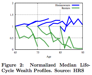
A new paper "Home Equity in Retirement" by Makoto Nakajima and Irina A. Telyukova (September 20, 2012) looks at the effects of homeownership on savings/dissaving by retirees, using the US data for 1996-2006.


Using an estimated structural model of saving and housing decisions, the study finds that "homeowners dissave slowly because they prefer to stay in their house as long as possible, but cannot easily borrow against it. Second, the 1996-2006 housing boom significantly increased homeowners' assets. These channels are quantitatively significant; without considering homeownership, retirees' savings are 24-43% lower."

Some more details:

Figure 1 shows over the period 1996-2006, median net wealth remains high very late into the life cycle. The observation that many people die with significant savings, which is puzzling in the context of a simple life-cycle model, has been termed the \retirement saving puzzle. However, the picture changes dramatically if we consider the saving behavior of retirees who
own homes, compared to those who do not. Consider figure 2, which documents the cohort profiles of median net worth over the same period, normalized by the first observation, for homeowners versus renters.


The difference is stark. Homeowners have flat or increasing profiles of net wealth over this period, while renters display a far faster rate of asset decumulation. This suggests that housing may play a major role in determining how retirees save or dissave."

Overall, the paper finds that:
  • "…high homeownership rate late into the life-cycle that we observe in the data is crucial to consider for understanding retiree saving behavior."
  • "Housing-related channels are significant contributors to the retirement saving puzzle. Retirees stay homeowners late in life, but become increasingly locked into their home equity as they age; 
  • "...we find that borrowing constraints on retirees tighten considerably. This means, on the one hand, that those who remain homeowners do not decumulate their home equity, thus creating the kind of flat housing profile that we see in the data, while those who face a large expense may come up against their borrowing constraint and be forced to sell the house. 
  • "We also use the model to understand why people retirees choose to remain homeowners late in life. We find that the leading motivators are utility benefits of owning a house (which capture also financial benefits, such as tax advantages) and bequest motives. 
  • "In contrast, precautionary motives in the face of medical expense risk do not a effect homeownership significantly, but play a role in the puzzle through financial asset accumulation, although overall this role is quantitatively modest and affects younger retirees more than older ones. 
  • "Quantitatively, we find that the housing channels {utility benefits of ownership, collateral constraints, and the housing boom} jointly account for between 24 and 43% of the median net worth profile, depending on age.
  • "The bequest motive accounts for up to 31% of the median net worth profile, and its importance increases with age. 
  • "Medical expense risk accounts for maximum 8% of median net worth, and its importance generally falls with age, due to interaction with Medicaid.
  • "..we conduct an experiment where we allow households to make a decision on whether or not to maintain their home. We want to evaluate this as an additional, possibly hidden, channel of asset decumulation, consistent with data evidence that homes of elderly owners depreciate more quickly than those of younger owners. We treat this as a hidden channel because we assume that self-reported housing values of owners who remain in their houses do not take into account the depreciation rate unless they have the house appraised for sale, for example. We find this to be a significant channel of asset decumulation. 30% of our model homeowners choose not to maintain their homes in the 75-85 year old cohort; for the younger cohort, that proportion is over 50%, while it is lower for the oldest cohort. We show that this channel affects median housing asset profiles as well."

All of this has huge implications for countries like Spain and Ireland that have undergone a massive property prices bust. Declines in property prices have wealth effects, negative equity has wealth effects. Both, however, have also direct behavioural effects that are also adverse, as outlined above. In my view, we have not even started to count the real costs of the property busts in our fiscal and economic forecasts.

18/11/2012: Innovation, Professionalization of Risk, Stagnation?


The recurrent theme in forward thinking nowdays is the decline of technological 'revolutions' cycle. I wrote about this on foot of earlier research (here) and in recent weeks there has been another - most excellent - article on the same topic from Garry Kasparov and Peter Thiel (link here).

Two quotes:

"During the past 40 years the world has willingly retreated from a culture of risk and exploration towards one of safety and regulation. We have discarded a century of can-do ambition built on rapid advances in technology and replaced it with a cautiousness far too satisfied with incremental improvements."

The irony has it that in our collective / social pursuit of certainty, we have surrendered risk pricing and risk taking to the professional class of the 'bankers' who proceeded to show us all that they are simply incapable of actual investing. The delegation of risk authority to them, compounded with over-taxing risk taking via tax systems and strict bankruptcy regimes, has meant that real equity and real investment have been replaced with financial instrumentation of debt and financial instrumentation of creativity.

"Many investors practise a fake form of long-term thinking. Portfolio managers see the returns of the 20th century and project those far into the future. Tomorrow’s retirees are betting their fortunes on the success rates of yesterday’s companies. But the vast wealth registered by modern capital markets came from technological feats that cannot be repeated. If nobody takes the risk to invent products that produce new industries and new profits, then analysing historical returns from the 20th century will be no better guide to our future than researching crop yields from the 10th century. Without innovation, faith in the stock market is a kind of cargo cult."

We are no longer thinking - as a society - in terms of risk as an input into production of new goods, services, value-added in the economy, but see it as both as a negative utility good (something to avoid and reduce) and as a fertile ground for taxation (a logical corollary in the world where risk is a matter of 'professional' fees collection, and not an input into innovation). The social structures of modern democracies in the West are now wholly committed to reducing risk impact on households - the Nanny State - and thus taxing risk returns.

"Above all the future will be created by individuals. Those with the most liberty to take on risk and make long-term plans, young people, should consider their options carefully. ...The coming generation of leaders and creators will have to rekindle the spirit of risk. Real innovation is difficult and dangerous but living without it is impossible."

Note: beyond 'professionalization' of risk, there also remains the issue of 'financialization' of risk. While Kasparov and Thiel clearly focus on the latter aspect, my comments focus on the former. But the two are not, in fact, separate - the financialization is impossible without professionalization, and vice versa.

18/11/2012: Irish Services Index - September 2012


Per CSO recent release (catching up with the data lags): Monthly Services Index for Ireland declined 2.9% m/m and rose 3.3% y/y in September 2012.

The dynamics were not great in m/m terms, but remain relatively firm on y/y basis:


The overall index hit second highest reading in series short history in August at seasonally adjusted 105.4 (highest reading was recorded in May 2012 at 105.9) and declined to 102.3 in September. 3mo MA through September is at a healthy 104.2, up on 103.6 3moMA through June 2012 and up on 98.7 3moMA through September 2011. In quarterly terms, 3Q 2012 ended up at 104.2, 0.6% ahead of previous quarter, marking the lowest q/q rate of growth since Q4 2011, however y/y Q3 2012 is up 5.6% - fastest growth on record so far (the records start at Q1 2011).

The slowdown in September was very broad:


In m/m terms:
  • Wholesale & Retail Trade sector posted a decline of 2% to 108.7, with 3mo MA at 110.1 still ahead of previous 3moMA (through June 2012) at 108.3 and ahead of Q3 2011 of 104. 
  • Wholesale Trade activity is down 5% to 118.3 in September.
  • Information and Communications sector posted a massive drop of 6.7% in September 2012
  • Business Services dropped 1.9% in September 2012 and posted an annual decline of -0.3%.
  • Transportation & Storage declined 1.9%, although the sector is up 14.2% y/y
  • Accommodation & Food sector is down 2.9% m/m and up 3.4% y/y
  • Other Services declined 0.5% m/m but are still up 2.1% y/y.

Looking at more stable, quarterly data:
  • Wholesale & Retail Trade sector index stood at 110.1 in Q3 2012, up 1.7% q/q and up 5.9% y/y
  • Wholesale Trade index was at 122.3, up 2.2% q/q and 10.6% y/y, which suggests that Retail Trade activity was rather subdued.
  • Information & Communications index was at 106.9 in Q3 2012, down 3.4% q/q and up 7% y/y. This marks the first quarter of q/q declines in the index reading since Q1 2011.
  • Business Services were up 2.1% q/q and y/y in Q3 2012
  • Transportation & Storage activity was up 2.7% q/q and 13.3% y/y - the fastest annual rate of growth in series history
  • Accommodation & Food Services is up 3.6% q/q and 3% y/y
  • Other Services activity fell 2.7% q/q in Q3 2012 and posted zero growth in y/y terms.
So overall, poor showing in September, relatively strong Q3 overall y/y performance, but a clear slowdown in growth in q/q terms. A mixed bag suggesting Services sectors are looking for some catalyst, most likely on the side of exports restart.


18/11/2012: US debt, deficits and spending


One of the best papers analysing the US spending, deficits and debt issues over historical perspective (link here to the older version and to latest version, published this month in Economic Affairs, Vol. 32, Issue 3, pp. 97-101, 2012).

Two charts from the paper:


I have done analysis of deficit / debt dynamics by Presidential Administration ( see link here ) and ehre's a chart from zerohedge on Federal deficits, spending and revenues (click to enlarge):


The above chart puts to rest the assertions made in the media that Bush Jr Administration was more profligate in spending than Obama Administration. Furthermore, as per evidence shown in my note (see link above), the above clearly shows that the current Administration is burning through deficits at a rate not once witnessed since the end of the World War 2.