Showing posts with label S&P500. Show all posts

Sunday, October 22, 2017

22/10/17: Framing Effects and S&P500 Performance


A great post highlighting the impact of framing on our perception of reality: https://fat-pitch.blogspot.com/2017/10/using-time-scaling-and-inflation-to.html.

Take two charts of the stock market performance over 85 odd years:


The chart on the left shows nominal index reading for S&P500. The one on the right shows the same, adjusted for inflation and using log scale to control for long term duration of the time series. In other words, both charts, effectively, contain the same information, but presented in a different format (frame).

Spot the vast difference in the way we react to these two charts...

Wednesday, June 7, 2017

7/6/17: Equity Markets Continue to Mis-price Policy Risks


There has been some moderation in the overall levels of Economic Policy Uncertainty, globally, over the course of May. The decline was primarily driven by European Uncertainty index falling toward longer-term average (see later post) and brings overall Global EPU Index in line with longer term trend (upward sloping):


This meant that short-term correlation between VIX and Global EPUI remained in positive territory for the second month in a row, breaking negative correlations trend established from October 2015 on.

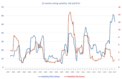
The trends in underlying volatility of both VIS and Global EPUI remained largely the same:


The key to the above data is that equity markets risk perceptions remain divorced from political risks and uncertainties reflected in the Global EPUI. This is even more apparent when we consider actual equity indices as done below:

Both, on longer-run trend comparative and on shorter term level analysis bases, both S&P 500 and NASDAQ Composite react in the exactly opposite direction to Global Economic Policy Uncertainty measure: rising uncertainty in the longer run is correlated with rising equities valuations.

7/6/17: Markets, Investors Exuberance and Fundamentals


Latest data from FactSet on S&P500 core metrics is an interesting read. Here are a couple of charts that caught my attention:

Look first at the last 6 months worth of EPS data through estimated 2Q 2017 (based on 99% of companies reporting). The trend continues: EPS is declining, while prices are rising. On a longer time scale, EPS have been virtually flat in 2014-2016, but are forecast to rise nicely in 2017 and 2018. Whatever the forecast might be for 2018, 2017 increase would do little to generate a meaningful reversion in EPS to price trend


However, the good news is, expectations on rising EPS are driven by rising sales for 2017, and to a lesser extent in 2018. This would be (if materialised) an improvement on the 2014-2016 core drivers, including shares repurchases (chart below).


Next, consider P/E ratios:

As the chart above indicates, P/E ratios are expected to continue rising in the next 12 months. In other words, the markets are going to get more expensive, relative to underlying earnings. Worse, on a 5-year average basis, all sectors, excluding Financials, are at above x14. Hardly a comfort zone for 'go long' investors. The overvalued nature of the market is clearly confirmed by both forward and trailing P/E ratios over the last 10 years:


Forward expectations are now literally a run-away train, relative to the past 10 years record (chart above), while trailing (lagged) P/Es are dangerously close to crisis-triggering levels of exuberance (chart below).


In summary, thus, latest data (through end-of-May) shows continued buildup of risks in the equity markets. At what point the dam will crack is not something I can attempt to answer, but the lake of investors' expectations is now breaching the top, and the spillways aren't doing the trick on abating them.

Monday, May 1, 2017

30/4/17: The Scariest Chart in the World


The scariest chart in the world this week, indeed this month, comes from the U.S. and plots U.S. real GDP growth with 1Q 2017 print at just 0.7% y/y.

Yes, the print ranks 13th from the bottom for any positive growth quarter since 2Q 1947. And yes, the rate of growth is (a) preliminary (subject to revisions) and (b) seeming one-off (driven by fall-off in consumer demand, despite strong indicators on consumer confidence side). There are reason and heaps of arguments why this print should not be treated as huge concern and that things might improve in 2Q and on.

But... the really scary stuff is longer-term trend in U.S. growth. And that is illustrated in the chart below:

Look at the grey bars: these take periods of expansion in the U.S. economy and average rates of growth over these periods. Notice the patter? Why, yes, the average expansion-consistent rates of growth have fallen, steadily, since 1975 through today. Worse, controlling for volatile growth (average rates) in pre-1975 period, an exponential trend for average expansion-consistent growth rates (the yellow line) is solidly trending down.

The latest period of economic expansion is underperforming even that abysmal trend. And 1Q 2017 is underperforming that worse than abysmal average.

Now, let me highlight that point: yellow line only considers periods of consistent growth (omitting official recessions, and one unofficial recession of  2001). So, no: the depth of the Great Recession has nothing to do with the yellow line direction. If anything, given the depth of the 2008-2009 crisis, the most current grey bar should have been at around 4%, almost double where it sits today.

That is what makes the chart above the scariest chart of April. And will probably make it the scariest chart of May too.

Tuesday, April 18, 2017

18/4/17: S&P500 Concentration Risk Impact


Recently I posted on FactSet data relating earnings within S&P500 across U.S. vs global markets, commenting on the inherent risk of low degree sales/revenues base diversification present across a range of S&P500 companies and industries. The original post is provided here.

Now, FactSet have provided another illustration of the 'concentration risk' within the S&P500 by mapping earnings and revenues growth across two sets of S&P500 companies: those with more than 50% of earnings coming from outside the U.S. and those with less than 50% of earnings coming from the global markets.


The chart is pretty striking. More globally diversified S&P constituents (green bars) are posting vastly faster rates of growth in earnings and a notably faster growth in revenues than S&P500 constituents with less than 50% share of revenues from outside the U.S (light blue bars).

Impact of the concentration risk illustrated. Now, can we have an ETF for that?..

Tuesday, April 11, 2017

11/4/17: S&P 500 Concentration Risk


Concentration risk is a concept that comes from banking. In simple terms, concentration risk reflects the extent to which bank's assets (loans) are distributed across the borrowers. Take an example of a bank which has 10 large borrowers with equivalent size loans extended to them. In this case, each borrower accounts for 10 percent of the bank total assets and bank's concentration ratio is 10% or 0.1. Now, suppose that another bank has 5 borrowers with equivalent loans. For the second bank, the concentration ratio is 0.2 or 20%. Concentration risk (exposure to a limited number of borrowers) is obviously higher in the latter bank than in the former.

Despite coming from banking, the concept of concentration risk applies to other organisations and sectors. For example, take suppliers of components to large companies, like Apple. For many of these suppliers, Apple represents the source of much of their revenues and, thus, they are exposed to the concentration risk. See this recent article for examples.

For sectors, as opposed to individual organisations, concentration risk relates to the distribution of sector earnings. And the latest FactSet report from April 7, 2017 shows just how concentrated the geographical distributions of earnings for S&P 500 are:


In summary:

  • With exception of Information Technology, not a single sector in the S&P 500 has aggregate revenues exposure to the U.S. market that is below 50%;
  • Seven out of 11 sectors covered within S&P 500 have exposure concentration to the U.S. market in excess of 70%; and
  • On the aggregate, 70% of revenues for the entire S&P 500 arise from within the U.S. markets.
In simple terms, S&P 500 is extremely vulnerable to the fortunes of the U.S. economy. Or put differently, there is a woeful lack of economic / revenue sources diversification in the S&P 500 companies.

Wednesday, May 18, 2016

17/5/16: US Earnings Recession: Four Quarters Long... but How Much Longer?


Recently, I have been highlighting in my Risk & Resilience course for MBAs at MIIS and on this blog the perils of corporate earnings gaming, including the rather worrying trend toward companies posting negative net cash flows (basically using debt to fund shares repurchases).

Here are two of my lecture slides from two weeks ago:


And to add to the pile of evidence, as 1Q 16 earnings rolled in, the numbers were coming in at a frankly put brutal squeeze: we had the fourth consecutive quarter for the S&P 500 earnings running in the red, with 1Q 16 decline being the steepest since 2008-2009 at 6.3%:


However, some interesting insight on the matter of forward earnings guidance was recently published by the Deutsche Bank Research and here is a link to the article discussing it: http://www.valuewalk.com/2016/05/earnings-q1-marks-darkest-hour-just-dawn-says-db/.

Yes, DB's model for earnings for S&P500 is an interesting one. No, without seeing actual standard econometric tests, I can't tell if it makes any sense in reality or not (just because it has high R-sq means diddly nada without knowing how the residuals behave). And no, I am not sure I am buying the idea of 'all factors in favour' arguments presented by DB Research. I am, however, pretty certain that probabilistically a bet should be for more moderate earnings performance in 2Q compared to 1Q, which of course will prompt DB Research lads cheering confirmation of their own model. So I am skeptical, but... still, the article is worth a read.

Friday, April 15, 2016

15/4/16: Corporate Finance, S&P500 and Bubble Trouble...


Classical corporate finance tells us that companies should be valued on their earnings with past earnings being indicative of future earnings (predictive component). Which is tosh. In today's world that is.

Q4 2016 saw highest payouts to shareholders (combined cash dividends and share repurchases) in over 10 years (couple of slides from my course presentation):

And yet... yet... earnings have hit the brick wall back in Q3 2014 and have been trending down ever since:

You really can't call S&P500 anything but a sail-in-the-Fed-wind. There are no fundamentals sustaining it above 1600-1650 range. At least, not corporate fundamentals.

Unless, of course, one expects the recent extraordinary payout performance to remain indefinitely present in the future. Which only a sell-side analyst or a lunatic can...

Saturday, March 19, 2016

19/3/16: Shares Buy-Backs: The Horror Show of QE Cash Excesses is Back


Remember the meme of the ‘recovery’?

The story of years of rising shares buy-backs by corporate desperate to do something / anything with all the debt they could get their hands on from the lending banks, whilst having no interest in investing any of these loans in real activity.

Well, back at the end of 2011 and the start of 2014, pumped up on hopium  of the so-called imminent recovery in global demand, we witnessed two dips in shares buy-backs, with resulting volatility going the flat trend taking us through some 12 months before lifting off the whole circus to new highs.

Source: @soberlook

And as you can see, the same momentum is now back. Shares buy-backs are booming once again, almost reaching all time highs of 2007. Thus, the toxic scenario whereby companies use cheap credit (QE-funded) to leverage themselves only to fund shares buybacks and not to fund new investment - that vicious cycle of leverage risk and wealth destruction - is open us once again.

Note: I have been tracking the topic on this blog, covering few months back the link between buybacks and lack of corporate capex: http://trueeconomics.blogspot.com/2015/11/111115-take-buyback-pill-us-corporates.html.

Monday, June 9, 2014

9/6/2014: 2 charts, 2 markets, same nagging sensation...


Two charts worth paying close attention to:

The first one from Deutsche Bank:


The above is showing ratio of S&P500 Price/Earnings ratio to VIX (quarterly) volatility indicator. Recent uplift in the series is down to simultaneously:

  • Rising equity price relative to earnings, and
  • Falling markets volatility
The second one is via TestosteronePit, showing the first bit: rising equity prices relative to falling earnings, except not for S&P, but for European equities:


Care to draw any conclusions as to rational expectations vs short-term profit chasing?..