Showing posts with label #Africa. Show all posts

Sunday, March 14, 2021

13/3/21: COVID19 Update: Most impacted countries

 In previous posts, I covered updates for Covid19 pandemic figures for:

  • Worldwide data: https://trueeconomics.blogspot.com/2021/03/12321-covid19-update-worldwide-data.html, and
  • Europe and the EU27 countries: https://trueeconomics.blogspot.com/2021/03/13221-covid19-update-europe-and-eu27.html.
Now, world's worst hit countries and regions.


World's 5 worst impacted countries by the number of cases per capita (the first table above), with ranks 1 = worst:

  1. Andora
  2. Montenegro
  3. Gibraltar
  4. Czechia
  5. San Marino
The U.S. ranks 9th worst in the world - the only country with more than 100 million population. There are three countries with population over 10 million but below 100 million on the list: Belgium (15th) and Portugal (11th), plus Czechia.

World's 5 worst impacted countries by the number of deaths per capita (the second table above), with ranks 1 = worst:
  1. Gibraltar
  2. San Marino
  3. Czechia
  4. Slovenia
  5. Belgium
The U.S. ranks 12th in the world - the only country with more than 100 million population in the list of worst-impacted in terms of deaths per capita. Notably, there are two countries with population between 50 million and 99 million on the list of the worst impacted countries by deaths per capita: Italy (ranked 8th worst in the world), and the UK (ranked 6th worst in the world). There are further 4 countries on the list with population over 10 million, but less than 50 million: Belgium and Czechia already referenced above, plus Portugal (ranked 11th), and Span (ranked 14th).


Two tables above summarize key statistics for the countries with more than 250,000 cases of Covid19 recorded. The table also provides overall rankings for these countries in terms of their performance across three metrics: cases per capita, deaths per capita and deaths per case.

Notably, ten worst countries based on these combined metrics are (once again, rank = 1 implies the worst overall performance):
  1. Belgium
  2. UK
  3. Italy
  4. Hungary (tied with Italy)
  5. Portugal
  6. Czechia
  7. Spain
  8. U.S.
  9. Bulgaria (tied with U.S.)
  10. Peru
Across major regions:


Note: in the above table, regions are ranked as countries, though countries' rankings do not include regions. Thus, if the EU27 was treated as a country, it would rank 19th worst in the list of countries. If we remove EU27 member states from the list, the EU27 itself would rank 9th worst in the list, just below the U.S. which continues to perform worse than the EU27, but only marginally. 

Finally, countries' and groups' shares of deaths relative to their share of world population:


The U.S. is the second worst performing major country with its ratio of its share of world deaths to its share of world's population standing at 4.7. The UK is the worst, with a ratio of 5.6 and the EU27 third worst with a ratio of 3.8. 

Saturday, March 13, 2021

13/2/21: COVID19 Update: Europe and EU27

Updating Covid19 data for Europe and EU27 for the period through Thursday this week. In line with global data trends (covered here: https://trueeconomics.blogspot.com/2021/03/12321-covid19-update-worldwide-data.html), Europe and the EU27 are starting to show some tentative signs of a risk of new wave of the pandemic emerging.


  • Both Europe and EU27 have experienced two waves of the pandemic, with the second wave characterized by two key features: 1) long and slow decline in the new cases counts, lasting from the peak of the wave around Week 45 of 2020; and 2) Re-acceleration in the wave into another local peak at Week 1 of 2021 and bottoming out in Week 6.
  • Since Week 7, we are in a potential start of Wave 3, as noted in the chart above.
  • Both Europe and EU27 are indicating the bottoming out of Wave 2 around Week 9 of 2021 in terms of death counts.
  • Weekly death counts are yet to show the potential start of Wave 3 that appears to be showing in the weekly case counts data.
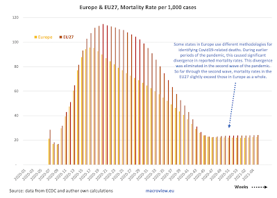
  • Some states in Europe use different methodologies for identifying Covid19-related deaths. During earlier periods of the pandemic, this caused significant divergence in reported mortality rates. This divergence was eliminated in the second wave of the pandemic. So far through the second wave, mortality rates in the EU27 slightly exceed those in Europe as a whole.

As noted in the table above, this week's counts of new cases are up 12% on 4 weeks-average in Europe and up 16% in the EU27. This is the worst performance for any region, save Oceania, where data quality is highly unreliable. Death counts dynamics clearly lag new cases dynamics, and it remains to be seen if the more recent uplifts in new cases do indeed mark a new wave of the pandemic.


12/3/21: COVID19 Update: Worldwide Data

Updating charts for weekly worldwide numbers covering the Covid19 pandemic, here is the data through Thursday this week:


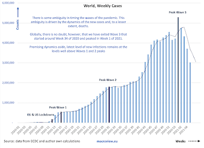
  • In terms of case counts: there is some ambiguity in timing the waves of the pandemic, driven by the dynamics of the new cases and, to a lesser extent, deaths.
  • Globally, there is no doubt, however, that we have exited Wave 3 that started around Week 34 of 2020, peaked in Week 1 of 2021, and, it appears to have bottomed out in Week 7 of 2021.
  • The latest level of new infections remains well above Waves 1 and 2 peaks. 
  • More ominously, since Week 8 of 2021, we are seeing a potential re-emergence of a new wave, Wave 4.
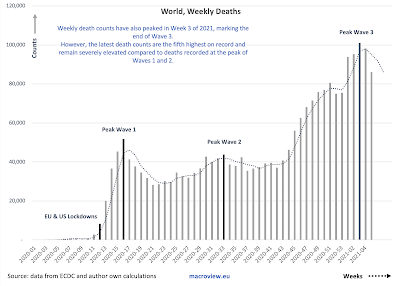
  • Weekly death counts have also peaked in Week 3 of 2021, marking the end of Wave 3. 
  • However, the latest death counts are still well above peaks of Waves 1 and 2, and as is the case with new cases, last two weeks have witnessed a new uplift in the deaths counts, potentially marking the beginning of a new wave.
  • Recent decreases in mortality rate are most likely attributable to three key drivers: (1) earlier detection of cases due to improved testing; (2) younger demographics of those with confirmed infections; and (3) improved treatments in the earlier stages of the disease.
  • The decrease in mortality appears to have stabilized and slightly reversed in the first 5 weeks of 2021.

Combined evidence suggests moderation in the global pandemic has been ongoing for some time now, however, new cases are rising once again across most major regions:


The good news is, we are out of the Wave 3 of the pandemic. The bad news is, even with significant in-roads in terms of vaccinations, we are still seeing an uptick in new cases in the last two weeks.


Sunday, February 14, 2021

14/2/21: COVID19 Update: BRIICS

 In previous posts, I covered the latest data for weekly Covid19 pandemic dynamics for:

Now, let's take a closer look at the pandemic dynamics in the BRIICS (Brazil, Russia, India, Indonesia, China and South Africa).


In broadly defined terms, there is an ongoing decline in both new cases and new deaths over the last week across all BRIICS. That said, it is too early to call the peaking of the second wave of this pandemic in terms of deaths counts, since weekly counts remain extremely high and show only one week of sustained declines. The good news is that last week's declines were evident in all BRIICS. Another good news is that we now have at least four consecutive weeks of declines in new cases across the entire group, except for Indonesia, where we only have one week of declines, and China. 

A summary table:


14/2/21: COVID19 Update: Most impacted countries


Previous posts on the COVID19 update covered global numbers and trends (https://trueeconomics.blogspot.com/2021/02/14221-covid19-update-worldwide-data.html) and European & EU27 trends (https://trueeconomics.blogspot.com/2021/02/14221-covid19-update-europe-and-eu27.html).

Here are some comparatives across all countries with the highest rates of detected infections (> 5% of population):


Note: I highlighted countries with > 10 million population.

Another way of looking at this is to take countries with more than 250,000 confirmed cases, as presented in the next set of tables:


Comparing regions to the above countries:

And looking at the countries by population relatives:

The table above really drives home the depth of the crisis in Europe and the U.S. U.S. accounts so far fo 20 percent of global deaths, having just 4.3 percent of the global population. This gives the U.S. second worst ratio of its share of global deaths to its share of world population. Only the UK exceeds the U.S. in this horrific metric. The EU27 fall in the third place, below the U.S. with 21.4% of the world's deaths and 5.8% of the global population. 


14/2/21: COVID19 Update: Europe and EU27

 Summary table from the previous post covering worldwide trends (https://trueeconomics.blogspot.com/2021/02/14221-covid19-update-worldwide-data.html) puts Europe and EU 27 in the context of global trends:


The chart next shows weekly data dynamics for new cases for EU27 and Europe:


Both Europe and EU27 have experienced two waves of the pandemic, with the second wave characterized by two key features:
  1. Long and slow decline in the new cases counts, lasting from the peak of the wave around Week 45 of 2020; and 
  2. Re-acceleration in the wave into another local peak at Week 1 of 2021. 
The quick reversals of decline trend around Weeks 51-53 of 2020 is a worrying sign that improvements in overall pandemic trends are fragile.


The fragility of the trend in terms of improvements are even more evident in the numbers of new weekly deaths. Both Europe and EU27 are yet to confirm the peaking of the second wave of the pandemic in terms of weekly new deaths. Nominally, the peaks of the most recent wave in Week 49 of 2020 in the EU27 and Week 3 of 2021 in Europe have not, yet, been followed by accelerating or deepening declines in the deaths counts.

One clear positive trend remains in terms of mortality rates per case:


The caveat to the above is a slight uplift in mortality around Week 51 of 2020 as shown in the above.

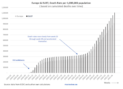
Cumulated deaths per capita are exhibiting a slight slowdown over time (slope) but are still increasing at a rate massively in excess of what was witnessed during the period of Week 19-43 of 2020. In other words, we are not yet out of the woods, even compared to the pandemic dynamics of the Summer 2020.

As with global figures, it is too early to say anything about vaccinations effects on general trends.


14/2/21: COVID19 Update: Worldwide Data

 Worldwide trends for COVID19 pandemic in terms of cases and deaths:


There is some ambiguity in timing the waves of the pandemic. This ambiguity is driven by the dynamics of the new cases and, to a lesser extent, deaths. Globally, we have exited Wave 3 that started around Week 34 of 2020 and peaked in Week 1 of 2021. Promising dynamics aside, latest level of new infections remains at the levels well above Waves 1 and 2 peaks.


Weekly death counts have also peaked in Week 3 of 2021, marking the end of Wave 3. However, the latest death counts are the fifth highest on record and remain severely elevated compared to deaths recorded at the peak of Waves 1 and 2.


Recent decreases in mortality rate are most likely attributable to three key drivers: (1) earlier detection of cases due to improved testing; (2) younger demographics of those with confirmed infections; and (3) improved treatments in the earlier stages of the disease. The decrease in mortality appears to have stabilized and is slightly reversing in the first 5 weeks of 2021. This is the most worrying aspect of the three trends discussed above.

Here is a summary table, with green cells showing improvements and red cells showing deterioration in dynamics:


Last week's deaths have shown an improvement on 4 weeks average in all regions world-wide, and this has been consistent across all (excluding Asia) regions also in terms of new cases 4 weeks average compared to prior 4 weeks average. Deaths, however, are still up on the 4weeks average relative to prior 4 weeks average basis in most regions, with exception of two.

For now, it is hard to attribute the above improvements to vaccinations (long term solutions) and the improved dynamics are probably more consistent with a natural flow of the pandemic wave, reflecting tightening of restrictions on social activities in virtually all major geographies following the holidays season. This, along with the rapidly growing prevalence of the new, more infective, strands of the virus suggests that the gains made in recent weeks are at a risk of reversals. 


Saturday, January 2, 2021

2/1/21: Covid19 update: BRIICS

 In previous posts, I covered Covid-19 updates for the last week of 2020 for:

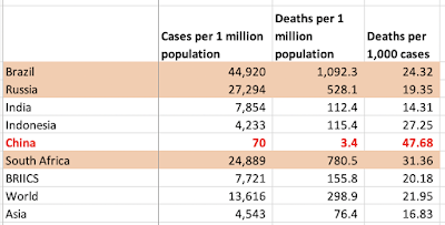
Cumulative data for BRIICS (Brazil, Russia, India, Indonesia, China and South Africa) shows continued steady expansion of the pandemic in total cases and deaths:


  • Currently, BRIICS account for 28.2% of all cases of Covid-19 in the world, and 25.3% of all deaths. This compares to these countries accounting for 45.3% of the world population.
  • The pandemic has been relatively benign for this group of countries. If BRIICS were ranked as a stand-alone country within the group of 40 countries with more than 250,000 cases, BRIICS would have ranked 38th worst in terms of cases per 1 million of population, 37th worst in terms of deaths per capita, and 28th in terms of deaths per case. 
  • BRIICS data, however is highly heterogeneous by country: 
    • Brazil ranks 11th worst-hit country in the world in terms of infections rate, death rate per capita and mortality rate; 
    • Russia ranks 28th;
    • India ranks 38th;
    • Indonesia 31st;
    • China is unranked (officially, the country has fever than 250,000 cases, although overall robustness of the Chinese data is highly questionable); and
    • South Africa ranks 22nd worst.
  • No BRIICS country enters the league of 22 countries most-impacted by the pandemic (defined as countries with infection rate of 4% of population and higher).

Most current summary of key stats is below:


Now, to dynamics and trends.


BRIICS weekly case numbers are on the sustained rise, once again, since the trough achieved in week 45 which marked the end of the Wave 1 and the start of Wave 2 of the pandemic:


India and Brazil are showing robust and weakly-robust declines in weekly cases, while Russia and South Africa are showing robust increases. Other BRIICS are on a weak upward trend. Put frankly, my expectation is for a rise in India cases in weeks ahead as the new wave of the pandemic starts to take hold. Brazil being in a summer season is likely to have a longer lead time into the new wave.

Rather similar dynamics are taking place in deaths counts:


One key feature of the data is, of course, the clearly unreliable data from China that skews overall picture for the BRIICS group as a whole. If China's data was running at 0.75-0.9 of the average BRIICS rates, the country would have reported over 9.26 million cases (as opposed to the officially-reported 96,292 cases) and 183,400 deaths (compared to the officially-reported 4,771 deaths). It is worth noting here that these estimates reflect BRIICS rates that include official China statistics (downward bias to the estimates). What is quite amazing is not the actual numbers themselves, but the nearly total silence on the state of the Chinese statistics in much of the Western media, despite the order of differences between China and other BRIICS. Take a look at the comparative table here:


Russian stats: scrutinized left, right and center on every op-ed and news page of all major media outlets in the West are pretty much bank-on as expected: worse than average in infection rates, worse than average in deaths per capita, roughly (statistically) below average in terms of mortality rate. Similar for India. China's data is a complete and total outlier, and yet not a peep from the mainstream news. 

2/1/21: Covid19 update: Countries with > 250K cases


In previous posts, I covered worldwide trends for Covid19 pandemic evolution (https://trueeconomics.blogspot.com/2021/01/2121-covid19-update-worldwide-numbers.html) and pandemic developments in Europe and the EU27 (https://trueeconomics.blogspot.com/2021/01/2121-covid19-update-europe.html). Here, let's take a look at the set of countries with more than 250,000 confirmed cases.

As of week 52 of 2020, there were 40 countries in this group, accounting for 90 percent of the world total number of cases, 92 percent of the global deaths and 64 percent of the world's population. 


Tables below provide summary statistics for these countries:


You can click on the charts to magnify them.

The same data reported by regions and continents:

And a table of summary statistics:


Some noteworthy observations from the above:

  • The U.S. is the worst performing major advanced economy when it comes to the pandemic trends: it ranks 2nd worst in the world in terms of its numbers of Covid19 cases per 1 million of population, 7th worst in the world in terms of its death rate per capita, but a reasonably-benign 25th in the world in mortality rate (deaths per positive test case). Using the three metrics mentioned, the U.S. ranks 6th worst performing country in the league of all countries with > 250,000 cases.
  • The UK ranks even worse than the U.S. The country ranks 15th worst in the world in the rate of infections (Covid19 positive tests per capita), and 5th worst in deaths per capita and deaths per positive case. Across all three metrics, the UK ranks third worst in the world.
  • Belgium ranks the worst major country in overall pandemic impact terms (cases per capita, deaths per capita and deaths per case), followed by Italy in the second place. The UK, as mentioned above ranks the third, Spain forth, Peru fifth, the US and Argentina tied in the sixth place, Hungary comes in 8th, Czechia 9th and France 10th. Thus, six out of the 10 worst hit countries in the world are EU27 members.
  • In mortality terms (deaths per 1,000 cases), Mexico is the worst-performing country with 88.42 deaths per 1,000 positive cases; followed by Iran (45.56), Peru (37.19), Italy (35.12) and the UK (30.52). Overall, only 6 countries have mortality rates > 30 per 1,000 positive tests.
  • There were 7 countries with more than 1,000 deaths per 1 million of population, and only 4 countries with infection rate of > 50,000 cases per 1 million of population.
Another summary table, showing relative contributions of each country to global cases and deaths, as well as their relative shares of total global population:


The above highlights once again the severity of the pandemic in the U.S., the UK and the EU27.

2/1/21: Covid19 update: Europe


Introducing new analysis for Europe and EU27 across the main metrics of the pandemic (see data note and coverage of worldwide trends here: https://trueeconomics.blogspot.com/2021/01/2121-covid19-update-worldwide-numbers.html). All data through week 52 of 2020.

Europe is continuing to experience Wave 2 of the pandemic, while EU27 is on the abating part of the pandemic curve, albeit with some volatility to the upside, especially in weeks 49-51. The above data is yet to fully reflect the beginning of the new strand of the virus (commonly referenced to the UK as the country of origin, although this appears to be a questionable reference point).

In terms of deaths, peak of the Wave 2 of the pandemic can now be timed to week 48, although in the last two weeks of 2020 there is some evidence emerging of re-amplification to the pandemic in Europe. 


Mortality rates have moderated at the peak of the Wave 2, hitting a trough at 23 per 1,000 cases, and staying at 23-24 since week 45:
Meanwhile, death rates per capita rose in the last week of the year to 797.4 per 1 million of population in EU27, up from 592.3 a month ago, and 651.5 in the Europe, up from 482.8 a month ago.


And a summary table of comparatives:


Overall, we can now call the peak of the Wave 2 of this pandemic at weeks 45 (in terms of new cases) and week 48 (in terms of deaths). That said, we can expect re-acceleration of both trends in weeks ahead as a new contagion wave develops following the last two weeks of the 2020. 


2/1/21: Covid19 update: Worldwide numbers


Starting the new year of data analysis for Covid19 pandemic, I have re-configured the charts and my database to reflect changes in ECDC reporting from daily to weekly aggregates, as reported through Thursday each week. The result is smoother data series, allowing for clearer analysis of the key trends. The downside, of course, is the lags in data reporting.

Please, note for the future: weekly data is subject to revisions by the ECDC.

First post, Worldwide figures and trends.

As of the last week of 2020, worldwide cases of positive tests have reached 80,177,400, with seventh consecutive week of above 4 million new cases reported on a weekly basis. The last week of the year data is subject to future revisions and reflects low accuracy of reporting due to holidays. Nonetheless, the pandemic shows no signs of de-acceleration globally in both cases and deaths.


As pointed out in the chart above, it is too early to call the peak of the Wave 3 of the pandemic, yet. Excluding the last week of the year, prior three weeks saw re-acceleration of the trend in new cases. Week 51 of 2020 saw the highest number of new cases on record at 4,534,601. 

Cumulated number of Covid19 related deaths reached 1,767,037 at the end of 2020, with week 52 marking the fifth consecutive week of > 70,000 new deaths per week. Week 51 marked the highest number of weekly deaths recorded to-date at 79,708. Again, given the nature of the data reporting during the last week of the year, it is too early to call the peak of the Wave 3 of the pandemic.


The mortality rate, measured as reported deaths per 1,000 cases continues to decline, but remains well above 20 deaths per 1,000 cases. The data is not, yet, reflective of the new (UK-originated) strand of the virus.


A summary table of the recent trends:


Based on monthly trends (4 weeks averages), the pandemic is showing no signs of abating in Africa, America (driven by the USA) and BRIICS, with signs of moderation off-the-peak in other parts of the world. In deaths, only Asia and Oceania are showing encouraging signs of the pandemic abating. 

Once again, even the tentative and weak signs of improvement in the pandemic dynamics mentioned above are subject to a lot of uncertainty, as the data covers the last week of 2020 and the Christmas period, both most likely contributing to underestimation of the pandemic severity.

Stay tuned for more analysis of the data.