The first four posts on the state of the U.S. labor markets have covered:
- Continued Unemployment Claims (https://trueeconomics.blogspot.com/2021/02/4221-us-labor-markets-americas-scariest.html);
- Labor force participation rate and Employment-to-Population ratio (https://trueeconomics.blogspot.com/2021/02/4221-us-labor-markets-americas-scariest_4.html);
- Non-farms payrolls (https://trueeconomics.blogspot.com/2021/02/4221-us-labor-markets-americas-scariest_16.html); and
- New (initial) unemployment claims data through January 30, 2021 (https://trueeconomics.blogspot.com/2021/02/4221-us-labor-markets-americas-scariest_57.html)
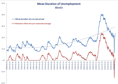
In this post, let's take a look at the latest data on average duration of unemployment through December 2020:


No comments:
Post a Comment