Sunday, August 22, 2010

Economics 22/8/10: Fundamentals of investing in IRL Inc - III

This is the third post in the series of four that presents fundamentals comparatives between Ireland, Switzerland and Luxembourg. The first post (here) covered analysis of current account dynamics, the second post (here) dealt with General Government balance. This post will highlight differences in GDP.

Once again, think of an investor making a choice between sovereign debt of three countries. Fundamentals about current account (external surpluses generated by economy - subject of the first post), government balances (second post), economic income and growth (present post), as well as unemployment, population and income per working person (following concluding post) all help underpin the economy ability to repay its sovereign debts.

So far, we have shown that:
  1. By external balances metric, Ireland is a much poorer performer than either Switzerland or Lux;
  2. By sovereign balances metric, Ireland is a much poorer performer than either Switzerland or Lux
Now, consider GDP metrics. We all heard that we are one of the richest economies in the entire world. Is this really so?

Let me put a caveat here - analysis of GDP figures for Lux is a bit tricky, since Luxembourg official stats exclude all those people who work in Luxembourg but reside outside its borders. So the best benchmark here is Switzerland. So
take a look at the 'Celtic Tiger' vis-a-vis Switzerland. 2002-2007 growth rates are virtually identical in both. But since 2007 - we have been a basket case, while Swiss have been ticking along nicely, like a fabled clock.

Chart 8:

And this is highlighted in each country share of the world GDP as well: w
e have 61% of Swiss population and 886% of Lux's population (Chart 9). Yet we have - in absolute terms - 54% of Swiss global share of GDP and 438% of Lux's. PPP-adjusted, our GDP is just 28.8% of Swiss and 400% of Lux's. In current prices-measured GDP, Ireland's GDP is 42.2% of Swiss and 400% of Lux's. So that population growth dividend isn't really working for us so far.

Chart 9:

Per capita GDP in current prices (Chart 10):

Chart 10:

  • 2008 peaks in all three countries: Luxembourg=USD118,570.05, Ireland= USD60,510.00, Switzerland= USD68,433.12
  • Peaks recovered by: Luxembourg= USD119,048.05 by the end of 2015, Ireland= USD60,729.66 by the end of 2019, Switzerland= USD69,838.79 by the end of 2010.
So it will take Ireland 9 more years to regain its income per capita 2007 levels, which were below those of Switzerland to begin with. Note: 2016-2020 forecast was performed assuming no recession between 2010 and 2019.

Of course, we were a stellar performer in terms of GDP growth prior to 2006. That's one fundamental where we did shine. But stripping out construction sector contribution in 2001-2007, we are not that spectacular (Chart 11)...

Chart 11:
The fourth and last post will conclude by making comparisons across other variables, such as inflation, population growth and labour markets.

Economics 22/8/10: Fundamentals of investing in IRL Inc - II

This is the second post in the series of four that presents fundamentals comparatives between Ireland, Switzerland and Luxembourg. Post I (here) covered analysis of current account dynamics. The present post will deal with General Government balance.

N
ow, let's check IRL's sovereign solvency position. Chart 5 illustrates:

Chart 5:

Again, if you are an investor hoping to get repaid on your bonds, you wouldn’t really go for Ireland as a place to park your money. Except during 1996-2001 and 2003-2007. But then, get out as fast as you can in 2007. All in, Ireland Inc hasn't paid its bills since 2007.

Let's see if the Government has been running operations consistent with long term attractiveness to sovereign investors. To do so, suppose we invested in the bonds written against General Government balances. Since timing matters, let us take two scenarios: investing €1.00 in 1980 and investing €1.00 in 1995, holding to 2010 or 2011.

So c
umulative returns on countries sovereign balances from 1980 are (Chart 6):
  • 2010: Ireland=28.5%, Switzerland=32.2%, Lux=43.3%. Ireland gap to best performer = -14.8%
  • 2011: Ireland=25.4%, Switzerland=31.9%, Lux=41.1%. Ireland gap to best performer = -15.7%
  • 2010-2011 gap deterioration for Ireland = -0.9%

Chart 6:

Chart 7 shows Slide 7 cumulative returns from 1995 are:
  • 2010: Ireland=-12.2%, Switzerland=-1.1%, Lux=-3.85%. Ireland gap to best performer=-11.1%
  • 2011: Ireland=-11.1%, Switzerland=-0.9%, Lux=-5.1%. Ireland gap to best performer=-10.2%
  • 2010-2011 gap improvement for Ireland = +0.9%
Chart 7:

So a portfolio of 50:50 split between 1980 investment and 1995 investment written against Irish Governments' fiscal positions since 1980 would have lost to investor 12.95% by 2010 and 2011, compared to a similar allocation into other two countries.

Economics 22/8/10: Fundamentals of investing in IRL Inc - I

Few months ago, while speaking as a guest on RTE's Frontline, I confronted two of our 'surrender to Brussels' politicians with a suggestion that a country can do just fine outside the 'Yes, Commissioner' world of European convergence consensus. In return, one politician - from the opposition side of the Dail - rushed to conclude that when advocating greater sovereignty on economic policies I was talking about the UK. My reply was that I had in mind more the path of the country like Switzerland.

In the light of the ongoing sovereign crisis, and with all the talk about bond markets unwillingness to underwrite our economy, I decided to return to the same issue. Here are major comparatives in investment (bonds-related) fundamentals in Ireland vis-a-vis Switzerland and Luxembourg.

I do this in a series of 4 posts. The first one deals with current account dynamics, the second one will deal with Government finances, the third one will show comparatives for GDP, and the fourth one will conclude by making comparisons across other variables, such as inflation, population growth and labour markets.

All data is based on IMF's World Economic Outlook, updates for April and July 2010, which covers period from 1980-2015. Some additional forecasts (beyond 2015) were performed by myself, alongside some additional variables computations.

I chose the two countries for several reasons:
  1. Both are core European countries;
  2. One of these is outside the EU, another is inside the same tent as Ireland;
  3. With a caveat concerning some of aggregate accounting issues with Luxembourg's data, all three have roughly similar economies characterized by: (a) no significant natural resources of their own, (b) small size of population and land mass, (c) heavy reliance on exports, (d) open nature of economies, (e) 'more Boston than Berlin' aspirations in tax policies, (f) being a bit of a thorn in the softer side of Brussels, and so on
So here are few charts and comments. In most cases, I take on the position of a rational investor in sovereign bonds, willing to hold these to maturity. In other words, what matters to me in most of these charts is the answer to the following question: "Given country A fundamentals compared to countries B and C, what is the likelihood that country A can generate sufficient net income to cover its debt obligations?"

Chart 1:
If our expected current account surplus of 2010 were to be used to pay down our debt, how long would it take? The answer to it is 'forever'. Our net surplus from trade and investments from the entire world was negative €4.03bn throughout the 2000s. In the 1990s, our average current account surplus was just €1.108bn, in 2010 our expected surplus in the only year when current account was positive in the 200s - the year 2010 - will be only €849mln. At the same time, our debt currently stands at €86.83bn and rising with interest bill on this well in excess of €4.56bn annually at latest 10 year bond auction yields. In other words, exporting our way out of the recession will not even cover our entire interest bill.

Here's an interesting observation. Irish Government thinks that exports will carry Ireland out of the recession. However, there is an argument to be made that value added in our exports is not really that impressive once the inputs costs are taken out.

Chart 2:
If you were an investor thinking about Ireland's fundamentals, you wouldn't have much hope of getting a positive return on your investment, if net exports were your underlying security, except in the period 1992-2000.

This, one can argue, might be true of our manufacturing exports, where we import often expensive inputs and where transfer
pricing (on inter-company sales) further contributes to lower net value added. But what about our services trade? Well, the current account data shows that during the last decade, when services trade really started to take off in Ireland, our net external balance was negative. So something is not adding up and I will take a look at this in the forthcoming posts.

But for now, we do have impressive exporters, yet our current account performance has been exceptionally weak, compared to
Switzerland and Luxembourg - two countries that are equally as reliant on imported inputs as Ireland.

It is worth noting also that in the case of Switzerland, their exports composition includes significant pharma and high tech
manufacturing exports as well. It just appears that they manage to do trade better...

I
n fact, a bet made on Ireland Inc based on its external economic performance back in 1980 would have been a disastrous one as Chart 3 below illustrates. An investor betting on our external balance would have 48.1 cents on every euro invested. Based on IMF forecasts, by 2015 this loss can be expected to widen to 48.9 cents. At the same time, identical bet on Luxembourg would have netted a gross return of over €5.11 by now, and a projected gain of €9.20 by 2015: a spread in return relative to Ireland of €5.59 by 2010 and €9.69 by 2015.

Chart 3:
The differences are even more dramatic when we look at comparison to Switzerland: a bet of €1.00 on Swiss external balance made in 1980 would have netted investor €8.145 by 2010 and is expected to yield €13.434 by 2015, implying the spread between investment in Ireland and Switzerland of €8.626 in 2010 and €13.923 in 2015.

O
bviously, the earlier analysis is sensitive to the time frame for investment chosen (Chart 4).

Chart 4:
Suppose a bet €1.00 was made on Ireland Inc based on its external economic performance back in 1995. An investor betting on our external balance would have grossed 0.393 cents on every euro invested by today and can be expected to gross a loss of 1 cent by 2015. An identical bet on Luxembourg would have netted a gross return of 11.23 cents by now, and a projected gain of 13.305 cents by 2015. The differences are slightly less dramatic when we look at comparison to Switzerland: a bet of €1.00 on Swiss external balance made in 1995 would have netted investor 9.54 cents by 2010 and is expected to yield 11.88 cents by 2015. Oh, and there wouldn't be any risk of getting these returns expropriated by the Government tax policy changes.

(Second post to follow)

Friday, August 20, 2010

Economics 20/8/10: BOSI lessons

Some impressive numbers from BOSI withdrawal from the Irish market are:
  • BOSI holds a €32bn loan book in the Irish market (total Irish market is ca €350bn)
  • BOSI holds a just over 9% market share of total Irish loans market
  • BOSI withdrawal of working capital facilities in Ireland will have immediate impact on 12,000 business customers
  • BOSI also holds €10bn mortgage book, or 7% of all Irish mortgages
  • BOSI holds 5,000 current accounts
  • Amazingly, 44% of the bank’s book was impaired as per H1 2010 generating a write-off of €4bn in loans
  • Per Bloxham stockbrokers: "the move is likely to have a negative impact in the economy where liquidity is still scarce and the closing off of business lines will force some businesses to wall" (sic).
Now, unless we are willing to assume that Irish banks (with such flagships of prudential lending as AIB, Anglo, INBS etc) are massively more brilliant than BOSI in writing loans, we simply cannot avoid translating BOSI impairment rate to their books as well. Which, of course, makes my estimate of 40% across the books losses for the banking system as a whole, peak to trough, rather safe.

Thursday, August 19, 2010

Economics 19/8/10: Irish bonds & our fndamentals

This is an unedited version of my article in the Irish Examiner from August 18, 2010.

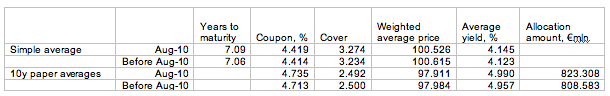
The latest Irish bonds auction was perhaps the most eagerly anticipated event in the NTMA’s history. Its outcome was a small victory for NTMA, but a Pyrrhic victory for Ireland.

A quick guide to the results first. Facing svere headwinds from the markets, NTMA managed to sell 4 and 10 year bonds at average yields of 3.627% and 5.386% respectively.

This means that NTMA improved on July auction of 10 year bonds, but is still locked into what amounts to the third highest cost of borrowing over the last three years. A year ago the same bonds were placed at an average yield of 4.55% - which means that borrowing €1 billion today is now €8.4 million costlier than a year ago.

However, the NTMA results are hardly a reason to cheer, from the economy wide perspective.

Three events have triggered the extraordinary global attention to Irish bonds over the last few weeks. Firstly, there was a public relations flop when the ECB had to step in provide support for Irish bonds by directly buying the surplus paper out of the market. Second by Monday this week, Irish bond spreads over the benchmark German bunds rose to a stratospheric 300 basis points. At the same time, our CDS spreads hovering above 310 basis points benchmarks, were
signaling that markets anticipated a significant probability of Irish Government default on its sovereign debt.

All of these developments, especially set against much calmer changes in yields and CDS spreads in other Eurozone economies have indicated that the markets are changing not just in terms of the overall willingness of bond investors to underwrite risk in general, but in their attitudes to Irish debt in particular.

You see, during the first quarter of this year, sovereign debt crisis has engulfed the peripheral economies of Europe, collectively know as PIIGS (Portugal, Greece, Ireland, Italy and Spain). The crisis, of course, was triggered by the markets belated realisation that these countries economies cannot sustain massive debt and deficit financing liabilities they have taken on before and during the current Great Recession. That was the moment when Ireland was lumped together with the rest of the Eurozone’s sickest economies.

This time around, we are on our own. Over recent months, all of the PIIGS countries have unveiled a series of aggressive deficit reduction and austerity programmes aimed at significantly reducing their future borrowing requirements. All, that is, except for Ireland. Instead, Irish Government has spent the last 9 months waiting for the Trade Unions to vote on the Croke Park deal that actually limited our future ability to address deficits. On top of that, we staunchly resisted markets, the IMF and the EU Commission repeated calls for clarity on specific budgetary measures planned for the period of 2011-2014. Currently, the IMF forecasts Irish deficit to remain at over 5% of GDP in 2015.

In May 2010, before factoring in the latest funding allocations to banks, IMF Fiscal Monitor provided an estimate for Ireland’s borrowing requirements for 2010. These figures are strikingly different from the deficit numbers presented by our official framework. IMF forecast that Ireland will need to borrow at least 19.9% of its GDP in order to finance debt roll overs from previous years maturing in 2010, plus the deficit of -12.2% of GDP. In approximate terms, Ireland’s Government borrowing this year would amount to roughly €33bn before Anglo Irish Bank and INBS latest projections for new funding.

Thus, in the last two weeks, the bond markets have finally began to re-price Irish sovereign debt as if the country is no longer the leader in the PIIGS pack in terms of expected future deficit
corrections.

In the end, the markets are right. Ireland is facing a massive debt and deficit overhang that is well in excess of any other advanced economy in the world. And contrary to official statements uttered on the matter this week, this twin problem is not a matter of one-off recapitalization of the Anglo Irish Bank. Instead, it is a long-term structural one.

Take first the banks. The recapitalization and balance sheets repair approach undertaken by the Government so far means that Nama alone can be expected to lose around €12 billion over the next 10 years. These losses will have to be underwritten by the Irish economy.

In addition, total losses by the Irish banks are likely to add up to between €49 and €53 billion over the next three-four years. These can be broken down to €33-36 billion that will be needed in the end for the zombie Anglo, €6bn for equally gravely sick INBS, at least €8 billion for AIB and up to €2 billion for the healthiest of all – Bank of Ireland.

These numbers are based on my own analysis and are confirmed by slightly more pessimistic estimates by the independent banking sector analyst Peter Mathews. Once again, Irish economy – or in other words all of us – can be expected to underwrite these. Thus, total bill for ‘repairing’ Irish banks via Government preferred approach of Nama, plus recapitalizations is likely to be €61-65 billion over the next decade.

Now, consider our current spending. Having slashed capital expenditure down to the bone, the Government has committed itself to preserving public sector pay and employment through 2014. Transfers – including welfare and subsidies – are pretty much a no-go area for serious
savings, given continued rises in unemployment, long term nature of new joblessness and political dynamics in the country. Between them, these two spending headlines account for over 1/3 of the entire deterioration in our public spending from 2008 to-date.

Budget 2010 forecasted that our debt to GDP ratio will peak at around 84% in 2012 and will slowly decline thereafter. This, of course, is clearly an underestimate, but even by that metric, we are looking at a debt mountain of over €152 billion.

All of this means that at the very least, Irish state debt will be well in excess of €210 billion by 2014-2015. Given yesterday’s auction results, the interest bill on this debt alone will total €11.3 billion annually – more than 1/3 of all tax revenue collected in 2009.

Let’s put this into more easily understood perspective. If Ireland were a household and its debt constituted its mortgage taken over 30 years, the ‘family’ will be spending more than half of its total gross income on interest and principal repayments.

Or put differently, the legacy of this crisis and systemically mistaken approach taken to repairing the banking sector will amount to over €111,000 in new debt dumped on the shoulders of every currently employed person in the country. To say, as our policymakers and official analysts do, that this figure doesn’t really matter because it is a ‘one-off measure’ is adding insult to the injury.

Tuesday, August 17, 2010

Economics 18/8/10: NTMA's foray into bond markets wilderness

As promised - a more in-depth analysis of today's data from NTMA auction.

"The Gruffalo said that no gruffalo should
Ever set foot
In the deep dark wood"

Clearly, bent on saving nation's face, the NTMA could not pass on going to the markets today.

First, let us take a look at the changes in averages from April 2009 first auction through today, against the same averages for the period excluding today's auction.
So today’s auctions have led to:
  • a small increase in overall maturity profile of Irish debt (good news)
  • a small increase in average coupon paid for all maturities (true future liabilities on debt)
  • a modest rise in average cover (potentially due to massive overbidding by ECB, but this is a speculative remark at this moment in time)
  • a drop in average price paid and a corresponding rise in the weighted average yield.
These effects were most discernible in the benchmark 10 year bonds issue, where:
  • Average coupon rose by ca ½ basis point;
  • Average cover dropped
  • Weighted average price declined and weighted average yield rose (the latter by almost 0.7%)
  • Average allocation amount rose.

Even more interesting stats are in the price and yield spreads:
Again, for across all issues averages spreads in prices rose significantly – by 8.3% and spreads in yields rose 7.85%. This is on the back of 10 year paper alone, suggesting the following two things:
  1. Whatever was happening in the shorter term paper market (cover and lower yields) appears to be disconnected from what was going on in longer term paper markets (perhaps the rumoured ECB intervention on the shorter side was after all true?);
  2. Since the prices and yields reflect bids by market makers – the widening of the spreads between max and min bids might be indicative of the markets inability to tightly price Irish sovereign risk. In other words, this might signal general markets uneasiness about the bonds.

Some charts illustrate more general trends.

Short term paper auctions first (5 years and less):
Average yield is still on the rising trend despite a clearly 'extraordinary' move down in today's auction. Even steeper upward trend for November 2009-present is still present. Yield spreads are on the upward move again once more signaling potential rise in overall market skepticism.
Price spread trends up predictably in line with yield spread trend. To see it in absolute terms:
Weighted average price achieved in the auctions:
Again, if ECB speculations play out to be true, the small uptick in price in last auction can be written off completely.

Now to longer maturity (10 years and above).
Average yield down, but still above long term trend. Yield spreads up, quite significantly. As I mentioned in the earlier post, latest auction produced yield spreads of 9.9bps - third highest spread since April 2009.
Price spreads are 75bps - second highest spread since April 2009. Cover down - lowest since February 2009 and is down year on year. Again, to highlight spreads in real terms:
Next, look at the price achieved:
This hardly constitutes any sort of 'success'. May be, just may be - some sort of a stabilization, with mean reversion still incomplete.

Now to the maturity profile of our debt:
We keep on loading the 2014 end of the spectrum - bang on for the year when we are supposed to reach 3% deficit. Of course, with already close to €5 billion in rollovers due in 2014, it's hard to imagine how this is going to help our fiscal position.